SlideShare a Scribd company logo
1 of 2
  There are many conventions of existing music magazines of which I have followed, However there are also some that I have challenged.   Evaluation (1) -In what ways does your media product use, develop, or challenge forms and conventions of real media products?   On the left is my front cover, and on the right is an existing magazine front cover from ‘Q’, and as you can see, there are many similarities and differences between them both.  Before starting my magazine creation, I deconstructed 3 existing products, evaluating the codes and conventions throughout.  One of the main conventions which I came across was the front cover main image. Most of the magazines which I deconstructed featured a large photo of an artist or band, placed in the centre of the page. I took this in consideration when taking my photographs, so that I would have one which would look similar to existing products. I then placed this image in the centre  of the page to carry on conveying to conventions.  One thing about my image which I found challenged conventions of most magazines in general was the black and white theme. Although I did not find many, if any existing products with this feature, I thought that black and white connoted acoustic better than a bright bold image. I also created an online poll asking my target audience if they would prefer to see a black and white image, or a brightly coloured image on the front cover of an acoustic magazine. The results came back as black and white in favour, and therefore I proceeded with this thought.  One thing that I also noticed about existing front cover images, was that they are almost always making eye contact with the reader. However, I decided to challenge this and have my featured artist looking down at their guitar – which shows that the magazine is going to be about music, in particularly connoting acoustic. Another convention is the cover lines. I used them down both sides of my image, with a range of different fonts which linked in with my genre, and co-ordinated the colours altogether.  I chose to use colours such as; Red, Black, White, and Grey as I thought that they would appeal to both genders, widening the range of people who would buy my magazine, proving more sales. I found that ‘Q magazine’ also used these colours which worked really well as a house style.  The background colour of ‘Q magazine’s front covers are usually grey, so I took this idea to use in my magazine instead of a plain white background, which I think makes it look really professional.  There are also minor conventions such as a barcode in the bottom right hand corner which I conveyed to, a masthead at the top of the page, and a price and date at the bottom of which I also conveyed to.
As you can see, I have used the same grey-black background as this existing contents page, the same way of writing the masthead, and the same sort of layout. However I decided to insert more pictures into my page so that I had a minimum of 5 at least throughout all 3 pieces. I also decided to use a black and white image which I think looks good as it continues the house style. The title of ‘contents’ is in the same font and colour as my title on the front cover, which also continues the house style. I think that overall, my contents page is a lot different to most existing contents pages, however I think that it looks good and the picture shows clearly that it is connoting music, which is a large factor in the success of a magazine. Here I have used the conventions of having a subheading/heading which overlaps the two pages, as does the image, so that the viewers can recognise that it is a double page spread, and that they both link. I also used a black background like this existing product that I saw, which I think makes the image more striking. I also placed the text in columns on the left hand page as that’s where most other double page spreads text is placed. Again, I have challenged the convention of having a coloured image, as I thought that a black and white image would further carry on the house style and convey to the acoustic genre.

More Related Content

What's hot

Production Of Double Page Spread
Production Of Double Page SpreadProduction Of Double Page Spread
Production Of Double Page SpreadD PS
 
Evaluatio nq.1
Evaluatio nq.1Evaluatio nq.1
Evaluatio nq.1misspauls
 
Evaluatio nq.1
Evaluatio nq.1Evaluatio nq.1
Evaluatio nq.1misspauls
 
Evaluatio nq.1
Evaluatio nq.1Evaluatio nq.1
Evaluatio nq.1misspauls
 
Question 3 – what have you learnt from
Question 3 – what have you learnt fromQuestion 3 – what have you learnt from
Question 3 – what have you learnt fromnushy1993
 
Attracting an audience
Attracting an audienceAttracting an audience
Attracting an audienceelliescobell
 
Construction of music dvd cover
Construction of music dvd coverConstruction of music dvd cover
Construction of music dvd coverDamienAshton
 
Construction of Music DVD Cover
Construction of Music DVD CoverConstruction of Music DVD Cover
Construction of Music DVD CoverJaredtw95
 
Magazine conventions
Magazine conventionsMagazine conventions
Magazine conventionsharrr002
 
Task 13 - Digipak Design
Task 13 - Digipak DesignTask 13 - Digipak Design
Task 13 - Digipak DesignElisa Di-Rosa
 
Digipack final outcome powerpoint re editing
Digipack final outcome powerpoint re editingDigipack final outcome powerpoint re editing
Digipack final outcome powerpoint re editingmsharrattmedia
 
Collection of my images
Collection of my imagesCollection of my images
Collection of my imagesChloe Howcroft
 
Proposal 1 - Klashed
Proposal 1 - KlashedProposal 1 - Klashed
Proposal 1 - Klashedthibbert2015
 
Task 14 – Draft of Magazine Advert
Task 14 – Draft of Magazine AdvertTask 14 – Draft of Magazine Advert
Task 14 – Draft of Magazine AdvertElisa Di-Rosa
 

What's hot (17)

Production Of Double Page Spread
Production Of Double Page SpreadProduction Of Double Page Spread
Production Of Double Page Spread
 
Evaluatio nq.1
Evaluatio nq.1Evaluatio nq.1
Evaluatio nq.1
 
Evaluatio nq.1
Evaluatio nq.1Evaluatio nq.1
Evaluatio nq.1
 
Evaluatio nq.1
Evaluatio nq.1Evaluatio nq.1
Evaluatio nq.1
 
Question 1a
Question 1aQuestion 1a
Question 1a
 
Question 3 – what have you learnt from
Question 3 – what have you learnt fromQuestion 3 – what have you learnt from
Question 3 – what have you learnt from
 
Attracting an audience
Attracting an audienceAttracting an audience
Attracting an audience
 
Construction of music dvd cover
Construction of music dvd coverConstruction of music dvd cover
Construction of music dvd cover
 
Construction of Music DVD Cover
Construction of Music DVD CoverConstruction of Music DVD Cover
Construction of Music DVD Cover
 
Q1 video
Q1 video Q1 video
Q1 video
 
Overall Evaluation
Overall EvaluationOverall Evaluation
Overall Evaluation
 
Magazine conventions
Magazine conventionsMagazine conventions
Magazine conventions
 
Task 13 - Digipak Design
Task 13 - Digipak DesignTask 13 - Digipak Design
Task 13 - Digipak Design
 
Digipack final outcome powerpoint re editing
Digipack final outcome powerpoint re editingDigipack final outcome powerpoint re editing
Digipack final outcome powerpoint re editing
 
Collection of my images
Collection of my imagesCollection of my images
Collection of my images
 
Proposal 1 - Klashed
Proposal 1 - KlashedProposal 1 - Klashed
Proposal 1 - Klashed
 
Task 14 – Draft of Magazine Advert
Task 14 – Draft of Magazine AdvertTask 14 – Draft of Magazine Advert
Task 14 – Draft of Magazine Advert
 

Similar to Challenging conventions of music magazines

Evaluation Question 1
Evaluation Question 1Evaluation Question 1
Evaluation Question 1bymckee
 
Evaluation for question number one
Evaluation for question number oneEvaluation for question number one
Evaluation for question number onejessduncan93
 
Evaluation question 1
Evaluation question 1Evaluation question 1
Evaluation question 1suhayl786
 
Finished! evaluation1
Finished! evaluation1 Finished! evaluation1
Finished! evaluation1 KendalMiles
 
Planning and research, construction and evaluation
Planning and research, construction and evaluationPlanning and research, construction and evaluation
Planning and research, construction and evaluationChrisPhillipou1993
 
Planning and research, construction and evaluation
Planning and research, construction and evaluationPlanning and research, construction and evaluation
Planning and research, construction and evaluationChrisPhillipou1993
 
Evaluation Question 1
Evaluation Question 1Evaluation Question 1
Evaluation Question 1taylzz1
 
Production commentary
Production commentaryProduction commentary
Production commentaryHaiiEmmaa
 
Media Evaluation New
Media Evaluation NewMedia Evaluation New
Media Evaluation NewNaomi Hall
 
Evaluation q1
Evaluation   q1Evaluation   q1
Evaluation q1Kiraan123
 
As media evaluation
As media evaluation As media evaluation
As media evaluation BenTibbits
 

Similar to Challenging conventions of music magazines (20)

Evaluation Question 1
Evaluation Question 1Evaluation Question 1
Evaluation Question 1
 
Question 1
Question 1Question 1
Question 1
 
Evaluation
EvaluationEvaluation
Evaluation
 
Evaluation for question number one
Evaluation for question number oneEvaluation for question number one
Evaluation for question number one
 
Evaluation question 1
Evaluation question 1Evaluation question 1
Evaluation question 1
 
Finished! evaluation1
Finished! evaluation1 Finished! evaluation1
Finished! evaluation1
 
Planning and research, construction and evaluation
Planning and research, construction and evaluationPlanning and research, construction and evaluation
Planning and research, construction and evaluation
 
Planning and research, construction and evaluation
Planning and research, construction and evaluationPlanning and research, construction and evaluation
Planning and research, construction and evaluation
 
Evaluation Question 1
Evaluation Question 1Evaluation Question 1
Evaluation Question 1
 
Production commentary
Production commentaryProduction commentary
Production commentary
 
Media Evaluation New
Media Evaluation NewMedia Evaluation New
Media Evaluation New
 
Question1+2
Question1+2Question1+2
Question1+2
 
Question1+2
Question1+2Question1+2
Question1+2
 
Evaluation
EvaluationEvaluation
Evaluation
 
Evaluation
EvaluationEvaluation
Evaluation
 
Question 1 completed
Question 1 completedQuestion 1 completed
Question 1 completed
 
Evalutaion Question One
Evalutaion Question OneEvalutaion Question One
Evalutaion Question One
 
Evaluation q1
Evaluation   q1Evaluation   q1
Evaluation q1
 
Evaluation
EvaluationEvaluation
Evaluation
 
As media evaluation
As media evaluation As media evaluation
As media evaluation
 

More from danilian

New media technology examples
New media technology examplesNew media technology examples
New media technology examplesdanilian
 
Conventions
ConventionsConventions
Conventionsdanilian
 
My products
My productsMy products
My productsdanilian
 
Cd cover production
Cd cover productionCd cover production
Cd cover productiondanilian
 
Genre theory
Genre theoryGenre theory
Genre theorydanilian
 
Presentation1
Presentation1Presentation1
Presentation1danilian
 
Storyboard
StoryboardStoryboard
Storyboarddanilian
 
Equipment testing
Equipment testingEquipment testing
Equipment testingdanilian
 
Your song’ Screen shots
Your song’ Screen shotsYour song’ Screen shots
Your song’ Screen shotsdanilian
 
Music industry
Music industryMusic industry
Music industrydanilian
 
Evaluation 1
Evaluation   1Evaluation   1
Evaluation 1danilian
 
Evaluation
EvaluationEvaluation
Evaluationdanilian
 
Contents media photos
Contents media photosContents media photos
Contents media photosdanilian
 
Initial Photographs
Initial PhotographsInitial Photographs
Initial Photographsdanilian
 
Initial Photographs
Initial PhotographsInitial Photographs
Initial Photographsdanilian
 
Photographs
PhotographsPhotographs
Photographsdanilian
 
Dps decons
Dps deconsDps decons
Dps deconsdanilian
 

More from danilian (20)

New media technology examples
New media technology examplesNew media technology examples
New media technology examples
 
Conventions
ConventionsConventions
Conventions
 
My products
My productsMy products
My products
 
Cd cover production
Cd cover productionCd cover production
Cd cover production
 
Genre theory
Genre theoryGenre theory
Genre theory
 
Album
AlbumAlbum
Album
 
Presentation1
Presentation1Presentation1
Presentation1
 
Storyboard
StoryboardStoryboard
Storyboard
 
Equipment testing
Equipment testingEquipment testing
Equipment testing
 
Your song’ Screen shots
Your song’ Screen shotsYour song’ Screen shots
Your song’ Screen shots
 
Music industry
Music industryMusic industry
Music industry
 
Evaluation 1
Evaluation   1Evaluation   1
Evaluation 1
 
Evaluation
EvaluationEvaluation
Evaluation
 
Dsiuh
DsiuhDsiuh
Dsiuh
 
Contents media photos
Contents media photosContents media photos
Contents media photos
 
Initial Photographs
Initial PhotographsInitial Photographs
Initial Photographs
 
Initial Photographs
Initial PhotographsInitial Photographs
Initial Photographs
 
Photographs
PhotographsPhotographs
Photographs
 
Dps decons
Dps deconsDps decons
Dps decons
 
Media
MediaMedia
Media
 

Challenging conventions of music magazines

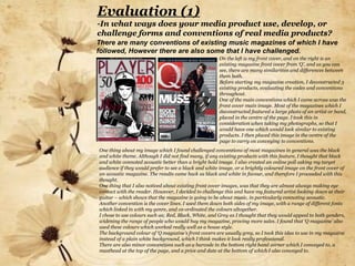
  • 1.   There are many conventions of existing music magazines of which I have followed, However there are also some that I have challenged.   Evaluation (1) -In what ways does your media product use, develop, or challenge forms and conventions of real media products?   On the left is my front cover, and on the right is an existing magazine front cover from ‘Q’, and as you can see, there are many similarities and differences between them both. Before starting my magazine creation, I deconstructed 3 existing products, evaluating the codes and conventions throughout. One of the main conventions which I came across was the front cover main image. Most of the magazines which I deconstructed featured a large photo of an artist or band, placed in the centre of the page. I took this in consideration when taking my photographs, so that I would have one which would look similar to existing products. I then placed this image in the centre of the page to carry on conveying to conventions. One thing about my image which I found challenged conventions of most magazines in general was the black and white theme. Although I did not find many, if any existing products with this feature, I thought that black and white connoted acoustic better than a bright bold image. I also created an online poll asking my target audience if they would prefer to see a black and white image, or a brightly coloured image on the front cover of an acoustic magazine. The results came back as black and white in favour, and therefore I proceeded with this thought. One thing that I also noticed about existing front cover images, was that they are almost always making eye contact with the reader. However, I decided to challenge this and have my featured artist looking down at their guitar – which shows that the magazine is going to be about music, in particularly connoting acoustic. Another convention is the cover lines. I used them down both sides of my image, with a range of different fonts which linked in with my genre, and co-ordinated the colours altogether. I chose to use colours such as; Red, Black, White, and Grey as I thought that they would appeal to both genders, widening the range of people who would buy my magazine, proving more sales. I found that ‘Q magazine’ also used these colours which worked really well as a house style. The background colour of ‘Q magazine’s front covers are usually grey, so I took this idea to use in my magazine instead of a plain white background, which I think makes it look really professional. There are also minor conventions such as a barcode in the bottom right hand corner which I conveyed to, a masthead at the top of the page, and a price and date at the bottom of which I also conveyed to.
  • 2. As you can see, I have used the same grey-black background as this existing contents page, the same way of writing the masthead, and the same sort of layout. However I decided to insert more pictures into my page so that I had a minimum of 5 at least throughout all 3 pieces. I also decided to use a black and white image which I think looks good as it continues the house style. The title of ‘contents’ is in the same font and colour as my title on the front cover, which also continues the house style. I think that overall, my contents page is a lot different to most existing contents pages, however I think that it looks good and the picture shows clearly that it is connoting music, which is a large factor in the success of a magazine. Here I have used the conventions of having a subheading/heading which overlaps the two pages, as does the image, so that the viewers can recognise that it is a double page spread, and that they both link. I also used a black background like this existing product that I saw, which I think makes the image more striking. I also placed the text in columns on the left hand page as that’s where most other double page spreads text is placed. Again, I have challenged the convention of having a coloured image, as I thought that a black and white image would further carry on the house style and convey to the acoustic genre.