
Recommended
More Related Content
What's hot
What's hot (20)
Similar to Digipak research
Similar to Digipak research (20)
More from danigordon01
More from danigordon01 (16)
Recently uploaded
Recently uploaded (20)
Digipak research
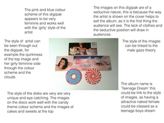
- 1. The images on this digipak are of a seductive nature, this is because the way the artist is shown on the cover helps to sell the album, as it is the first thing the audience will see. The lack of clothes and the seductive position will draw in audiences The album name is ‘Teenage Dream’ this could be link to the style of images, as having a attractive naked female could be classed as a teenage boys dream The pink and blue colour scheme of this digipak appears to be very feminine and works well with the ‘girly’ style of the artist The style of artist can be seen through out the digipak, for example the quirkiness of the top image and her girly feminine side through the colour scheme and the clouds The style of the disks are very are very unique and eye catching. The images on the discs work well with the candy theme colour scheme and the images of cakes and sweets at the top The style of the images can be linked to the male gaze theory
- 2. The images on both the front and the back of this digipak are of a seductive, eye catching nature. This will draw audiences in. The look of the artist is what helps to sell an album, for example having her legs exposed in back image and biting her finger in the front image are both eye catching poses The gradual ombre in the background of this image can be linked to the gradual style and music change the artist has been going through over the past few years. From a bright bubbly teenage TV star to a darker more mature musician The name of the artist isn't very bold or eye catching, this is because its not the most important thing on the cover. In this case the image of the artist is the most important, purely the show the stark transformation she has been through In comparison to the rest of the digipak this disc is rather dull and boring. This could be because its not on direct view to the buyer and therefore doesn't need to catch their attention The text frames the image of the artist on the back. The layout of the text draws you in to the image of the artist, particularly her legs, this can be linked to male gaze as you are immediately drawn towards her legs
- 3. The main image on the cover of this album is the artist herself. The close up of the image could suggest that she is trying to be bold and eye catching, being noticed as a newly transformed artist ( no longer a teenager TV star.) Her glare in to the camera shows the audience that she is trying to make a connection, trying to draw them in. This cover is very simple, yet still catches your eye. The font used, although light in colour is still bold enough to catch your attention. The artists name is included on the cover, maybe as it is assumed anyone buying the album will already know who she is or possibly it could be to show that she is restyling her career and therefore doesn’t want the connection her name has with her previous style The artist appears naked on the cover, the top of her chest covered by her arms, This can again show that she is trying to break free from her past style and grow in to a mature artist with a mature fan base. She is also covered in what appears to be dirt and glitter on a bright white background, this could show that before she was a squeaky clean pop artist and now thats no longer the case, her music is more emotional and edgy than in the past. The back and the disc are no where near as bold and eye catching as the cover. As this isn’t the first thing the audience sees it doesn’t matter as such that they aren’t as eye catching. However besides the colour scheme and font the back and the disc don’t appear to go with the cover, although the back and the disc are very similar and work very well together. This digipak appears to be very basic and too the point, there is attempt to draw audiences in with pretty girly colours and overly seductive image. This shows that the artist is more passionate about selling her music that promoting herself and her image ( although the cover shows she has changed as an artist)
- 4. The natural colour scheme shows the relaxed, down the earth nature of the artist. The use of these simple colours shows the audience that this album isn’t going to be too out there and won’t be the kind out music you’d expect to see at a party or a nightclub The artist isn’t heavily made up, she appears to be young and fresh and have an innocent, angelic feeling about her. The artists name is written in a very girly font, while the album name ‘Fearless’ is written in a bold eye catching font, the font used links well to the meaning of the word. It may also show that the artist is breaking away from her past and maturing as an artist The image on the cover isn’t what you would necessarily expect from the image on the cover of an album. She isn’t looking at the camera and therefore isn’t making eye contacting with the audience, however this difference in the style of the image still draws the audience in, personally I find the hair flick very eye catching A platinum edition of this album has also been released. Although the same images used on the cover this differ a lot. The neutral background was been replaced by a black one, also the colour of the text has been changed to black, this makes parts of it more difficult to read. There has been an addition of ‘platinum edition' at the bottom of the cover, this is in the same font as the album name, but smaller, this shows that it might not be as important as the album name, but also allows it to stay on one line, not ruining the aesthetics of the cover