QUATER-1-PE-HEALTH-LC2- this is just a sample of unpacked lesson
Task 1 advert
1. Unit 57: Photography and
Photographic Practice
Research of other photographers
work (P1, M1, D1)
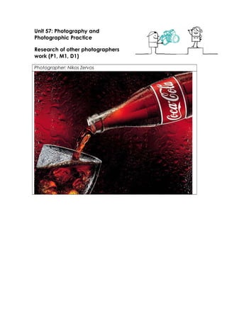
Photographer: Nikos Zervos
2.
3.
4.
5. Theme or focus of images
This is all the work of Nikos Zervos who is a Greek photographer all of his work mainly consists on
photography for advertisement. He has done a lot of work for coca cola all of his work but one are all
done with extreme close up macule shots. Also all of his work appears to be food or something to do
with food.
The first photograph is of a cola bottle being purred into a glass cup it has been taken mid purring to
show the liquid .he has done this by making someone else pure the bottle while he takes several shots
and although most of the shots would not turn out well others will look good .It also shows
condensation on the glass and bottle as well as fizz in the drink in the glass this has been done to show
us how fresh and cold the drink is it also has a way of making your mouth feel dry which makes you
crave for a drink of Coca Cola .The background is just a plain black and red but it has been dingily
modified so it has the condensation on the lances .This gives the effect that it is a cold drink that would
be good for a warm day.
The next image is an advert for Tabasco sauce the shot is a wide angle shot with it focused on a fork
that is in the centre of the image. The fork is resting on a plate this is usually to show that it was used
for a meal. Two of the edges of the fork are melting off and landing on the plate the artist has used this
to show that the sauce is so hot that it can be used to melt mettle I am a fan of the way he has done
that it’s a good way of showing the heat of the sauce. In the bottom left hand corner it has a small shot
of the sauce bottle and two chills this has been added later in a soft wear like Photoshop or something
similar. He has added this in photo to show what they are trying to sell, but this is very small can easy
be ignored on the first glance . One thing that I do not like about this it does not have any details about
the product like where to buy it.
Next has is an advert for Nescafe. I would say that this is my least favourite out of all the work done by
this artist. unlike his other work this has been done at a wide angle shot and unlike the rest of his work
this one focuses on people rather than object . The image is of a group of three people in a snowy
climate. At the side of the people is an picture of the product just like all of his work he has a picture of
the product that he is selling in the photo . The photographer has used this background of a snowy
climate to attempt to show the audience that the Nescafe is great on a cold day to keep you warm. On
the picture it has the title of the product is on show the photographer has made sure to keep it in the
same front as the logo is on the box that of coffee that they are selling.
Next we have another Coca Cola product this time it is a Coca Cola light . This image pretty much has
the same concept as the previous one .the different between this one and the first one are as followed
the item being purred into a glass is a can not a bottle and the position of the can and glass has been
reversed .the rest is the same with using condensation as a way to make the viewer feel thirsty and to
make it look as though the drink is cold and fresh
The last piece of work by this artist that is shall be looking at is another product for Coca Cola. This time
the artist is doing different approaches to taking the image. First he has taken uses using a macrule
lances he has done this to get all the detail of the coca cola can this allows us to see the condensation
dripping down it very clear this will give the viewers the sense that it is a colder and refreshing drink in
also makes us feel thirsty. It has also been done so it fits into a small cercal in the centre of the screen
with all the background plain black this has been done to direct the focused onto the Coca Cola can and
make sure that there are no distractions that the eye could wonder off to. This shot has been taken
tilting slightly down on the product at eye level .The photographer also made the choice to not have
the whole of the can on the screen I think that he has done this because Coca Cola is so rescannable he
does not need to show it all for people to understand what it is
composition
The composition has of lot of relations with each of the images that this artist has done
excluding the Nescafe one which is shot a different to the rest of his work. In the rest of
his work he is always zoomed into the object at eye high with a slight till upwards and a
6. slight tilt to the lances it is also tilted to both the right and left depending on the shot.
He has done this to make the shot angle not look plain and boring.
Techniques used
shutter speeds- This particular artist has used two different types of shutter speeds for
each of the adverts .For the coca cola product the shutter speed is about 1/120 with
the aperture around the F12 with ISO the would probably somewhere near the 100
mark since it is studio work and the lighting would be set up for that sort of shot
The chilli product would be slightly different with the shutter speed staying around
1/120 and the ISO staying the same but the aperture would be slightly less since the
background is slightly out of focus it would probably be something between F8 to F10
rule of thirds – This artist thinks about the rule of thirds in his work for example with the
Coca Cola product it has the glass and the coca cola can on the intersecting lines .
Also with the chilli product the intersecting lines connect at both sides of the fork
depth of field- The depth of field differs between the Coca Cola and the chili .The
Coca Colas background is in focus perfectly this is done with something near F12 and
the Chilli has the background only slightly out of focus this would have something
around F8 to F10.
Strengths & Weaknesses
Strengths
I really like the digitally editing the images to add the mention and condensation
effect
Most of his shots are created perfectly with not much free space
Good uses of backgrounds
Weaknesses
The glass can look slightly out of focus
7. slight tilt to the lances it is also tilted to both the right and left depending on the shot.
He has done this to make the shot angle not look plain and boring.
Techniques used
shutter speeds- This particular artist has used two different types of shutter speeds for
each of the adverts .For the coca cola product the shutter speed is about 1/120 with
the aperture around the F12 with ISO the would probably somewhere near the 100
mark since it is studio work and the lighting would be set up for that sort of shot
The chilli product would be slightly different with the shutter speed staying around
1/120 and the ISO staying the same but the aperture would be slightly less since the
background is slightly out of focus it would probably be something between F8 to F10
rule of thirds – This artist thinks about the rule of thirds in his work for example with the
Coca Cola product it has the glass and the coca cola can on the intersecting lines .
Also with the chilli product the intersecting lines connect at both sides of the fork
depth of field- The depth of field differs between the Coca Cola and the chili .The
Coca Colas background is in focus perfectly this is done with something near F12 and
the Chilli has the background only slightly out of focus this would have something
around F8 to F10.
Strengths & Weaknesses
Strengths
I really like the digitally editing the images to add the mention and condensation
effect
Most of his shots are created perfectly with not much free space
Good uses of backgrounds
Weaknesses
The glass can look slightly out of focus