
Recommended
More Related Content
Similar to Picture Evaluation
Similar to Picture Evaluation (20)
Recently uploaded
Recently uploaded (20)
Picture Evaluation
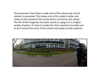
- 1. This panoramic shot allows a wide view of the school and a lot of content is presented. This shows a lot of the subject matter and relates to the context of the article which is primarily, the school. The file of this image has also been saved as a jpeg as it is a higher quality of photo. If I were to retake this shot I would try to make sure to do it around the areas of the school and maybe include students.
- 2. This photo is used as it includes a picture of students and it relates to the subject matter of the magazine, as did the other ones. This shot also includes a picture of some students included which is an improvement from the other shot. However, there is a lot of dead space included which could be cropped out from the cover and a grit bin is included in the bottom left which could also be cropped out as it is an eye sore.
- 3. I did not use this image because as you can see it is quite blurry and there is also a lot of dead space on the floor. The image looks out of focus and would not be suitable for the magazine, despite it showing images of students and including a lot of the subject matter which is the students.