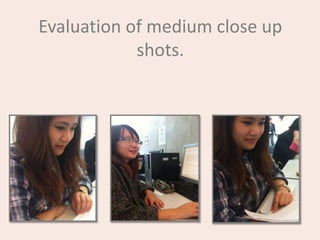
2. Medium Close up (1)
This is the first medium-
close up shot of a
student studying during
her private study time.
I chose this shot
because when I saw the
student sitting and
reading over her work, I
thought it would be nice
to have on my magazine
cover because it
connotes a harmonious
and enjoyable
atmosphere at
Plumstead Manor Sixth
Form.
For this photo I’m going to
increase the transparency of
the image. The reason being
because due to the
transparency being at the
lowest, the image seems
very abrupt, increasing the
transparency gives the image
a more professional look.
This medium close-up will be the image I use because it doesn’t have other students in the mise-en-scene,
no cropping will be necessary. Also, I’m only going to edit it by adjusting the transparency which will not
require hard-work.
3. Medium close up (2)
In this image I’m going to use
Photoshop or normal photo
editing software to crop out the
teacher and student who are
caught in the background. This
was another shot of the student
reading over her work, but I
caught her smiling (well, I tried
to!) The image itself looks
slightly dark to me due to the
lighting in the study area. If I
was going to use this image I
would definitely change the
transparency.
I think this picture
probably won’t be my
medium close up
because the image was
taken spontaneously
which caught the
student in a half-smile
type expression.
4. Medium close up (3)
Originally I wanted this image
because I likes the students
dress style, Having a shot with a
student who dresses a certain
way could connote the schools
non-overly strict rules but also
denotes that you can still be an
individual. This image would
need editing on the glasses.
There is reflection from the
study area light. Also I caught
the student off guard which
made the whole image look
slightly distorted.
5. I really like this image of two
students walking down the
stairs. Their facial expressions
connote happiness and
excitement (which would go
with my main feature of a
school event/concert etc.) and
also denotes a smart,
sophisticated look.
If I use this image I have
noticed that the light at the top
of the image is very
overwhelming. To fix this I
would need to change the
transparency. The reason it
would look better if I did this is
because you can’t really see the
students’ face at the side.