
Recommended
More Related Content
What's hot
What's hot (20)
Viewers also liked
Viewers also liked (12)
Similar to Photography analysis final
Similar to Photography analysis final (20)
Recently uploaded
Recently uploaded (20)
Photography analysis final
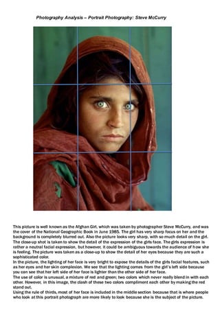
- 1. This picture is well known as the Afghan Girl, which was taken by photographer Steve McCurry, and was the cover of the National Geographic Book in June 1985. The girl has very sharp focus on her and the background is completely blurred out. Also the picture looks very sharp, with so much detail on the girl. The close-up shot is taken to show the detail of the expression of the girls face. The girls expression is rather a neutral facial expression, but however, it could be ambiguous towards the audience of how she is feeling. The picture was taken as a close-up to show the detail of her eyes because they are such a sophisticated color. In the picture, the lighting of her face is very bright to expose the details of the girls facial features, such as her eyes and her skin complexion. We see that the lighting comes from the girl’s left side because you can see that her left side of her face is lighter than the other side of her face. The use of color is unusual, a mixture of red and green; two colors which never really blend in with each other. However, in this image, the clash of these two colors compliment each other by making the red stand out. Using the rule of thirds, most of her face is included in the middle section because that is where people who look at this portrait photograph are more likely to look because she is the subject of the picture. Photography Analysis – Portrait Photography: Steve McCurry
- 2. This portrait picture is a close-up. It shows the detail of this individual’s face and the wrinkles all over. Also, this picture looks very sharp. The focal point of this picture is the person’s face; the rest of the photo is completely blurred out. The facial expression of this individual is a neutral expression; but however it can be ambiguous towards the audience to how the person is feeling. The picture looks very saturated in color. It has colors such as red, yellow, and green. Most of the background is black to make the colors stand out in the picture. The colors works together to compliment each other in the picture, making the brighter colors stand out more. The lighting of the picture is bright to expose the features of the person’s face and also to brighten up the colors of the clothing. We can see that the lighting comes from the person’s right side because the right side of the subject’s face looks more lighted up than the other side. We can also see a bit of the shadow on the other side of the subject’s face, knowing which side the lighting comes from. Applying the rule of thirds on this picture, the subject is in the middle square, where the people are more likely to focus on. Also, some of the beads land on the first vertical line of the grid.
- 3. Photography Analysis – Landscape Photography: Andrew Prokos This landscape photograph is the View of the Jefferson Memorial and Tidal Basin at Dusk. It shows a various amount of things such as the Memorial, The traffic (blurred), the Tidal Basin, the beautiful dusk sky and also the city view in the background. This shows that the photo has a various amount of subjects that people can focus on. You can tell that this photo was taken at a slow shutter speed because the light is blurred from the traffic that went past while the photo was being taken with the slow shutter speed. The main focal point of the photo is the Jefferson Memorial because it is in the centre of the photograph. This is so that people can focus on the memorial in this picture. The lighting of the trees in the photo is very dark, making them look silhouetted. The other lighting is bright, such as the blurred light left from the traffic. The lighting compliments the colour, making the photograph look brighter and more saturated in colour. The lighting also shows the gradient of blue to purple to red to orange, which is the colours of the dusk sky. The saturation of the photo compliments the colour gradient very well, exposing the gradient of the colours. Using the rule of thirds, we see that the Jefferson Memorial is directly in the middle of the photo, showing that it is the focal point of the photo. The sky lands in the top three squares of the photo, making the sky as a 3-grid focal point.
- 4. This landscape photograph is a panoramic skyline of Midtown Manhattan at night. It shows a beautiful view of a lot of buildings and also the traffic below. The lighting of the photo is bright because of the amount of lights that is in this photo. The most lit part of the photo is the traffic below, making it stand out the most. For the buildings, the lighting is dark but gradually becomes lighter, following up to the big buildings, as they’re the most lit buildings in this photo. The colour of the buildings is bright colours but they are lit very dim. However, the lighting makes them stand out more in the picture, making them nearly individually recognizable. Using the rule of thirds, the road and the three of the tallest building in the photo frame are in the middle frames of the photo, showing that they are the main focal points of the photo. Another tall building lands in the left middle frame of the photo making it another focal point of the photo. Also, the other bright light buildings that are in the picture land in the horizontal middle frames of the picture, showing that the focal point of the bright light buildings The meaning of the photo can be ambiguous. It can show how beautiful man- made can be as nature or it can show the brightness of a city, representing how successful the city is. It can have different themes depending on the audience’s perspective of the representation of the picture.
- 5. This war photograph is an image of a group of soldiers putting up an American flag during the war. This has two focal points, the soldiers and the flag. The soldiers represent war, and hem putting up the flag represents victory and taking over a territory, also it could represent that the soldiers are proud fighters of their country and they are representing their own country in the war. The lighting of the photo is bright. The colour of the photo is black and white, but however, the soldiers’ clothing is darker to show that war is dark, dull and negative and it promotes chaos, murder and damage to homes, cities etc. Using the rule of thirds, the vertical middle grids hold the main focal points of this photo, which are the soldiers and also the flag going up. The bottom grids are the foundation that the soldiers are standing on, showing that it could represent that it is a tough war, and it is hard to stand during the war because a various number of tough events are occurring, breaking apart cities, communities and families and people. The meaning of this photo can mean a lot of things. It can mean that the soldiers are conquering a fortress, or they are putting the flag up to represent their country, showing pride. This is a propaganda picture because the photographer Robert Capa, missed the first time they put it up, so he told them to take it down and to put it up again so he can take a photograph. Photography Analysis – War Photography: Robert Capa
- 6. This war photograph is of an American soldier smiling and walking hand in hand with three British orphans who were adopted by his unit. The focal points of this photo are the soldier and the three kids. This can have different representations on what is going on in this picture, depending on the audience’s perspective. It could be a soldier telling a story to his three kids on what its like in the war, or three little kids walking with the soldier after the war to return them to their parents. But unfortunately the second perspective does not relate to the picture, as the kids are orphans. The lighting of the picture is very bright, but however the photo is only black and white because of how long ago it was taken, which is about from 60-90 years ago. The clothing of the soldier represents the war, and also maybe the history behind his experience being in the war. Also, the clothing of the orphans is dark representing their experience during the war and also losing both of their parents during the war. Using the rule of thirds, the focal points of this photograph land in the middle grids of the photo, showing that the audience who views this photo focuses on the subjects of this photo. The rest of the grids do not have any focal points in the frame, and are blurred out.