1. In ELLE magazine they have displayed
Cheryl and the overall cover in a very
diverse way because the colours are dark
and stern ‘Cheryl the rebirth’ is very
powerful and straight to the point. The
photo of Cheryl dominates the page
because she is positioned in the top
centre and she is staring directly towards
the camera which makes her look
powerful and serious. In vogue they
make Cheryl look innocent and fresh and
here they make her look threatening and
dark and powerful. The font uses black
and white colours which are formal and
sophisticated. We are attracted to the
centre of the page which is Cheryl’s face.
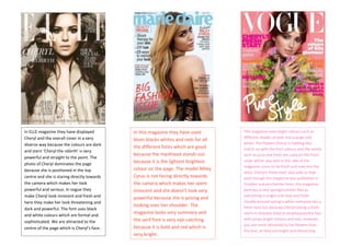
In this magazine they have used
blues blacks whites and reds for all
the different fonts which are good
because the masthead stands out
because it is the lightest brightest
colour on the page. The model Miley
Cyrus is not facing directly towards
the camera which makes her seem
innocent and she doesn’t look very
powerful because she is posing and
looking over her shoulder. The
magazine looks very summary and
the serif font is very eye-catching
because it is bold and red which is
very bright.
This magazine uses bright colours such as
different shades of pink and orange and
white. The flowers Cheryl is holding also
match up with the font colours and the words
such as pure and fresh are used on the front
cover which also add to the vibe of the
magazine cover to be fresh and new and the
story ‘Cheryl’s fresh start’ also tells us that
even though the magazine was published in
October autumn/winter time, this magazine
portrays a very spring/summer feel as
everything is bright and new and fresh.
Usually around spring is when everyone has a
fresh start but because Cheryl having a fresh
starts in October they’ve emphasized this fact
with props bright colours and text. However
you are more attracted to the flowers than
the text, as they are bright and distracting.