1. In ELLE magazine theyhave displayed
Cheryl andthe overall coverina very
diverse waybecause the coloursare dark
and stern‘Cheryl the rebirth’isvery
powerful andstraighttothe point.The
photoof Cheryl dominatesthe page
because she ispositionedinthe top
centre and she isstaringdirectlytowards
the camera whichmakesherlook
powerful andserious.Invogue they
make Cheryl lookinnocentandfreshand
here theymake herlookthreateningand
dark and powerful.The fontusesblack
and white colourswhichare formal and
sophisticated.We are attractedto the
centre of the page whichisCheryl’sface.
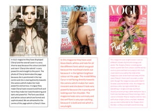
In this magazinethey haveused
blues blacks whites and reds for all
thedifferent fonts which aregood
becausethe masthead stands out
becauseit is thelightest brightest
colour on the page. The model Miley
Cyrus is not facing directly towards
the camera which makes her seem
innocent and shedoesn’t look very
powerful becauseshe is posing and
looking over her shoulder. The
magazinelooks very summary and
theserif font is very eye-catching
becauseit is bold and red which is
very bright.
This magazine uses brightcolours such as
different shades of pink and orange and
white. The flowers Cheryl is holdingalso
match up with the font colours and the words
such as pure and fresh are used on the front
cover which also add to the vibe of the
magazine cover to be fresh and new and the
story ‘Cheryl’s fresh start’ also tells us that
even though the magazine was published in
October autumn/winter time, this magazine
portrays a very spring/summer feel as
everything is brightand new and fresh.
Usually around springis when everyone has a
fresh startbut because Cheryl havinga fresh
starts in October they’ve emphasized this fact
with props bright colours and text. However
you are more attracted to the flowers than
the text, as they arebright and distracting.