This is a deconstruction of a double page spread. this helped me understand double page spread, which will help me make one myself. I used this double page spread as the target audience is near the same age gap as mine and the magazine "Billboard" is of the same genre of music, my magazine is. this means I can use this for inspiration when making my double page spread.
1. Contents page deconstruction
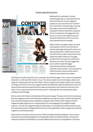
Masthead:the mastheadisa normal
contentspage title asit staywiththe forms
and conventionsof amusicmagazine
productas itjustusesthe word “contents”
thisisnormal for a contentspage,meaning
the readermay feel comfortablewhen
readingthis andwill readwhatis expected.
The font isboldand isthe biggestformof
textso itis clearto the readerto see and
drawstheirattentiontoit firstas itis the
mostimportanttexton the page.
Page numbers:the page numbersare small
and separate fromthe restof the textto
indicate whatpage eachspecificarticle ison.
Theyare boldandin a differentfonttothe
restof the textto make it more clearfor the
readerand make itstand out.The page
numberswithinthe picture are white and
the othersare black.Thismay suggestthe
onesinwhite maybe the bigger
stories/articlesandmayindicate the
importance of the articles.Thisisalsowhitto
match the colourscheme andto make it
standout and visible tothe readers.
Chart board:I like the ideaof thisicon,situatedonthe leftof the page.Thisis a chart musicboardto
showwhois at the top of the charts inmusic.Thisallowsreaderstosee whatsingers,albumsand
songsare crawlingupto the top of the charts. ThisIs to appeal tothe target audience asitis based
on the genre of musicin the musicmagazine whichresemblesthe audiencespreferences.Thisisa n
easyto followlayoutandmaybe handto readersto track where theirfavourite artistsare inthe
charts. Thisisa personal touchandI like the use of it.I shall take thisintoconsiderationwhen
makingmycontentspage.
Online section:thisfeaturesatthe bottomof the contentspage.Thisgivesalistof online exclusives
fromthe magazine writersandinformation of differentmusicgenresonline.I like the factthatthey
have usedtechnologyandonline websitesasitappealstothe readersof the magazine andthe
magazinestargetaudience and.Iam guessingitsof a similarage gapof mymagazine target
audience (11-19+) The magazine producershave takenintoconsiderationthatthe youthare very
well associated withtechnologyandthe internet,sotheyappliedthistotheirmagazine tomake the
magazine a multimediaproduct
Colourscheme:the colourscheme consists of blue (mainly) whiteblackandgreen. These colours
lookprofessional andcouldappeal toa mixedgenderaudience insteadof justgirls.Thesecould
representamoderntrend/fashionora certainadditionlikeawinterorspringaddition.The colour
2. scheme isrepresentedthroughoutthiscontentspage asitis determinedmostlyintextsandoutfits
inthe images,astwocelebritiesare stylingblackandwhite suitsandthe otherhasa blackjacket.
Main images:the bigmainimage isof a popularsingerin chart music.She isposingina playful/non
seriouspose.Thisisgoodas the readerwontmistake tismodel asa fashion/realitystar,butinstead,
see’sasingeror a musical instrumentplayer.She isstylishwhichcouldappeal toafemale audience
whilsthavingsex appeal toamale audience.The othermainimagesare of othercelebritiesand
musiciansthatresemble chartmusic.These are eithersoloartistsorbands.