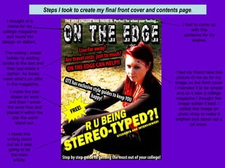
1. Steps I took to create my final front cover and contents page . I thought of a name for my college magazine and found the design on dafont. I had to come up with this sentence for my skyline. I made the star shape on work and then I wrote the word free and placed it within the star the word stand out. I had my friend take this picture of me as for my image on the front cover I intended it to be simple and as it was a college magazine I thought this image suited it best. I edited this image on photo shop to make it brighter and stand out a bit more. I made this writing stand out as it was going to be the main article. The writing I made bolder by adding stroke to the text and then just made it darker. As these were what’s on offer in the magazine.
2. This background image I took myself of the college corridor as I think it really linked it with the fact it is a college magazine. I edited this on photo shop and made it really bright and I blended in the are in which the end of the corridor was as I wanted it to long like it was fading. This image linked into another main story. ( can college be daunting for you? ) Again I made the text bolder with stroke but I made them different as the main articles were made to stand out more than others e.g. the cover story. I added on three more images that would link to certain pages as on out brief we had to include three or more images on the contents page. Some of my images were taken by me other by my friend. I didn’t edit them I just placed a bold outline around them. I added page numbers to the articles so the readers would know what page they would have to go if they only wanted to see that certain page. I kept with the same font and also created this on dafont and just simply copied and pasted It on.