
Recommended
More Related Content
Viewers also liked
Similar to Content Page Analysis
Similar to Content Page Analysis (20)
Recently uploaded
Recently uploaded (20)
Content Page Analysis
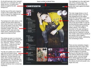
- 1. The main image shows a mix of dark and bright colours, from the dark background to the yellow jacket the main person in the main image is wearing. The yellow clothing is vivid and vibrant which links to the genre EDM. It could be the first thing the reader would see due to it’s brightness against the darker colours. The model is slouched on the seat, perhaps to show how casual or personal the article that he is featured in will be. The model is also looking directly at the camera, which makes it personal for the reader, addressing and connecting to them. There are two subsidiary images – a featured artist and a disco area, giving more information for the reader on what the article will have. The first image is of a woman posing and staring at the camera. The colours used for this is bright colours, green, red and orange which stands against the dark background. The second image has the colours of pink and purple, very bright and vivid. The masthead is on the right hand side of the contents page. The masthead is in white which can easily been seen against the black background. Issue number is placed here. The articles are seen in a columned placement, with the page number next to it. Each information is sectioned from “features”, “fashion”, “tunes” to “don’t stay in”. These are the main topics that the magazine has. Underneath is the article and underneath that is more information. The title and subtitles are in different style fonts and sizes to show difference but also to add style to the simple text. The text however is all white, which stands out against the dark background. The main titles are capitalized to show importance, while the rest of the information is in a smaller and thinner font, to show less importance. The background is dark colours, a mix of black and grey which allows the other colours to “jump” to the readers, such as the yellow on the main image and the pink and purple from the subsidiary images. The colour scheme is black, white and a few bright colours, allowing the content page to be simple but bold. On the left hand side is the “contents” text which is in a dramatic font, very stylish and fun. It is white which stands out against the dark background. Another issue of the same magazine is seen on the content page as well, just the image of the magazine and next to it is small, white text.
- 2. The main image shows a man standing alone in a room that is brightly lit. The mix of dark and light colours adds a sense of serenity to the contents page. Even if there are dark colours on the main image, it does not affect the black background, the main image is still able to be seen. The model is staring directly at the camera, allowing a connection between him and the readers. The image is a full body shot, allowing the readers to see every part of the model, this could perhaps show that he is an open person. His body language is very relaxed and confident, There are two subsidiary images seen in the contents page. – a featured artist and another featured artist. The first subsidiary image is a woman with her arms crossed, perhaps to show her confidence. She is also staring directly at the camera. She is dressed in a mix of dark and light colours, matching with the colours in the main image. The second subsidiary image shows a man looking to the left, behind him is artwork. This image shows a mix of bright colours, from the model’s shirt to the wall at the back. The masthead is placed on the right hand side of the contents page. The masthead is in white which can easily been seen against the black background. The articles are placed on the right hand side of the page. They are columned with the page number next to it. Each information is sectioned from “features”, “fashion”, “tunes” to “don’t stay in”. This shows the main topics and underneath is more information on the article. The articles are written in two different fonts, different styles and sizes. The text is written in white, standing against the black background very clearly. The background colour for the contents page is black, this allows the main image and the subsidiary images to stand out and be easy seen. The colour scheme is black, white and a few bright colours from the images. This makes the contents page very simple and sophisticated as well as bold. Another issue of the same magazine is seen on this page. The image of the magazine is shown and next to text which is white and written very small.