Backstage look ProApp
•Download as PPTX, PDF•
0 likes•368 views

A UI/UX focused look behind the scenes of Esri's new ProApp.

Recommended
More Related Content
Similar to Backstage look ProApp
Similar to Backstage look ProApp (20)
Recently uploaded
Recently uploaded (20)
Backstage look ProApp
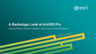
- 1. A Backstage Look at ArcGIS Pro Cassidy Bishop, Richard Cabellero, Steve Frizzell, Kyle Heinemann
- 4. Iconography
- 16. User Experience
- 22. User Interface
- 24. UX / UI Expertise Wireframes Prototypes Research Mockups Graphics Layouts Patterns
- 28. 10 px padding
- 29. Map Properties: Isle of Wight/Hampshire
- 30. CancelStart Map Properties: Isle of Wight/HampshireMap Properties: Isle of Wight/Hampshire
- 31. CancelStart Map Properties: Isle of Wight/Hampshire
- 32. CancelStart Map Properties: Isle of Wight/Hampshire Learn more about layer properties Visibility range (None) (None) In beyond (maximum scale) Out beyond (minimum scale) Site Addresses Name Description Do not show layer when zoomed Credits Header goeshere,using H3TextBlock and sentence case.General Another option More options
- 33. 10 px Standard spacing between paragraphs, unique lines of text, and general margins 6 px Used as horizontal spacing between lines of text with check boxes or radio buttons. Measured from the 16 px container of a check box or radio button. Used as margins inside tables and list boxes 4 px Used as vertical spacing between check boxes and text, or between radio buttons and text. Measured from the 16 px container of a check box or radio button. 3 px Standard horizontal spacing between a label and it’s item (popup menu, combo box, text field, text box, etc) Also used between closed expanders To see spacing marks, turn on the “Spacing” layer. Open this PDF in Acrobat and use the Layers sidebar on the left. 15 px Standard spacing that separates groups of items Also used before and after most tables 20 px Minimum spacing between an inline popup menu or spinner. Key to Spacing CancelStart Map Properties: Isle of Wight/Hampshire Learn more about layer properties Visibility range (None) (None) In beyond (maximum scale) Out beyond (minimum scale) Site Addresses Name Description Do not show layer when zoomed Credits Header goeshere,using H3TextBlock and sentenceGeneral Another option More options
- 34. CancelStart Map Properties: Isle of Wight/Hampshire Learn more about layer properties Visibility range (None) (None) In beyond (maximum scale) Out beyond (minimum scale) Site Addresses Name Description Do not show layer when zoomed Credits Header goeshere,using H3TextBlock and sentence case.General Another option More options
- 35. CancelStart Map Properties: Isle of Wight/Hampshire Learn more about layer properties Visibility range (None) (None) In beyond (maximum scale) Out beyond (minimum scale) Site Addresses Name Description Do not show layer when zoomed Credits Header goeshere,using H3TextBlock and sentence case.General Another option More options
- 36. CancelStart Map Properties: Isle of Wight/Hampshire Learn more about layer properties Visibility range (None) (None) In beyond (maximum scale) Out beyond (minimum scale) Site Addresses Name Description Do not show layer when zoomed Credits Header goeshere,using H3TextBlock and sentence case.General Another option More options
- 37. CancelStart Map Properties: Isle of Wight/Hampshire Learn more about layer properties Visibility range (None) (None) In beyond (maximum scale) Out beyond (minimum scale) Site Addresses Name Description Do not show layer when zoomed Credits Header goeshere,using H3TextBlock and sentence case.General Another option More options
- 38. CancelStart Coordinate System Details CancelOK Coordinate System Details Projection Transverse Mercator Foot US(0.304800609601219) 984250 0 -88.333333333333 0.999975 36.6666666666667 GCS North American 1983 HARN 4152 EPSG Degree(0.0174532925199433) Greenwich(0) D North American 1983 HARN GRS 1980 6,378,137.00 6, 356,752.31 0.00 Linear Unit False Easting False Northing Central Meridian Scale Fator Latitude of Origin Geographic coordinate system WKID Authority Angular Unit Prime Meridian Datum Spheroid Semimajor Axis Semiminor Axis Inverse Flattening Projection Transverse Mercator Foot US(0.304800609601219) 984250 0 -88.333333333333 0.999975 36.6666666666667 GCS North American 1983 HARN 4152 EPSG Degree(0.0174532925199433) Greenwich(0) D North American 1983 HARN GRS 1980 6,378,137.00 6, 356,752.31 0.00 Linear Unit False Easting False Northing Central Meridian Scale Fator Latitude of Origin Geographic coordinate system WKID Authority Angular Unit Prime Meridian Datum Spheroid Semimajor Axis Semiminor Axis Inverse Flattening This is where an introductory sentence of text would go—if needed.
- 39. CancelStart Coordinate System Details CancelOK Coordinate System Details Projection Transverse Mercator Foot US(0.304800609601219) 984250 0 -88.333333333333 0.999975 36.6666666666667 GCS North American 1983 HARN 4152 EPSG Degree(0.0174532925199433) Greenwich(0) D North American 1983 HARN GRS 1980 6,378,137.00 6, 356,752.31 0.00 Linear Unit False Easting False Northing Central Meridian Scale Fator Latitude of Origin Geographic coordinate system WKID Authority Angular Unit Prime Meridian Datum Spheroid Semimajor Axis Semiminor Axis Inverse Flattening Projection Transverse Mercator Foot US(0.304800609601219) 984250 0 -88.333333333333 0.999975 36.6666666666667 GCS North American 1983 HARN 4152 EPSG Degree(0.0174532925199433) Greenwich(0) D North American 1983 HARN GRS 1980 6,378,137.00 6, 356,752.31 0.00 Linear Unit False Easting False Northing Central Meridian Scale Fator Latitude of Origin Geographic coordinate system WKID Authority Angular Unit Prime Meridian Datum Spheroid Semimajor Axis Semiminor Axis Inverse Flattening This is where an introductory sentence of text would go—if needed.
- 40. CancelStart Map Properties: Layers Ground Vertical ExaggerationSurface 1 General Elevation surface Coordinate system Transformation Labels Add new surface 1.00 Location Workspace Vertical Units Dataset C:Userscont_richDocumentsArcGISLACountySubset 6471_1746a.tif Raster Vertical Exaggeration 1.00 MetersMeters Location Workspace Vertical Units Dataset C:Userscont_richDocumentsArcGISLACountySubset 6471_1746a.tif Raster MetersMeters Header goeshere,using H3TextBlock and sentence case. Learn more about elevation surfaces
- 41. CancelStart Map Properties: Layers Ground Vertical ExaggerationSurface 1 General Elevation surface Coordinate system Transformation Labels Add new surface 1.00 Location Workspace Vertical Units Dataset C:Userscont_richDocumentsArcGISLACountySubset 6471_1746a.tif Raster Vertical Exaggeration 1.00 MetersMeters Location Workspace Vertical Units Dataset C:Userscont_richDocumentsArcGISLACountySubset 6471_1746a.tif Raster MetersMeters Header goeshere, using H3TextBlock and sentence case. Learn more about elevation surfaces GGGGGGGGGGGGGGGGGGGGGGGGGGGGGGGGGGGG SSSSSSSSSSSSSSSSSSSSSSSSSSSSSSSSSSSS
- 42. Cancel Apply Label Weight Ranking Another TabGraphic Layers Weights let you control which labels will be placed when there are potential conflicts (overlaps) between features and labels. The feature weights are in the range 0 to 1000. OK Feature Layer - Label Class Feature Weight Polygon Boundary Weight Click on column header to sort table. Towns - Small/Medium Town Towns - Large Town Towns - Very Large Town Copyright - Default Airport - Default Spot Hts. - Default Geog. Features - Woodlands Geog. Features - Background Labels Geog. Features - Small Estuaries Geog. Features - Large Estuaries Roads - Unclassified Roads - Primary 100 0 0 0 0 20 0 0 0 0 20 50 N/A N/A N/A N/A N/A N/A N/A N/A N/A N/A N/A N/A FeatureLayers
- 43. Cancel Apply Label Weight Ranking Another TabGraphic Layers Weights let you control which labels will be placed when there are potential conflicts (overlaps) between features and labels. The feature weights are in the range 0 to 1000. OK Feature Layer - Label Class Feature Weight Polygon Boundary Weight Click on column header to sort table. Towns - Small/Medium Town Towns - Large Town Towns - Very Large Town Copyright - Default Airport - Default Spot Hts. - Default Geog. Features - Woodlands Geog. Features - Background Labels Geog. Features - Small Estuaries Geog. Features - Large Estuaries Roads - Unclassified Roads - Primary 100 0 0 0 0 20 0 0 0 0 20 50 N/A N/A N/A N/A N/A N/A N/A N/A N/A N/A N/A N/A FeatureLayers Towns - Small/Medium Town Towns - Large Town Towns - Very Large Town Copyright - Default Airport - Default Spot Hts. - Default Geog. Features - Woodlands Geog. Features - Background Labels Geog. Features - Small Estuaries Geog. Features - Large Estuaries F A
- 45. Questions
Editor's Notes
- Esri Corporate Template v2.1 16:9 version – April 18, 2014 See http://arczone/resources/presentations.cfm for sample slides and icons
- Nearly 2 years – ArcGIS Pro On the screen we have the app in its current state Today – visual design – 1 dialog and the efforts that go into converting the wonderful Wireframes and research from team members like Richard into a final UI design that you use everyday.
- UX (User Experience), Wireframing, UI design and Icon design
- Thank you Cassidy. My name is Steve Frizzell and I am the lead icon designer for ArcGIS Pro. For a new product this significant we felt it deserved an entirely new set of tool icons.
- Within ArcGIS Pro there are a lot of icons. In fact to date there are more than 1350 concepts represented by icons.
- Each of those icons are carefully crafted to represent a wide variety of tools and functions
- Each icon is designed at two sizes to serve a designated situation in the Ribbon UI
- When we create a 32x32 and a 16x16 pixel icon its not as simple as doubling the size from the smaller to the larger icon. We often add or remove detail like the number of lines representing text in the depiction of a document to maximize the available pixels at each size.
- Some icons contain elements carried over from one tool to another. In this case the icon in the middle shares the aircraft from the first and the funnel symbol from the last icon in the series. This often requires us to consider a larger set of tool icons as we select and position symbols within each icon.
- Sometimes the depiction of an icon comes naturally from a developers’ draft concept. In this case real world items like vegetation and buildings are easily understood.
- In some situations even pronouncing the name of the tool can be a challenge. Raster Image Analysis Interactive Histogram Stretch. What would you show for an icon like that?...
- Maybe it would be helpful to see what the control might look like in the software. The icon needs to convey the idea of adjusting the length of color bands of an image in the Red, Green, and Blue spectrums.
- Here is what we came up with and was approved by the team.
- In this case the challenge was not only to capture a concept but also to fit it into the available pixels.
- To get sense to the the environment and method of illustration used to create the ArcGIS Pro tool icons here is a short time lapse of a few icons taking shape. As you can see they are designed as vector based illustrations but they adhere to a raster grid. In this case the 32x32 pixel icons are deigned on a series of art boards at that size and when the design is completed and approved we can export the final files. Another thing to notice is our predefined color palette as seen in the swatch palette on the right. Each shape within the icons are limited to one of these colors. None of the designs include gradients, transparency, or shadows. For clarity we often include a 1 pixel gap between overlapping shapes like the one arround this pencil.
- video
- Workflow
- Usability
- 2 years – ArcGIS Pro App as you know it Today – visual design – 1 dialog and the efforts that go into converting the wonderful Wireframes and research from team members like Richard into a final UI design that you use everyday.
- Before I get started lets just reflect for a moment on the job of a UX designer and that of a UI designer. In today’s workplace these two roles so inter-twined and depended on each other in an effort to create a positive and appropriate user experience. Here on the screen we have a UX and a UI designer. On the left our UX designer (Like Richard) focused creative and critical thinking while our UI designer is focused on creative and convergent thinking. UX is more Human Centered design while the UI is more Visual design focused. So as a UI designer I rely on talented UX designers to provide me with well thought out wireframes so that I can create the visual rules and designs required for the final build. ------- Convergent thinking is the type of thinking that focuses on coming up with the single, well-established answer to a problem. It is oriented toward deriving the single best, or most often correct answer to a question. Convergent thinking emphasizes speed, accuracy, and logic and focuses on recognizing the familiar, reapplying techniques, and accumulating stored information. -------
- WIREFRAME – This is an example of a wireframe dialog that Richard created for the Group Template Properties Dialog But before we get started designing anything in the Pro App we have already spent significant time creating a partner library or asset library that full of art and design rules to guide us. For example. . . .
- Dialogs, pre planning – -Icons -Fonts -Text Usage -Colors -and lastly Icon usage rules -------------------------- Next slide wireframes
- Framework (skeleton). In this case we see the default size for all properties dialogue for the pro – app.
- Framework plus 10 px margins
- + 20 px title bar plus controls
- + 15 px spacing between major elements (teal) which is where we placed the content wrappers for this dialog ABOVE BELOW + 10 px between content containers (orange) INBETWEEN
- Inside of containers – 10 px margin -------------------- content
- Add content Respecting 10 px margins Between text items, predefined spacing ---------------- What do all these colors mean?
- Before we got started we defined the app’s fonts and spacing rules. Here you can see them implimented Teal – 15 Orange – 10 Purple -3 ------------ Next, fonts and font usage
- 11 pt fonts Content-font styles—product engineers
- 12 pt font (default size) Content-font styles—product engineers
- 14 pt font – section headers Content-font styles—product engineers
- 18 pt - titles Content-font styles—product engineers ---------- 4 Example Dialogs
- What it looks like to you
- What it looks like to us
- What it looks like to you
- What it looks like to us
- What it looks like to you
- What it looks like to us ------------- To wrap up,
- combining all together, what looks like from framework team And a finished dialog in ArcGIS Pro The point of my talk today is to illustrate that even the simplest things in ArcGIS Pro respect complex rules and take time, consideration to create. What may look like a plain dialog to you, that you never pay attention to, actually means that we have done our job well – that the design is not getting in the way, but information is clearly communicated.