1. Step one
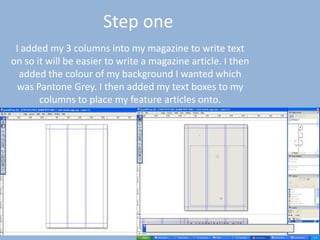
I added my 3 columns into my magazine to write text
on so it will be easier to write a magazine article. I then
added the colour of my background I wanted which
was Pantone Grey. I then added my text boxes to my
columns to place my feature articles onto.
2. Step two
I then added my masthead to my article. I used the same font throughout my
magazine, I kept to the same colour scheme also which is Black and yellow and
white. I also put my positioning statement below my masthead which also is a
way of advertising the magazine. I then added a text box with my issue number
and price and date of my magazine. Then I added the word contents to my page
and I used a drop shadow on the text so it stood out more to the reader.
3. Step three
I then added to my magazine shape boxes with bright colours
inside to make the text inside stand out. Inside my shapes was the
text saying regular contents and posters inside and feature articles.
After this I then added rounded text boxes to the cover and added
inside my page numbers and my inside articles.
4. Step four
I then added my images to my cover page. I placed them in
rounded boxes and added borders around my images to make
them stand out. I made some of my images much bigger than the
others to make the main story lines stand out more.
5. Step five
Finally I then added more text boxes on my images and added the page numbers on
the image. I then also added shape boxes either in black or white then either with
black or white borders around to make it stand out.