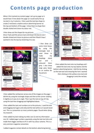
1. When I first started my content page I set up my page so it
would have 3 lines down the page so I could easily line up
my text in my 3 columns. I then used the text box shape to
create 2 red boxes a skyline and an advertising banner at
the top and bottom of the page. I drew them to shape then
double clicked and chose my colour red.
I then drew out the shapes for my pictures.
Once I had used the picture tool and drawn the box to size I
double clicked and chose my picture and then fitted it how I
wanted it into the box by stretching it to size.
I then drew out
some more boxes
by using the
rectangle tool. I
used these to
make
my
headings
stand
out
and
I
coloured
them
I then added the text onto my headings and I
grey. I also drew
added the text onto my top skyline and the
large grey boxes
bottom advertising banner. I did this by clicking
as an outline for
on the text tool and choosing the font I wanted
my picture.
then clicking on the yellow cross tool and
dragging it onto the red box.
I then added the red banner across one of the images on the page. I
did this by using the rectangle shape and then at the corner rotating
it slightly so it was at an angle. Then I put the text on top of it by
using the text then dragging tool highlighted above.
I then added the text and numbers on to the pictures. I used the text
and dragging tool again and coloured the text white so it would stand
out. This is a convention on most contents pages I found when doing
my research.
I then added my text making my titles size 12 and my information
size 10. I added page numbers separately using the text tool also and
made them bigger and blue to fit in with my colour scheme. This is a
very common magazine convention.
I added magazine contact details on the bottom advertising banner.