Verified # 971581275265 # Indian Call Girls In Deira By International City Ca...
Contects2.docx
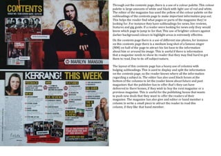
1. Through out the contents page, there is a use of a colour palette. This colour
palette is large amounts of white and black with light use of red and white.
The editor of the magazine has used the yellow of the colour palette on the
subheadings of the contents page to make important information pop out.
This helps the reader find what pages or parts of the magazine they’re
looking for. For instance they have subheadings for news, live reviews,
features and gig guide. If a reader were looking for news only they would
know which page to jump to for that. This use of brighter colours against
darker background colours to highlight areas is extremely effective.
On the contents page there is a use of different size photos, for instance
on this contents page there is a medium long shot of a famous singer
(MM) on half of the page to attract his fan base to the information
about him or around his image. This is useful if there is information
that a magazine needs to show its reader that they may find hard to get
them to read, Due to its off subject nature.
The layout of this contents page has a heavy use of columns with
bulging subheadings. This is used to display and split the information
on the contents page, so the reader knows where all the information
regarding a subject is. The editor has also used black boxes at the
bottom of the columns to let the reader know about future and past
magazines that the publisher has to offer that’s they can have
delivered to there homes, if they wish to buy the next magazine or a
previous magazine. This is useful for the publishing house that wants
to push new deals that they want to offer the readers of their
magazine. The magazine has also give and editor or band member a
column to write a small piece to attract the reader to read this
column, if they like that band member.