
Recommended
Recommended
More Related Content
Similar to A INTER, ,CTIOW DESIGN I beyond human-computer interacti.docx
Similar to A INTER, ,CTIOW DESIGN I beyond human-computer interacti.docx (20)
More from blondellchancy
More from blondellchancy (20)
Recently uploaded
Recently uploaded (20)
A INTER, ,CTIOW DESIGN I beyond human-computer interacti.docx
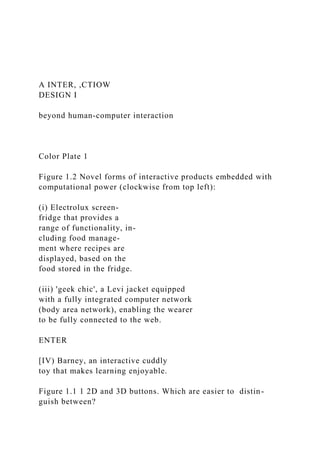
- 1. A INTER, ,CTIOW DESIGN I beyond human-computer interaction Color Plate 1 Figure 1.2 Novel forms of interactive products embedded with computational power (clockwise from top left): (i) Electrolux screen- fridge that provides a range of functionality, in- cluding food manage- ment where recipes are displayed, based on the food stored in the fridge. (iii) 'geek chic', a Levi jacket equipped with a fully integrated computer network (body area network), enabling the wearer to be fully connected to the web. ENTER [IV) Barney, an interactive cuddly toy that makes learning enjoyable. Figure 1.1 1 2D and 3D buttons. Which are easier to distin- guish between?
- 2. Color Plate 2 Figure 2.1 An example of augmented reality. Virtual and physical worlds have been combined so that a digital image of the brain is superimposed on the person's head, providing a new form of medical visualization. Figure 2.14 The i-room project at Stanford: a graphical rendering of the Interactive Room Terry Winograd's group is researching, which is an innovative technology- rich prototype workspace, integrating a variety of dis- plays and devices. An overarching aim is to explore new possibilities for people to work together (see http://graphics.stanford.EDU/projects/iwork/). - . - I.. , . Color Plate 3 Figure 2.6 Recent direct-manipulation virtual environments (a) Virtue (Daniel Reid, 1999, www-pablo.cs.uiuc.edulPro- jectNRNirtue) enables software developers to directly ma- nipulate software components and their behavior. (b), (c) Crayoland (Dave Pape, www.ncsa.uiuc.eduNis/) is an interactive virtual environment where the child in the image on the right uses a joystick to navigate through the
- 3. space. The child is interacting with an avatar in the flower world. Color Plate 4 Figure 3.7 Dynalinking used in the PondWorld software. In the background is a simulation of a pond ecosystem, comprising perch, stickleback, beetles, tadpoles, and weeds. In the foreground is a food web diagram representing the same ecosystem but at a more abstract level. The two are dynalinked: changes made to one representation are reflected in the other. Here the user has clicked on the arrow between the tadpole and the weed rep- resented in the diagram. This is shown in the PondWorld simulation as the tadpole eating the weed. The dynalinking is accompanied by a narrative explaining what is happening and sounds of dying organisms. Figure 3.9 A see-through handset-transparency does not mean simply showing the insides of a machine but involves providing a good system image. Color Plate 5 Figure 4.1 'l'he rooftop gar- den in BowieWorld, a collab- orative virtual environment
- 4. (CVE) supported by Worlds.com. The User takes part by "dressing up" as an avatar. There are hundreds of avatars to choose from, in- cluding penguins and real people. Once avatars have entered a world, they can ex- plore it and chat with other avatars. Color Plate 6 Figure 5.3 Examples of aesthetically pleasing interactive products: iMac, Nokia cell phone and IDEO's digital radio for the BBC. 1 Figure 5.9 Virtual screen characters: (a) Aibo, the interactive dog. Color Plate 7 Figure 5.1 1 I-lerman the bug watches as a stu- dent chooses roots for a plant in an Alpinc meadow. Figure 5.1 2 The
- 5. Woggles inter- face, with icons and slider bars repl-escnting emotions. specch and actions. Color Plate 8 Figure 5.13 Rea the real estate agent welcoming the user to look at a condo. Figure 7.3(b) The KordGrip being used underwater Figure 15.8 The first foam mod- els of a mobile communicator for children. INTERACTION' DESIGN beyond human-computer interaction John Wiley & Sons, Inc. ACQUISITIONS EDITOR Gaynor Redvers-MuttonlPaul Crockett MARKETING MANAGER Katherine Hepburn SENIOR PRODUCTION EDITOR Ken Santor
- 6. COVER DESIGNER Madelyn Lesure ILLUSTRATION EDITOR Anna Melhorn ILLUSTRATIONS Tech-Graphics, Inc. COVER IMAGE "Thoughts in Passage 11" by Michael Jon March. Courtesy of Grand Image Publishing This book was set in 10112 Times Ten by UG I GGS Information Services, Inc., and printed and bound by R. R. DonnelleylCrawfordsville. The cover and the color insert were printed by Phoenix Color Corporation. This book is printed on acid free paper. m Copyright O 2002 John Wiley & Sons, Inc. All rights reserved. No part of this publication may be reproduced, stored in a retrieval system or transmitted in any form or by any means, electronic, mechanical, photocopying, recording, scanning or otherwise, except as permitted under Sections 107 or 108 of the 1976 United States Copyright Act, without either the prior written permission of the Publisher, or authorization through payment of the appropriate per-copy fee to the Copyright Clearance Center, 222 Rosewood Drive, Danvers, MA 01923, (508) 750-8400, fax (508) 750-4470. Requests to the Publisher for permission should be addressed to the Permissions Department, John Wiley & Sons, Inc., 605 Third Avenue, New York, NY 10158-0012, (212) 850-6011, fax (212) 850-6008, E- Mail: [email protected] To order books or for customer service please call 1(800)225-
- 7. 5945. Library of Congress Cataloging in Publication Data. Preece, Jennifer. Interaction design : beyond human- computer interaction1 Jennifer Preece, Yvonne Rogers, Helen Sharp. p. cm. Includes bibliographical references and index. ISBN 0-471-49278-7 (paper : alk. paper) 1. Human-computer interaction. I. Rogers, Yvonne. 11. Sharp, Helen. 111. Title. QA76.9.H85 P72 2002 004'.01'94c21 Printed in the United States of America 2001006730 Preface Welcome to Interaction Design: Beyond Human-Computer Interaction, and our in- teractive website at ID-Book.com This textbook is for undergraduate and masters students from a range of back- grounds studying classes in human-computer interaction, interaction design, web design, etc. A broad range of professionals and technology users will also find this book useful, and so will graduate students who are moving into this area from re-
- 8. lated disciplines. Our book is called Interaction Design: Beyond Human- Computer Interaction because it is concerned with a broader scope of issues, topics, and paradigms than has traditionally been the scope of human-computer interaction (HCI). This reflects the exciting times we are living in, when there has never been a greater need for in- teraction designers and usability engineers to develop current and next-generation interactive technologies. To be successful they will need a mixed set of skills from psychology, human-computer interaction, web design, computer science, informa- tion systems, marketing, entertainment, and business. What exactly do we mean by interaction design? In essence, we define interac- tion design as: "designing interactive products to support people in their everyday and working lives". This entails creating user experiences that enhance and extend the way people work, communicate, and interact. Now that it is widely accepted that HCI has moved beyond designing computer systems for one user sitting in front of one ma- chine to embrace new paradigms, we, likewise, have covered a wider range of is- sues. These include ubiquitous computing and pervasive computing that make use of wireless and collaborative technologies. We also have tried
- 9. to make the book up-to-date with many examples from contemporary research. The book has 15 chapters and includes discussion of how cognitive, social, and affective issues apply to interaction design. A central theme is that design and eval- uation are interleaving, highly iterative processes, with some roots in theory but which rely strongly on good practice to create usable products. The book has a 'hands-on' orientation and explains how to carry out a variety of techniques. It also has a strong pedagogical design and includes many activities (with detailed com- ments), assignments, and the special pedagogic features discussed below. The style of writing is intended to be accessible to students, as well as profes- sionals and general readers, so it is conversational and includes anecdotes, car- toons, and case studies. Many of the examples are intended to relate to readers' own experiences. The book and the associated website encourage readers to be ac- tive when reading and to think about seminal issues. For example, one feature we have included in the book is the "dilemma," where a controversial topic is aired. The aim is for readers to understand that much of interaction design needs consid- vi Preface
- 10. eration of the issues, and that they need to learn to weigh-up the pros and cons and be prepared to make trade-offs. We particularly want readers to realize that there is rarely a right or wrong answer although there are good designs and poor designs. This book is accompanied by a website, which provides a variety of resources and interactivities, The website offers a place where readers can learn how to design websites and other kinds of multimedia interfaces. Rather than just provide a list of guidelines and design principles, we have developed various interactivities, includ- ing online tutorials and step-by-step exercises, intended to support learning by doing. Special features We use both the textbook and the web to teach about interaction design. To pro- mote good pedagogical practice we include the following features: Chapter design Each chapter is designed to motivate and support learning: Aims are provided so that readers develop an accurate model of what to ex- pect in the chapter. Key points at the end of the chapter summarize what is
- 11. important. Activities are included throughout the book and are considered an essential ingredient for learning. They encourage readers to extend and apply their knowledge. Comments are offered directly after the activities, because peda- gogic research suggests that turning to the back of the text annoys readers and discourages learning. An assignment is provided at the end of each chapter. This can be set as a group or individual project. The aim is for students to put into practice and consolidate knowledge and skills either from the chapter that they have just studied or from several chapters. Some of the assignments build on each other and involve developing and evaluating designs or actual products. Hints and guidance are provided on the website. Boxes provide additional and highlighted information for readers to reflect upon in more depth. Dilemmas offer honest and thought-provoking coverage of controversial or problematic issues. Further reading suggestions are provided at the end of each chapter. These refer to seminal work in the field, interesting additional material, or work that has been heavily drawn upon in the text. Interviews with nine practitioners and visionaries in the field enable readers
- 12. to gain a personal perspective of the interviewees' work, their philosophies, their ideas about what is important, and their contributions to the field. Cartoons are included to make the book enjoyable. How to use this book vii ID-Book.com website The aim of the website is to provide you with an opportunity to learn about inter- action design in ways that go "beyond the book." Additional in- depth material, hands-on interactivities, a student's corner and informal tutorials will be provided. Specific features planned include: Hands-on interactivities, including designing a questionnaire, customizing a set of heuristics, doing a usability analysis on 'real' data, and interactive tools to support physical design. Recent case studies. Student's corner where you will be able to send in your designs, thoughts, written articles which, if suitable, will be posted on the site at specified times during the year. Hints and guidance on the assignments outlined in the book.
- 13. Suggestions for additional material to be used in seminars, lab classes, and lectures. Key terms and concepts (with links to where to find out more about them). Readership This book will be useful to a wide range of readers with different needs and aspirations. Students from Computer Science, Software Engineering, Information Systems, Psychology, Sociology, and related disciplines studying courses in Interaction De- sign and Human-Computer Interaction will learn the knowledge, skills, and tech- niques for designing and evaluating state-of-the-art products, and websites, as well as traditional computer systems. Web and Interaction Designers, and Usability Professionals will find plenty to satisfy their need for immediate answers to problems as well as for building skills to satisfy the demands of today's fast moving technical market. Users, who want to understand why certain products can be used with ease while others are unpredictable and frustrating, will take pleasure in discovering that there is a discipline with practices that produce usable systems. Researchers and developers who are interested in exploiting the potential of the
- 14. web, wireless, and collaborative technologies will find that, as well as offering guid- ance, techniques, and much food for thought, a special effort has been made to in- clude examples of state-of-the-art systems. In the next section we recommend various routes through the text for different kinds of readers. How to use this book Interaction Design is not a linear design process but is essentially iterative and some readers and experienced instructors will want tb find their own way through the chapters. Others, and particularly those with less experience, may prefer to viii Preface work through chapter by chapter. Readers will also have different needs. For ex- ample, students in Psychology will come with different background knowledge and needs from those in Computer Science. Similarly, professionals wanting to learn the fundamentals in a one-week course have different needs. This book and the website are designed for using in various ways. The following suggestions are pro- vided to help you decide which way is best for you. From beginning to end
- 15. There are fifteen chapters so students can study one chapter per week during a fifteen-week semester course. Chapter 15 contains design and evaluation case studies. Our intention is that these case studies help to draw together the contents of the rest of the book by showing how design and evaluation are done in the real world. However, some readers may prefer to dip into them along the way. Getting a quick overview For those who want to get a quick overview or just the essence of the book, we suggest you read Chapters 1, 6, and 10. These chapters are recommended for everyone. Suggestions for computer science students In addition to reading Chapters 1,6, and 10, Chapters 7 and 8 contain the material that will feel most familiar to any students who have been introduced to software development. These chapters cover the process of interaction design and the activi- ties it involves, including establishing requirements, conceptual design, and physi- cal design. The book itself does not include any coding exercises, but the website will provide tools and widgets with which to interact. For those following the ACM-IEEE Curriculum (2001)*, you will find that this text and website cover most of this curriculum. The topics listed
- 16. under each of the following headings are discussed in the chapters shown: HC1 Foundations of Human-Computer Interaction (Chapters 1- 5, 14, website). HC2 Building a simple graphical user interface (Chapters 1,6,8,10 and the website). HC3 Human-Centered Software Evaluation (Chapters 1,10-15, website). HC4 Human-Centered Software Design (Chapters 1,6-9,15). HC5 Graphical User-Interface Design (Chapters 2 and 8 and the website. Many relevant examples are discussed in Chapters 1-5 integrated with dis- cussion of cognitive and social issues). *ACM-IEEE Curriculum (2001) [computer.org/education/cc2001/] is under development at the time of writing this book. kegreen Highlight How to use this book ix HC6 Graphical User-Interface Programming (touched upon only in Chap- ters 7-9 and on the website). HC7 HCI Aspects of Multimedia Information Systems and the
- 17. web (inte- grated into the discussion of Chapters 1-5, and in examples throughout the text, and on the website). HC8 HCI Aspects of Group Collaboration and Communication Technology (discussed in 1-5, particularly in Chapter 4. Chapters 6-15 discuss design and evaluation and some examples cover these systems, as does the website.) Suggestions for information systems students Information systems students will benefit from reading the whole text, but instructors may want to find additional examples of their own to illustrate how issues apply to business applications. Some students may be tempted to skip Chapters 3-5 but we rec- ommend that they should read these chapters since they provide important founda- tional material. This book does not cover how to develop business cases or marketing. Suggestions for psychology and cognitive science students Chapters 3-5 cover how theory and research findings have been applied to interac- tion design. They discuss the relevant issues and provide a wide range of studies and systems that have been informed by cognitive, social, and affective issues. Chapters 1 and 2 also cover important conceptual knowledge, necessary for having a good grounding in interaction design.
- 18. Practitioner and short course route Many people want the equivalent of a short intensive 2-5 day course. The best route for them is to read Chapters 1,6,10 and 11 and dip into the rest of the book for reference. For those who want practical skills, we recommend Chapter 8. Plan your own path For people who do not want to follow the "beginning-to-end" approach or the sug- gestions above, there are many ways to use the text. Chapters 1,6,10 and 11 provide a good overview of the topic. Chapter 1 is an introduction to key issues in the disci- pline and Chapters 6 and 10 offer introductions to design and evaluation. Then go to Chapters 2-5 for user issues, then on to the other design chapters, 2-9, dipping into the evaluation chapters 10-14 and the case studies in 15. Another approach is to start with one or two of the evaluation chapters after first reading Chapters 1, 6, 10 and 11, then move into the design section, drawing on Chapters 2-5 as necessary. Web designer route Web designers who have a background in technology and want to learn how to de- sign usable and effective websites are advised to read Chapters 1, 7, 8, 13 and 14.
- 19. x Preface These chapters cover key issues that are important when designing and evaluating the usability of websites. A worked assignment runs through these chapters. Usability professionals' route Usability professionals who want to extend their knowledge of evaluation techniques and read about the social and psychological issues that underpin design of the web, wireless, and collaborative systems are advised to read Chapter 1 for an overview, then select from Chapters 10-14 on usability testing. Chapters 3,4, and 5 provide dis- cussion of seminal user issues (cognitive, social, and affective aspects). There is new material throughout the rest of the book, which will also be of interest for dipping into as needed. This group may also be particularly interested in Chapter 8 which, to- gether with material on the book website, provides practical design examples. Acknowledgements Many people have helped to make this book a reality. We have benefited from the advice and support of our many professional colleagues across the world, our stu- dents, friends, and families and we thank you all. We also warmly thank the following people for reviewing the manuscript and making many helpful
- 20. suggestions for im- provements: Liam Bannon, Sara Bly, Penny Collings, Paul Dourish, Jean Gasen, Peter Gregor, Stella Mills, Rory O'Connor, Scott Toolson, Terry Winograd, Richard Furuta, Robert J.K. Jacob, Blair Nonnecke, William Buxton, Carol Traynor, Blaise Liffich, Jan Scott, Sten Hendrickson, Ping Zhang, Lyndsay Marshall, Gary Perlman, Andrew Dillon, Michael Harrison, Mark Crenshaw, Laurie Dingers, David Carr, Steve Howard, David Squires, George Weir, Marilyn Tremaine, Bob Fields, Frances Slack, Ian Graham, Alan O'Callaghan, Sylvia Wilbur, and several anonymous re- viewers. We also thank Geraldine Fitzpatrick, Tim and Dirk from DSTC (Australia) for their feedback on Chapters 1 and 4, Mike Scaife, Harry Brignull, Matt Davies, the HCCS Masters students at Sussex University (2000-2001), Stephanie Wilson and the students from the School of Informatics at City University and Information Systems Department at UMBC for their comments. We are particularly grateful to Sara Bly, Karen Holtzblatt, Jakob Nielsen, Abi- gail Sellen, Suzanne Robertson, Gitta Salomon, Ben Shneiderman, Gillian Cramp- ton Smith, and Terry Winograd for generously contributing in- depth interviews. Lili Cheng and her colleagues allowed us to use the Hutchworld case study. Bill Killam provided the TRZS case study. Keith Cogdill supplied the MEDLZNE-
- 21. plus case study. We thank Lili, Bill, and Keith for supplying the basic reports and commenting on various drafts. Jon Lazar and Dorine Andrews contributed mater- ial for the section on questionnaires, which we thank them for. We are grateful to our Editors Paul Crockett and Gaynor Redvers-Mutton and the production team at Wiley: Maddy Lesure, Susannah Barr, Anna Melhorn, Gemma Quilter, and Ken Santor. Without their help and skill this book would not have been produced. Bill Zobrist and Simon Plumtree played a significant role in persuading us to work with Wiley and we thank them too. About the authors xi I About the authors The authors are all senior academics with a background in teaching, researching, and consulting in the UK, USA, Canada, Australia, and Europe. Having worked together on two other successful text books, they bring considerable experience in curriculum development, using a variety of media for distance learning as well as face-to-face teaching. They have considerable knowledge of creating learning texts and websites that motivate and support learning for a range of students. All three authors are specialists in interaction design and human-computer in-
- 22. teraction (HCI). In addition they bring skills from other discipline~. Yvonne Rogers is a cognitive scientist, Helen Sharp is a software engineer, and Jenny Preece works in information systems. Their complementary knowledge and skills enable them to cover the breadth of concepts in interaction design and HCI to pro- duce an interdisciplinary text and website. They have collaborated closely, sup- porting and commenting upon each other's work to produce a high degree of integration of ideas with one voice. They have shared everything from initial con- cepts, through writing, design and production. Con tents Chapter 1 What is interaction design? 1 1 . I Introduction 1 1.2 Good and poor design 2 1.2.1 What to design 4 1.3 What is interaction design? 6 1.3.1 The makeup of interaction design 6 1.3.2 Working together as a multidisciplinary team 9 1.3.3 Interaction design in business 10 1.4 What is involved in the process of interaction design? 12 1.5 The goals of interaction design 13
- 23. 1.5.1 Usability goals 1 A 1.5.2 User experience goals 18 1.6 More on usability: design and usability principles 20 1.6.1 Heuristics and usability principles 26 Interview with Gitta Salomon 3 1 Chapter 2 Understanding and concep~alizing interaction 35 2.1 lntroduction 35 2.2 Understanding the problem space 36 2.3 Conceptual models 39 2.3.1 Conceptual models based on activities 41 2.3.2 Conceptual models based on objects 51 2.3.3 A case of mix and match? 54 2.4 Interface metaphors 55 2.5 Interaction paradigms 60 2.6 From conceptual models to physical design 64 Interview with Terry Winograd 70 Chapter 3 Understanding users 73 3.1 Introduction 73 3.2 What is cognition? 74 3.3 Applying knowledge from the physical world to the digital world 90 3.4 Conceptual frameworks for cognition 92 3.4.1 Mental models 92 xiv Contents
- 24. 3.4.2 Information processing 96 3.4.3 External cognition 98 3.5 Informing design: from theory to practice 101 Chapter 4 Designing for collaboration and communica~ion 105 4.1 Introduction 105 4.2 Social mechanisms used in communication and collaboration 106 4.2.1 Conversational mechanisms 107 4.2.2 Designing collaborative technologies to support conversation 110 4.2.3 Coordination mechanisms 1 18 4.2.4 Designing collaborative technologies to support coordination 122 4.2.5 Awareness mechanisms 124 4.2.6 Designing collaborative technologies to support awareness 126 4.3 Ethnographic studies of collaboration and communication 129 4.4 Conceptual frameworks 130 4.4.1 The language/action framework 130 4.4.2 Distributed cognition 133 Interview with Abigail Sellen 138 Chapter 5 Understanding how interfaces affect users 141 5.1 lntroduction 141 5.2 What are affective aspects? 142
- 25. 5.3 Expressive interfaces 143 5.4 User frustration 147 5.4.1 Dealing with user frustration 152 5.5 A debate: the application of anthropomorphism to interaction design 153 5.6 Virtual characters: agents 157 5.6.1 Kinds of agents 1 57 5.6.2 General design concerns 160 Chapter 6 The process of interaction design 165 6.1 Introduction 165 6.2 What is interaction design about? 166 6.2.1 Four basic activities of interaction design 1 68 6.2.2 Three key characteristics of the interaction design process 170 6.3 Some practical issues 170 6.3.1 Who are the users? 171 Contents xv Chapter 7 1 Chapter 8 6.3.2 What do we mean by "needs"? 172 6.3.3 How do you generate alternative designs? 174 6.3.4 How do you choose among alternative designs? 179 6.4 Lifecycle models: showing how the activities are related I 82
- 26. 6.4.1 A simple lifecycle model for interaction design 186 6.4.2 Lifecycle models in software engineering 187 6.4.3 Lifecycle models in HCI 192 Interview with Gillian Crampton Smith 198 Identifying needs and establishing requirements 201 7.1 Introduction 201 7.2 What, how, and why? 202 7.2.1 What are we trying to achieve in this design activity? 202 7.2.2 How can we achieve this? 202 7.2.3 Why bother? The importance of getting it right 203 7.2.4 Why establish requirements? 204 7.3 What are requirements? 204 7.3.1 Different kinds of requirements 205 7.4 Data gathering 21 0 7.4.1 Data-gathering techniques 21 1 7.4.2 Choosing between techniques 21 5 7.4.3 Some basic datmgathering guidelines 21 6 7.5 Data interpretation and analysis 21 9 7.6 Task description 222 7.6.1 Scenarios 223 7.6.2 Use cases 226 7.6.3 Essential use cases 229 7.7 Task analysis 231 7.7.1 Hierarchical Task Analysis (HTA) 231 Interview with Suzanne Robertson 236 Design, prototyping and construction 239
- 27. 8.1 lntroduction 239 8.2 Prototyping and construction 240 8.2.1 What is a prototype? 240 8.2.2 Why prototype? 241 8.2.3 Low-fidelity prototyping 243 8.2.4 High-fidelity prototyping 245 8.2.5 Compromises in prototyping 246 xvi Contents 8.2.6 Construction: from design to implementation 248 8.3 Conceptual design: moving from requirements to first design 249 8.3.1 Three perspectives for developing a conceptual model 250 8.3.2 Expanding the conceptual model 257 8.3.3 Using scenarios in conceptual design 259 8.3.4 Using prototypes in conceptual design 262 8.4 Physical design: getting concrete 264 8.4.1 Guidelines for physical design 266 8.4.2 Different kinds of widget 268 8.5 Tool support 275 Chapter 9 User-centered approaches to interaction design 279 9.1 Introduction 279 9.2 Why is it important to involve users at all? 280 9.2.1 Degrees of involvement 281 9.3 What i s a user-centered approach? 285 9.4 Understanding users' work: applying ethnography in design 288
- 28. 9.4.1 Coherence 293 9.4.2 Contextual Design 295 9.5 involving users in design: Participatory Design 306 9.5.1 PICTIVE 307 9.5.2 CARD 309 Interview with Karen Holtzblatt 31 3 Chapter 1 0 Introducing evaluation 31 7 1 0.1 Introduction 31 7 10.2 What, why, and when to evaluate 31 8 10.2.1 What to evaluate 31 8 10.2.2 Why you need to evaluate 31 9 10.2.3 When to evaluate 323 10.3 Hutchworld case study 324 1 0.3.1 How the team got started: early design ideas 324 10.3.2 How was the testing done? 327 10.3.3 Was it tested again? 333 10.3.4 Looking to the future 334 10.4 Discussion 336 Chapter 1 1 An evaluation framework 339 1 1 .1 Introduction 339 Contents xvii 1 1.2 Evaluation paradigms and techniques 340 1 1.2.1 Evaluation paradigms 341 1 1.2.2 Techniques 345
- 29. 1 1.3 D E C I D E: A framework to guide evaluation 348 1 1.3.1 Determine the goals 348 1 1.3.2 Explore the questions 349 1 1.3.3 Choose the evaluation paradigm and techniques 349 1 1.3.4 identify the practical issues 350 1 1.3.5 Decide how to deal with the ethical issues 351 1 1.3.6 Evaluate, interpret, and present the data 355 1 1.4 pilot studies 356 Chapter 12 Observing users 359 1 2.1 Introduction 359 12.2 Goals, questions and paradigms 360 12.2.1 What and when to observe 361 1 2.2.2 Approaches to observation 363 1 2.3 How to observe 364 12.3.1 In controlled environments 365 1 2.3.2 In the field 368 12.3.3 Participant observation and ethnography 370 12.4 Data collection 373 12.4.1 Notes plus still camera 374 12.4.2 Audio recording plus still camera 374 12.4.3 Video 374 1 2.5 Indirect observation: tracking users' activities 377 12.5.1 Diaries 377 12.5.2 Interaction logging 377 12.6 Analyzing, interpreting and presenting data 379 12.6.1 Qualitative analysis to tell a story 380 1 2.6.2 Qualitative analysis for categorization 381 12.6.3 Quantitative data analysis 384
- 30. 12.6.4 Feeding the findings back into design 384 Interview with Sara Bb 387 Chapter 13 Asking users and experts 389 1 3.1 introduction 389 1 3.2 Aking users: interviews 390 13.2.1 Developing questions and planning an interview 390 xviii Contents 13.2.2 Unstructured interviews 392 13.2.3 Structured interviews 394 13.2.4 Semi-structured interviews 394 13.2.5 Group interviews 396 1 3.2.6 Other sources of interview-li ke feedback 397 1 3.2.7 Data analysis and interpretation 398 13.3 Asking users: Questionnaires 398 13.3.1 Designing questionnaires 398 1 3.3.2 Question and response format 400 13.3.3 Administering questionnaires 404 13.3.4 Online questionnaires 405 1 3.3.5 Analyzing questionnaire data 407 13.4 Asking experts: Inspections 407 13.4.1 Heuristic evaluation 408 1 3.4.2 Doing heuristic evaluation 41 0 1 3.4.3 Heuristic evaluation of websites 41 2 1 3.4.4 Heuristics for other devices 41 9 1 3.5 Asking experts: walkthroughs 420 I 3.5.1 Cognitive walkthroughs 420
- 31. 1 3.5.2 Pluralistic walkthroughs 423 Interview with Jakob Nielsen 426 Chapter 14 Testing and modeling users 429 1 4.1 Introduction 429 14.2 User testing 430 14.2.1 Testing MEDLINE~~us 432 14.3 Doing user testing 438 14.3.1 Determine the goals and explore the questions 439 14.3.2 Choose the paradigm and techniques 439 14.3.3 Identify the practical issues: Design typical tasks 439 14.3.4 Identify the practical issues: Select typical users 440 14.3.5 Identify the practical issues: Prepare the testing conditions 441 14.3.6 Identify the practical issues: Plan how to run the tests 442 1 4.3.7 Deal with ethical issues 443 14.3.8 Evaluate, analyze, and present the data 443 14.4 Experiments 443 14.4.1 Variables and conditions 444 14.4.2 Allocation of participants to conditions 445 Contents xix 14.4.3 Other issues 446 14.4.4 Data collection and analysis 446 1 4.5 Predictive models 448 1 4.5.1 The W M S model 449
- 32. 1 4.5.2 The Keystroke level model 450 14.5.3 Benefits and limitations of W M S 453 14.5.4 Fitts' Law 454 Interview with Ben Shneiderman 457 Chapter 15 Design and evaluation in the real world: communicators and advisory systems 461 15.1 Introduction 461 15.2 Key Issues 462 15.3 Designing mobile communicators 463 15.3.1 Background 463 15.3.2 Nokia's approach to developing a communicator 464 15.3.3 Philip's approach to designing a communicator for children 474 15.4 Redesigning part of a large interactive phone-based response system 482 1 5.4.1 Background 483 15.4.2 The redesign 483 Reflections from the Authors 491 References 493 Credits 503 Index 509
- 33. I by Gary Perlman As predicted by many visionaries, devices everywhere are getting "smarter." My camera has a multi-modal hierarchical menu and form interface. Even my toaster has a microprocessor. Computing is not just for computers anymore. So when the authors wrote the subtitle "beyond human-computer interaction," they wanted to convey that the book generalizes the human side to people, both individuals and groups, and the computer side to desktop computers, handheld computers, phones, cameras . . . maybe even toasters. My own interest in this book is motivated by having been a software developer for 20 years, during which time I was a professor and consultant for 12. Would the book serve as a textbook for students? Would it help bring software development practice into a new age of human-centered interaction design? A textbook for students . . . More than anything, I think students need to be motivated, inspired, challenged, and I think this book, particularly Chapters 1-5, will do that. Many students will not have the motivating experience of seeing projects and products fail because of a lack of attention, understanding, and zeal for the user, but as I read the opening chapters, I imagined students thinking, "This is what I've been looking for!" The in-
- 34. terviews will provide students with the wisdom of well-chosen experts: what's im- portant, what worked (or didn't), and why. I see students making career choices based on this motivating material. The rest of the book covers the art and some of the science of interaction de- sign, the basic knowledge needed by practitioners and future innovators. Chapters 6-9 give a current view of analysis, design, and prototyping, and the book's website should add motivating examples. Chapters 10-14 cover evaluation in enough depth to facilitate understanding, not just rote application. Chapter 15 brings it all to- gether, adding more depth. For each topic, there are ample pointers to further reading, which is important because interaction design is not a one-book discipline. Finally, the book itself is pedagogically well designed. Each chapter describes its aims, contains examples and subtopics, and ends with key points, assignments, and an annotated bibliography for more detail. A guide for development teams . . . When I lead or consult on software projects, I face the same problem over and over: many people in marketing and software development-these are the people who have the most input into design, but it applies to any members of multidisciplinary teams-have little knowledge or experience building systems with a user-centered
- 35. xxii Foreword focus. A user-centered focus requires close work with users (not just customer-buy- ers), from analysis through design, evaluation, and maintenance. A lack of user- centered focus results in products and services that often do not meet the needs of their intended users. Don Norman's design books have convinced many that these problems are not unique to software, so this book's focus on interaction design feels right. To help software teams adopt a user-centered focus, I've searched for books with end-to-end coverage from analysis, to design, to implementation (possibly of prototypes), to evaluation (with iteration). Some books have tried to please all au- diences and have become encyclopedias of user interface development, covering topics worth knowing, but not in enough detail for readers to understand them. Some books have tried to cover theory in depth and tried to appeal to developers who have little interest in theory. Whatever the reasons for these choices, the re- sults have been lacking. This book has chosen fewer topics and covered them in more depth; enough depth, I think, to put the ideas into practice. I think the mater- ial is presented in a way that is understandable by a wide
- 36. audience, which is impor- tant in order for the book to be useful to whole multidisciplinary teams. A recommended book . . . I've been waiting for this book for many years. I think it's been worth the wait. As the director of the HCI Bibliography project (www.hcibib.org), a free-ac- cess HCI portal receiving a half-million hits per year, I receive many requests for suggestions for books, particularly from students and software development man- agers. To answer that question, I maintain a list of recommended readings in ten categories (with 20,000 hits per year). Until now, it's been hard to recommend just one book from that list. I point people to some books for motivation, other books for process, and books for specific topics (e.g., task analysis, ergonomics, usability testing). This book fits well into half the categories in my list and makes it easier to recommend one book to get started and to have on hand for development. I welcome the commitment of the authors to building a website for the book. It's a practice that has been adopted by other books in the field to offer additional information and keep the book current. The site also presents interactive content to aid in tasks like conducting surveys and heuristic evaluations. I look forward to seeing the book's site present new materials, but as director of
- 37. www.hcibib.org, I hope they use links to instead of re-inventing existing resources. Gary Perlman Columbus October 2001 Foreword xxiii About Gary Perlman Gary Perlman is a consulting research scientist at the OCLC- Online Computer Li- brary Center (www.oclc.org) where he works on user interfaces for bibliographic and full-text retrieval. His research interests are in making information technology more useful and usable for people. He has also held research and academic positions at Bell Labs in Murray Hill, New Jersey; Wang Institute of Graduate Studies; Massachusetts Institute of Tech- nology; Carnegie-Mellon University; and The Ohio State University. Dr. Perlman's Ph.D. is in experimental psychology from the University of California, San Diego. He is the author of over 75 publications in the areas of mathematics education, sta- tistical computing, hypertext, and user interface development. He has lectured and consulted internationally since 1980.
- 38. He is best known in the HCI community as the director of the HCI Bibliogra- phy (www.hcibib.org), a free-access online resource of over 20,000 records searched hundreds of thousands of times each year. A native of Montreal, Canada, Gary now lives in Columbus, Ohio with his wife and two sons. What is interaction design? 1 .I Introduction 1.2 Good and poor design 1.2.1 What to design 1.3 What is interaction design? 1.3.1 The makeup of interaction design 1.3.2 Working together as a multidisciplinary team 1 3.3 Interaction design in business 1.4 What is involved in the process of interaction design? 1.5 The goals of interaction design 1.5.1 Usability goals 1.5.2 User experience goals 1.6. More on usability: design and usability principles 1.1 Introduction How many interactive products are there in everyday use? Think
- 39. for a minute about what you use in a typical day: cell phone, computer, personal organizer, re- mote control, soft drink machine, coffee machine, ATM, ticket machine, library in- formation system, the web, photocopier, watch, printer, stereo, calculator, video game.. . the list is endless. Now think for a minute about how usable they are. How many are actually easy, effortless, and enjoyable to use? All of them, several, or just one or two? This list is probably considerably shorter. Why is this so? Think about when some device caused you considerable grief- how much time did you waste trying to get it to work? Two well-known interactive devices that cause numerous people immense grief are the photocopier that doesn't copy the way they want and the VCR that records a different program from the one they thought they had set or none at all. Why do you think these things happen time and time again? Moreover, can anything be done about it? Many products that require users to interact with them to carry out their tasks (e.g., buying a ticket online from the web, photocopying an article, pre-recording a TV program) have not necessarily been designed with the users in mind. Typically, they have been engineered as systems to perform set functions. While they may work effec- tively from an engineering perspective, it is often at the expense of how the system will
- 40. be used by real people. The aim of interaction design is to redress this concern by 2 Chapter 1 What is interaction design? bringing usability into the design process. In essence, it is about developing interactive products1 that are easy, effective, and enjoyable to use-from the users' perspective. In this chapter we begin by examining what interaction design is. We look at the difference between good and poor design, highlighting how products can differ radically in their usability. We then describe what and who is involved in interac- tion design. In the last part of the chapter we outline core aspects of usability and how these are used to assess interactive products. An assignment is presented at the end of the chapter in which you have the opportunity to put into practice what you have read, by evaluating an interactive product using various usability criteria. The main aims of the chapter are to: Explain the difference between good and poor interaction design. Describe what interaction design is and how it relates to human- computer interaction and other fields.
- 41. Explain what usability is. Describe what is involved in the process of interaction design. Outline the different forms of guidance used in interaction design. Enable you to evaluate an interactive product and explain what is good and bad about it in terms of the goals and principles of interaction design. 1.2 Good and poor design A central concern of interaction design is to develop interactive products that are usable. By this is generally meant easy to learn, effective to use, and provide an en- joyable user experience. A good place to start thinking about how to design usable interactive products is to compare examples of well and poorly designed ones. Through identifying the specific weaknesses and strengths of different interactive systems, we can begin to understand what it means for something to be usable or not. Here, we begin with an example of a poorly designed system-voice mail- that is used in many organizations (businesses, hotels, and universities). We then compare this with an answering machine that exemplifies good design. Imagine the following scenario. You're staying at a hotel for a week while on a business trip. You discover you have left your cell (mobile)
- 42. phone at home so you have to rely on the hotel's facilities. The hotel has a voice-mail system for each room. To find out if you have a message, you pick up the handset and listen to the tone. If it goes "beep beep beep" there is a message. To find out how to access the message you have to read a set of instructions next to the phone. You read and follow the first step: "1. Touch 491". The system responds, "You have reached the Sunny Hotel voice message center. Please enter the room number for which you would like to leave a message." 'We use the term interactive products generically to refer to all classes of interactive systems, technologies, environments, tools, applications, and devices. 1.2 Good and poor design 3 You wait to hear how to listen to a recorded message. But there are no further instructions from the phone. You look down at the instruction sheet again and read: "2. Touch*, your room number, and #". You do so and the system replies, "You have reached the mailbox for room 106. To leave a message type in your password." You type in the room number again and the system replies,
- 43. "Please enter room number again and then your password." You don't know what your password is. You thought it was the same as your room number. But clearly not. At this point you give up and call reception for help. The person at the desk explains the correct procedure for recording and listening to messages. This involves typing in, at the appropriate times, the room number and the extension number of the phone (the latter is your password, which is differ- ent from the room number). Moreover, it takes six steps to access a message and five steps to leave a message. You go out and buy a new cell phone. What is problematic with this voice-mail system? It is infuriating. It is confusing. It is inefficient, requiring you to carry out a number of steps for basic tasks. It is difficult to use. It has no means of letting you know at a glance whether any messages have been left or how many there are. You have to pick up the handset to find out and then go through a series of steps to listen to them. It is not obvious what to do: the instructions are provided partially by the system and partially by a card beside the phone. Now consider the following phone answering machine. Figure
- 44. 1.1 shows two small sketches of an answering machine phone. Incoming messages are represented using physical marbles. The number of marbles that have moved into the pinball- like chute indicates the number of messages. Dropping one of these marbles into a slot in the machine causes the recorded message to play. Dropping the same mar- ble into another slot on the phone dials the caller who left the message. Figure 1 .1 Two small sketches showing answer- ing phone. 4 Chapter 1 What is interaction design? How does the "marble" answering machine differ from the voice-mail system? It uses familiar physical objects that indicate visually at a glance how many messages have been left. It is aesthetically pleasing and enjoyable to use. It only requires one-step actions to perform core tasks. It is a simple but elegant design. It offers less functionality and allows anyone to listen to any of the messages.
- 45. The marble answering machine was designed by Durrell Bishop while a stu- dent at the Royal College of Art in London (described by Crampton-Smith, 1995). One of his goals was to design a messaging system that represented its basic func- tionality in terms of the behavior of everyday objects. To do this, he capitalized on people's everyday knowledge of how the physical world works. In particular, he made use of the ubiquitous everyday action of picking up a physical object and putting it down in another place. This is an example of an interactive product de- signed with the users in mind. The focus is on providing them with an enjoyable ex- perience but one that also makes efficient the activity of receiving messages. However, it is important to note that although the marble answering machine is a very elegant and usable design, it would not be practical in a hotel setting. One of the main reasons is that it is not robust enough to be used in public places, for ex- ample, the marbles could easily get lost or taken as souvenirs. Also, the need to identify the user before allowing the messages to be played is essential in a hotel setting. When considering the usability of a design, therefore, it is important to take into account where it is going to be used and who is going to use it. The marble answering machine would be more suited in a home setting- provided there were no children who might be tempted to play with the marbles!
- 46. 1.2.1 What to design Designing usable interactive products thus requires considering who is going to be using them and where they are going to be used. Another key concern is under- standing the kind of activities people are doing when interacting with the products. The appropriateness of different kinds of interfaces and arrangements of input and output devices depends on what kinds of activities need to be supported. For exam- ple, if the activity to be supported is to let people communicate with each other at a distance, then a system that allows easy input of messages (spoken or written) that can be readily accessed by the intended recipient is most appropriate. In addition, an interface that allows the users to interact with the messages (e.g., edit, annotate, store) would be very useful. The range of activities that can be supported is diverse. Just think for a minute what you can currently do using computer-based systems: send messages, gather information, write essays, control power plants, program, draw, plan, cal- culate, play games-to name but a few. Now think about the number of inter- faces and interactive devices that are available. They, too, are equally diverse: 1.2 Good and poor design 5
- 47. multimedia applications, virtual-reality environments, speech- based systems, per- sonal digital assistants and large displays-to name but a few. There are also many ways of designing the way users can interact with a system (e.g., via the use of menus, commands, forms, icons, etc.). Furthermore, more and more novel forms of interaction are appearing that comprise physical devices with embedded computational power, such as electronic ink, interactive toys, smart fridges, and networked clothing (See Figure 1.2 on Color Plate 1). What this all amounts to is a multitude of choices and decisions that confront designers when developing in- teractive products. A key question for interaction design is: how do you optimize the users' inter- actions with a system, environment or product, so that they match the users' activi- ties that are being supported and extended? One could use intuition and hope for the best. Alternatively, one can be more principled in deciding which choices to make by basing them on an understanding of the users. This involves: taking into account what people are good and bad at considering what might help people with the way they currently do things thinking through what might provide quality user experiences listening to what people want and getting them involved in the design
- 48. using "tried and tested" user-based techniques during the design process The aim of this book is to cover these aspects with the goal of teaching you how to carry out interaction design. In particular, it focuses on how to identify users' needs, and from this understanding, move to designing usable, useful, and enjoy- able systems. How does making a phone call differ when using: a public phone box a cell phone? How have these devices been designed to take into account (a) the kind of users, (b) type of activity being supported, and (c) context of use? Comment (a) Public phones are designed to be used by the general public. Many have Braille em- bossed on the keys and speaker volume control to enable people who are blind and hard of hearing to use them. Cell phones are intended for all user groups, although they can be difficult to use for people who are blind or have limited manual dexterity. (b) Most phone boxes are designed with a simple mode of interaction: insert card or money and key in the phone number. If engaged or unable to connect the money or card is returned when the receiver is replaced. There is also the option of allowing the
- 49. caller to make a follow-on call by pressing a button rather than collecting the money and reinserting it again. This function enables the making of multiple calls to be more efficient. I 6 Chapter 1 What is interaction design? Cell phones have a more complex mode of interaction. More functionality is provided, requiring the user to spend time learning how to use them. For example, users can save phone numbers in an address book and then assign these to "hotkeys," allowing them to be called simply through pressing one or two keys. (c) Phone boxes are intended to be used in public places, say on the street or in a bus sta- tion, and so have been designed to give the user a degree of privacy and noise protec- tion through the use of hoods and booths. Cell phones have have been designed to be used any place and any time. However, lit- tle consideration has been given to how such flexibility affects others who may be in the same public place (e.g., sitting on trains and buses). I 1.3 What is interaction design? I By interaction design, we mean I designing interactive products to support people in their
- 50. everyday and working lives. In particular, it is about creating user experiences that enhance and extend the way people work, communicate and interact. Winograd (1997) describes it as "the de- sign of spaces for human communication and interaction." In this sense, it is about finding ways of supporting people. This contrasts with software engineering, which focuses primarily on the production of software solutions for given applications. A simple analogy to another profession, concerned with creating buildings, may clar- ify this distinction. In his account of interaction design, Terry Winograd asks how architects and civil engineers differ when faced with the problem of building a house. Architects are concerned with the people and their interactions with each other and within the house being built. For example, is there the right mix of family and private spaces? Are the spaces for cooking and eating in close proximity? Will people live in the space being designed in the way it was intended to be used? In contrast, engineers are interested in issues to do with realizing the project. These include practical concerns like cost, durability, structural aspects, environmental aspects, fire regulations, and construction methods. Just as there is a difference between designing and building a house, so too, is there a distinction between in- teraction design and software engineering. In a nutshell, interaction design is re-
- 51. lated to software engineering in the same way as architecture is related to civil engineering. 1.3.1 The makeup of interaction design It has always been acknowledged that for interaction design to succeed many disci- plines need to be involved. The importance of understanding how users act and react to events and how they communicate and interact together has led people from a variety of disciplines, such as psychologists and sociologists, to become in- volved. Likewise, the growing importance of understanding how to design different kinds of interactive media in effective and aesthetically pleasing ways has led to a 1.3 What is interaction design? 7 diversity of other practitioners becoming involved, including graphic designers, artists, animators, photographers, film experts, and product designers. Below we outline a brief history of interaction design. In the early days, engineers designed hardware systems for engineers to use. The computer interface was relatively straightforward, comprising various switch panels and dials that controlled a set of internal registers. With the advent of moni- tors (then referred to as visual display units or VDUs) and personal workstations in
- 52. the late '70s and early '80s, interface design came into being (Grudin, 1990). The new concept of the user interface presented many challenges: Terror. You have to confront the documentation. You have to learn a new language. Did you ever use the word 'interface' before you started using the computer? -Advertising executive Arthur Einstein (1990) One of the biggest challenges at that time was to develop computers that could be accessible and usable by other people, besides engineers, to support tasks in- volving human cognition (e.g., doing sums, writing documents, managing accounts, drawing plans). To make this possible, computer scientists and psychologists be- came involved in designing user interfaces. Computer scientists and software engi- neers developed high-level programming languages (e.g., BASIC, Prolog), system architectures, software design methods, and command-based languages to help in such tasks, while psychologists provided information about human capabilities (e.g., memory, decision making). The scope afforded by the interactive computing technology of that time (i.e., the combined use of visual displays and interactive keyboards) brought about many new challenges. Research into and development of graphical user inter- faces (GUI for short, pronounced "goo-ee") for office-based
- 53. systems took off in a big way. There was much research into the design of widgets (e.g., menus, win- dows, palettes, icons) in terms of how best to structure and present them in a GUI. In the mid '80s, the next wave of computing technologies- including speech recognition, multimedia, information visualization, and virtual reality-presented even more opportunities for designing applications to support even more people. Education and training were two areas that received much attention. Interactive learning environments, educational software, and training simulators were some of the main outcomes. To build these new kinds of interactive systems, however, re- quired a different kind of expertise from that of psychologists and computer pro- grammers. Educational technologists, developmental psychologists, and training experts joined in the enterprise. As further waves of technological development surfaced in the '90s-network- ing, mobile computing, and infrared sensing-the creation of a diversity of applica- tions for all people became a real possibility. All aspects of a person's life-at home, on the move, at school, at leisure as well as at work, alone, with family or friends-began to be seen as areas that could be enhanced and extended by design- ing and integrating various arrangements of computer
- 54. technologies. New ways of learning, communicating, working, discovering, and living were envisioned. 8 Chapter 1 What is interaction design? In the mid '90s, many companies realized it was necessary again to extend their existing multidisciplinary design teams to include professionals trained in media and design, including graphical design, industrial design, film, and narrative. Sociol- ogists, anthropologists, and dramaturgists were also brought on board, all having quite a different take on human interaction from psychologists. This wider set of 1.3 What is interaction design? 9 people were thought to have the right mix of skills and understanding of the differ- ent application areas necessary to design the new generation of interactive systems. For example, designing a reminder application for the family requires understand- ing how families interact; creating an interactive story kit for children requires un- derstanding how children write and understand narrative, and developing an interactive guide for art-gallery visitors requires appreciating what people do and how they move through public spaces.
- 55. Now in the 'OOs, the possibilities afforded by emerging hardware capabilities- e.g., radio-frequency tags, large interactive screens, and information appliances- has led to a further realization that engineers, who know about hardware, software, and electronics are needed to configure, assemble, and program the consumer elec- tronics and other devices to be able to communicate with each other (often re- ferred to as middleware). 1.3.2 Working together as a multidisciplinary team Bringing together so many people with different backgrounds and training has meant many more ideas being generated, new methods being developed, and more creative and original designs being produced. However, the down side is the costs involved. The more people there are with different backgrounds in a design team, the more difficult it can be to communicate and progress forward the designs being generated. Why? People with different backgrounds have different perspectives and ways of seeing and talking about the world (see Figure 1.4). What one person values as important others may not even see (Kim, 1990). Similarly, a computer sci- entist's understanding of the term representation is often very different from a graphic designer's or a psychologist's. Figure 1.4 Four different team members looking at
- 56. the same square, but each seeing it quite differently. 10 Chapter 1 What is interaction design? What this means in practice is that confusion, misunderstanding, and com- munication breakdowns can often surface in a team. The various team members may have different ways of talking about design and may use the same terms to mean quite different things. Other problems can arise when a group of people is "thrown" together who have not worked as a team. For example, the Philips Vi- sion of the Future Project found that its multidisciplinary teams-who were re- sponsible for developing ideas and products for the future- experienced a number of difficulties, namely, that project team members did not always have a clear idea of who needed what information, when, and in what form (Lambourne et al., 1997). practice, the makeup of a given design team depends on the kind of interactive product ing built. Who do you think would need to be involved in developing: (a) a public kiosk providing information about the exhibits available in a science museum?
- 57. (b) an interactive educational website to accompany a TV series? Comment Each team will need a pumber of different people with different skill sets. For example, the first interactive product would need: (a) graphic and inteiaction designers, museum curators, educational advisors, software engineers, software designers, usability engineers, ergonomists The second project would need: (b) TV producers, graphic and interaction designers, teachers, video experts, software engineers, software designers, usability engineers In addition, as both systeds are being developed for use by the general public, representa- tive users, such as school children and parents, should be involved. In practice, design teams often end up being quite large, especially if they are working on a big project to meet a fixed deadline. For example, it is common to find teams of fifteen peo- ple or more working on a website project for an extensive period of time, like six months. This means that a number of people from each area of expertise are likely to be working as part of the project team. 1.3.3 Interaction design in business Interaction design is dbw big business. In particular, website consultants, start- up companies, a n d mobile computing industries have all
- 58. realized its pivotal role in successful interactive hroducts. To get noticed in the highly competitive field of web products requires standing out. Being able to say that your product is easy and effective to use is seen as central to this. Marketing departments are re- alizing how branding, the number of hits, customer return rate, and customer satisfaction are greatly affected by the usability of a website. Furthermore, the presence or absence of good interaction design can make or break a company. 1.3 What is interaction design? 1 1 One infamous dot.com fashion clothes company that failed to appreciate the im- portance of good interaction design paid heavily for its oversight, becoming bankrupt within a few months of going public.' Their approach had been to go for an "all singing and all dancing," glossy 3D graphical interface. One of the problems with this was that it required several minutes to download. Further- more, it often took more than 20 minutes to place an order by going through a painfully long and slow process of filling out an online form- only to discover that the order was not successful. Customers simply got frustrated with the site and never returned.
- 59. In response to the growing demand for interaction design, an increasing number of consultancies are establishing themselves as interaction design ex- perts. One such company is Swim, set up by Gitta Salomon to assist clients with the design of interactive products (see the interview with her at the end of this chapter). She points out how often companies realize the importance of interac- tion design but don't know how to do it themselves. So they get in touch with companies, like Swim, with their partially developed products and ask them for help. This can come in the form of an expert "crit" in which a detailed review of the usability and design of the product is given (for more on expert evaluation, see Chapter 13). More extensively, it can involve helping clients create their products. Another established design company that practices interaction design is IDEO, which now has many branches worldwide. Drawing on over 20 years of experience in the area, they design products, services, and environments for other companies, pioneering new user experiences (Spreenberg et al., 1995). They have developed 'This happened before the dot.com crash in 2001. 12 Chapter 1 What is interaction design?
- 60. Figure 1.5 An innovative product developed by IDEO: Scout Modo, a wire- less handheld device deliv- ering up-to-date information about what's going on in a city. thousands of products for numerous clients, each time following their particular brand of user-centered design (see Figure 1.5). 1.4 What is involved in the process of interaction design? Essentially, the process of interaction design involves four basic activities: 1. Identifying needs and establishing requirements. 2. Developing alternative designs that meet those requirements. 3. Building interactive versions of the designs so that they can be communi- cated and assessed. 4. Evaluating what is being built throughout the process. These activities are intended to inform one another and to be repeated. For exam- ple, measuring the usability of what has been built in terms of whether it is easy to use provides feedback that certain changes must be made or that certain require- ments have not yet been met.
- 61. Evaluating what has been built is very much at the heart of interaction design. Its focus is on ensuring that the product is usable. It is usually addressed through a user-centered approach to design, which, as the name suggests, seeks to involve users throughout the design process. There are many different ways of achieving this: for example, through observing users, talking to them, interviewing them, test- ing them using performance tasks, modeling their performance, asking them to fill 1.5 The goals of interaction design 13 in questionnaires, and even asking them to become co- designers. The findings from the different ways of engaging and eliciting knowledge from users are then inter- preted with respect to ongoing design activities (we give more detail about all these aspects of evaluation in Chapters 10-14). Equally important as involving users in evaluating an interactive product is un- derstanding what people currently do. This form of research should take place be- fore building any interactive product. Chapters 3,4, and 5 cover a lot of this ground by explaining in detail how people act and interact with one another, with informa- tion, and with various technologies, together with describing their strengths and weaknesses. Such knowledge can greatly help designers
- 62. determine which solutions to choose from the many design alternatives available and how to develop and test these further. Chapter 7 describes how an understanding of users' needs can be translated to requirements, while Chapter 9 explains how to involve users effec- tively in the design process. A main reason for having a better understanding of users is that different users have different needs and interactive products need to be designed accord- ingly. For example, children have different expectations about how they want to learn or play from adults. They may find having interactive quizzes and cartoon characters helping them along to be highly motivating, whereas most adults find them annoying. Conversely, adults often like talking-heads discussions about top- ics, but children find them boring. Just as everyday objects like clothes, food, and games are designed differently for children, teenagers, and adults, so, too, must in- teractive products be designed to match the needs of different kinds of users. In addition to the four basic activities of design, there are three key character- istics of the interaction design process: 1. Users should be involved through the development of the project. 2. Specific usability and user experience goals should be
- 63. identified, clearly doc- umented, and agreed upon at the beginning of the project. 3. Iteration through the four activities is inevitable. We have already mentioned the importance of involving users and will return to this topic throughout the book. Iterative design will also be addressed later when we talk about the various design and evaluation methods by which this can be achieved. In the next section we describe usability and user experience goals. 1.5 The goals of interaction design Part of the process of understanding users' needs, with respect to designing an in- teractive system to support them, is to be clear about your primary objective. Is it to design a very efficient system that will allow users to be highly productive in their work, or is it to design a system that will be challenging and motivating so that it supports effective learning, or is it something else? We call these top-level con- cerns usability goals and user experience goals. The two differ in terms of how they are operationalized, i.e., how they can be met and through what means. Usability 14 Chapter 1 What is interaction design? goals are concerned with meeting specific usability criteria (e.g., efficiency) and
- 64. user experience goals are largely concerned with explicating the quality of the user experience (e.g., to be aesthetically pleasing). 1.5.1 Usability goals To recap, usability is generally regarded as ensuring that interactive products are easy to learn, effective to use, and enjoyable from the user's perspective. It involves optimizing the interactions people have with interactive products to enable them to carry out their activities at work, school, and in their everyday life. More specifi- cally, usability is broken down into the following goals: effective to use (effectiveness) efficient to use (efficiency) safe to use (safety) have good utility (utility) easy to learn (learnability) easy to remember how to use (memorability) For each goal, we describe it in more detail and provide a key question. Effectiveness is a very general goal and refers to how good a system is at doing what it is supposed to do. Question: Is the system capable of allowing people to learn well, carry out their work efficiently, access the information they need, buy the goods they want, and
- 65. so on? Efficiency refers to the way a system supports users in carrying out their tasks. The answering machine described at the beginning of the chapter was considered efficient in that it let the user carry out common tasks (e.g., listening to messages) through a minimal number of steps. In contrast, the voice-mail system was consid- ered inefficient because it required the user to carry out many steps and learn an arbitrary set of sequences for the same common task. This implies that an efficient way of supporting common tasks is to let the user use single button or key presses. An example of where this kind of efficiency mechanism has been effectively em- ployed is in e-tailing. Once users have entered all the necessary personal details on an e-commerce site to make a purchase, they can let the site save all their personal details. Then, if they want to make another purchase at that site, they don't have to re-enter all their personal details again. A clever mechanism patented by Amazon.com is the one-click option, which requires users only to click a single but- ton when they want to make another purchase. Question: Once users have learned how to use a system to carry out their tasks, can they sustain a high level of productivity? Safety involves protecting the user from dangerous conditions and undesirable
- 66. situations. In relation to the first ergonomic aspect, it refers to the external condi- tions where people work. For example, where there are hazardous conditions-like X-ray machines or chemical plants--operators should be able to interact with and control computer-based systems remotely. The second aspect refers to helping any 1.5 The goals of interaction design 15 kind of user in any kind of situation avoid the dangers of carrying out unwanted ac- tions aceidentally. It also refers to the perceived fears users might have of the con- sequences of making errors and how this affects their behavior. To make computer-based systems safer in this sense involves (i) preventing the user from making serious errors by reducing the risk of wrong keyslbuttons being mistakenly activated (an example is not placing the quit or delete-file command right next to the save command on a menu) and (ii) providing users with various means of re- covery should they make errors. Safe interactive systems should engender confi- dence and allow the user the opportunity to explore the interface to try out new operations (see Figure 1.6a). Other safety mechanisms include undo facilities and Color Settings b
- 67. lb) Figure 1.6 (a) A safe and an unsafe menu. Which is which and why? (b) Warning dialog message from Eudora. 16 Chapter 1 What is interaction design? confirmatory dialog boxes that give users another chance to consider their inten- tions (a well-known example used in e-mail applications is the appearance of a dia- log box, after the user has highlighted messages to be deleted, saying: "Are you sure you want to delete all these messages?" See Figure 1.6(b)). Question: Does the system prevent users from making serious errors and, if they do make an error, does it permit them to recover easily? Utility refers to the extent to which the system provides the right kind of func- tionality so that users can do what they need or want to do. An example of a system with high utility is an accounting software package providing a powerful computa- tional tool that accountants can use to work out tax returns. A example of a system with low utility is a software drawing tool that does not allow users to draw free- hand but forces them to use a mouse to create their drawings, using only polygon shapes. Question: Does the system provide an appropriate set of
- 68. functions that enable users to carry out all their tasks in the way they want to do them? Learnability refers to how easy a system is to learn to use. It is well known that people don't like spending a long time learning how to use a system. They want to get started straight away and become competent at carrying out tasks without too much effort. This is especially so for interactive products intended for everyday use (e.g., interactive TV, email) and those used only infrequently (e.g., videoconferenc- ing). To a certain extent, people are prepared to spend longer learning more com- plex systems that provide a wider range of functionality (e.g., web authoring tools, word processors). In these situations, CD-ROM and online tutorials can help by providing interactive step-by-step material with hands-on exercises. However, many people find these tedious and often difficult to relate to the tasks they want to 1.5 The goals of interaction design 17 accomplish. A key concern is determining how much time users are prepared to spend learning a system. There seems little point in developing a range of function- ality if the majority of users are unable or not prepared to spend time learning how to use it.
- 69. Question: How easy is it and how long does it take (i) to get started using a sys- tem to perform core tasks and (ii) to learn the range of operations to perform a wider set of tasks? Memorability refers to how easy a system is to remember how to use, once learned. This is especially important for interactive systems that are used infre- quently. If users haven't used a system or an operation for a few months or longer, they should be able to remember or at least rapidly be reminded how to use it. Users shouldn't have to keep relearning how to carry out tasks. Unfortunately, this tends to happen when the operations required to be learned are obscure, illogical, or poorly sequenced. Users need to be helped to remember how to do tasks. There are many ways of designing the interaction to support this. For example, users can be helped to remember the sequence of operations at different stages of a task through meaningful icons, command names, and menu options. Also, structuring options and icons so they are placed in relevant categories of options (e.g., placing all the drawing tools in the same place on the screen) can help the user remember where to look to find a particular tool at a given stage of a task. Question: What kinds of interface support have been provided to help users re- member how to carry out tasks, especially for systems and
- 70. operations that are used infrequently? How long do you think it should take to learn how to use the following interactive products and how long does it actually take most people to learn them? How memorable are they? (a) using a VCR to play a video (b) using a VCR to pre-record two programs (c) using an authoring tool to create a website Comment (a) To play a video should be as simple as turning the radio on, should take less than 30 seconds to work out, and then should be straightforward to do subsequently. Most people are able to fathom how to play a video. However, some systems require the user to switch to the "video" channel using one or two remote control devices, select- ing from a choice of 50 or more channels. Other settings may also need to be config- ured before the video will play. Most people are able to remember how to play a video once they have used a particular VCR. (b) This is a more complex operation and should take a couple of minutes to learn how to do and to check that the programming is correct. In reality, many VCRs are so poorly designed that 80% of the population is unable to accomplish this task, despite several attempts. Very few people remember how to pre-record a program, largely because the interaction required to do this is poorly designed, with poor or no feedback, and is
- 71. often illogical from the user's perspective. Of those, only a few will bother to go through the manual again. 1 8 Chapter 1 Whpt is interaction design? (c) A well-designed authoring too1 should let the user create a basic page in about 20 min- utes. Learning the full range of operations and possibilities is likely to take much longer, possibly a few days. In reality, there are some good authoring tools that allow the user to get started straight away, providing templates that they can adapt. Most users will extend their repertoire, taking another hour or so to learn more functions. However, very few people actually learn to use the full range of functions provided by the authoring tool. Users will tend to remember frequently used operations (e.g., cut and paste, inserting images), especially if they are consistent with the way they are car- ried out in other software applications. However, less frequently used operations may need to be relearned (e.g., formatting tables). The usability goals discussed so far are well suited to the design of business systems intended to support working practices. In particular, they are highly relevant for companies and organizations who are introducing or updating applications running on desktop and networked systems-that are intended to increase productivity by
- 72. improving and enhancing how work gets done. As well as couching them in terms of specific questions, usability goals are turned into usability criteria. These are specific objectives that enable the usability of a product to be assessed in terms of how it can improve (or not) a user's performance. Examples of commonly used us- ability criteria are time to complete a task (efficiency), time to learn a task (learn- ability), and the number of errors made when carrying out a given task over time (memorability). 1.5.2 User experience goals The realization that new technologies are offering increasing opportunities for sup- porting people in their everyday lives has led researchers and practitioners to con- sider further goals. The emergence of technologies (e.g., virtual reality, the web, mobile computing) in a diversity of application areas (e.g., entertainment, educa- tion, home, public areas) has brought about a much wider set of concerns. As well as focusing primarily on improving efficiency and productivity at work, interaction design is increasingly concerning itself with creating systems that are: satisfying enjoyable fun entertaining
- 73. helpful motivating aesthetically pleasing supportive of creativity rewarding emotionally fulfilling 1.5 The goals of interaction design 19 The goals of designing interactive products to be fun, enjoyable, pleasurable, aesthetically pleasing and so on are concerned primarily with the user experience. By this we mean what the interaction with the system feels like to the users. This in- volves explicating the nature of the user experience in subjective terms. For exam- ple, a new software package for children to create their own music may be designed with the primary objectives of being fun and entertaining. Hence, user experience goals differ from the more objective usability goals in that they are concerned with how users experience an interactive product from their perspective, rather than as- sessing how useful or productive a system is from its own perspective. The relation- ship between the two is shown in Figure 1.7. Much of the work on enjoyment, fun, etc., has been carried out
- 74. in the enter- tainment and computer games industry, which has a vested interest in understand- ing the role of pleasure in considerable detail. Aspects that have been described as contributing to pleasure include: attention, pace, play, interactivity, conscious and unconscious control, engagement, and style of narrative. It has even been suggested that in these contexts, it might be interesting to build systems that are non-easy to use, providing opportunities for quite different user experiences from those designed based on usability goals (Frohlich and Murphy, 1999). Interact- ing with a virtual representation using a physical device (e.g., banging a plastic TfUn ----, satisfying emotionally / fulfilling efficient TI enjoiable easy to effective rewarding i remember to use how to use easy to safe learn /
- 75. 1 to use supportive entertaining of creativity havetgood utility / helpful aesthetically motivating Figure 1.7 Usability and user experience goals. Usability goals are central to interaction de- sign and are operationalized through specific criteria. User experience goals are shown in the outer circle and are less clearly defined. 20 Chapter 1 What is interaction design? I hammer to hit a virtual nail represented on the computer screen) compared with using a more efficient way to do the same thing (e.g., selecting an option using com- mand keys) may require more effort but could, conversely, result in a more enjoy- able and fun experience. Recognizing and understanding the trade-offs between usability
- 76. and user expe- rience goals is important. In particular, this enables designers to become aware of the consequences of pursuing different combinations of them in relation to fulfill- ing different users' needs. Obviously, not all of the usability goals and user experi- ence goals apply to every interactive product being developed. Some combinations will also be incompatible. For example, it may not be possible or desirable to de- sign a process control system that is both safe and fun. As stressed throughout this chapter, what is important depends on the use context, the task at hand, and who the intended users are. elow are a number of proposed interactive products. What do you think are the key usabil- y goals and user experience goals for each of them? (a) a mobile device that allows young children to communicate with each other and play collaborative games (b) a video and computer conferencing system that allows students to learn at home (c) an Internet application that allows the general public to access their medical records via interactive TV (d) a CAD system for architects and engineers (e) an online community that provides support for people who have recently been bereaved
- 77. Comment (a) Such a collaborative device should be easy to use, effective, efficient, easy to learn and use, fun and entertaining. (b) Such a learning device should be easy to learn, easy to use, effective, motivating and rewarding. (c) Such a personal system needs to be safe, easy to use and remember how to use, effi- cient and effective. (d) Such a tool needs to be easy to learn, easy to remember, have good utility, be safe, ef- ficient, effective, support creativity and be aesthetically pleasing. (e) Such a system needs to be easy to learn, easy to use, motivating, emotionally satisfy- ing and rewarding. 1.6 More on usability: design and usability principles Another way of conceptualizing usability is in terms of design principles. These are generalizable abstractions intended to orient designers towards thinking about dif- ferent aspects of their designs. A well-known example is feedback: systems should be designed to provide adequate feedback to the users to ensure they know what to 1.6 More on usability: design and usability principles 21
- 78. do next in their tasks. Design principles are derived from a mix of theory-based knowledge, experience, and common sense. They tend to be written in a prescrip- tive manner, suggesting to designers what to provide and what to avoid at the inter- face-if you like, the do's and don'ts of interaction design. More specifically, they are intended to help designers explain and improve the design (Thimbleby, 1990). However, they are not intended to specify how to design an actual interface (e.g., telling the designer how to design a particular icon or how to structure a web por- tal) but act more like a set of reminders to designers, ensuring that they have pro- vided certain things at the interface. A number of design principles have been promoted. The best known are con- cerned with how to determine what users should see and do when carrying out their tasks using an interactive product. Here we briefly describe the most common ones: visibility, feedback, constraints, mapping, consistency, and affordances. Each of these has been written about extensively by Don Norman (1988) in his bestseller The Design of Everyday Things. Visibility The importance of visibility is exemplified by our two contrasting exam- ples at the beginning of the chapter. The voice-mail system made the presence and number of waiting messages invisible, while the answer machine made both aspects
- 79. highly visible. The more visible functions are, the more likely users will be able to know what to do next. In contrast, when functions are "out of sight," it makes them more difficult to find and know how to use. Norman (1988) describes the controls of a car to emphasize this point. The controls for different operations are clearly visible (e.g., indicators, headlights, horn, hazard warning lights), indicating what can be done. The relationship between the way the controls have been positioned in the car and what they do makes it easy for the driver to find the appropriate con- trol for the task at hand. Feedback Related to the concept of visibility is feedback. This is best illustrated by an analogy to what everyday life would be like without it. Imagine trying to play a guitar, slice bread using a knife, or write using a pen if none of the actions pro- duced any effect for several seconds. There would be an unbearable delay before the music was produced, the bread was cut, or the words appeared on the paper, making it almost impossible for the person to continue with the next strum, saw, or stroke. Feedback is about sending back information about what action has been done and what has been accomplished, allowing the person to continue with the activity. Various kinds of feedback are available for interaction design- audio, tactile, ver-
- 80. bal, visual, and combinations of these. Deciding which combinations are appropri- ate for different kinds of activities and interactivities is central. Using feedback in the right way can also provide the necessary visibility for user interaction. Constraints The design concept of constraining refers to determining ways of re- stricting the kind of user interaction that can take place at a given moment. There are various ways this can be achieved. A common design practice in graphical user interfaces is to deactivate certain menu options by shading them, thereby restrict- 22 Chapter 1 What is interaction design? Figure 1.8 A menu illustrating restricted availability of options as an example of logical constraining. Shaded areas indicate deactivated options. ing the user to only actions permissible at that stage of the activity (see Figure 1.8). One of the advantages of this form of constraining is it prevents the user from se- lecting incorrect options and thereby reduces the chance of making a mistake. The use of different kinds of graphical representations can also constrain a person's in- terpretation of a problem or information space. For example, flow chart diagrams show which objects are related to which, thereby constraining the way the informa-
- 81. tion can be perceived. Norman (1999) classifies constraints into three categories: physical, logical, and cultural. Physical constraints refer to the way physical objects restrict the move- ment of things. For example, the way an external disk can be placed into a disk drive is physically constrained by its shape and size, so that it can be inserted in only one way. Likewise, keys on a pad can usually be pressed in only one way. Logical constraints rely on people's understanding of the way the world works (cf. the marbles answering machine design). They rely on people's common-sense reasoning about actions and their consequences. Picking up a physical marble and placing it in another location on the phone would be expected by most people to 1.6 More on usability: design and usability principles 23 Figure 1.9 (a) Natural mapping between rewind, play, and fast forward on a tape recorder device. (b) An alternative arbitrary mapping. trigger something else to happen. Making actions and their effects obvious enables people to logically deduce what further actions are required. Disabling menu op- tions when not appropriate for the task in hand provides logical constraining. Jt al-
- 82. lows users to reason why (or why not) they have been designed this way and what options are available. Cultural constraints rely on learned conventions, like the use of red for warn- ing, the use of certain kinds of audio signals for danger, and the use of the smiley face to represent happy emotions. Most cultural constraints are arbitrary in the sense that their relationship with what is being represented is abstract, and could have equally evolved to be represented in another form (e.g., the use of yellow in- stead of red for warning). Accordingly, they have to be learned. Once learned and accepted by a cultural group, they become universally accepted conventions. Two universally accepted interface conventions are the use of windowing for display- ing information and the use of icons on the desktop to represent operations and documents. Mapping This refers to the relationship between controls and their effects in the world. Nearly all artifacts need some kind of mapping between controls and effects, whether it is a flashlight, car, power plant, or cockpit. An example of a good map- ping between control and effect is the up and down arrows used to represent the up and down movement of the cursor, respectively, on a computer keyboard. The mapping of the relative position of controls and their effects is also important. Con-
- 83. sider the various musical playing devices (e.g., MP3, CD player, tape recorder). How are the controls of playing, rewinding, and fast forward mapped onto the de- sired effects? They usually follow a common convention of providing a sequence of buttons, with the play button in the middle, the rewind button on the left and the fast-forward on the right. This configuration maps directly onto the directionality of the actions (see Figure 1.9a). Imagine how difficult it would be if the mappings in Figure 1.9b were used. Look at Figure 1.10 and determine from the various map- pings which is good and which would cause problems to the person using it. Figure 1.10 Four possible combinations of arrow-key mappings. Which is the most natural mapping? 24 Chapter 1 What is interaction design? Consistency This refers to designing interfaces to have similar operations and use similar elements for achieving similar tasks. In particular, a consistent interface is one that follows rules, such as using the same operation to select all objects. For example, a consistent operation is using the same input action to highlight any graphical object at the interface, such as always clicking the left mouse button. In- consistent interfaces, on the other hand, allow exceptions to a
- 84. rule. An example of this is where certain graphical objects (e.g., email messages presented in a table) can be highlighted only by using the right mouse button, while all other operations are highlighted using the left button. A problem with this kind of inconsistency is that it is quite arbitrary, making it difficult for users to remember and making the users more prone to mistakes. One of the benefits of consistent interfaces, therefore, is that they are easier to learn and use. Users have to learn only a single mode of operation that is applicable to all objects. This principle works well for simple interfaces with limited operations, like a mini CD player with a small number of operations mapped onto separate but- tons. Here, all the user has to do is learn what each button represents and select ac- cordingly. However, it can be more problematic to apply the concept of consistency to more complex interfaces, especially when many different operations need to be designed for. For example, consider how to design an interface for an application that offers hundreds of operations (e.g. a word-processing application). There is simply not enough space for a thousand buttons, each of which maps onto an indi- vidual operation. Even if there were, it would be extremely difficult and time- consuming for the user to search through them all to find the desired operation.
- 85. A much more effective design solution is to create categories of commands that can be mapped into subsets of operations. For the word- processing applica- tion, the hundreds of operations available are categorized into subsets of different menus. All commands that are concerned with file operations (e.g., save, open, close) are placed together in the same file menu. Likewise, all commands con- cerned with formatting text are placed in a format menu. Selecting an operation then becomes a matter of homing in on the right category (menu) of options and scanning it for the desired one, rather than scrolling through one long list. How- ever, the consistency rule of having a visible one-to-one mapping between com- mand and operation is broken. Operations are not immediately visible at the interface, but are instead hidden under different categories of menus. Furthermore, some menu items are immediately visible, when a top-level menu is first pulled down, while others remain hidden until the visible items are scrolled over. Thus, users need to learn what items are visible in each menu category and which are hid- den in submenus. The way the items are divided between the categories of menu items can also appear inconsistent to users. Various operations appear in menus where they do not belong. For example, the sorting operation (very useful for listing references or
- 86. names in alphabetical order) in Microsoft Word 2001 is in the Table menu (the Mac Version). In the previous Word 98 version, it was in both the Tools and Table menus. I always thought of it as a Tool operation (like Word Count), and became very frustrated to discover that as a default for Word 2001 it is only in the Table menu. This makes it inconsistent for me in two ways: (i) with the previous version and (ii) in the category it has been placed. Of course, I can customize the new ver- 1.6 More on usability: design and usability principles 25 sion so that the menus are structured in the way I think they should be, but this all takes considerable time (especially when I use different machines at work, home, and when travelling). Another problem with consistency is determining what aspect of an interface to make consistent with what else. There are often many choices, some of which can be inconsistent with other aspects of the interface or ways of carrying out ac- tions. Consider the design problem of developing a mechanism to let users lock their files on a shared server. Should the designer try to design it to be consistent with the way people lock things in the outside world (called external consistency) or with the way they lock objects in the existing system (called
- 87. internal consis- tency)? However, there are many different ways of locking objects in the physical world (e.g., placing in a safe, using a padlock, using a key, using a child safety lock), just as there are different ways of locking electronically (e.g., using PIN numbers, passwords, permissions, moving the physical switches on floppy disks). The prob- lem facing designers is knowing which one to be consistent with. Ahbrdance is a term used to refer to an attribute of an object that allows people to know how to use it. For example, a mouse button invites pushing (in so doing ac- tivating clicking) by the way it is physically constrained in its plastic shell. At a very simple level, to afford means "to give a clue" (Norman, 1988). When the affor- dances of a physical object are perceptually obvious it is easy to know how to inter- act with it. For example, a door handle affords pulling, a cup handle affords grasping, and a mouse button affords pushing. Norman introduced this concept in the late '80s in his discussion of the design of everyday objects. Since then, it has been much popularized, being used to describe how interface objects should be de- signed so that they make obvious what can be done to them. For example, graphi- cal elements like buttons, icons, links, and scroll bars are talked about with respect to how to make it appear obvious how they should be used: icons should be de-