CTAC 2024 Valencia - Henrik Hanke - Reduce to the max - slideshare.pdf
Evaluation presentation .
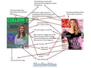
1. The masthead is positioned
At the top of the magazine to follow
Conventions.
In the main image, the person
Is looking directly at the audience for
Direct address and to engage the
Audience.
Consistant colours
For a colour scheme.
The main image is a mid shot.
Main coverline is bigger than all the
Other coverlines so that it stands
Out more and gives the audience an
Idea to what is in the magazine.
barcode
have a plain
background
Date and issue
number
The main image is big
And it takes up most of the
Space.
An easy to read font and the
colour makes it stand out.
Rule of thirds
Text anchors the image
2. The red magazine has more
Cover lines than my magazine
Theres less blank space
On the Red magazine
The main image on the
Red magazine is bigger
And takes us more space
My magazine has a puff
But the Red magazine
doesn't.
The main coverline is a lot bigger on
The red magazine and makes it stand
Out more
3. Comparison to drawn draft
mid shot for main
image
Same colour scheme
Same mastheads
Doesn’t have a secondary
image
Same puff
Same layout
4. - One way which I followed codes and conventions is by positioning the masthead at the top of the magazine, I did this because it stands
out at the top and it would be one of the first things an audience would see when It is on a magazine stand. Another reason why the
masthead is at the top of the magazine is because it suggests what genre it is and the masthead gives an idea of what the target
audience would be. Its big so its easy to read.
- Another way In which I followed codes and conventions is by the main image being a mid shot and looking directly at the camera. I did
this so that the main image was clear. A reason why the person in the main image is looking directly at the camera is for direct address,
it makes the audience feel as if the magazine is looking at them and they feel engaged, therefor it encourages the audience to but the
magazine.
- I followed codes and conventions by putting the date and issue number on the front cover, I did this so that the audince know which
issue it is and so they can get them all and wont miss out.
- Another thing I did to follow codes and conventions is making the main coverline bigger than all the other coverlines, I did this because
it stands out more and gives the audience a hint as to what is in the magazine and what the main stories will be in it, this will
encourage the audience to buy it if they are interested in the main coverline.
- Another way which I followed codes and conventions is by having a colour scheme, this makes the magazine cover and contents page
match, therefore it looks more proffesional.
- A way which I followed codes and conventions is by having a plain background wiyh not mch goin on, I did this so that it doesn’t take
the effect away from the main image or mastheads. I made the background plain so that everything else stands out more and is easier for
the audience to see and read.
5. Says contents at the top
Has more than one image
Says what's on each page and
Gives a page number.
Has the magazines name
At the top
They both
Have a Colour scheme
The images link with
Whats inside the magazine and
What some articles are based
On.
6. There's less blank space on the Q
magazine
One image on the Q magazine is
Bigger than the others.
Theres more articles on
The Q magazine.
7. How I followed codes and conventions.
-one way which I followed codes and conventions is by using the rule of thirds .
-Another way which I followed coes and conventions is by having the page number next to the article so that the
audience knows which page to go to.
-Another way I followed codes and conventions is by having a plain background, I did this so that it would be easier
To read the writing and the pictures would stand out more on a plain background.
-another way which I followed codes and conventions is by having ‘contents’ at the top of the page so that the
Audience know which page it is.
- Another way I followed codes and convention is by having the contents in a list, I did this so that it looks neat
and is easy for the audience to read and they wont get confused.
- Another way which I followed codes and conventions is by having the page number at the bottom of the page,
This is because it it easy to see at the bottom and stands out therefor pages can be found quicker.
8. Comparison to drawn draft
Says contents at
the top
The draft has less
Images on it than the
Final one.
Has roughly the
same amount of
articles/pages.
Has the same
sort of layout.
Page number at
the bottom.