
Recommended
More Related Content
What's hot
What's hot (20)
Viewers also liked
Viewers also liked (18)
Similar to POSTER ANALYSIS
Similar to POSTER ANALYSIS (20)
Recently uploaded
Recently uploaded (20)
POSTER ANALYSIS
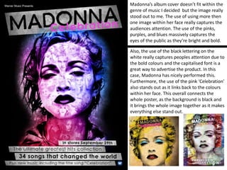
- 1. Madonna’s album cover doesn’t fit within the genre of music I decided but the image really stood out to me. The use of using more then one image within her face really captures the audiences attention. The use of the pinks, purples, and blues massively captures the eyes of the public as they’re bright and bold. Also, the use of the black lettering on the white really captures peoples attention due to the bold colours and the capitalised font is a great way to advertise the product. In this case, Madonna has nicely performed this. Furthermore, the use of the pink ‘Celebration’ also stands out as it links back to the colours within her face. This overall connects the whole poster, as the background is black and it brings the whole image together as it makes everything else stand out.
- 2. This album cover states the artists name ‘RIHANNA’ and the name of her new album ‘LOUD’. Firstly, we are all informed that her album is out now due to it saying it. Also there are names of some of her singles she has realised from her new album, familiarising the audience with the music we have already heard from her. This text has been printed on a red background to make it stand out more from the photographs presented. All the lettering is written in clear capitals and has been made to stand out for the audience to be able to read and recognise the content of the poster. The use of the small CD cover gives us a preview which allows us to know what we are looking out for when deciding to buy the album. Lastly, the colour red is used a lot in this advert, clearly. Red could massively respect romance, sexuality and or danger. This could give us an idea what her album is going to be about overall.
- 3. We witness the name of the artist placed at the top of the poster which shows contrasting colours as its important to be able to get the attention of the audience. Furthermore, this is also the first glance to sell the artist straight away. In which has been portrayed very well on this poster. We then can see the website and company for the product purchasing displayed for advertising purposes. The picture as a whole fills the majority of the page. Lana Del Rey is wearing red lipstick, which possibly matches her hair colour which stands out to the audience. As shown, the title of the album is in a bold text, clearly smaller than the artist name but has still been portrayed to show the importance. The album release date and statement of popular songs has been printed on the front to inform the buyers when they can purchase it. Lastly, the logo of company has been involved for recognition.