
Recommended
More Related Content
What's hot
Similar to Evaluation 1
Similar to Evaluation 1 (20)
Recently uploaded
Recently uploaded (20)
Evaluation 1
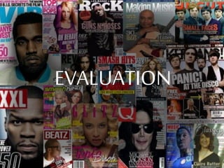
- 1. EVALUATION
- 2. In what ways does your media product use, develop or challenge forms and conventions of real media products? My magazine follows most of the conventions that are normal found in a music magazine. First convention is the masthead is that they are at the top and either centre or left alignment. I followed this convention as in my magazine I put my masthead in the top left of my page. It is also conventional as it is behind the main image. I also followed conventions of a music magazine by having a buzz word on the front cover of my magazine to draw in the audience. I had the word of “Free” in my magazine to draw in the audience and make it stand out on the shelf. This follows conventions of a music magazine. Also this follows convention as it is in a bright colour so that it grabs the audiences attention.
- 3. In what ways does your media product use, develop or challenge forms and conventions of real media products? The main image in my magazine follows the convention of a music as the image I used the character has direct eye contact with the camera to make the audience feel like the person is looking at them. Also I put my main image on top of my masthead, this follows conventions as in music magazines the main image is always in front of the masthead. I followed many conventions of a music magazine in my product, another convention I followed is having a sub-heading on the front cover of my magazine. I did this by having the sub-heading KNOWN on my front cover, talking about one an article that will be in the magazine.
- 4. In what ways does your media product use, develop or challenge forms and conventions of real media products? I have the Heading in the middle of the page in a big text to capture the audience attention this follows conventions of music magazines. This also follows conventions as it matches with the colour scheme of the main image. I have used the date in the same style as existing magazine. I have placed it above the barcode. This is because when my audience go to buy the magazine they have to look at the barcode in order to buy it so they will easily be able to see the date. This follows conventions of many other magazine as magazine such as Kerrang and Q have the date in the similar place as it is easy for the audience to quickly check the date of the issue.
- 5. In what ways does your media product use, develop or challenge forms and conventions of real media products? A pull quote is a main convention of many magazines. I used a pull quote that directly comes from the interview that the article is on. I did this to draw in attention. This follows the conventions of music magazine as it is very common to see pull quotes directly from the article. I used fonts that were very bold and that stand out to the audience such as Eagle Strike for my header on the double page spread. However I used things such as Minion Pro as it is easy to reader and easy on the eye. However I do not use a font that I have used previously in my magazine in my double page spread. This challenges conventions as most magazines use the same font the whole way through. I used different font as it made it easy for the audience to read.
- 6. In what ways does your media product use, develop or challenge forms and conventions of real media products? The colour scheme of my magazine is black white and red mainly. Because of this in my photos I tried to get some of these colours within them. I dressed my models in in very dark clothes and mainly blacks, this is so they contrasted with the white of the background and followed my colour scheme. This sticks to the conventions of magazines as they are not wearing stand out colours and fit with the colour scheme. My photos are all taken in the same sort of style with the models looking at the camera so it looks like they are making eye contact with the audience. Most of my photos are taken in this way as it is a good way to interact the audience. This is seen as following conventions as many magazines use the same style of photography.