The document discusses how the media product of a magazine challenges conventions of real music magazines. It uses a black and white color scheme rather than color, and images that are partially obscured by text, in contrast to typical magazines that prominently feature faces. While some layout aspects like placement of text and use of pull quotes conform to conventions, other choices like multiple small images on the contents page rather than a single featured one aim to give a DIY, less polished look preferred by the target niche audience. Overall, the document analyzes how the magazine challenges expectations through its visual design and aesthetic choices.
1. Evaluation question 1
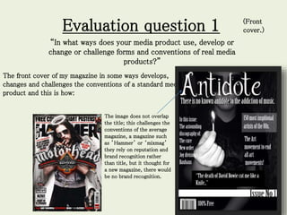
“In what ways does your media product use, develop or
change or challenge forms and conventions of real media
products?”
The front cover of my magazine in some ways develops,
changes and challenges the conventions of a standard media
product and this is how:
The image does not overlap
the title; this challenges the
conventions of the average
magazine, a magazine such
as ’Hammer’ or ‘mixmag’
they rely on reputation and
brand recognition rather
than title, but it thought for
a new magazine, there would
be no brand recognition.
(Front
cover.)
2. “In what ways does your media product use, develop or change or challenge
forms and conventions of real media products?” (front cover)
The colour scheme is purely black and white, this
challenges convention due to most modern music
magazines being in colour, due to a younger audience
not being really familiar with black and white as
they’ve always had colour cameras, tv and films.
Black and white may also be linked to an older less
modern audience but in my magazine I tried to erase
this idea. I aimed to use black and white to capture
the dark aesthetic I was going for and to ultimately
please the niche audience. Black and white also
makes it a more art based magazine and gives it a
D.I.Y look which also links to the goth subculture. It
also disassociates from real life linked to goths love of
literature.
The use of image also defies convention due to the face being
partially covered by the text, in a standard magazine the featured
artists face is usually prominent but in this case I wanted the focus
to be on the prop rather than the face, the audience I'm going for
probably aren't concerned with costume or makeup but with
meaning and artistic value, the match is a direct contrast to dark
and therefore fits the black and white aesthetic.
3. “In what ways does your media product use, develop or change or
challenge forms and conventions of real media products?” (front
cover)
Although the face of the image is slightly blocked the shot itself is a medium shot a standard shot for music
and other magazines as it allows room for costume, settings and theme. In my case it also left room for a
prop.
Medium shots in magazines:
The placement of text also conforms to convention as the text
predominantly sticks to either sides of the image rather than over
the top, this is a staple magazine convention as it allows the
audience to see the image and text separately. It also helps in the
recognition of what a magazine is.
4. “In what ways does your media product use, develop or change or challenge
forms and conventions of real media products?” (contents page)
The placement of the text in the left hand corner is a
convention of general music magazines as they usually go for
the rule of thirds which the most aesthetically pleasing for the
audience. Also the continuation of the colour scheme and
image style is a convention as it adds to the continuity of the
magazine and brand recognition.
The use of the image boxes are a non standard use of image as the convention
on a contents page is a predominant image/ central image, like the image with
Kanye West, but in my magazine I decided to go against this, so I could use
three images, this like the front cover I wanted to give a D.I.Y look to, rather
than a polished Hollywood effect as this would appeal more to my audience,
who value substance over style.
The use of the smoke is also a non standard use of image as it blends with
the background and isn't necessarily linked to the other images yet still fits
with the over all ‘look’ of the magazine and shows continuity between the
front cover and contents page.
5. “In what ways does your media product use, develop or change or challenge
forms and conventions of real media products?” (contents page)
• The row of text is a standard use space in a contents page often
going down diagonally, this makes it easier to read for the audience
and more recognisable as a contents page.
The choice to have contents wrote small is unconventional as
usually it is a large feature, I chose to feature it small as I
believe the placement and layout would identify its elf as a
contents page.
6. “In what ways does your media product use, develop or change or challenge
forms and conventions of real media products?”(double page spread)
• The layout of the text is a convention of music magazines at
it is the simplest form and is easy and clear to read, unlike a
horizontal or separate word box layout.
Standard uses of text:
7. “In what ways does your media product use, develop or change or challenge
forms and conventions of real media products?”(double page spread)
• The use of ‘pull quotes’ is a standard convention of a music
magazine as it allows the audience to preview quickly what
they’re about to read and highlights an interesting concept of the
interview.
The use of the double image challenges the conventions
of a standard magazine at it is usually one image spread
across or one image and a blank page, I went against this
as I though that this better captured the desired effect I
was going for and is more interesting to look at.
I kept this area free as it is a break from
the busier elements such as the image and
the text