2. IN WHAT WAYS DOES YOUR MEDIA PRODUCT USE, DEVELOP OR CHALLENGE
FORMS AND CONVENTIONS OF MEDIA PRODUCTS?
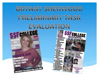
SIMILARITIES
Masthead is bold and goes across the
width of the page to attract the reader
to magazine and it has a distinct font.
Puff to provide an offer as an
incentive for the reader to
purchase the magazine.
Main cover line to stand out
above the other cover lines to
provide an insight of what’s in the
magazine.
Cover image is well positioned with the
rule of thirds and mainly in the centre of
the page.
Cover line in a black box to create
an edge on the page and make the
sell line stand out more.
3. IN WHAT WAYS DOES YOUR MEDIA PRODUCT USE, DEVELOP OR CHALLENGE
FORMS AND CONVENTIONS OF MEDIA PRODUCTS?
DIFFERENCES
On my advertisement, I used the colour
of the logo of what I was advertising so
that it was easy recognisable.
Advertising on this magazine were kept
to match the other cover lines.
I made sure my model was smiling so
that she came across as friendly and
happy as it is a student magazine.
I kept the main title of the cover lines
one colour and the smaller points such
as the bullet points another colour. In
contrast, the KERRANG! Magazine has
changed between two colours for the
bullet points.
I didn’t use any other photos other than
the cover image because I didn’t want to
take the attention away from the main
image. However, this magazine has
used photos to help advertisement.
On the small cover lines, I didn’t use an edge or shadow on the writing as I didn’t want
it to stand out as much as the main cover line. However, KERRANG! Had put a
shadow/ edge on all of their writing.
4. FEEDBACK OF FRONT COVER
My audience gave me the following feedback about my front cover:
• The masthead was bold and stood out well.
• My cover photo was well positioned and eye catching.
• The cover lines were short and snappy to catch your attention.
• The colours were appropriate and created a theme.
• There was still some blank space that needed to be filled.
5. IN WHAT WAYS DOES YOUR MEDIA PRODUCT USE, DEVELOP OR
CHALLENGE FORMS AND CONVENTIONS OF MEDIA PRODUCTS?
SIMILARITIES
I had the title ‘contents’ so it was clear
what the page was.
I had a larger photo near the top of the
contents page so it immediately looks
appealing.
I have split my article’s into sections and given
it a clear title so the magazine will be easily
laid out and understandable.
I have put in an ‘Editor’s note’ in order to
make the magazine more personal to the
reader and give a brief insight as to what’s
in the magazine.
I have linked in a page number and
article with each photograph that I
have on the contents page.
6. IN WHAT WAYS DOES YOUR MEDIA PRODUCT USE, DEVELOP OR
CHALLENGE FORMS AND CONVENTIONS OF MEDIA PRODUCTS?
DIFFERENCES
I put my masthead onto my contents page to
carry on the design of my front cover and to
make it easily recognisable.
KERRANG! Puts a box around the section titles
to make it stand out more and it also eliminates
blank space. I didn’t do this, instead I just had
the title in a different colour.
As it was a college magazine, I thought it was
important to include the contact details of the college.
However, in the KERRANG! Contents page, the contact
details aren’t included.
They included more advertisement on their
contents page where as I just listed the
articles.
7. FEEDBACK ON CONTENTS PAGE
My audience said the following about my contents page:
• It all stood out well and looked as appealing as the front cover.
• The photos were well taken and had articles to relate to them.
• Clear and understandable layout and it’s easy to tell that it’s a contents page.
• The font could be a bit difficult to read as it was quite bold.
• The Masthead should have gone across the width of the page as it did on the front cover.
• The photo of the principle in the corner looked quite out of place and it would have looked better
without it.
8. WHAT HAVE YOU LEARNT ABOUT TECHNOLOGIES FROM THE PROCESS OF
CONSTRUCTING THIS PRODUCT?
Photoshop is a industry standard application used to produce image based items
such as a front cover of a magazine. In Photoshop I learnt how to take a colour
swatch off of a picture and apply it to text, I did this with the ‘£1 off’ and the costa
logo. Photoshop also works in layers which is different to any programme I’ve
used in the past, so I had to get used to working with layers. On my cover image, I
put the cover image over the top of my masthead to make it stand out more. To
do this, I had to learn how to create a duplicate layer of my cover image and put it
over the top of the masthead.
For my cover lines, I applied a drop shadow on them in order for
them to ‘jump out of’ the page. Photoshop taught me to that trial
and error is the best way to get the result that you are looking for as
you have to be able to see what looks better out of a variety of
options.
9. WHAT HAVE YOU LEARNT ABOUT TECHNOLOGIES FROM THE PROCESS OF
CONSTRUCTING THIS PRODUCT?
InDesign is an industry standard application which allows us to create products that
are mainly writing and placing in things that have been designed somewhere else.
To begin with, I had to create a new document with two pages to allow me to
import my front cover onto the first page when I was finished. InDesign is based
around boxes and places things into them such as the images on my contents page
had to be ‘placed’ into the boxes that I drew. InDesign is a lot more text based
which is why it was the best product for me to use to create a contents page.
In InDesign I learnt how to position my text appropriately to look
like a contents page using the measurement indicators at the top
and side of the page. In order to get my subject titles to match
the colour of my masthead, I had to get a colour swatch off of
Photoshop and create the same one on InDesign by creating a
‘new swatch’ in the ‘swatches’ section. As my masthead was
repeated on the contents page, I also had to import the
masthead from Photoshop and place it into a frame that I had set
out on my contents page.
10. WHAT HAVE YOU LEARNT ABOUT TECHNOLOGIES FROM THE PROCESS OF
CONSTRUCTING THIS PRODUCT?
In order to present the work I have undertaken, a
blog was set up on ‘Blogger’ to upload all of my
work in a clean and efficient manner. From using
blogger, I have learnt how to clearly set out a post
To take the images that I used on both my front and upload images onto them. I have also had to
cover and contents page, I had to use a digital learn how to export a PDF file into a JPEG file.
camera. When taking the images, I had to When uploading my posts to my blog, I have added
remember the rule of thirds and make sure I a label to them to clearly show it is my work if the
took images that were well proportioned and blogs ever get mixed up.
that would match my theme and layout of my
contents and front cover. Therefore, I took my
cover image portrait and used a medium close
up which is from the waist upwards to
emphasise the body language. The images on
my front cover were a long shot – landscape,
two medium shots portrait and a close up
landscape that I then cropped to a square to fit
in my ‘Editor’s note’ section.