
Recommended
More Related Content
What's hot
What's hot (20)
Viewers also liked
Viewers also liked (20)
Similar to Task 3- Nathan Green
Similar to Task 3- Nathan Green (20)
Recently uploaded
Recently uploaded (20)
Task 3- Nathan Green
- 1. Q magazine
- 2. Front Cover • This magazine includes/ I will talk about: • Masthead • Main image • Main cover line • Cover lines • Shot type • Genre • Rule of thirds • Layout • Colour scheme • Denotation and connotation
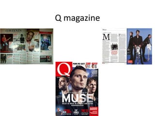
- 3. Masthead- the masthead has been located at the top right of the front cover. This is purely so the audience can quickly notices the magazine if on a shelf in a shop. Due to the simplicity of the masthead, it becomes iconic and recognizable by not just the target audience but by everyone. Main cover line- the main cover lines quickly informs the reader of what the magazine content will be about. “Muse is the band featured in the main image and the main cover line so they will be the main focus involved inside this magazine. The main cover line quotes “Boldly go where no band has gone before” this will lure readers whom are interested into wanting to buy the magazine due to how big of a statement this actually is. Furthermore the background links in with the main cover line as the band members are in space. This simply emphasizes that the band are willing to go to extreme extents to try something new. Cover lines- Most of the cover lines are placed at the bottom most probably because of their lack of interest in comparison to the cover line at the top. The cover line at the top stands out from the others as it’s on its own so readers would be more included to read that stand alone cover line then the bundle of others at the bottom. Every cover line on this magazine has a short header which entices the reader to read the sub heading. “Cat power” on its own doesn’t make much sense but with the sub heading “she’s having kittens”, gives more of a short glance of what to expect in the magazine. Main image and shot type- the main image is of the band Muse which is told from the main cover line. The band members are all looking serious, which could furthermore suggest that they’re serious about their music and the what’s mentioned in the main cover line. Two of the members either side are looking away where as the singer in the middle is using direct address which helps the audience feel the impression that he’s looking right at you. The shot used is a medium close up. By using a mid close up, you can focus more so on their facial expressions and less so on their body language.
- 4. Genre- the genre would mainly appeal to those who listen to rock/alternative music. The age range would be young adults most likely male ranging from 16+. The type of people who’d buy this magazine would be those of a working class. Due to the magazine not being priced on the actual magazine and on a separate section to the magazine (plastic cover), shows that the magazine couldn’t be too much in terms of price. Layout- The magazine is laid- out in a very clear and open way, furthermore the magazine doesn’t feel cluttered and the actually text featured on the magazine is well spaced out. Colour scheme- The colour scheme on the magazine is very simple and keeps the consistence of red and white. Other colours such as blue and black are featured as a background colour to put more emphasis on the main image. By just mainly using red and white, helps the audience become familiar with the style of the magazine and the masthead. The colours used are also the same colours as the masthead which also shows the link in the front cover of the magazine. Rule of thirds- At the bottom left of the magazine is usually where the less important information is added onto the front cover. Due to there being some information on this magazine (at the bottom left), it’s not known as dead- space. This magazine challenges the stereotypical way in which most magazines leave the bottom left blank or put a barcode/ issue number there. In addition to that, the cover line that is put at the bottom left, most probably doesn’t shine to the target audience and would only appeal to a niche target audience.
- 6. Layout- straight away on the bottom left of the page, the cover story has been added in with another shot of the band featured on the front cover. This helps show the connection between the two also informing the reader of where to go if they’re interested by the front cover. With a short header following on from that, lures readers into the magazine article on the certain page. “we’ve really gone the whole hog this time”, immediately entices the readers into thinking about what the band as done differently in comparison to their previous work. The contents page is spread across two pages and in four different columns. This helps readers visually scan the page in smaller sections, making it easier to read the text and find a certain page number. Images- despite the front cover picture not being the main picture on the contents page, it still has what looks like a regular spot on the contents page. At the bottom left of the first page, it says cover story. This clearly shows where to find the article on the band featured on the front cover. The picture at the top right and the two smaller ones next to them have grab quotes which tell the reader a brief bit of information on what to expect on that certain page. The two larger pictures on the other page are of two other articles featured inside the magazine and also have grab quotes to lure the readers into wanting to read on. The bigger the picture, the more of the interest the audience will have on that article.
- 7. Colour scheme- The colour scheme is very consistent and just like the front cover, it keeps the same colours (red, white and black). This is purely to show the sheer familiarization the magazine has with these colours whilst also making them iconic Loyal buys of the magazine/ subscribers will start to notice the colour scheme and start to relate the colours featured in one magazine to the rest. In addition to that the colour red stands out which catches the audiences eye, which is good purely because the reader will notice the text more so than if I was black. Subscriber advertisement- The advertisement has been located at the bottom right of the second page purely so as the reader will turn the page, they’d notice who they could subscribe to the magazine and actually get the magazine weekly. Front- the font for the header to page numbers has been put in bold red writing purely so it stands out in addition to the other text. The red text is of a bigger font then the black text which helps show that the red text is the header and the black text is a sub heading.
- 9. Layout- The layout has been divided into three columns on one page and a stand alone picture on the other. This makes it easier to read for the audience purely so they can read down the page in sections as apposed to reading across. A picture has also been put into the middle of the text to break up the text more and make it easier for the audience to visually see the text as apposed to just simply reading the text. The band name has also been put at the top of the page to make it easier and clear for the audience to know what this page is about. Furthermore it has also been put there so if the reader was skipping through the pages, they would notice the title ‘Muse’. The magazine name ‘Q’ has also been put at the bottom of the page to tell the reader that this certain article is excusive to this magazine. Font- The giant M has been put to start off the article whilst that also being the first letter of the band the article is formally about (Muse). The main image- The main image shows the band and their instruments which helps the audience visually see what they play in the band if they either didn’t know or just don’t know the band. Colour scheme- The colour scheme is very similar all the way through the magazine and keeping the three main colours (red, white and black). The main text tends to be black and the header text tends to be in red and also in bold.