1. Amira Abdi 12OF
k
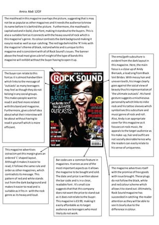
The mastheadinthismagazine overlapsthe picture,suggestingthatismay
not be as popularas othermagazinesanditneedsthe audience toknow
itsname before itisbehindthe picture. Furthermore,the masthead is
capitalisedandinbold,clearfont,makingitstandouttothe buyers.Thisis
alsoa suitable fontasitconnectswiththe heavysoundof rock whichis
thismagazine’sgenre.Itscolourcontraststhe darkbackground makingit
easyto readas well aseye-catching.The redlogobehindthe ‘R’linkswith
the magazine’stheme of black,redandwhite andisunique tothis
magazine andisconsistentwithall of RockSound’sissues.The banner
above the headmast givesabrief insightof the type of bandsthis
magazine will exhibitwithoutthe buyerhavingtoopenitup.
The buyercan relate tothis
fontas it isalmosthandwritten
whichlinkstothe message of
‘outcasts’as manyteenagers
may feel asthoughtheydonot
belonginanysocial groups.
Thismakespeople wantto
readit and feel more related
withthisbandand magazine.
Furthermore,givesabrief idea
aboutwhat theirinterviewwill
be about withouthavingto
readit yourself whichismore
efficient.
The emo/gothsubculture is
evidentfromthe darklayoutin
thismagazine.Here,the main
focusis a close upof Andy
Biersack,a leadsingfromBlack
Veil Brides.Withmessyhairand
uneventeeth,hisimage clearly
goesagainstthe social viewof
beautythushisrepresentationof
‘the ultimate outcasts’.Hishand
gesture suggestsamischievous
personalitywhichlinkstoindie
rock and histattoo sleeveswhich
symbolisesthissubculture and
musicgenre of rock and roll.
Also,Andyisan appropriate
coverfor thismagazine asit
focusesonrock music.He
appealstothe target audience as
hismake-up,hairandoutfitare
not sociallydesirablehence why
the readerscan easilyrelate to
hissense of uniqueness.
The magazine advertisesitself
withthe promise of free goods
withissue brought.These plugs
do notfollow the black,white
and redcolourscheme which
allowsitto standout.Ultimately,
Rock Soundmagazine has
succeededincatching the reader
attentionastheywill be able to
see itclearlydue to the
difference incolour.
Thismagazine advertises
ostracismyetthismargingivesan
ordered‘L’shapedlayout.
Althoughitmakesiteasierto
read,it followsthe same rule and
orderas othermagazines,which
contradictsitsmessage.This
patternof redand white stands
out fromthe dark backgroundand
makesiteasierto readand is
suitable asitfitsin withthe rock
genre as itsheavyandloud.
Bar codesare a commonfeature in
magazines.Itservesasone of the
mostimportantaspectsas it allows
the magazine tobe boughtandsold.
The date and price iswrittenabove
the bar code andis ina clear,
readable font.It's small size
suggeststhatthat thiscompany
doesnotwant the price to stand out
as it doesnotrelate tothe buyer.
Thismagazine is£3.99, makingit
easilyaffordable asitstarget
audience are teenagerswhomost
likelydonotwork.