
Recommended
More Related Content
What's hot
Viewers also liked
Viewers also liked (13)
Similar to Keri hilson dec 1
Similar to Keri hilson dec 1 (20)
More from TriciaBrown354
More from TriciaBrown354 (20)
Keri hilson dec 1
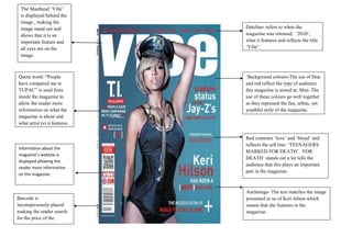
- 1. The Masthead „Vibe‟ is displayed behind the image , making the image stand out and Dateline- refers to when the shows that it is an magazine was released: „2010‟, important feature and what it features and reflects the title all eyes are on the „Vibe‟. image. Quote word: “People Background colours-The use of blue have compared me to and red reflect the type of audience TUPAC” is used from this magazine is aimed at: Men. The inside the magazine to use of these colours go well together allow the reader more as they represent the fun, urban, yet information on what the youthful style of the magazine. magazine is about and what artist (s) it features. Red connotes „love‟ and „blood‟ and reflects the sell line: „TEENAGERS Information about the MARKED FOR DEATH‟. „FOR magazine’s website is DEATH‟ stands out a lot tells the displayed allowing the audience that this plays an important reader more information part in the magazine. on the magazine. Anchorage- The text matches the image Barcode is presented to us of Keri hilson which inconspicuously placed means that she features in the making the reader search magazine. for the price of the magazine.