1. House Style
The same type of house style has been
used in this issue of Kerrang! like many
other issues. For example, the issue on
right is laid out almost exactly the same as
the contents page I've used.
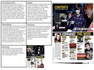
Use of Rule of Thirds
The rule of thirds was used in the main
image (Bring Me The Horizon image) at the
top of the page. The subject, Oli Sykes, is
placed on the second/third section of the
image so that there is more attention
drawn to him. Also, using the rule of thirds
has created more negative or dead space
on the left hand side of the image. This has
then been filled by other relevant images
that fit with the issue e.g. other big stories
or news.
Design Balance
The contents page has ben split horizontally
into two separate parts. This has been done
purposely to split the important
information with the eye-catching photo in
the top half. For example, the top half is
mainly a big photo with extra 2 photos. This
is so it can quickly let the reader know
about the main story and also draw the
reader in. This design balance is good as it
separates the important information about
the issue and about the main cover line.
Imagery
A limited number of imagery has been used
to ensure the page isn’t cluttered with
images. For example, too much imagery
can limit the amount of text and
information about the issue. The main
image uses high key lighting upon the
important subject e.g. the artist in the
issue. This is so the reader can quickly
identify who it is and be more engaged with
the issue. The page includes images of
albums, bands and the editor.
Texts/Fonts
The same font for the front cover masthead
has been used as title fonts in the contents
page (Contents, Kerrang! This Week etc.).
It’s been used throughout the page to
highlight important topics.
Important sections and words have been
highlighted in bold to draw attention in.
Different font was used for the editors
comment.
2. House Style
The same style and layout has been used to
show consistency through the issues. For
example, the issue on the right uses the
same layout as the one I’ve chose. They use
a consistent house style as it’s to easier to
understand each time you purchase the
issue. For example, if you are subscriber of
the NME magazine and it changes each
week, it may become confusing as the
layout keeps changing.
Use of Rule of Thirds
The image of Alex Turner uses a form of
rule of thirds. For example, he’s slightly to
the right of the image to draw more
attention to him and also allow space for
others to be included in the left hand side
of the image. The microphone he is singing
into is also in line with the first section of
the photo which does follow the rule of
thirds. Even though this photo has been
taken naturally, the photographer has
clearly considered composition for the
photo.
Design Balance
No specific design balance has been used.
However, the constant use of black and
white colour balances out the page as these
are these are simple and bold colours that
are a direct contrast of each other. The
overall page however, follows the rule of
thirds as the main text/cover line takes up
the majority of the page whereas the actual
information about the magazine is section
in the last third of the page.
Imagery
A limited used of photos have been used.
This is so the page isn’t cluttered with
images so that more information can be
shown. For example, we only see one
image for the main topic. The imagery is
mainly low key lighting and uses a variety of
dark colours. For example, the dark clothing
he is wearing could perhaps suggest this is
a live performance as many artists wear all
black when playing live. The low key
lighting also gives a sense of verisimilitude
as it’s natural lighting.
Texts/Fonts
The ‘Contents’ font at the top of the page
has been used for subheadings to highlight
the main topics. They also use the same
background to make the headings stand
out and draw in attention. There has been a
consistent use of font throughout the page
when the main information is being used.
Whereas subheadings and headings use a
different font that makes the section stand
out from the rest and also separates the
details.