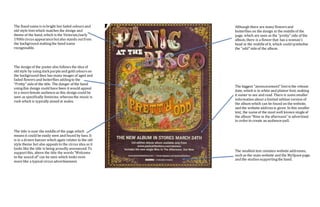
1. The Band nameis in bright but faded coloursand
old-style fontwhich matches the design and
theme of the band, which is the Victorian/early
1900scircusappearancebutalso stands outfrom
the background makingthe band name
recognisable.
The design of the poster also follows the idea of
old style by using dark purpleand gold colourson
the background then has many images of aged and
faded flowersand butterflies addingto the
“Pretty” sideof the title. The danger of the band
usingthis design could have been it would appeal
to a morefemale audienceas this design could be
seen as specifically feminine, whereasthe music is
rock which is typically aimed at males.
The title is near the middleof the page which
meansit could be easily seen and found by fans. It
is in a drawn banner which again relates to the old
style theme but also appealsto the circus idea as it
looks like the title is being proudly announced. To
supportthis, above the title the words“Welcome
to the sound of” can be seen which looks even
morelike a typical circus advertisement.
Although there are many flowersand
butterflies on the design in the middleof the
page, which are seen as the “pretty” side of the
album, there is a flower that has a woman’s
head in the middleof it, which could symbolise
the “odd” sideof the album.
The biggest “announcement” fontisthe release
date, which is in white and plainer font, making
it easier to see and read. There is somesmaller
information about a limited edition version of
the album which can be found on the website,
and the website addressis given. In this smaller
text, the nameof the most well known singleof
the album “Nine in the afternoon” is advertised
in order to create an audiencepull.
The smallest text contains website addresses,
such as the main website and the MySpacepage,
and the studiossupportingthe band.