Media Practical Music Timed Analysis 2
•Download as PPTX, PDF•
0 likes•168 views
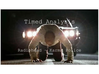
A timed analysis of the music video for the song "Karma Police" by the band "Radiohead".
Report
Share
Report
Share

Recommended
Media Practical Music Timed Analysis 3
A timed analysis of the music video for the song "South" by the band "Hippo Campus".
Media Practical Music Timed Analysis 1
A timed analysis of the music video for the song "Prison's to Purify" by the band "Sundara Karma".
Audience Analysis - Dylan Koolman G324
The document provides guidance for producing a music video for an indie song. It recommends using conventions of the indie genre like darker clothing styles and natural settings. The video would have a loose narrative and symbolic themes. It would appear on indie music channels and be targeted towards 14-24 year olds to represent youth exploring freedom. Gender, ethnicity and nationality would not be focused on to promote inclusiveness. The video would portray characters as independent thinkers experimenting with drugs and alcohol. It analyzes the music video for "Young Blood" by The Naked and Famous as an example of the genre.
Media Practical Music Textual Detailed Analysis 1
The video is a narrative music video that tells the story of a love triangle through symbolic imagery and references to color. It uses techniques like parallel editing and symbolic color filters to explore themes of love, heartbreak, and the complex dynamics of family relationships. The fast-paced cinematography and editing match the tempo of the song. Framing and shots are used to represent the male gaze and female gaze theories. Overall, the video successfully uses visual storytelling and symbolism to relate the themes of the song through its imagery and narrative structure.
Media Practical Music Textual Detailed Analysis 3
This music video for Troye Sivan's song "Youth" can be summarized in 3 sentences:
The video uses symbolic colors, costumes, and settings to represent themes of youth like carefreeness, love, and recklessness. It features Troye Sivan performing the song at a house party with various scenes showing youthful stereotypes through dance and interactions. The fast-paced editing, direct addresses to the camera, and narrative storyline portray the invincibility and short-lived nature of youth described in the song through spectacle, performance, and symbolic visuals.
Media Practical Music Textual Detailed Analysis 2
This music video by The 1975 tells a narrative story through implications and lyrics. It follows the reckless relationship of two young lovers who engage in self-destructive behaviors like drugs, alcohol, sex, and crime. Various techniques are used to symbolize their chaotic lifestyle and downfall. The target audience is likely younger people who identify with themes of youth stereotypes, and the video aims to sell both the song and band's image through an artistic short film-like experience rather than a typical performance-based music video.
Ancillary Product Digipak Timeline
Digipaks are a type of CD packaging made of paper and cardboard with internal plastic segments to hold one or more discs. They are folded like a book and can contain additional materials like lyrics and photos. Digipaks became popular in the 2000s as an alternative to jewel cases and were originally owned by IMPAC Group, which was later acquired by various packaging companies. While less durable than jewel cases, digipaks are less likely to crack and are considered more environmentally friendly due to reduced plastic usage.
Ancillary Product Website Timeline
The document provides a timeline of key events in the development of the world wide web and websites from 1989 to 2010. It begins with the creation of the world wide web as a CERN project in 1989. Major milestones include the invention of the first web browser in 1990, making the web free to use in 1993, the release of Mosaic which popularized web browsing in 1993, the first online purchase from Pizza Hut in 1994, the creation of Yahoo and release of Internet Explorer in 1994, the launch of Google.com in 1997, and the founding of YouTube and Twitter in 2005 and 2006. The document also provides brief definitions of static and dynamic/interactive websites.
Ancillary Product Textual Analysis Digipak 2
This document analyzes the design of Morgan Redman's digipak album packaging. It discusses the color scheme of black, white and pink used to evoke nostalgia and romance. The layout employs a simplistic, centered typography with lyrics in a narrative column format. Images are letterboxed and placed in the top horizontal third. Fonts include a neon-style title font and easy-to-read sans serif lyrics. The overall design constructs a simple two-pocket digipak and incorporates ideas like post-production colorization and unconventional lyric layout.
Ancillary Product Textual Analysis Website
The website uses a central column layout that minimizes extreme changes between computer and phone views. Interactive links to music, social media, tickets and the online store are prominently displayed below the band's name. A dark navy blue color scheme and emboldened sans serif font are used throughout. Rolling images and product photos are featured to promote the band's latest album and merchandise available in the online store. Red highlights indicate interactive buttons and links to drive users to purchase music and tickets.
Ancillary Product Textual Analysis Digipak 1
The document analyzes the cover art and design of the compilation album "Digipak" by The Smiths. It summarizes:
- The color scheme uses blue, black, white, sepia and red to convey themes of sorrow, sadness, nostalgia, romanticism and danger.
- The layout features a diptych CD case, large format images, repeated cover art and non-standard capitalization and font sizes.
- Composition follows the rule of thirds, framing the band members and centering the title.
- Typography matches the romantic style of lyrics with varied colored fonts.
- The complex design construction includes a singular pocket and fold-out pages for the
Music Video Primary and Secondary Research
A-Level Media research into practical project of creating a music video and other such ancillary products.
Graphic Questionnaire Analysis
This graphic questionnaire surveyed participants about their listening and watching habits, preferred music video genres, ideal video experience, and ideas on dubbing, performance aspects, symbolism, reckless behavior, and favored themes in music videos.
Textual analysis
The poster uses contrasting colors between the top and bottom halves, with a colorful sunset on top and a black bottom. The font colors match to increase contrast and legibility. Specifically, white text stands out against the black background at the bottom. Overall, the calm, pastel colors are meant to convey a relaxing, peaceful vibe that matches the album's sound. The layout clearly displays the band name and album title to identify what is being advertised, along with details about the debut album, release date, and website. A simple image without the band draws attention to the text, while intriguing viewers to learn more.
Location scouting 2
This document outlines the locations that will be used to film a music video. Mary's house will serve as the main location, with her bedroom, kitchen, living room, and garden all being used for different scenes. The bedroom will be where two girls get ready for a party by trying on clothes and dancing. The kitchen will have party scenes of people making drinks and chatting. Most inside shots will take place in the living room, including dancing and singing. While the garden may get a few shots, most outside filming will occur at a nearby field. Permission has been obtained from Mary's family to use the house for filming.
Digipak timeline
A digipak is a style of optical disc packaging that consists of a paperboard outer binding and plastic trays inside to hold discs. Digipaks grew in popularity with artists in the early 2000s as an alternative to standard jewel cases. While less durable than jewel cases, digipaks were adopted for their unique style and ability to showcase artwork. The digipak trademark has changed hands several times between packaging companies.
Textual analysis marys media
The document provides analysis of the editing, sound, camera work, and mise-en-scene elements in four music videos: "Sippy Cup" by Melanie Martinez, "Youth" by Troye Sivan, "High" by Tove Lo, and an unnamed video by Troye Sivan. It examines how these technical elements convey the narratives, themes, and meanings of the songs and advance the stories being told in each video.
Lorde: Timed Analysis
This document provides a timed analysis of the music video for Lorde's song "Royals". It describes each shot in the video in order from 0 to 3 minutes and 20 seconds, including shots of Lorde singing, shots of young men in various settings like their homes, a gym, and on public transportation. The analysis describes the composition and elements within each shot to analyze the visual storytelling of the music video.
Questionnnaire Data Analysis G324
The document discusses the results of a questionnaire given to gather perspectives on youth and music videos. It summarizes that most respondents were teens, the target audience, and responses were primarily from females. Narrative and symbolic music video styles were preferred. Indie music and themes of grunge appearance and alcohol were popular. Props and costumes were seen as most essential to music videos, followed by location and lighting. Gender, ethnicity, and sexuality were seen as most important for characters. Most respondents said they would feel comfortable watching depictions of cigarettes, alcohol, and minor drug use in a music video.
Ideas for a Promotional Package for a New Film
This is part of my A-Level Media course in which I will have to choose my next portfolio project which can either be in music, film or advertising.
M&S Advert Analysis
The document analyzes an M&S food advertisement featuring the song "No Place I'd Rather Be" by Clean Bandit. It summarizes that the ad uses a current popular song to appeal to a modern audience and convey that M&S is up to date. Synchronous sound effects and rhythmic music keep the audience engaged with what is happening on screen and direct their attention to the products. The ad presents colorful foods against a black background to emphasize the products through contrast and draw the viewer's eye with no distractions.
Papermate Inkjoy Analysis
The advertisement is 30 seconds long, using upbeat music and bird's eye camera shots in different colors to engage the audience and show the various ways the Papermate Inkjoy pen can be used. Through synchronization with the music and constant display of the brand name, the ad aims to perk interest in the euphoric writing experience promised by the narrator's use of adjectives, adverbs and imperatives like "Experience."
The Shallows Analysis
The document analyzes how sound, editing, camera work, and mise-en-scene are used in a thriller genre film to build suspense and tension. It notes that the music intensity and muffled water sounds create anticipation of something to come. As the key event happens suddenly, the music abruptly ends with a crunching apple sound effect. Shots start out peaceful but then a fast pan and dramatic sound reveal the sudden action and new threat, with sounds muffled again to remind the audience of the surrounding terror. Shot durations, facial expressions of fear and injuries, and a disorienting blackout reflect the adrenaline, emotions and hopelessness of the characters.
Ideas for a Promotional Package for the Release of an Album
This is part of my A-Level Media course in which I have to choose my next portfolio project which can either be in music, film or advertising.
Money Monster Analysis
The document analyzes editing, music, structure, camerawork, and mise-en-scene techniques used in the movie "Money Monster" to build suspense and engage the audience. Fast cuts, short shots, fluctuating music, a non-linear timeline, medium shots of the main characters, and dramatic irony through happy music create anxiety and confusion about upcoming terrible events while conforming to thriller genre conventions.
Secondary audience research
The document provides details about a music video being created to promote the band Catfish and the Bottlemen. It will target 17-25 year olds and feature representations of youth subcultures and peer pressure. Specifically, it will show stereotypical depictions of youth while also showing those who do not conform to drinking or smoking. The video will be distributed on channels like MTV and 4Music that target this age range. It aims to appeal to both male and female viewers as well as people of various ethnicities and nationalities. Socioeconomically, it targets classes C1-E who are still in education or entry-level jobs. The ideal viewers would be classified as "Aspirers" or "Explorers
Digipak Timeline
The document outlines the history and development of the digipak packaging format for optical discs like CDs and DVDs. It traces the origins of digipaks back to 1985, when Prince released an album with artwork on the front and lyrics on the back in a sleeve-style package similar to early digipaks. In the 1990s, digipaks became more commonly used in the music industry, such as with Depeche Mode's album Violator. Through the 2000s and 2010s, digipak ownership changed hands between various companies, and the format grew to include additional inserts for lyrics or credits.
Evaluation Question 1
This document discusses how the media product uses, develops, and challenges conventions of indie music videos. It incorporates common indie conventions like quick cuts and low-budget settings. Where conventions couldn't be replicated, such as using the band in performances, a symbolic narrative was used instead. Close-up shots focused on youth symbols rather than band members. The representation of youth as fun rather than destructive challenged typical indie conventions. A pink color filter presented a more positive depiction than typical black-and-white filters. Overall, the media product engaged with indie conventions while adapting and challenging norms around representing youth.
Main Task Audience Feedback
The document contains feedback from multiple viewers on a music video created by Morgan Redman for the song "Main Task" by Troye Sivan. The feedback praised aspects like the pastel color grading conveying youthfulness, strong storyline, and shots matching the rhythm of the song. Suggestions for improvement included incorporating faster shots to better portray the upbeat nature of youth and loosening some shot lengths to feel less restrictive. One viewer noted an actor looking at the camera and unnatural shots of drinking/cigarettes. Overall the narrative and themes were seen as clear but some felt visuals could better sync with the audio in places.
More Related Content
Viewers also liked
Ancillary Product Website Timeline
The document provides a timeline of key events in the development of the world wide web and websites from 1989 to 2010. It begins with the creation of the world wide web as a CERN project in 1989. Major milestones include the invention of the first web browser in 1990, making the web free to use in 1993, the release of Mosaic which popularized web browsing in 1993, the first online purchase from Pizza Hut in 1994, the creation of Yahoo and release of Internet Explorer in 1994, the launch of Google.com in 1997, and the founding of YouTube and Twitter in 2005 and 2006. The document also provides brief definitions of static and dynamic/interactive websites.
Ancillary Product Textual Analysis Digipak 2
This document analyzes the design of Morgan Redman's digipak album packaging. It discusses the color scheme of black, white and pink used to evoke nostalgia and romance. The layout employs a simplistic, centered typography with lyrics in a narrative column format. Images are letterboxed and placed in the top horizontal third. Fonts include a neon-style title font and easy-to-read sans serif lyrics. The overall design constructs a simple two-pocket digipak and incorporates ideas like post-production colorization and unconventional lyric layout.
Ancillary Product Textual Analysis Website
The website uses a central column layout that minimizes extreme changes between computer and phone views. Interactive links to music, social media, tickets and the online store are prominently displayed below the band's name. A dark navy blue color scheme and emboldened sans serif font are used throughout. Rolling images and product photos are featured to promote the band's latest album and merchandise available in the online store. Red highlights indicate interactive buttons and links to drive users to purchase music and tickets.
Ancillary Product Textual Analysis Digipak 1
The document analyzes the cover art and design of the compilation album "Digipak" by The Smiths. It summarizes:
- The color scheme uses blue, black, white, sepia and red to convey themes of sorrow, sadness, nostalgia, romanticism and danger.
- The layout features a diptych CD case, large format images, repeated cover art and non-standard capitalization and font sizes.
- Composition follows the rule of thirds, framing the band members and centering the title.
- Typography matches the romantic style of lyrics with varied colored fonts.
- The complex design construction includes a singular pocket and fold-out pages for the
Music Video Primary and Secondary Research
A-Level Media research into practical project of creating a music video and other such ancillary products.
Graphic Questionnaire Analysis
This graphic questionnaire surveyed participants about their listening and watching habits, preferred music video genres, ideal video experience, and ideas on dubbing, performance aspects, symbolism, reckless behavior, and favored themes in music videos.
Textual analysis
The poster uses contrasting colors between the top and bottom halves, with a colorful sunset on top and a black bottom. The font colors match to increase contrast and legibility. Specifically, white text stands out against the black background at the bottom. Overall, the calm, pastel colors are meant to convey a relaxing, peaceful vibe that matches the album's sound. The layout clearly displays the band name and album title to identify what is being advertised, along with details about the debut album, release date, and website. A simple image without the band draws attention to the text, while intriguing viewers to learn more.
Location scouting 2
This document outlines the locations that will be used to film a music video. Mary's house will serve as the main location, with her bedroom, kitchen, living room, and garden all being used for different scenes. The bedroom will be where two girls get ready for a party by trying on clothes and dancing. The kitchen will have party scenes of people making drinks and chatting. Most inside shots will take place in the living room, including dancing and singing. While the garden may get a few shots, most outside filming will occur at a nearby field. Permission has been obtained from Mary's family to use the house for filming.
Digipak timeline
A digipak is a style of optical disc packaging that consists of a paperboard outer binding and plastic trays inside to hold discs. Digipaks grew in popularity with artists in the early 2000s as an alternative to standard jewel cases. While less durable than jewel cases, digipaks were adopted for their unique style and ability to showcase artwork. The digipak trademark has changed hands several times between packaging companies.
Textual analysis marys media
The document provides analysis of the editing, sound, camera work, and mise-en-scene elements in four music videos: "Sippy Cup" by Melanie Martinez, "Youth" by Troye Sivan, "High" by Tove Lo, and an unnamed video by Troye Sivan. It examines how these technical elements convey the narratives, themes, and meanings of the songs and advance the stories being told in each video.
Lorde: Timed Analysis
This document provides a timed analysis of the music video for Lorde's song "Royals". It describes each shot in the video in order from 0 to 3 minutes and 20 seconds, including shots of Lorde singing, shots of young men in various settings like their homes, a gym, and on public transportation. The analysis describes the composition and elements within each shot to analyze the visual storytelling of the music video.
Questionnnaire Data Analysis G324
The document discusses the results of a questionnaire given to gather perspectives on youth and music videos. It summarizes that most respondents were teens, the target audience, and responses were primarily from females. Narrative and symbolic music video styles were preferred. Indie music and themes of grunge appearance and alcohol were popular. Props and costumes were seen as most essential to music videos, followed by location and lighting. Gender, ethnicity, and sexuality were seen as most important for characters. Most respondents said they would feel comfortable watching depictions of cigarettes, alcohol, and minor drug use in a music video.
Ideas for a Promotional Package for a New Film
This is part of my A-Level Media course in which I will have to choose my next portfolio project which can either be in music, film or advertising.
M&S Advert Analysis
The document analyzes an M&S food advertisement featuring the song "No Place I'd Rather Be" by Clean Bandit. It summarizes that the ad uses a current popular song to appeal to a modern audience and convey that M&S is up to date. Synchronous sound effects and rhythmic music keep the audience engaged with what is happening on screen and direct their attention to the products. The ad presents colorful foods against a black background to emphasize the products through contrast and draw the viewer's eye with no distractions.
Papermate Inkjoy Analysis
The advertisement is 30 seconds long, using upbeat music and bird's eye camera shots in different colors to engage the audience and show the various ways the Papermate Inkjoy pen can be used. Through synchronization with the music and constant display of the brand name, the ad aims to perk interest in the euphoric writing experience promised by the narrator's use of adjectives, adverbs and imperatives like "Experience."
The Shallows Analysis
The document analyzes how sound, editing, camera work, and mise-en-scene are used in a thriller genre film to build suspense and tension. It notes that the music intensity and muffled water sounds create anticipation of something to come. As the key event happens suddenly, the music abruptly ends with a crunching apple sound effect. Shots start out peaceful but then a fast pan and dramatic sound reveal the sudden action and new threat, with sounds muffled again to remind the audience of the surrounding terror. Shot durations, facial expressions of fear and injuries, and a disorienting blackout reflect the adrenaline, emotions and hopelessness of the characters.
Ideas for a Promotional Package for the Release of an Album
This is part of my A-Level Media course in which I have to choose my next portfolio project which can either be in music, film or advertising.
Money Monster Analysis
The document analyzes editing, music, structure, camerawork, and mise-en-scene techniques used in the movie "Money Monster" to build suspense and engage the audience. Fast cuts, short shots, fluctuating music, a non-linear timeline, medium shots of the main characters, and dramatic irony through happy music create anxiety and confusion about upcoming terrible events while conforming to thriller genre conventions.
Secondary audience research
The document provides details about a music video being created to promote the band Catfish and the Bottlemen. It will target 17-25 year olds and feature representations of youth subcultures and peer pressure. Specifically, it will show stereotypical depictions of youth while also showing those who do not conform to drinking or smoking. The video will be distributed on channels like MTV and 4Music that target this age range. It aims to appeal to both male and female viewers as well as people of various ethnicities and nationalities. Socioeconomically, it targets classes C1-E who are still in education or entry-level jobs. The ideal viewers would be classified as "Aspirers" or "Explorers
Digipak Timeline
The document outlines the history and development of the digipak packaging format for optical discs like CDs and DVDs. It traces the origins of digipaks back to 1985, when Prince released an album with artwork on the front and lyrics on the back in a sleeve-style package similar to early digipaks. In the 1990s, digipaks became more commonly used in the music industry, such as with Depeche Mode's album Violator. Through the 2000s and 2010s, digipak ownership changed hands between various companies, and the format grew to include additional inserts for lyrics or credits.
Viewers also liked (20)
Ideas for a Promotional Package for the Release of an Album
Ideas for a Promotional Package for the Release of an Album
More from MorganRedman
Evaluation Question 1
This document discusses how the media product uses, develops, and challenges conventions of indie music videos. It incorporates common indie conventions like quick cuts and low-budget settings. Where conventions couldn't be replicated, such as using the band in performances, a symbolic narrative was used instead. Close-up shots focused on youth symbols rather than band members. The representation of youth as fun rather than destructive challenged typical indie conventions. A pink color filter presented a more positive depiction than typical black-and-white filters. Overall, the media product engaged with indie conventions while adapting and challenging norms around representing youth.
Main Task Audience Feedback
The document contains feedback from multiple viewers on a music video created by Morgan Redman for the song "Main Task" by Troye Sivan. The feedback praised aspects like the pastel color grading conveying youthfulness, strong storyline, and shots matching the rhythm of the song. Suggestions for improvement included incorporating faster shots to better portray the upbeat nature of youth and loosening some shot lengths to feel less restrictive. One viewer noted an actor looking at the camera and unnatural shots of drinking/cigarettes. Overall the narrative and themes were seen as clear but some felt visuals could better sync with the audio in places.
Logo Production Process
The document outlines the logo production process for a company. It starts with generating a list of potential names, then shortlisting some names. Further shortlisting and finalizing a name is done along with drafting potential logo designs. Final logo and name designs are then selected to complete the logo production process.
Questionnaire Results
Morgan Redman compiled the results of a questionnaire. Twenty respondents completed the blank questionnaire, with each response appearing three times in the document.
Electronic Portfolio
An electronic portfolio created by Morgan Redman is described. The portfolio contains examples of Morgan's work including academic papers, creative writing samples, and multimedia projects. It serves to showcase Morgan's skills and experiences to potential employers or for educational purposes.
Electronic Final Pieces
The document outlines 10 photoshoots and details of physical, computer, and print experiments conducted by Morgan Redman for an electronic final project. Photoshoot 1-10 each have a few lines of description, and the document concludes by listing physical experiments, computer experiments, and print techniques used in the project.
Electronic Portfolio
This electronic portfolio document contains sections describing various physical experiments, computer experiments, print techniques, and photoshoots. The majority of the sections are dedicated to describing photoshoots, with over 20 entries related to different photoshoot projects. The document provides an overview of the different types of work completed by Morgan Redman across various mediums.
An Advertising Package for a New Product or Service
This is part of my A-Level Media course in which I have to choose my next portfolio project which can be either in music, film or advertising.
Music Video Analysis: Part 3
An A2 music video preparatory analysis to guide us towards creating our own. This video studies 'The 1975 - Robbers'.
Music Video Analysis: Part 2
An A2 music video preparatory analysis to guide us towards creating our own. This video studies 'Halsey - Colours'.
Music Video Analysis: Part 1
An A2 music video preparatory analysis to guide us towards creating our own. This video studies 'Troye Sivan - Youth'
Electronic Portfolio Photography Unit 1 Final Version 2
This document outlines various formal elements of visual art including line, color, pattern, texture, tone, form, and shape. It then provides further sections on specific techniques related to these elements such as tone studio, shape studio, documentary, sculpture, portraiture, and physical and technical manipulation.
Electronic Portfolio Photography Unit 1 Final
This document discusses various formal elements of visual art including line, color, pattern, texture, tone, form, and shape. It also explores concepts like movement, depth of field, documentary, composite, low key lighting, sculpture, portraiture, and physical and technical manipulation as they relate to visual art forms and techniques.
Timed Analysis of 'Woman in Black' Version 2
The document provides a timed analysis of the opening scenes of the horror film "The Woman in Black". It summarizes each shot from 0:02 to 1:29 in the film, noting details like characters, settings, camera angles, and potential meanings or foreshadowing of events. The analysis follows three young girls at a tea party whose play suddenly turns ominous as they seem to be possessed and line up at open windows, implying they will jump to their deaths, with the woman in black watching over them.
Document Evaluation AS-Level Media Coursework
The document discusses various paperwork and documentation required for a film production, including:
- A questionnaire to gather information on the target audience and ideas.
- A storyboard to communicate the director's vision to cast and crew.
- A camera shot list detailing shots needed to compose the final product.
- Talent and location releases to ensure legal processes are followed and rights are obtained.
- A risk assessment to identify potential risks and how to mitigate them.
- A budget proposal to ensure costs are documented and do not exceed profits.
The only issue was the storyboard requiring regular changes due to location and camera capabilities, but it was ultimately completed to a good standard.
Electronic Portfolio Photography Unit 1
This document lists various formal elements of visual art including line, color, texture, pattern, form, tone, shape, reflection, movement, depth of field, documentary, composite, joiners, sculpture, portraiture, physical manipulation, and technical manipulation. The core formal elements discussed are line, color, texture, pattern, form, shape, and tone.
More from MorganRedman (16)
An Advertising Package for a New Product or Service
An Advertising Package for a New Product or Service
Electronic Portfolio Photography Unit 1 Final Version 2
Electronic Portfolio Photography Unit 1 Final Version 2
Media Practical Music Timed Analysis 2
- 1. Timed Analysis Radiohead – Karma Police
- 2. 0.00 – 0.07
- 3. 0.08 – 0.17
- 4. 0.17 – 0.20
- 5. 0.21 – 0.23
- 6. 0.24 – 0.27
- 7. 0.28 – 1.07
- 8. 1.08 – 1.32
- 9. 1.33 – 1.56
- 10. 1.57 – 2.23
- 11. 2.24 – 2.34
- 12. 2.35 – 2.49
- 13. 2.50 – 3.00
- 14. 3.01 – 3.06
- 15. 3.07 – 3.14
- 16. 3.15 – 3.21
- 17. 3.22 – 3.23
- 18. 3.23 – 3.24
- 19. 3.24 – 3.27
- 20. 3.27 – 3.28
- 21. 3.28 – 3.30
- 22. 3.31 – 3.32
- 23. 3.33 – 3.39
- 24. 3.40 – 3.45
- 25. 3.46 – 4.08
- 26. 4.09 – 4.13
- 27. 4.14 – 4.20
- 28. 4.21 – 4.26