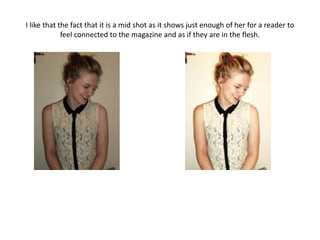
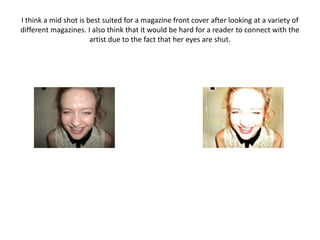
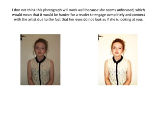
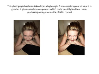
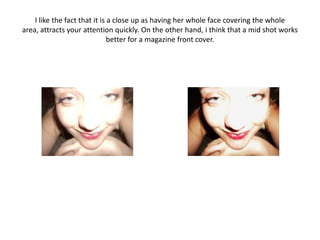
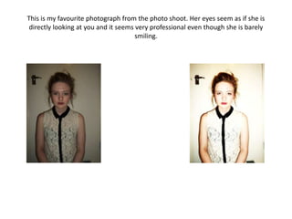
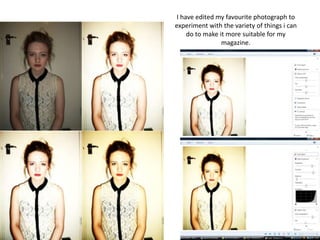
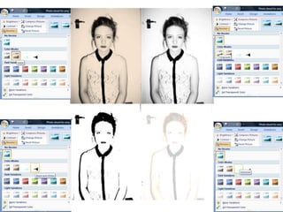
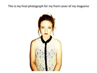
Photo shoot

            Amy Kathryn
I have included the original photo
 and slightly edited photo of each
I like that the fact that it is a mid shot as it shows just enough of her for a reader to
             feel connected to the magazine and as if they are in the flesh.
I think a mid shot is best suited for a magazine front cover after looking at a variety of
different magazines. I also think that it would be hard for a reader to connect with the
                       artist due to the fact that her eyes are shut.
I don not think this photograph will work well because she seems unfocused, which
would mean that it would be harder for a reader to engage completely and connect
  with the artist due to the fact that her eyes do not look as if she is looking at you.
This photograph has been taken from a high angle, from a readers point of view it is
    good as it gives a reader more power...which could possibly lead to a reader
                    purchasing a magazine as they feel in control
I like the fact that it is a close up as having her whole face covering the whole
area, attracts your attention quickly. On the other hand, i think that a mid shot works
                               better for a magazine front cover.
This is my favourite photograph from the photo shoot. Her eyes seem as if she is
 directly looking at you and it seems very professional even though she is barely
                                      smiling.
I have edited my favourite photograph to
experiment with the variety of things i can
     do to make it more suitable for my
                 magazine.
Review of photo shoot and group
                 discussion
Overall I am happy with the photographs I have taken, I have a variety to choose from
    and all, I think link to my indie/mainstream image for my front cover of my music
    magazine.
In my planning for the organisation of my location for this photo shoot, I stated that I
    wanted to photograph Amy in an environment that reflected her and her music.
To see if my target audience agreed with my idea I conducted a group discussion
    consisting of 20 17-24 year olds-my target audience; too see whether they liked
    the idea. Every single person said it was a good idea as it would create a larger
    connection between the reader and the artist. Yet they also agreed that they
    wanted to purchase a magazine that was professional, so possibly my idea
    wouldn't work.
I showed them the photos from my photo shoot and we decided
                                                     that it was
   more important to maintain a professional image therefore a
   blank background was more suitable, yet my idea may work with
   certain artists/bands and certain environments.
Therefore I am gong to going to use Photoshop so create a more professional look and
   take out the “door”.
This is my final photograph for my front cover of my magazine

Photo shoot for Amy

  • 1.
    Photo shoot Amy Kathryn I have included the original photo and slightly edited photo of each
  • 2.
    I like thatthe fact that it is a mid shot as it shows just enough of her for a reader to feel connected to the magazine and as if they are in the flesh.
  • 3.
    I think amid shot is best suited for a magazine front cover after looking at a variety of different magazines. I also think that it would be hard for a reader to connect with the artist due to the fact that her eyes are shut.
  • 4.
    I don notthink this photograph will work well because she seems unfocused, which would mean that it would be harder for a reader to engage completely and connect with the artist due to the fact that her eyes do not look as if she is looking at you.
  • 5.
    This photograph hasbeen taken from a high angle, from a readers point of view it is good as it gives a reader more power...which could possibly lead to a reader purchasing a magazine as they feel in control
  • 6.
    I like thefact that it is a close up as having her whole face covering the whole area, attracts your attention quickly. On the other hand, i think that a mid shot works better for a magazine front cover.
  • 7.
    This is myfavourite photograph from the photo shoot. Her eyes seem as if she is directly looking at you and it seems very professional even though she is barely smiling.
  • 8.
    I have editedmy favourite photograph to experiment with the variety of things i can do to make it more suitable for my magazine.
  • 10.
    Review of photoshoot and group discussion Overall I am happy with the photographs I have taken, I have a variety to choose from and all, I think link to my indie/mainstream image for my front cover of my music magazine. In my planning for the organisation of my location for this photo shoot, I stated that I wanted to photograph Amy in an environment that reflected her and her music. To see if my target audience agreed with my idea I conducted a group discussion consisting of 20 17-24 year olds-my target audience; too see whether they liked the idea. Every single person said it was a good idea as it would create a larger connection between the reader and the artist. Yet they also agreed that they wanted to purchase a magazine that was professional, so possibly my idea wouldn't work. I showed them the photos from my photo shoot and we decided that it was more important to maintain a professional image therefore a blank background was more suitable, yet my idea may work with certain artists/bands and certain environments. Therefore I am gong to going to use Photoshop so create a more professional look and take out the “door”.
  • 11.
    This is myfinal photograph for my front cover of my magazine