Runchart
- 1. Run Chart
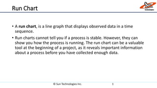
• A run chart, is a line graph that displays observed data in a time
sequence.
• Run charts cannot tell you if a process is stable. However, they can
show you how the process is running. The run chart can be a valuable
tool at the beginning of a project, as it reveals important information
about a process before you have collected enough data.
© Sun Technologies Inc. 1
- 2. Using run charts to detect "special causes" of variation:
• If you have 5 points or more in your data series, you can use run
charts to detect special causes - something beyond the usual
variability of the process -acting on the process.
• If you see 3 points or more consecutive points on one side of the
center line that indicates that a special cause has influenced the
process. Points on the center line don't count.
© Sun Technologies Inc. 2
- 3. © Sun Technologies Inc. 3
29
26
32
34
28
35
24
0
5
10
15
20
25
30
35
40
Palaksha Suprith Vinodh Kamal Surekha Haritha Parimala
No. of Test case executed in a week
Palaksha
Suprith
Vinodh
Kamal
Surekha
Haritha
Parimala
Test cases with 1 to 5
number of test steps
Test cases with more
than 5 number of test
steps
- 4. © Sun Technologies Inc. 4
All blue dots are test cases with 1 – 5 number of test steps.
All brown dots are test cases with more than 5 number of test steps.
Palaksha (29 Test cases) Suprith(26)
Vinodh (32) Haritha(35)
Kamal (34)
Surekha (28)
Parimala (24)
- 5. © Sun Technologies Inc. 5
Dotted line indicates base line.
If graph goes above base line, it means that the employee is more efficient, i.e. executed more number of test
cases.
If graph goes below base line it means that the employee is less efficient, i.e. executed less number of test cases.