
Recommended
More Related Content
What's hot
What's hot (20)
Viewers also liked
Viewers also liked (12)
Similar to Digipak analysis 8
Similar to Digipak analysis 8 (20)
More from SirAtko
Recently uploaded
Recently uploaded (20)
Digipak analysis 8
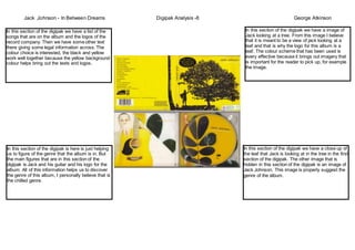
- 1. Jack Johnson - In Between Dreams Digipak Analysis -8 George Atkinson In this section of the digipak we have a image of Jack looking at a tree. From this image I believe that it is meant to be a view of jack looking at a leaf and that is why the logo for this album is a leaf. The colour scheme that has been used is every effective because it brings out imagery that is important for the reader to pick up, for example the image. In this section of the digipak we have a list of the songs that are on the album and the logos of the record company. Then we have some other text there giving some legal information across. The colour choice is interested, the black and yellow work well together because the yellow background colour helps bring out the texts and logos. In this section of the digipak is here is just helping us to figure of the genre that the album is in. But the main figures that are in this section of the digipak is Jack and his guitar and his logo for the album. All of this information helps us to discover the genre of this album, I personally believe that is the chilled genre. In this section of the digipak we have a close up of the leaf that Jack is looking at in the tree in the first section of the digipak. The other image that is hidden in this section of the digipak is an image of Jack Johnson. This image is properly suggest the genre of the album.