1. Magazine Advert Analysis
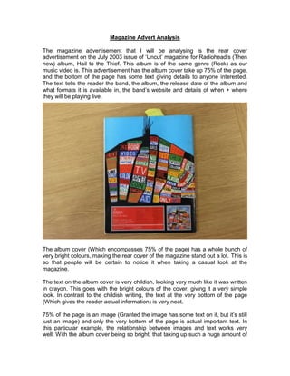
The magazine advertisement that I will be analysing is the rear cover
advertisement on the July 2003 issue of ‘Uncut’ magazine for Radiohead’s (Then
new) album, Hail to the Thief. This album is of the same genre (Rock) as our
music video is. This advertisement has the album cover take up 75% of the page,
and the bottom of the page has some text giving details to anyone interested.
The text tells the reader the band, the album, the release date of the album and
what formats it is available in, the band’s website and details of when + where
they will be playing live.
The album cover (Which encompasses 75% of the page) has a whole bunch of
very bright colours, making the rear cover of the magazine stand out a lot. This is
so that people will be certain to notice it when taking a casual look at the
magazine.
The text on the album cover is very childish, looking very much like it was written
in crayon. This goes with the bright colours of the cover, giving it a very simple
look. In contrast to the childish writing, the text at the very bottom of the page
(Which gives the reader actual information) is very neat.
75% of the page is an image (Granted the image has some text on it, but it’s still
just an image) and only the very bottom of the page is actual important text. In
this particular example, the relationship between images and text works very
well. With the album cover being so bright, that taking up such a huge amount of
2. the page makes people notice the advertisement, and the small amount of space
left out at the bottom of the page is just enough to fit all of the important
information.
The bright colours and crayon-like text don’t particularly indicate any one genre
of music. If anything, it seems to point more towards Pop (Being very bright and
happy) or Punk (Viewed as very archaic which goes with the very scruffy text) as
opposed to Rock. Even so, the bright colours just help to make the advert stand
out.
There is nothing on the advertisement images that scream “This is a Radiohead
Advertisement” except for the small text at the bottom of the page of course.
Though Radiohead are known for album covers that are very bright and very
alternative (Which this is) so fans of Radiohead may recognise it.
A record label logo for Parlophone is present on the advertisement, but it is so
very tiny that some people might not even notice it. Some of the informational
text says “New album” which indicates that this is not Radiohead’s first album,
and website addresses and phone numbers are shown for people who want to
buy or research the album.