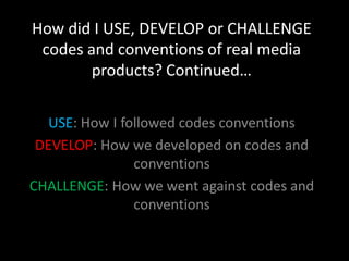
1. How did I USE, DEVELOP or CHALLENGE
codes and conventions of real media
products? Continued…
USE: How I followed codes conventions
DEVELOP: How we developed on codes and
conventions
CHALLENGE: How we went against codes and
conventions
2. Ancillaries- TOWIE
The posters and advertisements for The Only
Way is Essex are very structured and
posed, they are all wearing lots of make-up
and have their hair done making them look
glamorous. Most of the poses are used to
represent the character’s personality, such as
Georgina’s winking pose showing she’s
flirty, or Gemma’s pose suggesting she may
be dumb, which fits into the dumb blonde
stereotype of Essex.
3. The character’s almost all have different poses which shows off
their individual personality. This represents the character
stereotype's in the soap, this is a convention used in a lot of TV
reality shows as the advertising can be focused more on the
character’s other than the story lines at that time.
An example of this is in Keeping up with the Kardashian’s at the opening
where the family are getting ready for a photo shoot.
http://www.youtube.com/watch?v=UnJlzfZrbiQ
Kendal and Kylie are back to back showing they are close to each other,
they use their hands as a gun showing their young children.
Kim is posing in the middle showing she is the most famous and wants to
be centre of attention indicating she’s also vain.
4. Ancillaries- Well Jel
The yellow on the background of Hannah
and Rowan show the cheerful and happiness
of the characters
Megan’s winking pose suggests
her character is flirty
Hannah’s pose is more humorous
implying she is the ‘funny’
character in the series.
Ollie is winking and pointing at the
camera indicating he is confident
and possibly arrogant and the
pose and the pink colour in the
background that he’s a ladies man.
5. I used block bright colours for the
background, different for each pictures to The title ‘Well Jel’ lets the audience know
separate each character . The bright what the soap is called, and what day and
colours connote a party feel, relating to time they can catch the show. I used this
Well Jel as it’s supposed to be a party and Serif font as I felt it matched the
upbeat type reality show glamorous feel to Well Jel.
The ITV logo shows
what channel
audiences can watch
the soap on and
shows off the brand
identity. to have it
next to the other text
is a convention for
soap posters and title
cards.
6. TOWIE’s Well Jel
These posters are very similar, as we chose to use
this TOWIE poster to imitate as we thought it would
be the easiest and most effective poster to create.
We also liked this idea from TOWIE of the
characters sitting on the fancy sofa, however we
didn’t think we could do this as effective and
because of expenses.
8. We chose the title
Glamorous as we thought
that it would match the
glamour of our soap. The
font of the Masthead is also
similar to Fabulous, and is
sophisticated.
Some of my blog
posts also help
answer this We used the pull-out
question quote as it’s a
http://rowankirby convention for the main
a2media.blogspot feature, as he’s a ladies
.co.uk/2012/11/a man we chose for him
ncillary- to ‘say’ this.
planning_23.html