Monogram Decor - Brand Guidelines
•
1 like•1,188 views

In early 2014, Skout It helped launch Monogram Decor for Courtney Lake Interior Design. Our scope included naming the firm, branding, website design, and email marketing.

Recommended
More Related Content
What's hot
What's hot (10)
Viewers also liked
Viewers also liked (20)
Similar to Monogram Decor - Brand Guidelines
Similar to Monogram Decor - Brand Guidelines (20)
More from Luxury Lifestyle Decor
Recently uploaded
Recently uploaded (20)
Monogram Decor - Brand Guidelines
- 2. CONTENTS Unacceptable Logo Usage Logo & Icon Minimum Size Logo & Icon Clear Space The Logo & Icon 6 Secondary Graphic Usage Secondary Graphic 8 Acceptable Logo Usage 5 7 4 3 2 Logo & Icon Applications About Monogram 1 Primary Print Typeface 10 Color Palette Secondary Graphics Color Palette 9 Typography AMONOGRAM BRAND ST YLE GUIDE
- 3. ABOUT MONOGRAM 1MONOGRAM BRAND ST YLE GUIDE Monogram Decor is my attempt at making an indelible imprint on the design landscape. It encompasses my design firm (Courtney Lake Interiors) , my staging and photo styling business (CLIC) and lifestyle writing/speaking engagements. It’s a young and fresh approach to decorating that doesn’t worry about perfection. It’s about allowing the best of the client to shine in whatever project we are working on. “Progress is impossible without change, and those who cannot change their minds cannot change anything.” - George Bernard Shaw
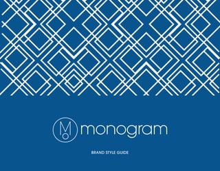
- 4. The Monogram logo is a symbol of elegance and precision. The logo has two different versions, a positive and reverse. Use each one independently. Position, sizing, color, and the proportions of the logo are predetermind and should never, under any circumstances, be altered. In certain situations, the logo icon can be utilized on its own. Be advised the icon should be accompanied by the full Monogram logo. When color is not available, the logo can be changed to grayscale or black. Preferably, use the Monogram gray as listed on page 10. 2MONOGRAM BRAND ST YLE GUIDE THE LOGO & ICON
- 5. The clearspace for the full logo applies to the icon as well. Clear space is the area around the logo that should be free of all other symbols, text or other graphic elements. Clear space is defined by the height of “m” in the logo. A minimum clear space requirement has been established to ensure the clarity of the Monogram logo. 3MONOGRAM BRAND ST YLE GUIDE LOGO & ICON CLEAR SPACE
- 6. Minimum size refers to the smallest size at which the Monogram Logo may be reproduced and still maintain legibility. Don’t forget to constrain proportions when scaling the logo, small or large. To ensure its legibility, the minimum reproduction size of the Monogram Logo is .38” x 1.75” for print applications. The size needs to be increased for web applications. The dimensions are 48 px x 168px for web and electronic media. 4MONOGRAM BRAND ST YLE GUIDE LOGO & ICON MINIMUM SIZE .38”.38” 1.75” .38” 48px48px 168px 48px
- 7. 5MONOGRAM BRAND ST YLE GUIDE ACCEPTABLE LOGO & ICON USAGE Utilize the positive version on white backgrounds. Scale the logo proportionally. Utilize the reverse version on solid colored backgrounds. Darker, solid colored backgrounds work best. Include the icon to reinforce the brand. The icon should be used as a secondary logo, meaning the main Monogram logo should also be included in the design (where applicable). This is some dummy text. Perhaps a description of something and some words about another thing.
- 8. NOTE: SOME, NOT ALL, COMMON MISUSES ARE SHOWN ON THIS PAGE. 6MONOGRAM BRAND ST YLE GUIDE UNACCEPTABLE LOGO USAGE Don’t make the seperate elements of the logo different colors. Don’t rearrange individual logo elements. Don’t use the positive logo over any colored or textured background. Don’t scale the signature unproportionally. ALL OF THESE RULES CAN BE APPLIED TO THE ICON AS WELL.
- 9. The secondary graphic for the Monogram brand is this dynamic and flexible pattern. It can be incorporated into any design, or left out for a more clean look. The pattern must touch at least two corners of the page. Try not to create any distracting points of conflict around the edges. The pattern can be scaled accordingly to meet design needs. 7MONOGRAM BRAND ST YLE GUIDE SECONDARY GRAPHIC FULL PATTERN SHOWN
- 10. Above is a good example of incorporating the pattern into a design. The pattern reaches at least two corners and no unfinished edges are showing. The composition, overall, is nice with no visual tension. Here is an example of what not to do with the secondary graphic in a design. The edges of the pattern are showing, there are several points of visual tension and the logo is hard to read. Always keep in mind the clear space for the logo. 8MONOGRAM BRAND ST YLE GUIDE SECONDARY GRAPHIC USAGE
- 11. MONOGRAM GREY CYMK: 58,42,35,5 RGB: 117,130,142 HEX: 75828E The primary color palette for the Monogram brand consists of two bold colors. Using white to accompany these colors will make the brand stand out. With every design comes the opportunity to include some other secondary colors, but sticking to the primaries will carry our brand. Secondary colors should be deep, and rich in saturation. No pastels or cream tones. 9MONOGRAM BRAND ST YLE GUIDE PRIMARY COLOR PALETTE RGB: HEX: MONOGRAM BLUE CYMK: 99,72,19,4 0,84,141 00548D
- 12. Electronic communications (e.g. Word documents and Powerpoint presentations) may utilize the same typeface. For web, If Avant Garde Gothic is not available, a generic san serif may be used. The Avant Garde Gothic family is the primary typeface for all our brand communications. A variety of weights shown above will provide versatility and flexibility in layouts. Different weights can be applied depending on the paper material, layout, and overal design. ITC AVANT GARDE GOTHIC Ab Medium 8pt ABCDEFGHIJKLMNOPQRSTUVWXYZ abcdefghijklmnopqrstuvwzyz 1234567890 Super 8pt ABCDEFGHIJKLMNOPQRSTUVWXYZ abcdefghijklmnopqrstuvwzyz 1234567890 Demi 8pt ABCDEFGHIJKLMNOPQRSTUVWXYZ abcdefghijklmnopqrstuvwzyz 1234567890 Book 8pt ABCDEFGHIJKLMNOPQRSTUVWXYZ abcdefghijklmnopqrstuvwzyz 1234567890 Extra Light 8pt ABCDEFGHIJKLMNOPQRSTUVWXYZ abcdefghijklmnopqrstuvwzyz 1234567890 PRIMARY PRINT TYPEFACE 10MONOGRAM BRAND ST YLE GUIDE