Logo Application Guide
These corporate guidelines are applicable to
all documentation, both printed and electronic,
for Director 2 Director and where the company
logo is used.
To obtain logos or for further information,
please contact Digital Glue
www.digitalglue.eu | hello@digitalglue.eu
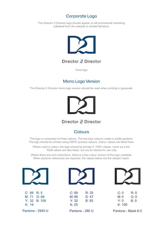
Corporate Logo
The Director 2 Director logo should appear on all promotional marketing
collateral from the website to printed literature.
Mono Logo Version
The Director 2 Director mono logo version should be used when printing in greyscale.
Colours
The logo is composed of three colours. The two blue colours create a subtle gradient.
The logo should be printed using CMYK process colours. Colour values are listed here.
Where used in colour, the logo should be printed in 100% values, never as a tint.
RGB values are also listed, but are for electronic use only.
Where there are print restrictions, there is a two colour version of the logo available.
When pantone references are required, the values below are the closest match.
Core logo
C:
M:
Y:
K:
Pantone - 2945 U Pantone - 280 U Pantone - Black 6 C
99
71
32
19
R: 5
G: 68
B: 109
C:
M:
Y:
K:
C:
M:
Y:
K:
99
88
32
25
0
0
0
100
R: 35
G: 47
B: 93
R: 0
G: 0
B: 0
Exclusion zone
Where the logo is used, a clear exclusion zone
around it should be respected to enhance the
design and prevent the logo being cluttered.
This area, defined by the width of the graphic
element, must be kept free of all other text or
graphical elements. This is shown here.
The logo must not be separated into its component
parts and the aspect ratio of the logo must never
be altered. The logo must always be used in its
normal, horizontal orientation. See the “Things
to Avoid” section for more information.
Minimum size
The logo may be reproduced at any size, but should
never be used smaller than its minimum size shown -
30mm wide for the logo including title,
15mm wide for the logo in acronym form.
Please maintain the logo proportions and
ensure legibility is never compromised.
15mm
30mm
Typefaces
For all company documents and designs please use Arial,
For all designs referencing the logo, Sk-Modernist may be used.
Sk-Modernist
Arial
a b c d e f g h i j k l m n o p q r s t u v w x y z
Backgrounds
Where possible, the logo should always be used on a white or pale
background ensuring that the exclusion zone is respected.
Useage of company name
In company documents, Director 2 Director should be displayed in full in the first
instance with the acronym followed in brackets, Director 2 Director (D2D). Director 2
Director can be shortened to D2D for future references in the same document.
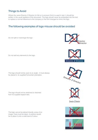
Things to Avoid
Where the name Director 2 Director (in full or in acronym form) is used in text, it should be
written in the usual typeface of the document. The logo should never be embedded into the text
to replace a normal reference to the company or the font changed to mimic the logo.
The following examples of logo misuse should be avoided
Do not split or rearrange the logo.
Do not add any elements to the logo.
The logo should not be used at an angle - it must always
be placed in its supplied horizontal orientation.
The logo should not be stretched or distorted
from its supplied aspect ratio.
The logo cannot be placed directly ontop of an
image. Care must be taken. A solution would
be to place it onto a solid band of colour.

Director 2 Director Logo Guide

  • 1.
    Logo Application Guide Thesecorporate guidelines are applicable to all documentation, both printed and electronic, for Director 2 Director and where the company logo is used. To obtain logos or for further information, please contact Digital Glue www.digitalglue.eu | hello@digitalglue.eu
  • 2.
    Corporate Logo The Director2 Director logo should appear on all promotional marketing collateral from the website to printed literature. Mono Logo Version The Director 2 Director mono logo version should be used when printing in greyscale. Colours The logo is composed of three colours. The two blue colours create a subtle gradient. The logo should be printed using CMYK process colours. Colour values are listed here. Where used in colour, the logo should be printed in 100% values, never as a tint. RGB values are also listed, but are for electronic use only. Where there are print restrictions, there is a two colour version of the logo available. When pantone references are required, the values below are the closest match. Core logo C: M: Y: K: Pantone - 2945 U Pantone - 280 U Pantone - Black 6 C 99 71 32 19 R: 5 G: 68 B: 109 C: M: Y: K: C: M: Y: K: 99 88 32 25 0 0 0 100 R: 35 G: 47 B: 93 R: 0 G: 0 B: 0
  • 3.
    Exclusion zone Where thelogo is used, a clear exclusion zone around it should be respected to enhance the design and prevent the logo being cluttered. This area, defined by the width of the graphic element, must be kept free of all other text or graphical elements. This is shown here. The logo must not be separated into its component parts and the aspect ratio of the logo must never be altered. The logo must always be used in its normal, horizontal orientation. See the “Things to Avoid” section for more information. Minimum size The logo may be reproduced at any size, but should never be used smaller than its minimum size shown - 30mm wide for the logo including title, 15mm wide for the logo in acronym form. Please maintain the logo proportions and ensure legibility is never compromised. 15mm 30mm Typefaces For all company documents and designs please use Arial, For all designs referencing the logo, Sk-Modernist may be used. Sk-Modernist Arial a b c d e f g h i j k l m n o p q r s t u v w x y z a b c d e f g h i j k l m n o p q r s t u v w x y z Backgrounds Where possible, the logo should always be used on a white or pale background ensuring that the exclusion zone is respected. Useage of company name In company documents, Director 2 Director should be displayed in full in the first instance with the acronym followed in brackets, Director 2 Director (D2D). Director 2 Director can be shortened to D2D for future references in the same document.
  • 4.
    Things to Avoid Wherethe name Director 2 Director (in full or in acronym form) is used in text, it should be written in the usual typeface of the document. The logo should never be embedded into the text to replace a normal reference to the company or the font changed to mimic the logo. The following examples of logo misuse should be avoided Do not split or rearrange the logo. Do not add any elements to the logo. The logo should not be used at an angle - it must always be placed in its supplied horizontal orientation. The logo should not be stretched or distorted from its supplied aspect ratio. The logo cannot be placed directly ontop of an image. Care must be taken. A solution would be to place it onto a solid band of colour.