Download as PDF, PPTX


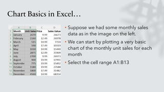
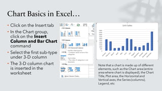
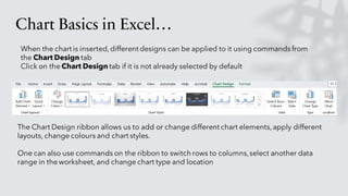
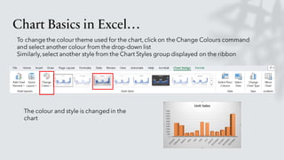
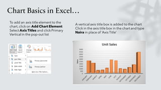
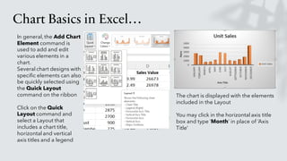
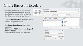
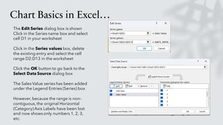
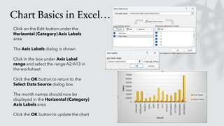
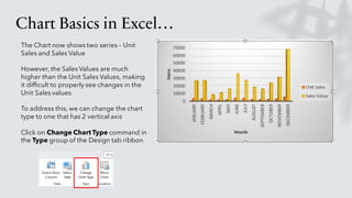
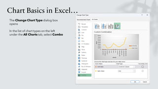
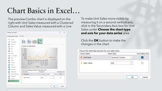
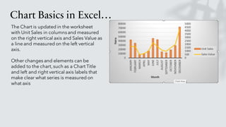
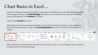
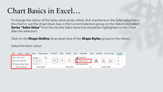
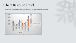

The document provides an overview of creating and formatting charts in Excel. It describes how to insert different chart types from worksheet data, format chart elements like titles and axes, change colors and styles, select new data ranges, and edit chart types. Examples demonstrate creating column, bar, and combo charts from sample sales data and formatting elements like data series colors.