1. Jake Sandham
Masthead- Times New
Roman makes it look
classic like is been
around for a long
time.
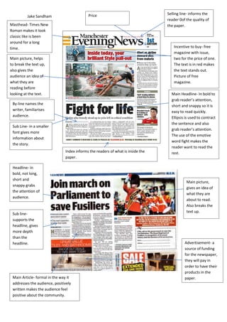
Main Headline- In bold to
grab reader’s attention,
short and snappy so it is
easy to read quickly.
Ellipsis is used to contract
the sentence and also
grab reader’s attention.
The use of the emotive
word fight makes the
reader want to read the
rest.
Sub Line- in a smaller
font gives more
information about
the story.
By-line names the
writer, familiarises
audience.
Selling line- informs the
reader 0of the quality of
the paper.
Incentive to buy- free
magazine with issue,
two for the price of one.
The text is in red makes
the text stands out.
Picture of free
magazine.
Price
Index informs the readers of what is inside the
paper.
Advertisement- a
source of funding
for the newspaper,
they will pay in
order to have their
products in the
paper.
Main picture,
gives an idea of
what they are
about to read.
Also breaks the
text up.
Main picture, helps
to break the text up,
also gives the
audience an idea of
what they are
reading before
looking at the text.
Headline- in
bold, not long,
short and
snappy grabs
the attention of
audience.
Sub line-
supports the
headline, gives
more depth
than the
headline.
Main Article- formal in the way it
addresses the audience, positively
written makes the audience feel
positive about the community.
2. Jake Sandham
+
Masthead- Times
New Roman makes
it look classic like is
been around for a
long time.
Sub line- in a smaller
font than the
masthead and gives
the audience a brief
insight of what they
are about to read.
Main body of text, put
into columns sticking to
the conventions of most
newspapers, it is in a
small font and reads
sophisticatedly.
The price is clearly
displayed and sticks to the
conventions of normal
newspapers by the way it
is in the top right hand
corner.
Advert on the main page of
the newspaper and also
relates to the main picture
as it is about the hospital.
Main advert; conventionally
in the bottom right hand of
the paper. It also applies to
the readers as they will
mostly be middle aged
home owners.
Local sportswoman
main picture, it is
quite large, fits half
of the page not
therefore there is not
too much text and it
is not too boring to
read.
Main headline, in a
bold font, uses
alliteration and also is
short and snappy so it
catches the reader’s
attention.
Main body of text,
in a smaller font
and describes the
picture. Set in one
column to the right
hand side which is
conventional in
most newspapers.
Explains what the
picture is and who is in
the picture, it also can
explain some of the
story.
3. Jake Sandham
The main picture is at the
top of the page, which is
the most eye capturing
place. The text relates to
the picture and is in red
bold; therefore it
captures the reader’s
eye.
The main headline is in
bold large font, and covers
most of the page; this
catches the reader’s eye
and is one of the main
selling points of the
newspaper. The advertisement covers
the whole bottom of the
newspaper. It is advertising
credit cards which also target
the middle aged audience.
The website is displayed
under the title of the
newspaper and catches the
audience’s eye. Therefore
they might visit the site.
The name of the newspaper
is the largest font, and is
conventional of most other
newspapers as it uses the
name ‘advertiser’.