1. DRAFTS ANNOTATED
CONTENTS PAGE INITIALE IDEAS:
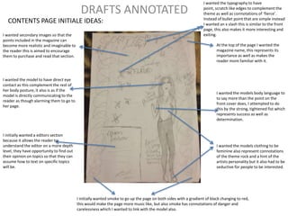
I wanted secondary images so that the
points included in the magazine can
become more realistic and imaginable to
the reader this is aimed to encourage
them to purchase and read that section.
I wanted the model to have direct eye
contact as this complement the rest of
her body posture, it also is as if the
model is directly communicating to the
reader as though alarming them to go to
her page.
I initially wanted a editors section
because it allows the reader to
understand the editor on a more depth
level, they have opportunity to find out
their opinion on topics so that they can
assume how to text on specific topics
will be.
I wanted the typography to have
point, scratch like edges to complement the
theme as well as connotations of ‘fierce’.
Instead of bullet point that are simple instead
I wanted an x slash this is similar to the front
page, this also makes it more interesting and
exiting.
At the top of the page I wanted the
magazine name, this represents its
importance as well as makes the
reader more familiar with it.
I wanted the models body language to
to say more than the point on the
front cover does, I attempted to do
this by the strong, tightened fist which
represents success as well as
determination.
I wanted the models clothing to be
feminine also represent connotations
of the theme rock and a hint of the
artists personality but it also had to be
seductive for people to be interested.
I initially wanted smoke to go up the page on both sides with a gradient of black changing to red,
this would make the page more music like, but also smoke has connotations of danger and
carelessness which I wanted to link with the model also.
2. FRONT COVER INITIAL IDEAS:
I wanted the masthead typography to
have Sharpe edges so that it
complements the theme of rock, at the
end of the edges it wanted it to continue
into a claw scratch this represent the
connotations of fierce. I wanted the font
of the masthead to be big so that it
stands out and is eye catchy as well as
for the audience to identify.
I wanted to add social networking sites as the age
I target my magazine to are aware and are
frequent users of the networks, they would also
allow the magazine to post and update its loyal
target audience about new issues and hot topics
coming up.
I wanted to use sub stories so that the
magazine appeals to wider audience
not only people who relate to the main
cover story, the sub stories also maker
the magazine more interesting
therefore it can gain new audience. I
aimed to make the stories appeal to my
target audience for example “the hot
list”.
The barcode and date are general convention of
magazine, the date shows it is current issue this is important if
attempting to appeal to new audience as they would be
unaware of past or present issues.
I wanted the artist to be strong
and fierce looking for the front
cover one way I tried to
represent this is by the direct
eye contact.
I wanted the main story to be above
the artist and in the middle, this makes
it easy for the reader to link the story
with the main image as well as its font
will be larger to be more eye catchy
this represents it to be more important
as it is the cover story.
3. DOUBLE PAGE SPREAD IDEAS:
I wanted the artist name to be at the top of the page this
suggests that the article will be all about the artist, I also
wanted the typography to be feminine this is a contrast to the
front cover. This change represents the different aspects of the
artist.
I wanted the eye contact to be
towards the text this represents the
text importance, also it brings the
two pages together.
wanted to have two columns of
text, each paragraph to be
shaped getting smaller this adds
to the feminine effect. I initially
wanted the text colour to be red
this was to complement the ideas
of the colour red for example
being passionate which is what
the text explains about the artist.
wanted the first letter of the
first paragraph to start a font size
bigger compared to the rest of
the text, this represents the
nterviews significance.
I wanted a quote from the interview to be
highlighted, this is to generate interest by
finding out what is included inside. This quote is
supposed to sum up the interview.
I wanted the model to be
seductive and passionate for
example the colour red lipstick
suggests these connotations.
I initially wanted smoke
appearing from the model
going on to the next page this
would bring the pages
together but also it is similar
to the content page smoke
also.
I wanted a second to show different camera shots and ideas for
example the initial image idea was for the artist to be powerful in
her posture as well as seductive, to also acknowledge the reader by
direct eye contact and to be feminine by the loose hair. This image
represents the meaning behind the interview for example the artist
character being strong, power and determined to have gone
through her past and now those qualities are needed for her future.