
Recommended
More Related Content
What's hot
What's hot (20)
Viewers also liked
Similar to Titanic
Similar to Titanic (20)
More from Mimi Lai
Recently uploaded
Recently uploaded (20)
Titanic
- 1. TITANIC MIMI
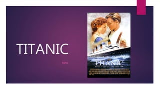
- 2. The font type for this is a serif font which looks quite formal. Because they are talking about the facts and really want people to know this person seriously. Also they are all in capital letters which shows this information is really want you to realize it so they pointed them out. This is really eye- catching and standout from other text, so people will realize it and have a chance to think about watching the film. Advertising technique: the famous director who has many famous productions like here say: ALIENS, T2 and TRUE LIES. This is a USP to attract more audiences who are those film’s fans before and they will know this director and believe his this production will be as good as previous one. . All the words are serif font which shows this film is quite formal and serious, do not have comedy elements in it and people might have a guess the ending of it is not perfect. Also they are all in capital letters which they want them to stand out and attract people’s attention. They are all in white which is easier for people to see and separate from the background colour. The title is the most important one. The title is a name and under the ship, so maybe that is the ships’ name. Celebrity: he is a famous American actor. He has many other good productions like-the quick and the dead! This is an USP to attract more audience like his fans and this is a advertising skills to make the films more powerful and competitive because people usually think the film which has most celebrity will be better then others who does not have many famous actors.
- 3. Film company or credits and any other sponsors. These symbols show those companies are get involved into this film which can involved into this film which can give people more confidence to believe this film is good, because people always think the public praise is very important. Also if these companies had published any other successful films before, then this can let more people who watch it because they will believe that this film will as good as last one, so if the companies are really successful and famous, this is another USP to help this film to attract more audiences as people always think the famous one is the best one, also for the funding as well. The tag line gives us clue to know the basic narrative about what is happening. It under the title which shows they want people to look at it spot them under the title where people can see it quite easy. It said: noting on the earth could come between them. Clearly, this is a love, romantic movie which is talking about this couple’s love story. Nothing in earth shows that it might be really horrible. Their background is a sea and a ship with spindrift, so maybe is an accident was happen in this journey . This can give clue to people to interested in and attract people who love this type of film. The size of the fonts for character’s names are different and looks special as different letters are in different size which makes it interesting to read and eye-catching for people, audiences can notice them easily. This information is position on the top of the film poster, which let people see it in the first eye therefore which let us know this is a really important USP to attract audiences. The second things they will see is the image, and then is the celebrity’s name , fettle of the film and tag line.
- 4. The colour of this poster is yellow and golden on the top and behind the two characters and dark blue at the bottom. This shows that there is warm because they are holding each other’s hand in yellow area, but accident is cruel and cold which shows the dark colour with blue. The blue might refer to the sea which shows the accidents was happened on the sea. The colours gives the feeling of the poster and imply many potential meanings for audiences, let them feel interesting about the actual story. These two main image was the most beautiful point to attract point audiences; really beautiful and romantic. They are holding hands and nearly kiss to each other which is the gesture that lovers always do stereotypically; which shows the romance which show the gene of this film is romantic as well. Their face might makes people recognize them and want to see their film. The rule of third can let us see them clearly, so they are important for people to see and attract people’s eye in the first because the size and the position(top). They gives the main characters of this film which is an important part of the information and they looks nice and have well- looking appearance which might especially aim to the audiences who are materialistic like aspire. This is another celebrity as well, which is another USP in advertising skills and marketing to attract more audiences especially her or his fans; also it helps to promote the film, build its reputation better by using the character’s reputation. This actress is really famous and come from UK. So maybe the home town countries’ people would like to supports her and watching the movies.
- 5. END