2. Reasons To Go Mobile
• To reach a bigger audience
• For better user experience
• Your regular website is not going to cut it
• To Interact And Engage with more people
• There are more than 4.6 billion mobile
phones in the world.
• You’ll appear in search
engine database, which new users
to find you.
• Mobile web will overtake the desktop
within 5 years
• 93% of U.S. adults own a cell phone
2
3. Mobile Site V.S. Web Site
• Mobile Site Screen Resolution = 320 x 480
• Web Site Resolution = 1024 x 768
• Web Site = Wide Variety of Content
• Mobile Site = Crucial Content And Features
3
4. 10 Tools To Build A
Mobile Site
• Wapple
• Modify Studio
• Wirenode
• Mobi10
• bMobilized
• Mofuse
• MobilePress
• Mobile Pluglin
• Mobile Joomla
• Magenta Mobile
4
5. Essential Mobile Site
Design Features
• Prioritize content & features based on Users needs
• Vertical Instead Of Horizontal Navigation
• Less Hypertext
• Use Bars, Tabs, Or Buttons
5
17. PRODUCED BY:
MISS V
MISS V INC
WWW.MISSVINC.COM
HTTP://TWITTER.COM/MISS__V_
HTTP://TWITTER.COM/MISSVINC
HTTP://FACEBOOK.COM/MICHELLEVIEYRA
HTTP://FACEBOOK.COM/MISSVINC
17
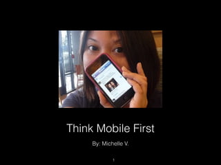
Going Mobile is the new trend. It is time for you start “Thinking Mobile First”. There are more than 4.6 billion mobile phones in the world. 93% of U.S. adults own a cell phone. The mobile web will overtake the desktop within 5 years. Here are reasons why you must take your web site to a mobile platform. Your existence depends on it. \n
Going Mobile is the new trend. There are more than 4.6 billion mobile phones in the world. 93% of U.S. adults own a cell phone. The mobile web will overtake the desktop within 5 years. Here are reasons why you must take your web site to a mobile platform. Your existence depends on it. \n
the biggest challenge in designing a Web site for a smartphone with a 320 x 480 screen resolution is how to cope with this dramatic difference in screen size without sacrificing the user experience.\n\nWeb sites often contain a wide range of content, mobile sites usually include only the most crucial functions and features.\n
These are a list of tools you can use to build mobile site. Its easy to learn. It's easy to use and cost effective.\n
When building a mobile be sure to these crucial concepts in the design: \n\nGive priority to the features & content users are most likely to need when viewing a site using a mobile device.\n\nHypertext is ideal when users click links using a mouse on a computer, but tapping links using your fingers on a touchscreen mobile device is not easy. Users can too easily activate a link they did not intend to tap and accidentally land on an undesired page. This can lead to a bad user experience.\n\nBigger objects such as bars, tabs, or buttons allow users to tap with more precision. It is essential to make the actionable objects on mobile sites big and easily noticeable.\n\n\n
Here is an example of the difference in navigation alignment for a web site and mobile version of the site. Web site usually have horizontal navigation menus as you can see in image of Urban Outfitters Web Page. Web pages have more space where as mobile screens have limited space. It is best use vertical navigation for mobile site design.\n
Hypertext is ideal when users click links using a mouse on a computer, but tapping links using your fingers on a touchscreen mobile device is not easy. Users can too easily activate a link they did not intend to tap and accidentally land on an undesired page. This can lead to a bad user experience. This is Kayak's webpage with hyperlinks\n
As you can see, the mobile doesn't have any hyperlinks. Only buttons and tabs for easy navigation and good user experience.\n
\n
\n
The main reason for the reduction of global and contextual navigation on mobile sites is the limited screen real estate on mobile devices. However, a lack of global and contextual navigation may cause users to find themselves in the middle of nowhere, not knowing where they are. Therefore, it’s essential to reduce hierarchy when organizing the content on mobile sites, so users don’t have to dig too deeply to get things done. They should be able to achieve what they want to accomplish before becoming lost\n
\n
\n
Def Jam's web site is an example of a site that is not mobile friendly.\n
I recommend Def Jam build a mobile site for mobile users that gives priority to the features & content users are most likely to need when viewing a site using a mobile device.\n\nThe design should have vertical menu navigation with following pages\n Vertical Navigation Bar\nAbout Us\nArtist\nNew Releases\nOn Tour\nContact Us\n
Take a look at the following examples. Notice how simplified the Bank of America mobile site version is, making the browsing experience easier for the user. This is a great example of a user friendly mobile version of the original site. It has the most crucial content ad features a user accessing their site from a mobile device might need. \n