
Recommended
More Related Content
What's hot
What's hot (20)
Similar to Constructed Media - The Sun Newspaper
Similar to Constructed Media - The Sun Newspaper (20)
Recently uploaded
Recently uploaded (20)
Constructed Media - The Sun Newspaper
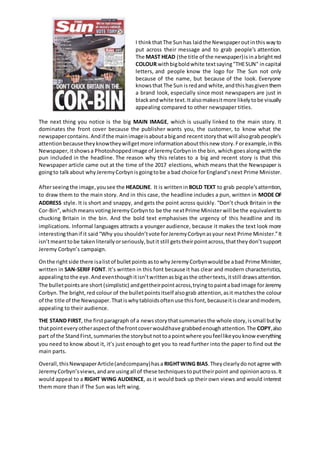
- 1. I thinkthatThe Sunhas laidthe Newspaperoutinthiswayto put across their message and to grab people’s attention. The MAST HEAD (the title of the newspaper)isinabrightred COLOUR withbigboldwhite textsaying"THESUN" incapital letters, and people know the logo for The Sun not only because of the name, but because of the look. Everyone knowsthatThe Sun isredand white,andthishasgiventhem a brand look, especially since most newspapers are just in blackandwhite text.Italsomakesitmore likelytobe visually appealing compared to other newspaper titles. The next thing you notice is the big MAIN IMAGE, which is usually linked to the main story. It dominates the front cover because the publisher wants you, the customer, to know what the newspapercontains.Andif the mainimageisaboutabigand recentstorythat will alsograbpeople’s attentionbecausetheyknowtheywillgetmore informationaboutthisnew story.Forexample,inthis Newspaper,itshowsa Photoshoppedimage of JeremyCorbynin the bin, whichgoesalong withthe pun included in the headline. The reason why this relates to a big and recent story is that this Newspaper article came out at the time of the 2017 elections, which means that the Newspaper is goingto talkabout whyJeremyCorbynisgoingtobe a bad choice forEngland’snext Prime Minister. Afterseeingthe image,yousee the HEADLINE. It is writtenin BOLD TEXT to grab people’sattention, to draw them to the main story. And in this case, the headline includes a pun, written in MODE OF ADDRESS style. It is short and snappy, and gets the point across quickly. “Don’t chuck Britain in the Cor-Bin”,whichmeansvotingJeremyCorbynto be the nextPrime Ministerwill be the equivalentto chucking Britain in the bin. And the bold text emphasises the urgency of this headline and its implications. Informal languages attracts a younger audience, because it makes the text look more interestingthanif it said“Why you shouldn’tvote forJeremyCorbynasyour next Prime Minister.”It isn’tmeanttobe takenliterallyorseriously,butit still getstheirpointacross,thattheydon’tsupport Jeremy Corbyn’s campaign. Onthe rightside there isalistof bulletpointsastowhyJeremyCorbynwouldbe abad Prime Minister, written in SAN-SERIF FONT. It’s written in this font because it has clear and modern characteristics, appealingtothe eye.Andeventhoughitisn’twrittenasbigasthe othertexts,itstill drawsattention. The bulletpointsare short (simplistic) andgettheirpointacross,tryingtopaintabadimage forJeremy Corbyn.The bright,red colour of the bulletpointsitself alsograb attention,asit matchesthe colour of the title of the Newspaper.Thatiswhytabloidsoftenuse thisfont,becauseitisclearandmodern, appealing to their audience. THE STAND FIRST, the firstparagraph of a newsstorythatsummariesthe whole story,issmall butby thatpointeveryotheraspectof thefrontcoverwouldhave grabbedenoughattention.The COPY,also part of the StandFirst, summariesthe storybutnottoapointwhere youfeellikeyouknow everything you need to know about it, it’s just enoughto get you to read further into the paper to find out the main parts. Overall,thisNewspaperArticle(andcompany)hasa RIGHTWING BIAS.Theyclearlydonotagree with JeremyCorbyn’sviews,andare usingall of these techniquestoputtheirpoint and opinionacross.It would appeal to a RIGHT WING AUDIENCE, as it would back up their own views and would interest them more than if The Sun was left wing.