SlideShare a Scribd company logo
1 of 56
1
The table gives information about the female workforce and female managers in five countries.
Summarise the information by selecting and reporting the main features and make comparisons
where relevant.
Percentage of workforce
who are women
Percentage of managers
who are women
Australia 42 41
Egypt 20 12
Japan 41 12
Sri Lanka 37 9
United States 46 43
The given table compares the percentage of women in the total workforce with the percentage of women
employed at managerial positions. Overall it can be seen that the difference is not much marked in
Australia and USA but in the other countries given, there is a lot of difference.
42% of the workforce is comprised of women in Australia and almost an equal percentage (41%) is at
managerial posts. USA has the highest percentage of working women (46%) and a slightly lesser
percentage (43%) is at top positions of managers. Sri Lanka is next in the list with 37% women
employees but only a quarter (12%) workers are managers. Almost similar scenario is there in Japan
where 41% women work but less than a third (12%) work as managers. In Egypt only a fifth of the
workforce comprises of women but only 12% are working as managers.
It can be concluded that USA has the maximum number of women in the workforce and also the
maximum number at managerial posts but Egypt has the least number of working women. The least
number of working women as managers are in Sri Lanka.
Another version
The table lists the percentage of the total workforce and the percentage of managers who are women in
five countries.
The United States has a roughly gender-balanced workforce and women make up about half the
country’s working population (46%). Women in Australia and Japan have similar share of country’s labour
force (42% and 41% respectively). Next comes Sri Lanka with 37% of all workers being women. Finally,
Egypt is where the most striking gender difference is found, there is only one woman for every four men
in the workforce.
Turning to employment at management levels, the United States and Australia have a similar percentage
of managers who are women (43% and 41% respectively), which is only slightly lower than the
corresponding percentage of women in the overall workforce. However, managerial positions in the other
three countries are predominantly occupied by men, as women constitute only 12% of all managers in
both Egypt and Japan, and only 9% in Sri Lanka.
To sum up, Australia and the US have the most balanced gender ratio throughout the workplace and
gender difference is the greatest at management levels in Sri Lanka.
2
The table below shows some data regarding Australia’s nursing employment and total
workforce in 1987 and 2001. Summarise the information by selecting and reporting the
main features and make comparisons where relevant.
Employmentnumber
(1987)
Employmentnumber
(2001)
Changes(%)
Directorof nursing 4,000 5,200 30%
Seniornurses 20,000 16,000 -20%
Juniornurses 39,000 28,000 -28%
Assistantnurses 117,000 112,000 -4%
Total nurse
employment
180,000 162,000 -10%
Total workforce in
Australia
2,728,000 3,378,000 24%
The given table compares the number of nurses of various seniority levels and the total nurses
employed with the total workforce in Australia in 1987 and 2001. It is clear from the graph that
total workforce and the number of Directors of nursing increased over the period of 14 years but
the employment decreased in all other categories of nursing.
In 1987, 4000 Directors of nursing were there but this number increased to 5,200 which was a
change of 30%. The number of senior nurses fell from 20,000 to 16,000 over the period. Junior
nurses decreased from 39,000 to 28,000 which was the biggest negative change of 28%. The
number of assistant nurses decreased marginally from 117,000 to 112,000 and the total nurse
employment decreased from 180,000 to 162,000. The total workforce grew from 2,728,000 to
3,378,000, a change of 24%.
Overall it can be seen that the total workforce increased despite the fact that people working in
the nursing sector decreased.
Another version
The given table shows changes in Australia’s nursing employment between 1987 and 2001. The nursing
workforce represented in this table consists of nurses working at four different levels. It is clear that the
higher the level, the lower the number.
During these 14 years, Australia’s entire labour force grew from 2,728,000 to 3,738,000, an increase of
37%. Despite the impressive growth in the total workforce, however, there was a 10% decrease from
180,000 to 161,000 in the number of employees in the nursing sector.
The vast majority of nurses were working at the lowest level, 1.e. assistant nurses, whose number
remained largely unchanged between 1987 and 2001 (117,000 and 112,000 respectively). However, the
number of senior nurses and that of junior nurses decreased dramatically, the former by 20% from 20,000
to 16,000 and the latter by 28% from 39,000 to 28,000.
The significant drop in employment numbers at lower levels were somewhat compensated by a 30%
increase in the number working in the highest level (director of nursing) from 4.000 to 5,200.
Overall, the table suggests that the development of the nursing employment in Australia was incompatible
with the growth of its total workforce.
3
The table below shows the percentage of households with various electronic items in
1995 and 2002. Summarise the information by selecting and reporting the main features
and make comparisons where relevant.
Electronic goods in New Zealand households
Percentage of households with 1995 2002
Washing machine 97 97
Colour TV 94 98
Computer 49 76
Cell phone 19 60
Video recorder 76 65
Dishwasher 45 54
Digital camera 2 39
The table demonstrates the changes in the ownership rates of selected consumer
electronics in New Zealand households between 1995 and 2002. A comparison of the
variation in ownership shows that the listed items fall into three categories.
In the first category, significant improvements in the ownership of three items can be
observed. Digital cameras were a relatively rare item in 1995, owned by only 2% of New
Zealand families, put the percentage rocketed to 99% seven years later. Cell phones
were also an increasingly common electronic item. There was an approximately three-
fold rise in its ownership from 19% in 1995 to 69% in 2002.
In addition, mere than a quarter of New Zealand families had a computer, up from about
half in 1995. On the other hand, three items saw little change or no change. 54% of the
households had a dishwasher in 2002, an increase of only 9%. Colour TV was only
slightly more prevalent, up from 94% to 99%. Washing machine, however, had the
same ownership rates of 97% in both years. In the third category comes video recorder,
the only item that had its percentage dropped, from 76% to 65%.
In conclusion, modern electronic items showed a more dramatic increase in ownership
while traditional ones had the highest ownership rates.
4
The table below shows the percentage of men and women who travelled to work by
different means of transport in Sydney in 2001. Summarise the information by selecting
and reporting the main events and make comparisons where relevant.
Percentage of people who chose different means of transport to travel to work
Men Women
BUS 32 38
CAR 28 27
MOTORBIKE 5 2
BICYCLE 18 16
ON FOOT 17 17
The table shows five different means of transportation taken to work by people living in
Sydney in 2001. The five ways given are – bus, car, motorbike, bicycle and walking.
As can be seen from the chart, buses were the most common way to travel to work by
both genders in Sydney, although a slightly higher percentage of women than men
chose this as their preferred form of transport (38% and 28% respectively). Cars were
the second most popular, taken by almost an equal percentage of men and women
(28% and 27%).
Motorbike , on the other hand, was the least preferred means of transport for both
genders. Only a small fraction of the population (5% for men and 2% for women)
travelled to work on a motorcycle.
Interestingly, about one third of citizens in Sydney got to their workplace without a motor
vehicle. 18% of men and 16% of women rode a bicycle while 17% of both genders
simply walked.
Overall, citizens in Sydney made good use of alternative methods of transport for going
to work but there was a heavy dependence on buses and cars.
5
The graph below shows the production level of three main types of fuels in the UK from
1981 to 2000. Summarise the information making comparisons where relevant.
The given line graph shows the levels of three types of fuel produced in the UK from
1981 to 2000. It is clear from the graph that the production of oil and natural gas
showed an upward trend but the production of coal showed a downward trend
The first type, petroleum, was produced more than natural gas and coal throughout the
entire given period. The production was approximately 90 million tons in 1981. It peaked
at aver 100 million tons in 1984, but after that there was a gradual increase to reach an
all time high of over 120 million tons in 2000. This steady increase can also be observed
in the production level of natural gas. From 40 million tons in 1981, it climbed upwards
continuously and reached at around 110 million tons in 2000.
The trend in the production level of coal, however, is different from the trend of
petroleum and natural gas. At the start of the period, 80 million tonnes of coal was being
produced, but the level of production fluctuated throughout the period. It dropped
dramatically to just 40 million tonnes in 1984, recovered slightly, to a little over 60 after
1985, and steadily decreased to hit an all time low of just over 20million tonnes in 2000.
To conclude, the production levels of petroleum and natural gas increased during the
period, while that of coal decreased.
6
The charts below show the energy consumption in UK and USA in 2005 and 2011.
Summarise the information by selecting and reporting the main events and make
comparisons where relevant.
Energy Consumption2005
Energy Consumption2011
The given column graphs compares the energy consumption from different sources in the UK
and the USA in 2005 and 2011. In both the given years non-renewable sources provided the
vast majority of energy in both countries.
In 2005, USA obtained more energy from oil and coal than the UK. It procured 37% and 35%
energy from oil and coal respectively whereas UK obtained 30% energy from coal and 25%
from oil. UK relied more than USA on gas, nuclear power and other renewable sources.
In 2011, UK derived maximum energy from gas (36%) whereas the USA mainly used oil (40%).
The oil consumption of both countries increased over the years with figures in the UK rising from
25% to 28% and in the USA from 37% to 40%. The consumption of coal in both countries
decreased and that of natural gas increased over the years. The usage of nuclear power almost
halved in UK in 2006 as compared to that of 2000. It came down from 15% to 8% in UK and
from 8% to 6% in USA. The dependence on other renewable sources was the same in UK in
2011 as in 2005 but in USA the percentage fell slightly.
0
5
10
15
20
25
30
35
40
oil coal gas nuclear
power
other
renewable
sources
%
UK
USA
0
5
10
15
20
25
30
35
40
oil coal gas nuclear
power
other
renewable
sources
%
UK
USA
7
The chart below shows the percentage of the Internet users (males and females) in
2008. Summarise the information by selecting and reporting the main features and
make comparison where relevant.
The given column graph compares the percentage of male and female internet users in
2008. It is clear that males used the internet more for goods and services whereas
females used it more for health information.
65% each of both sexes used the internet for banking and almost an equal percentage
(70%) of both genders played games on the net. Using the net for sending and
receiving e-mails was the most popular activity on the net with about 98-99% using the
net for this purpose. 45% men used the net for health information. In contrast an almost
double number (80%) of women used the net to get health information. Using the net for
goods and services showed an opposing trend to using the net for health information
with 35% women using the net for this purpose as opposed to 75% men.
It can be concluded that using the net for gaming, banking and e-mailing was equally
popular among both genders. The major discrepancy was in using the internet for health
and for goods and services.
65
45
70
75
99
65
80
68
35
98
0
20
40
60
80
100
percentage
Males
Females
8
The charts below show the percentage of men and women in different weight groups in
England between 1993 and 2002. Summarise the information by selecting and reporting
the main features and make comparison where relevant.
The two charts depict the proportion of males and females of England of four different weight
categories over a nine year period starting 1993. The maximum percentage of both genders
was overweight.
In 1993, a little less than half the male population in England (47%) were within the healthy
weight range, but the percentage dropped to 40% in 1998 and continued to decline slightly to
about 38% in 2002. By comparison, the percentage of men who were overweight had an
opposite trend, rising in two stages from 42% in 1993 to 45% in 1998 and finally 46% in 2002.
During the same time, there was a modest increase in the obesity rate in the male population
from 10% to 15% while the proportion of dangerously obese men remained low at about 2%.
The second line graph shows that females had a quite similar trend as men over the same
period. Women who had healthy weight and who were overweight constituted the vast majority
of the female population, while the remaining 15-20% were considered obese or dangerously
obese.
Overall, it is clear that the whole population in England were becoming increasingly overweight
and the obesity rate was constantly higher in the female population than in the male population.
0
10
20
30
40
50
1993 1998 2002
%
Men
healthy weight
overweight
obese
dangerously obese
0
10
20
30
40
50
1993 1998 2002
%
Women
healthy weight
overweight
obese
dangerously obese
9
The chart below shows the changes in car ownership in Great Britain between 1961 and
2001. Summarise the information by selecting and reporting the main events and make
comparisons where relevant.
The given line graph shows the variation in the percentage of households that owned no
car, 1 car and 2 or more cars in Britain during a 40 year period from 1961 to 2001. The
percentage of families with no cars showed a decreasing trend whereas families with
one or two cars increased over the period of four decades.
As can be seen from the chart, cars were a rare item in Britain in 1961, as nearly 65%
of the households did not have a car. Half that percentage of families had 1 car and no
families owned two or more cars.
The next 20 years saw a significant increase in car ownership. In 1981, 15% of British
families owned 2 or more cars while the percentage of families with 1 car reached a
peak at 50%. During the same period, the percentage of households with no cars
decreased sharply to approximately 35%.
From 1981 to 2001, the percentage of households with one car decreased slightly to
about 43%, while that with 2 or more cars kept increasing to about 30% in 2001,
equaling the percentage of families with no cars.
Overall, the proportion families without cars and with two cars showed opposing trends
whereas the families with one car fluctuated over the period.
0
10
20
30
40
50
60
70
1961 1971 1981 1991 2001
Percentageofhouseholds
Car ownership in Britain
no car
one car
two or more cars
10
The graphs below are forecasts of carbon emissions and global temperature change
from 2010 to 2100. Summarise the information by selecting and reporting the main
features, and make comparisons where relevant.
The given two line graphs predict the emissions of carbon in relation to the temperature
changes that may occur by the end of the 21st century. Both graphs make different
predictions about the future.
The first graph predicts that both carbon emissions and global temperature will rise
slowly till about 2060 and after that there is expected to be a sharp rise in both carbon
emissions and global temperature. Both show similar trends throughout the period of
ninety years. The global temperature is forecast to increase by 12.5°C by the year 2100.
In the second graph it is predicted that the carbon emissions would show a sharp rise in
the early part of the century and after that the carbon emissions are estimated to fall
moderately and would be quite less than what they are at present. The global
temperature is projected to increase by 7.5°C by 2100. This graph shows opposing
trends. Despite the downward trend of carbon emissions the temperature rise would
show an upward trend. However, the increase in temperature is predicted to be less
severe.
It is clear from the graphs that carbon emissions are directly related to the temperature
changes and if carbon emissions are curbed then about 5° of temperature rise could be
prevented.
11
The graphs below show the prison population in a European country between 1911 and
2001. Summarise the information by selecting and reporting the main features and
make comparisons where relevant.
The two line graphs show the male and female population from 1911 to 2001 of a prison
in a European country. It is clearly seen that the female inmates were much lesser than
the male inmates throughout the period of nine decades.
As shown in the first line graph, there were 25,000 male prisoners in 1911. In 1921, the
number dropped to approximately 20,000 and leveled out at that point until 1951, after
which it rose gradually back to 25,000 by 1981. After that the number rose sharply
before finally reaching an all time high of 35,000 in 2001.
Turning to the second line graph, it is apparent that the population of female prisoners
was significantly lower, with a highest point of 4500 prisoners at the beginning of the
period. The number fell with fluctuations and reached the lowest point of less than 1500
prisoners in 2001.
Overall, there were more male prisoners than female prisoners. Moreover, the number
of male prisoners increased over the period while that of female prisoners decreased.
12
The graph below shows the percentage of secondary school leavers in Australia who
were employed, unemployed or who pursued further education from 1980 to 2000.
Summarise the information by selecting and reporting the main points and make
comparisons where relevant.
The Graph shows the percentage of secondary graduates who were employed,
unemployed, and who pursued further education from 1980 to 2000. It is clear that the
percentage of those employed and those who went for further education followed
opposing trends whereas those who were unemployed followed a stable trend with
minor fluctuations.
As shown in the graph, the number of students who took up further studies increased
significantly over the period. Their number peaked at around 60% in 1995 before
decreasing to 50% in 2000. The number of students who got employed was around
50% in 1980. In this year the number of employed was higher than those who took up
further education, but the trend reversed over the period and in 1995 it touched an all
time low of 30% after which it recovered again and reached a little over 40% by 2000.
As for the unemployed graduates, the number hovered constantly around 10% all
throughout the period with minor ups and downs here and there.
Based on the graph, it is clear that majority of secondary school graduates either got a
job or took up higher studies, and only a small percentage ended up unemployed.
0
10
20
30
40
50
60
70
1980 1985 1990 1995 2000
%
Australian Secondary School leavers
Employed
Further education
Unemployed
13
The graph below shows the changes in the number of property crimes (e.g. theft) and
violent crimes in the USA from 1982 – 2002. Summarise the information by selecting
and reporting the main features and make comparisons where relevant.
The graph shows the crime rate in the US in terms of property crimes and violent crimes
over a period of two decades starting 1982. From the first glance it is clear that there
are more property crimes than violent crimes in the US.
According to the first line graph the number of property crimes in the US for the entire
given period hovered around the 3000-4000 range. After remaining steady at around
4000 from 1982 to 1986, the number of property crimes dipped continuously for eight
years straight and finally landed at a bit under 3000 in 1994. After that, however, the
number rose to 4000 by I998, and fell slowly to exactly 3000 in 2002.
The second line graph, on the other hand, tells us that the rate of violent crimes is lower
than that of property crimes. The number of violent crimes was between 500 and 600 in
the first decade after which there was a sharp dip in 1994 and the number of crimes
halved and reached 300 per 100,000 population. The violent crimes grew again and
reached around 550 crimes in 2002.
The graphs show us that there was a similar trend of both, petty and violent crimes, and
both were at their lowest levels in 1994.
0
1000
2000
3000
4000
5000
6000
1982 1984 1986 1988 1990 1992 1994 1996 1998 2000 2002
Property crimes per 100,000 population
0
200
400
600
800
1000
1982 1984 1986 1988 1990 1992 1994 1996 1998 2000 2002
Violent crimes per 100,000 population
14
The tables below show the average hours worked by full-time and part-time workers
according to gender in three countries. Summarise the information by selecting and
reporting the main features and make comparisons where relevant.
Full-time work hours per week in Europe in 2002
Country Female Male
Greece 33.5 39
Netherlands 38 38
UK 36.5 43
European Average 36 40
Part-time work hours per week in Europe in 2002
Country Female Male
Greece 24.5 28.5
Netherlands 33 35
UK 30.5 32.5
European Average 29 32
The two given tables compare the number of hours worked by full-time and part-time
male and female workers in three countries of Europe in 2002. It is clear from the graph
that in both categories men worked more hours than women.
If the European average is seen, full time male workers worked 40 hours a week and
women worked 36 hours per week. Part-time work hours were 32 and 29 for men and
women respectively. In UK, the full-time work hours spent by men were the highest (43
hours) where as women spent six and a half hours lesser at work. Among part time
workers in UK the difference between the genders was not so marked. Men and women
spent 32.5 and 30.5 hours respectively in part-time work.
In the Netherlands, both men and women worked equal number of hours (38) in full time
work. However there was a slight difference in part time work hours. The difference of
the part-time and the full-time work hours was most marked in Greece. Men and women
spent 39 and 33.5 hours in full time work but only 28.5 and 24.5 hours/week
respectively in part-time work.
Overall male employees and full timers worked more than their female and male
counterparts. Further, the Greeks worked lesser than the European average, while the
reverse is true for UK workers.
15
The graph below shows the actual and predicted population of Jakarta, Shanghai and
Sao Paulo in 1990 and 2000. Summarise the information by selecting and reporting the
main features and make comparisons where relevant
The bar chart compares the population in Jakarta, Shanghai and Sao Paulo in the years 1990
and 2000, against the figures which were predicted for 2000 in 1990.
Jakarta had the smallest population among the three cities. With 8 million in 1990, Jakarta's
population was predicted to grow to 9 million 10 years later. But the actual figure for the year
2010 was approximately 11 million.
Shanghai is the only city whoso population fell over the 10-year period. In 1990 over17 million
people were living in Shanghai but this number dropped to 16.5 million in 2000. The predicted
population was 16 million.
Sao Paulo had the second largest population of 15 million in 1990, but 3 million people were
added to its population which made it the largest city in 2000. This growth in population was
much faster than previously predicted.
Clearly, the populations of the three cities in 2000 were underestimated.
16
The table below shows energy used in 3 countries in 2000 and the rate of increase as
compared to the year 1999. Summarise the information by selecting and reporting the
main features, and make comparisons where relevant
Energy consumption in millions of tonnes of oil equivalents and the rate of increase
Countries /
consumers
Australia Japan USA
Industry
Increase since 1999
36
28%
159
39%
420
0.9%
Transportation
Increase since 1999
25
23%
96
52%
565
22%
Others
Increase since 1999
31
16%
148
46%
435
15%
Total
Increase since 1999
92
21.5%
403
42.5%
1420
13%
The given table compares the energy consumed in industry, transportation and other
sectors not mentioned in the graph, in three countries in 2000 along with the percentage
increase since 1999. Overall, Australia consumed the minimum energy in all three
sectors.
Australia consumed 36 million tonnes of oil equivalent of energy in the industrial sector
which was far lesser than that consumed in USA and Japan at 420 and 159 million
tonnes respectively. It is interesting to note that even though USA consumed the
maximum energy in this sector, the percentage change in USA was 0.9% since 1999
which implies that a year earlier, it consumed almost the same amount of energy. In
contrast, Japan and Australia consumed lesser energy (159 and 36 million tons
respectively) in this sector than the USA, but the percentage change was much higher
at 39% and 28% respectively.
In transportation sector, again the USA took the lead in consumption (565 million
tonnes). Australia consumed 25 million tonnes whereas Japan used 96 million tonnes.
The percentage change, however, was 23%, 52% and 22% for Australia, Japan and
USA respectively.
In all other areas USA took the lead in consumption of energy (435 million tonnes) and
the percentage change since 1990 was 15%. Australia and Japan consumed 31 and
148 million tonnes energy respectively and the percentage change was 16% and 46%
respectively. The total energy consumption followed a similar trend with USA taking the
lead and Australia following at number 3.
Overall the US consumed the maximum energy, but the percentage change was the
highest in Japan.
17
The graph below shows the households in UK according to the number of family
members between 1981 and 2001. Summarise the information by selecting and
reporting the main features, and make comparisons where relevant.
1981 2001
8% 5%
19%
26%
12%
18%
9% 20%
4% 15%
The given graph compares the household in United Kingdom according to the number
of family members in each household. Overall it is clear from the graph that more than
three persons per family households decreased in numbers over a period of two
decades and one and two member holds increased considerably from 1981 to 2001.
In 1981, a small minority (4%) households had only one person per family but this
number grew to almost four fold and in 2001, 15% single member households were
there. Two-member households also grew considerably from 9% in 1981 to 20% in
2001. Three persons per family households decreased from 18% to 12% over the
period of two decades. Five-member households constituted the maximum number in
1981 at 26%. However, their number fell to 19% by 2001. More than 5 members per
family households had a moderate fall from 8% to 5%.
It is clear from the graph that 2 and 5 member households were almost equal in 2001
and the least number of households had more than 5 members per family. The
More than 5 per family
5 Persons per family
3 Persons per family
2 Persons per family
1 Person per family
18
maximum number of households had 4 members in both the years but this is not
directly given in the graph. It can be inferred by reading between the lines.
The table below shows the number of men and women in a UK city who enrolled in
adult educational courses between 1996 and 2002. Summarise the information by
selecting and reporting the main features, and make comparisons where relevant.
Adult education enrollment
Daytime study Evening /
distance
courses
Male Female Total
enrollment
1996 580 677 310 930 1240
1998 565 615 290 890 1180
2000 540 564 270 834 1104
2002 560 544 285 819 1104
The table shows the number of males who enrolled in adult educational courses in the
UK. The period covered is between 1996 and 2002.
In 1996, there were 1240 students overall. Out of that number, 930 were female and
only a third (310) were males. Two years later the total number decreased to 1180, but
the distribution remained the same with three times more women. In 2000 and 2002, the
total number decreased further to 1104, but the greater percentage still belonged to the
female group.
As for the enrollment in daytime study and evening/distance classes is concerned, the
number of students throughout the period was distributed fairly evenly. Students in
daytime courses ranged between 540 and 580, while those in evening/distance courses
ranged from 540 to 680. However, the decreased noticeably as time went by.
It is clear that there was a decreasing trend for both the number of men and women
throughout the years, but there were more females than males throughout the period.
19
The table below shows the number of workers (actual and predicted figures between
1985 and 2015) with different types of qualifications. Summarise the information by
reporting the main figures and make comparisons where relevant.
Numberof workers (inmillion) withdifferentlevelsofqualifications
Level of
qualification
1985 1995 2005 2015 (predicted)
No qualification 6 4.5 3 1.5
Low qualification 5 6.5 8 8.5
Intermediate
qualification
4 5 5 7.5
Degree holdersor
graduates
6 8.5 11.2 13.5
The given table depicts the actual and estimated figures of workers with different type of
qualifications from 1985 to 2015. Overall it can be seen that the number of workers with no
qualification decreased till 2005 and is predicted to decrease further till 2017 but the figures for
all other categories increased and is expected to increase by 2015.
It can be seen from the graph that 6 million workers had no qualification in 1985. This number
decreased steadily over the period and halved to 3 million by 2005. The projected figures for
this category for 2015 are 1.5 million. This trend is in sharp contrast to the degree holders or
graduates. Their number was also 6 million in 1985 but this almost doubled and reached 11.2
million by 2005. This number is also predicted to rise and reach 13.5 million in 2015.
The employees with low qualification stood at 5 million and grew rapidly to 8 million by 2005.
This number is expected to show a slight increase by half a million by the year 2015. The
people with intermediate qualification were 4 million in 1985 and their number is expected to
almost double and become 7.5 million by 2015.
Overall it is clear from the table that the importance of obtaining a degree is projected to
increase among the workers.
20
The diagram below shows the development of the village of Kelsby between 1780 and
2000. Summarise the information by selecting and reporting the main features, and
make comparisons where relevant.
The given maps illustrate the development of Kelsby village from 1780 to 2000. It can be seen
that radical changes took place in this village over a period of 240 years.
In 1780, four farms can be seen in the centre of the layout. Towards the west of the farms a
river running from the north to south can be seen. Towards the east of the farms there were
woodlands and on the north east there were about a 100 homes.
In 1860, a bridge was constructed over the river and the houses doubled in number. A road was
made to connect the river to the residential area, The farming area halved and most of the trees
from the woodland area were cut off.
In 2000, many shops opened along the river and a wetland for birds developed towards the
south west. Two schools and three sports fields were made. The farms were no longer there in
2000 and in their place another road was built to connect the houses with the schools. The
number of homes grew to 500 in 2000.
21
It can be seen that by 2000, massive changes had taken place in the village of kelsby.
The two maps below show an island before and after the construction of some tourist
facilities. Summarize the information by selecting and reporting the main features, and
make comparisons where relevant.
The given two maps illustrate the changes that took place at an island prior to and after
it was transformed into a tourist destination. It can be clearly seen that many changes
took place at the island.
The first map shows an island with a beach on the west. The total length of the island is
approximately 200 metres. A few trees at odd places can be seen on the whole island.
The second map shows a lot of buildings on the island. A pier can be seen on the
southern side of the island for the tourists to get on and off the boats. The pier leads to
a reception behind which a restaurant is there. On the eastern and western sides of the
reception and restaurants there are huts for the accommodation of tourists.
The huts are connected to each other by footpaths and the footpath also leads to the
beach which the tourists use for swimming. There is also a vehicle track which leads
from the pier to the reception and the restaurant.
22
Overall, there are a lot of changes on the island. It is clear that the once unused island
has been transformed into a popular tourist destination.
The three pie charts below show the changes in annual spending by a particular UK
university in 1981, 1991 and 2001. Summarise the information by selecting and
reporting the main features, and make comparisons where relevant.
The three pie charts show a UK university’s expenditure by category in 1981, 1991 and 2001. It
is clear from the chart that Spending on insurance increased and spending other staff’s salaries
decreased, but the spending on but on all other things fluctuated over the given period of two
decades.
The most significant feature is that salary to teachers and other non teaching staff, was the
major expenditure for this university throughout the 20 year period. The percentage of total
spending on teacher’s salary was between 40% and 55% while that on other staff’s salary
decreased steadily from a third to less than a fifth.
teacher's salary,
40%
other staff's
salary, 33%
resources (e.g.
books), 10%
insurance, 2%
furniture and
equipment, 15% 1981
teacher's salary,
55%
other staff's
salary, 23%
resources (e.g.
books), 12%
insurance, 3%
furniture and
equipment, 7% 1991
teacher's salary,
45%
other staff's
salary, 18%
resources (e.g.
books), 5%
insurance, 8%
furniture and
equipment, 24%
2001
23
The remaining expenditures were divided between smaller items such as furniture equipment,
insurance and resources. Insurance spending continued to grow from 2% of the total spending
in 1981 to 3% in 1991 and 8% in 2001. The percentage of total spending on resource such as
books also increased slightly from 10% to 12% during the first 10 years, but it dropped sharply
to 5% in 2001. Spending on furniture and equipment showed the most dramatic change. After
being reduced by 8% in 1991, it more than tripled to make up about a quarter of the total
amount a decade later.
The graphs below show the percentage of household waste recycled in city between
1992 and 2002. Summarise the information by selecting and reporting the main features and
make comparisons where relevant.
The given bar graph illustrates the percentage of different household wastes recycled
during the period from 1992 to 2002. It is clear that with the passage of time the
recycling of all the given things grew except for the recycling of cans which was lesser
in 1997 than in 1992.
As can be observed from the chart, in 1992, the most recycled household waste are
cans (17%), followed by paper (15%) and glass (15%), then by plastic (10%). In 1997,
the trend reversed. The recycling rate for cans decreased by around 4%, whereas, the
rate for glass, paper and plastic increased to 34%, 32% and 12% respectively.
In 2002, the recycling for all things escalated and about 52% of glass was recycled that
year. It was followed closely by paper at around 46%. 25% of the cans were recycled
and only about 12% of plastic was recycled.
Overall, plastic was recycled the least in all the given years.
0% 10% 20% 30% 40% 50% 60%
Glass
Paper
Cans
Plastic
HouseholdWaste RecyclingRate
2002
1997
1992
24
The graphs below show the life expectancy of people in three countries in 1900, 1950
and 2000 and the proportion of population aged 15 or below. Summarise the
information by selecting and reporting the main features and make comparisons where
relevant.
The given bar graphs depict the life expectancy and the percentage of people under
age 15 during the years 1900, 1950 and 2000. It is interesting to note that the life
expectancy increased in all three countries, whereas the proportion of youngsters below
15 years decreased over the given period of time.
Looking at the first graph, we can see that life expectancy in 1900 was more or less
equal in all the three countries (between 45 and 50 years). In 1950, life expectancy
increased in all three countries, but in country A, it grew the most and in country B it
escalated the least. In 2000 also the life expectancy rose further and became 82, 58
and 65 years for countries A, B and C respectively.
Turning to the second graph, it is interesting to note that although country B had the
lowest life expectancy, it had the highest percentage of people under 15 during 1900
and 1950 (50% and 40% respectively). Country C and country A had 48% and 35% in
0 20 40 60 80 100
Country C
Country B
Country A
Years
Life Expectancy
1900
1950
2000
0 20 40 60
Country C
Country B
Country A
%
Percentage of people aged 15 years old or younger
1900
1950
2000
25
1900, and 37% and 32% of people under the age of 15, in 1950. In 2000, all three
countries suffered significant drops in the percentage of people aged 15 and below.
In conclusion, there seems to be an inverse relation between life expectancy and
percentage of young people in a country.
The diagram and the line chart below show the growth of the city of Alexandria and its
population from 1820 to 1940. Summarise the information by selecting and reporting the
main features and make comparisons where relevant.
The given diagram and line graph show the growth of Alexandria in terms of physical
space and population during the period 1820 to 1940.
The diagram describes how the city of Alexandria’s physical area grew from 1820 to
1940. In 1820, the beginning of the period, the size of Alexandria was 4 km2. The area
then doubled in 1860 and again in 1900. Finally, in 1940, it expanded to 100 km2.
Turning to the line graph, the population of the city remained steady under half a million
from 1820 to 1870. By 1880, the number finally reached to 0.5 million mark. From that
point on, the population climbed steeply to 2.5.million by 1920. By the end of the period,
the city’s population reached to a peak of 2.8 million.
26
The sharp rise in population in 1900 can be attributed to the substantial expansion of
the city’s geographical area during the same period.
The pie chart below shows the main reasons why agricultural land becomes less
productive. The table shows how these causes affected three regions of the world
during the 1990s. Summarise the information by selecting and reporting the main
features, and make comparisons where relevant.
Causes of worldwide land degradation
Causes of land degradation by region
Region % land degraded by
deforestation Over cultivation Over grazing Total land degraded
North America 12 53 22 5%
Europe 31 29 28 23%
Oceania* 8 7 73 18%
* A large group of islands in the South Pacificincluding Australia and New Zealand
The pie chart and the table show the causes and the percentage of land degradation in
three areas namely North America, Europe and Oceania.
The pie chart shows that the causes of land degradation can be classified into three
main causes, namely deforestation, over-cultivation, overgrazing and other factors. As
can be seen from the chart that overgrazing is responsible for the biggest percentage
(35%) of land degradation cases, closely followed by deforestation (30%) and over-
cultivation (28%). The remaining 7% are caused by other factors.
Turning to the table it is clear that Europe experienced the largest percentage of
degradation (23%), and cases are almost equally caused by the top three factors.
Oceania came in second with 18% of land degraded, with 73% due to overgrazing. 5%,
27
the lowest percentage of North American land has degraded and more than half this
percentage is due to over-cultivation.
Overall, it can be concluded that all three factors are almost equally responsible for land
degradation in Europe, overgrazing is the top cause of land degradation in Oceania and
over-cultivation is the major cause of land degradation in North America.
The table below shows the use of three energy sources in the UK, their world reserve
and how many years they are going to last. Summarise the information by selecting and
reporting the main features and make comparisons where relevant.
Percentage of
total energy
supply in the UK
World Reserve
(units)
Expected to last
(years)
Coal 25% 13,530 300
Oil 45% 3,750 30
Uranium 3.5% 560 200
The given table illustrates the percentage of total energy supply in the UK from Oil, Coal
and Uranium along with the world reserve of these in units and also gives the estimate
of the years these sources are expected to last.
45% of the total energy supply in UK is from oil. This is the most used source out of the
three given in the table. However, the world reserve of oil is 3,750 units and if it is used
to this extent it is predicted to last only another 30 years. Coal is the second most
commonly used source of energy with a quarter of the total energy coming from it.
Fortunately the world reserves of coal are still the highest and these 13,530 units are
expected to last another 300 years. Uranium is the least used energy source today
(3.5%) and with 560 reserve units it is expected to last another 200 years.
The table graph depicts that all these resources are not going to last much longer and
alternative renewable sources have to be tapped on a war footing.
28
The graphs below show the percentage of time spent by workers in a typical office in
US in 1980 and 2006. Summarise the information by selecting and reporting the main
features and make comparisons where relevant.
The given pie charts compare the time spent by employees in a typical US office in
1980 and 2006. The most striking feature of the pie charts is that no time was spent on
e-mails in 1980 where as, in 2006 sending and receiving e-mails occupied 9% of the
time.
Time spent on telephone decreased from 12% in 1980 to 6% in 2006. Similarly time
spent talking to colleagues halved from 22% in 1980 to 11% in 2006. Time spent on
managing documents also decreased by 10% from 25% to 15% over the period of 26
years. Time spent on using computer increased threefold from 10% to 30%. Time spent
on formal meetings stayed the same at 14%. However, time spent on other tasks not
mentioned decreased slightly from 17% to 15% over the period.
It can be concluded that office hours saw a considerable change in the way they were
spent by employees mostly because of the revolution in communication technology.
Using
phone
12%
Using
computer
10%
Documents
25%
Talking to
collegues
22%
Formal
meetings
14%
Other tasks
17%
Working time spent in 1980
Using
phone
6%
Using
computer
30%
Documents
15%
Talking to
collegues
11%
Formal
meetings
14%
Other tasks
15%
Emails
9%
Working time spent in 2006
29
The diagrams below show the stages and equipment used in the cement-making
process, and how cement is used to produce concrete for building purposes.
Summarise the information by selecting and reporting the main features, and make
comparisons where relevant.
The diagram illustrates the various stages in the production of cement and concrete.
From this diagram it can be seen that cement is a necessary ingredient of concrete, so
concrete production follows cement production.
The production of cement starts in a mixer, where limestone and clay are converted into
a mixture, which is then fed into a crusher. Here the mixture is ground into cement
powder, and then is passed through a rotating heater. After the heating is finished, the
mixture is ground in a grinder after which the final step is to pack the cement into bags
using special packing facilities.
The production of concrete, by comparison, is a simple mix and mould process. The raw
materials are mixed in measured proportions – approximately 15% cement, 10% water,
25% sand and 50% gravel. The blending takes place in a concrete mixture and the
resulting mixture is poured into a mould where it sets into slabs of concrete.
Overall, it is clear that cement and concrete production involve many steps.
30
The graphs below show the marriage and divorce numbers in the US and the marital
status of its population in 1970 and 2000. Summarise the information by selecting and
reporting the main features, and make comparisons where relevant.
Two bar charts are given. The first bar chart demonstrates the number of marriages and
divorces in the United States from 1970 to 2000, and the second compares the
percentage of its population above the age of 15 in different marital status in 1970 and
2000.
In 1970, there were around 2,200 thousand marriages in the US – the smallest number
during the 30 years. The number of divorces was also very low (700 thousand). After
that, although the number of marriages increased steadily, divorce rates showed a more
significant growth and by 1985, 2400 thousand marriages were registered but almost
half of them ended up in divorces. From then on, the number of marriages showed little
variation, but the number of divorces declined to around 1000,000 in 2000.
Turning to the US population over 15, 1970 and 2000 had the same percentage of
married people (40%). Similarly the proportion of single people also remained the same
at around 38%. Both together accounted for almost three quarters of the population
above 15 years old. While the ratio of widowed citizens was slightly higher than that of
divorced men in 1970, the reverse was true after three decades.
Overall, divorce rate was the highest in the mid 1980s and a slightly higher percentage
of the US population was divorced in 2000 than in 1970.
500
1000
1500
2000
2500
1970 1975 1980 1985 1990 1995 2000
inthousands
Number ofmarriagesand divorcesin USA
Number of marriages
Number of divorces
0
10
20
30
40
50
1970 2000
%
Population over theage of15 in different marital status.
married
divorced
widowed
single
31
The table below shows the monthly expenditure of an average Australian family in 1991
and 2001. Summarise the information by selecting and reporting the main features and
make comparisons where relevant.
1991 2001
Australian dollar per month
Food 155 160
Electricity and water 75 120
Clothing 30 20
Housing 95 100
Transport 70 45
Other goods and services 250 270
Total 675 715
Other goods and services – non essential goods and services
The table shows the changes in the spending pattern of an average Australian
household between 1991 and 2001. In general, the total Australian household spending
was marginally higher in 2001 than in 1991.
The amount of monthly spending on electricity and water saw a dramatic increase over
the 10 year period from $ 75 to $ 120. The maximum spending in both years was on
other goods and services but the rise in 2001 was very insignificant. In 1970 the
Australians spent $250 on other non essential goods and services, but in 2001, this
expenditure was $ 270. At the same time, money spent on food and housing rose very
slightly from $155 to $160 and from $ 95 to $ 100 respectively.
However, there was a decrease in expenditure on the other two items. Expenditure on
clothing fell from $30 to $20, and that on transport fell from $70 to $ 45 over the period.
Overall, Australians spent the maximum on food and other goods and services and
spent the minimum on clothing.
32
The graphs below show information about the weekly work hours in Australia in 2001.
Summarise the information by selecting and reporting the main features and make
comparisons where relevant.
The pie charts illustrate the working patterns of Australian employees and
owners/managers by indicating the percentage of them who worked full time, part time
or over time.
Australia had 8.8 million total workforce in 2001, among which the vast majority were
hired as employees (6.9 million) and the remaining 1.9 million either owners or
managers.
Only 29% of Australian employees had a full-time working week of 35-40 hours. 38% of
them were working on a part-time basis for less than 35 hours per week, while a third
had long working hours of 41 hours a week or more.
When it comes to owners or managers, interestingly, two thirds of them had long hour
weeks while only one fifth had a regular working day. Part-time working as can be
expected, was relatively rare among owners/managers (only 14%)
Full time 35-40hours
per week
29%
Part time: under 35
hoursper week
38%
Long hours: over 41
hoursper week
33%
Employees (6.9 million)
Full time 35-40hours
per week
19%
Part time: under 35
hoursper week
14%
Long hours: over 41
hoursper week
67%
Owners/Managers (1.9 million)
Full time 35-40hours
per week
27%
Part time: under 35
hoursper week
33%
Long hours: over 41
hoursper week
40%
Total Workforce(8.8 million)
33
Overall, two thirds of the total workforce work full time or long hours and the remaining
one third work part-time. Working overtime was over two times more common among
owners/managers than among employees
The diagram shows the process of flooding in a UK town and two possible solutions.
Summarise the information by selecting and reporting the main features, and make
comparisons where relevant.
The three diagrams highlight a flooding problem in UK town, and outline two possible
suggestions to solve this problem. One solution is costlier but environmentally friendlier,
while the other solution is less costly but affects the environment more.
The flooding problem is shown in an area where the River A merges into River B and
the areas affected residential area, Commercial buildings and an Industrial park.
One solution to the area is to relocate the affected development to nearby areas which
are slightly further away from the river. The downside of this is that it would be very
costly, but the upside is that it would cause less environmental damage.
The other solution is to dam the two rivers causing the flooding. This is a much cheaper
option but would result in more area being taken up by the resulting reservoirs behind
the dams thus leading to more environmental damage.
34
The graph below shows the land damaged in million hectares in four continents from
tree cutting, overgrazing and crop farming. Summarise the information by selecting and
reporting the main features and make comparisons where relevant.
The given column graph depicts the amount of land damaged by tree cutting, over
grazing and crop farming in Australia, Europe, Asia and Africa.
It is clear from the graph that deforestation caused damage to 300 million hectares of
land in Europe. Surprisingly, only about 40 million hectares of land is damaged from
deforestation in Asia which is otherwise a much larger continent than Europe. Africa and
Australia had 70-80 million hectares of land damage due to this reason.
Over grazing is the major cause of land damage in Australia. 250 million hectares of
land was damaged because of overgrazing. A little less than 150 million hectares of
land in Europe, about 80 hectares in Asia and slightly less than 50 million hectares of
land in Africa was damaged because of over grazing. Crop farming damaged 160, 120,
70 and 60 million hectares of land in Australia, Europe, Asia and Africa respectively.
Overall, the maximum land damage from all these three causes occurred in Europe
which was closely followed by Australia. Land damaged in Asia and Africa was almost
similar.
0
50
100
150
200
250
300
350
Australia Europe Asia Africa
Landdamaged(millionhectare)
Tree cutting
Over grazing
Crop farming
35
The chart below shows the percentage of households with cars in one European
country between 1971 and 2001. Summarise the information by selecting and reporting
the main features and make comparisons where relevant.
The given column graph shows the percentage of households with no car, one car and
two or more cars between 1971 and 2001. It can be seen that with the passage of time,
more and more households had one or two cars.
It is very noticeable that in 1971 and in 1981, the numbers of households with no cars
were very high, at around 55% and 45% respectively. The number of households with
one car followed behind at about 35% which rose to about 40% in 1981. The trend
reversed in 1991 and 2001, when the number of households with no cars dropped to
10% and 8% respevtively. In stark contrast, however, the number of households who
had one car saw a dramatic increase to around 73% in both years. As for the
households with two or more cars, the numbers saw a slight but continuously increasing
trend, but stayed under 20% for the four years.
Overall, it is clear that the number of car owners increased substantially over the period.
0
20
40
60
80
100
1971 1981 1991 2001
Percentageofhouseholds
Car Ownership
No car
1 car
2 or more cars
36
The bar chart below shows the passenger kilometres travelled by different means of
transport in the UK in 1990 and 2000. Summarise the information by selecting and
reporting the main features, and make comparisons where relevant.
Passenger kilometres by different means of transport
The given column graph compares five different means of passenger transport in the
UK for the years 1990 and 2000 in terms of total passenger kilometres travelled.
In 1990, a total of 100 billion passenger kilometres were travelled by UK residents using
the surveyed transportation methods, which went up slightly by about 10 billion to reach
110 billion 10 years later. The rise in passenger kilometre number was recorded in air,
bus and rail travelbut a slight decline was actually found in bicycle and motorbike travel.
In this survey, buses and trains were the principal modes of public transport during the
last decade in the UK, each with between 40 and 50 billion kilometres travelled. In
contrast, the annual distance covered by bicycle, motorbyke and air travel only
represented an insignificant share, with less than 8 billion passenger kilometres for
each.
Overall, there was a growth in ‘mass transit service’ in the UK such as air, bus and rail
travel during the given decade.
0
20
40
60
80
100
120
bicycle motorbike air bus rail total
passengerkilometres(billions)
1990
2000
37
The charts below show the number of students of a UK university who completed (on
time or late), failed or rewrote their postgraduate dissertation in 1980, 1990 and 2000.
Summarise the information by selecting and reporting the main features and make
comparisons where relevant.
The given column graph shows the number of students in a university who completed,
failed, or had to rewrite their dissertation. The years covered are 1980, 1990 and 2000.
In 1980, 150 students completed their dissertations on time, and around 140 completed
theirs late. Only 40 students failed to complete their dissertation, while around 30
students had to rewrite.
In 1990, the largest number of students accomplished their dissertations on time (210).
This was followed closely by the number of those who submitted beyond the deadline (
a little over 150). The number of students who failed (30) is smaller compared to the
previous year, while the number of students who had to rewrite their dissertations
increased to 40.
In 2000, the number of students increased substantially. Out of the total number of
students, about 360 students completed their dissertations on time, and precisely half
that number (180) completed theirs late. The numbers of students who failed to
complete and who had to rewrite are both 20.
Overall, in all three years, majority of students completed their dissertations on time.
Also, only small numbers of students failed or had to rewrite theirs.
0
50
100
150
200
250
300
350
400
completed on time late failed to complete rewrote
1980
1990
2000
38
The charts below show the percentage of young people aged 15 to 24 employed in
different sectors in New Zealand in 1990 and 2000. Summarise the information by
selecting and reporting the main features and make comparisons where relevant.
The chart shows the percentage of people from 15 no 24 who are already employed in
different fields. The period covered is 1990 and 2000.
In both 1990 and 2000, the largest number of the employed young people work in the
commerce industry. The number also increased from nearly 30% in 1990 to almost 40%
in 2000. On the other hand, the lowest number can be found in other services (13%) in
1990 and transport (7%) in 2000.
In 1990, the number of young workers is almost equally distributed among the five
sectors, except for commerce and other services, all with about 15% of workers. In
contrast, the number of workers in 2000 is unequally distributed. The second largest
number of workers (24%) is found in the hotel and restaurant field, followed by the
agriculture industry (12%). The manufacturing sector and other services are tied in
fourth, with 10% of workers each.
Overall, the graph tells us that the number of young workers in the commercial field is
consistently the highest in both years. Also, the workers are more evenly distributed in
1951 than in 2000.
0
5
10
15
20
25
30
35
40
%
Percentage of young people in different employment sectors
1990
2000
39
The graphs below show the weekly spending of overseas students in four countries in
four countries. Summarise the information by selecting and reporting the main features
and make comparisons where relevant.
Country Average weekly spending in US$
A 895
B 615
C 535
D 429
The table and graph show the weekly expenses of students in four countries, and the
distribution of their overall expense.
We can see from the table that students in Country A spend the most weekly at $895 a
week and the amount leads by a large margin of about $200 to $400 a week from the
other countries. The expenses of students in Country B, C, and D follow behind with
$615, $535, and $429 respectively.
The bar chart shows us how the expenses are distributed among three items, namely
tuition, accommodation and living cost. According to the chart, County A spends the
most on living costs, which account for more than half of their total weekly expense,
than on tuition end accommodation, in that order. Among the four countries, Country B
spends the most on tuition ($200), and Country C spends the largest amount on
accommodation. Country D spends the least on tuition and living costs. It is also clear
that in all the countries, tuition is more expensive than accommodation. But in countries
A and B, living costs are higher than tuition.
In summary, Country A spends the most in terms of overall expenses, but spends the
least on accommodation and spends less on tuition compared to countries B and C.
0
100
200
300
400
Country A Country B Country C Country D
Breakdown of student spending
Tuition
Accommodation
Living cost
40
The graphs below show the annual expenditure of university students in three countries
in 2003. Summarise the information by selecting and reporting the main features and
make comparisons where relevant.
The three pie charts show how university students in three countries spent their money in the year 2003.
In general, students in country A spent slightly more than those in country B (US $5000 and US $4500
respectively. In comparison, student expenditure in country C was considerably lower at only US$1500
per year.
Accommodation and food were the two biggest items of expenditure. Altogether they constituted around
60% of the total students’ expenditure in all the three countries. The difference is that in country A and B
spending on accommodation exceeded the spending on food where as the reverse was true for country
C.
The rest of the students’ spending was divided among leisure, books and other items. Leisure
expenditure constituted a larger percentage (around 20%) of student expenditure in both country A and
country B, while in country C more money was spent on books (21%) than on leisure (12%).
Leisure, 22%
Books, 3%
Food, 22%
Accommodation,
45%
Other, 8%
Country A: Annual Expenditure per student US $ 5000
Leisure, 20%
Books, 12%
Food, 27%
Accommodation,
36%
Other, 5%
Country B: Annual Expenditure per student US $ 4500
Leisure, 12%
Books, 21%
Food, 35%
Accommodation,
31%
Other, 1%
Country C: Annual Expenditure per student US $ 1500
41
Overall, as wealth decreased, the percentage of students’ spending on non-essential items went down.
The table below shows the size of a class in British primary schools from 1998 to 2002.
Summarise the information by selecting and reporting the main features and make
comparisons where relevant.
1998 1999 2000 2001 2002
Number of students in classes with 30 pupils or less 14500 14358 16224 18343 22193
Percentage of all students 72% 70% 78% 85% 99.3%
Number of students in classes with 31 pupils or
more
5840 6153 4576 3237 156
Percentage of all students 29% 30% 22% 15% 0.7%
Average class size ( number of pupils) 25.9 26.1 25.3 24.8 24.5
The given table demonstrates how the average class size changed between 1998 and
2002 in British primary schools. It also shows the total number (as well as the
percentage) of students who were studying in a small class (30 pupils or less) or a large
class (31 pupils or more).
In 1998 and 1999, an average class in Britain had about 26 students (25.9 and 26.1
respectively). Since then the number decreased at a slow but steady rate to 24.5 pupils
in 2002.
Throughout the 5 year period, the vast majority (more than 70%) of the primary school
students in Britain were studying in a small class. The preference for a smaller class
over a larger one, however, declined slightly from 72% in 1988 to 70% in 1999, but over
the next 3 years it increased considerably, and until 2002, almost every student (99.3%
or 22193) was studying in a small class.
Overall, the numbers show a clear trend for British primary school classes to have fewer
students, as an increasingly larger percentage of pupils chose to study in a smaller
class.
42
The tables show the information about temperature and hours of daytime in two cities
during a weekend in May 2003. Summarise the information by selecting and reporting
the main features and make comparisons where relevant.
Mumbai, India
Friday Saturday Sunday
Temperature Max: 33
Min: 28
Max: 33
Min: 29
Max: 34
Min: 28
Sunrise time 6.01 6.01 6.01
Sunset time 19.11 19.12 19.11
Moscow, Russia
Friday Saturday Sunday
Temperature Max: 8
Min: 5
Max: 12
Min: 9
Max: 17
Min: 10
Sunrise time 4.50 4.51 4.51
Sunset time 22.01 22.02 22.02
The two given tables show the highest and the lowest temperatures recorded on three
consecutive days in May 2003 in Mumbai and Moscow. Listed in the tables are also the
exact times for sunset and sunrise over the same days.
The temperature in Mumbai ranged from 28°C to 34°C on Friday, Saturday and Sunday
with only slight variations. While the sun rose at the same time (6.01) every morning, it
set at 19.11. on Friday and Sunday, but one minute late on Saturday.
The weather in Moscow was much colder, but there was an apparent increase in
temperature from Friday to Sunday. On Friday, the highest and the lowest temperature
in Moscow was recorded at 8 ° and 5 ° respectively, which rose considerably to 17 ° and
10 ° only two days later. Compared with Mumbai, sunrise time in Moscow was more
than 1 hour earlier, while sunset time was about 2 hours and 50 minutes later.
Overall, the spring season of May was much colder in Moscow than in Mumbai but
people in Moscow enjoyed about 4 hours more daylight every day.
43
The graphs below show about citizenship to the UK and the origin of the immigrants to
the UK. Summarise the information by selecting and reporting the main features and
make comparisons where relevant.
Origin of immigrants to the UK (number in thousands)
The line graph shows the number of immigrants who obtained UK citizenship between
1996 and 2002, and the bar chart gives a breakdown of the number in 1996 and 2002
according to the continents they came from.
In 1962, the number of people who became UK citizens stood at 20 thousand, which
almost doubled to slightly less than 40 thousand in 1972. Although the next ten years
saw a modest decline, the number increased again to 50,000 in 1992 and then shot up
to just under the 120 thousand mark in 2002.
Among the 72 thousand new citizens in the UK in 1996, the vast majority came from
Asia (49 thousand). An equal number (9thousand) came from Europe and from Africa
and the remaining came from other regions including Americas and Australasia. 6 years
later, the number of citizens from Asia, Africa and Europe rose to 58, 25 and 27
thousand respectively, while immigrants from Americas, Australasia and from other
regions showed a slight drop to 4 million.
Overall, a surge in the immigration from Europe and Africa to the UK contributed to the
rising number of UK citizens between 1996 and 2002.
0
20
40
60
80
100
120
1962 1972 1982 1992 2002
Inthousands
Number of people who became UK citizens
Asia, 49 Asia, 58
Africa, 9
Africa, 25
Europe, 9
Europe, 27
Americas,
Australasiaand
others, 5
Americas,
Australasiaand
others, 4
1996 2002
44
The table and the bar chart below show the result of a survey into how students in an
Australian university used online facilities in 2001 and 2002. Summarise the information
by selecting and reporting the main features and make comparisons where relevant.
Total number of students in the
university
Students using online
facilities
Students submitting work
online
2001 1600 1088 (68%) 320 (17%)
2002 1600 1536 (96%) 1568 (98%)
The given table and bar chart show data regarding students’ use of computers and
online facilities in 2001 and 2002.
It can be seen from the table that there was an equal number of students in 2001 and
2002. Out of the 1600 students only 68% used online facilities in 2001. This percentage,
however, increased dramatically to 96% in the following year. The increase in usage of
online facilities also caused the number or students submitting work online leap from
17% to 98%.
The bar chart, on the other hand, shows that there were 800 students using computers
at home, 500 at the university, and 300 did not have access to computers in 2001. In
2002, only a little over 100 students did not have computers. The number of students
using computers at home jumped to 1200, while those using computers at the school
decreased to just 300.
To conclude, the number of people using computers and online facilities increased
sharply from 2001 to 2002.
0
200
400
600
800
1000
1200
1400
2001 2002
Locations of students using computers
At home
At University
No computer
45
The table below shows the main reasons why people in the UK use the internet.
Summarise the information by selecting and reporting the main features and make
comparisons where relevant.
Percentage of people who use the
internet for
16-24 25-44 45-54 55 and over
E-mail 38 36 39 40
Information on goods and services 12 20 20 22
Education 26 22 18 15
Banking 1 5 8 9
Chat-room 5 4 None None
Other reasons 16 13 13 14
The table shows the percentage of people who used the internet for various reasons. It
is clear that using the internet for banking and for chatting are the least popular reasons
among all age groups.
People of all ages use the internet the most for communication purposes, in the form of
e-mails (36-40%). Almost equal percentage of people aged 25 and above (20%-
22%)use the internet for searching for information on products and services, while those
aged 16-24 don’t do this as much (12%). Using the internet for education is the second
most common reason among the youngest age group (26%), whereas only 15% of the
oldest age group does so.
Approximately 14%-16% of all ages use the internet for other purposes not mentioned
in the table. Internet banking is used by 9% of the oldest age group which is in sharp
contrast with 1% of the youngest age group. Chatting on the internet is not done by
those over 45 years old but 4%-5% of the younger age groups use the internet for
chatting.
Based on the table we can see that different age groups use the internet for different
reasons.
46
The chart below shows the number of total hours per year of different types of TV
programmes shown on TV channel BBC1 in Britain. Summarise the information by
selecting and reporting the main features and make comparisons where relevant.
Hours of programming shown on BBC1
The given bar graph illustrates the number of hours various television shows were aired
in the four given years.
First, the number of hours that film and drama shows were shown increased
consistently over the period. From just 500 hours in 1970, the number jumped to around
1750 hours in 2000.
Turning to sports television shows, the number of hours fluctuated a bit. These shows
were telecast for the lowest number of hours in 1970, at only approximately 200 hours,
which jumped substantially to a little under 1000 hours in 2000.
News and weather shows experienced a dramatic change over the period. These
programmes started with only around 300 hours in 1970, but rose sharply to 1100
hours, then to 1600 hours before finally reaching at an all time high of 2700 hours in
2000.
Overall, the number of hours that films and drama shows, and news and weather shows
were telecast followed an upward trend, but sports shows showed inconsistent
changes.
0 500 1000 1500 2000 2500 3000
News and weather
Sports
Filmsand drama
1970
1980
1990
2000
47
The bar chart below shows the percentage of students with part time jobs in Australia in
1983 and 2003 and the table shows the average hours of part time work and years to
complete degree. Summarise the information by selecting and reporting the main
features and make comparisons where relevant.
Percentage of students with part-time jobs
Average hours of part time work and years to complete degree
1983 2003
Average hours of work 5 hours 14.4 hours
Average years to complete degree 4 years 5 years
The bar chart demonstrates the percentage of Australian students with part time jobs
during a given period, and the table shows the average number of hours they work and
the average number of years they need to complete their degrees.
According to the bar chart, the number of students who had part-time jobs in 2003 was
generally higher than in 1983. In 1983, the highest number belonged to the 20-24 group
at 55%, while the lowest number belonged to the 17-19 group at 35%. In 2003, the
highest number can be traced to the 20-24 group with a little over 70%, but the lowest
belongs to the 40+ group at around 54%.
Turning to the table, it can be observed that the number of part time work hours per
week almost trebled from 5 hours in 1983 to 14.4 hours in 2003. There was also an
increase in years needed to complete the degree from 4 years in 1983, to 5 years in
2003.
Overall, it is clear that when students did less part-time work, they completed their
degree in lesser time.
0
20
40
60
80
17-19 20-24 25-29 30-39 40+
%
Axis Title
1983
2003
48
Mock test 22/5/2017
The illustrations above show how chocolate is produced. Summarize the information by
selecting and reporting the main features.
Essay
International travel makes people prejudiced rather than broad-minded. What are the
causes and what solutions can be taken to solve the problem?
49
The diagram explains the process for the making of chocolate. There are a total of ten
stages in the process, beginning with the growing of the pods on the cacao trees and
culminating in the production of the chocolate.
To begin, the cacao comes from the cacao tree, which is grown in the South American
and African continents and the country of Indonesia. Once the pods are ripe and red,
they are harvested and the white cacao beans are removed. Following a period of
fermentation, they are then laid out on a large tray so they can dry under the sun. Next,
they are placed into large sacks and delivered to the factory. They are then roasted at a
temperature of 350 degrees, after which the beans are crushed and separated from
their outer shell. In the final stage, this inner part that is left is pressed and the chocolate
is produced.
Overall, it can be seen that the process of making chocolate is a long process involving
many steps.
The graph shows some values and regions of import and export of food. Summarize the
information by selecting and reporting the main features, and make comparisons where
relevant.
The given column graph illustrates the import and export of food from seven global
regions. It is clear that North America, Oceania and Latin America are the major
exporters, whereas Far East, Africa, Near East and Europe are the major importers.
The total population of exporters is more than 600 million whereas the importers have a
far more population of 5000+ million. North America exported $10,000 million worth of
food and is thus the highest exporter. Oceania and Latin America export a little under
$4000 million worth of food each.
Europe is the biggest importer of food and shells out more than $5000 million worth for
food items. Near East and Africa import food worth $4000 and $3000 million and Far
East imports the least at $2000 million.
-10,000
-8,000
-6,000
-4,000
-2,000
0
2,000
4,000
6,000
8,000
10,000
North America Oceania Latin America Far East Africa Near East Europe
Value-$million
Net importersand Exporters
Importer
Total population
5000+million
Exporter
Total population
600+million
50
Overall, it is understandable that the importers have to import as their population is far
more than the population of countries that export food.
The graph below gives information about a 2010 report about consumption of energy in
the USA since 1980 with projections upto 2030. Summarise the information by selecting
and reporting the main features and make comparisons where relevant
The given line graph illustrates the energy consumption in the US from 1980 to 2012,
and the projected consumption upto 2030.
Petrol and oil are the dominant fuel sources during this period, with 35 quadrillion (35q)
units used in 1980, rising to 42q in 2012. Despite small initial fluctuations, there was a
steady increase after 1995. This rise is expected to continue and reach 47q by 2030.
51
Energy consumed from natural gas and coal is similar over the period. From 20q and
15q respectively in 1980, gas showed an initial fall and coal a gradual increase, with the
two fuels equal between 1985 and 1990. Consumption has fluctuated since 1990 but
both now provide 24q. Coal consumption is expected to grow steadily to 31q in 2030,
whereas after 2014 it is predicted that usage of gas will remain stable at around 25q.
In 1980, energy from nuclear, hydro and solar/wind power was equal at around 4q.
Nuclear and solar/wind showed very insignificant increases and are expected to show
the same trends, but hydro came back to its starting level after showing a slight
increase in between.
Overall, the US will continue to rely on the conventional fossil fuels with other alternative
sources remaining relatively insignificant.
The table below shows the changes of population in Australia and Malaysia from 1980
to 2002. Summarise the information by selecting and reporting the main features and
make comparisons where relevant.
Australia Malaysia
1980 2002 1980 2002
Total population 34.5 36.7 32.5 34.1
Rate of birth ( per hundred) 9.8 10.2 11.3 11.1
Male population (%) 27.8 27.8 24.8 25.9
Female population (%) 28.1 28.1 25.7 26.1
52
Population aged 65+ (%) 17.1 23.8 19.2 24.9
S. No. Graph Type
1. The table gives information about the female
workforce and female managers in five
countries.
Table
2. The table below shows some data regarding
Australia’s nursing employment and total
workforce in 1987 and 2001.
Table Past exam question
3. The table below shows the percentage of
households with various electronic items in
1995 and 2002.
Table Past exam question
4. The table below shows the percentage of
men and women who travelled to work by
different means of transport in Sydney in
2001.
Table Past exam question
53
5. The graph below shows the production level
of three main types of fuels in the UK from
1981 to 2000.
Line Past exam question
6. The charts below show the energy
consumption in UK and USA in 2005 and
2011.
2 column Past exam question
7. The chart below shows the percentage of
the Internet users (males and females) in
2008.
Column Past exam question
8. The charts below show the percentage of
men and women in different weight groups in
England between 1993 and 2002.
Line Past exam question
9. The chart below shows the changes in car
ownership in Great Britain between 1961
and 2001.
Line Past exam question
10. The graphs below are forecasts of carbon
emissions and global temperature change
from 2010 to 2100.
Line
11. The graphs below show the prison
population in a European country between
1911 and 2001.
Line
12. The graph below shows the percentage of
secondary school leavers in Australia who
were employed, unemployed or who
pursued further education from 1980 to
2000.
Line
13. The graph below shows the changes in the
number of property crimes (e.g. theft) and
violent crimes in the USA from 1982 – 2002.
Line
14. The tables below show the average hours
worked by full-time and part-time workers
according to gender in three countries.
2 Tables Past exam question
15. The graph below shows the actual and
predicted population of Jakarta, Shanghai
and Sao Paulo in 1990 and 2000.
Bar – prediction for the
future in the past
Past exam question
16. The table below shows energy used in 3
countries in 2000 and the rate of increase as
compared to the year 1999.
Table Past exam question
17. The diagram below describes the structure
of a home smokery and how it works.
Process Past exam question
18. The graph below shows the households in
UK according to the number of family
members between 1981 and 2001.
Graph Past exam question
19. The table below shows the number of men
and women in a UK city who enrolled in
adult educational courses between 1996 and
2002.
Table Past exam question
20. The table below shows the number of
workers (actual and predicted figures
between 1985 and 2015) with different types
of qualifications.
Table Past Exam question
21. The diagram below shows the development
of the village of Kelsby between 1780 and
2000.
Map Past exam question
22. The two maps below show an island before Map Past exam question
54
and after the construction of some tourist
facilities.
(Cambridge 9)
23. The three pie charts below show the
changes in annual spending by a particular
UK university in 1981, 1991 and 2001.
3 pie Past exam question
Similar Cambridge 8
24. The graphs below show the percentage of
household waste recycled in city between
1992 and 2002.
Bar Past exam question
25. The graph below shows the life expectancy
of people in three countries in 1900, 1950
and 2000 and the proportion of population
aged 15 or below.
Bar Past exam question
26. The diagram and the line chart below show
the growth of the city of Alexandria and its
population from 1820 to 1940.
Map and line Past exam question
27. The pie chart below shows the main reasons
why agricultural land becomes less
productive. The table shows how these
causes affected three regions of the world
during the 1990s.
Pie and table Past exam question
Also in Cambridge 8
28. The table below shows the use of three
energy sources in the UK, their world
reserve and how many years they are going
to last.
Table - future Past exam question
29. The graphs below show the percentage of
time spent by workers in a typical office in
US in 1980 and 2006.
2 pie
30. The diagrams below show the stages and
equipment used in the cement-making
process, and how cement is used to produce
concrete for building purposes.
Process – cement and
concrete
Past exam question
Also Cambridge 8
31. The graphs below show the marriage and
divorce numbers in the US and the marital
status of its population in 1970 and 2000.
2 Columns Past exam question
32. The table below shows the monthly
expenditure of an average Australian family
in 1991 and 2001.
Table Past exam question
33. The graphs below show information about
the weekly work hours in Australia in 2001.
Pie Past exam question
34. The diagram shows the process of flooding
in a UK town and two possible solutions.
Map Past exam question
35. The graph below shows the land damaged in
million hectares in four continents from tree
cutting, overgrazing and crop farming.
Column Past exam question
36. The chart below shows the percentage of
households with cars in one European
country between 1971 and 2001.
Column Past exam question
37. The bar chart below shows the passenger
kilometres travelled by different means of
transport in the UK in 1990 and 2000.
Column Past exam question
38. The charts below show the number of
students of a UK university who completed
(on time or late), failed or rewrote their
postgraduate dissertation in 1980, 1990 and
2000.
Column Past exam question
55
39. The charts below show the percentage of
young people aged 15 to 24 employed in
different sectors in New Zealand in 1990 and
2000.
Column Past exam question
40. The graphs below show the weekly spending
of overseas students in four countries in four
countries.
Column and table Past exam question
41. The graphs below show the annual
expenditure of university students in three
countries in 2003.
3 pie Past exam question
42. The table below shows the size of a class in
British primary schools from 1998 to 2002.
Table Past exam question
43. The tables show the information about
temperature and hours of daytime in two
cities during a weekend in May 2003.
2 tables Past exam question
44. The graphs below show about citizenship to
the UK and the origin of the immigrants to
the UK.
Line and column
(breakdown)
Past exam question
45. The table and the bar chart below show the
result of a survey into how students in an
Australian university used online facilities in
2001 and 2002.
Column and table Past exam question
46. The table below shows the main reasons
why people in the UK use the internet.
Table Past exam question
47. The chart below shows the number of total
hours per year of different types of TV
programmes shown on TV channel BBC1 in
Britain.
Bar Past exam question
48. The bar chart below shows the percentage
of students with part time jobs in Australia in
1983 and 2003 and the table shows the
average hours of part time work and years to
complete degree.
Column and table Past exam question
49. The illustrations above show how chocolate
is produced.
Process Past exam question
50. The graph shows some values and regions
of import and export of food.
Column 12/1/2012 Australia
51. The graph below gives information about a
2010 report about consumption of energy in
the USA since 1980 with projections upto
2030.
Line 19/5/2010 India
Also in Cambridge 9
52. The tables below are the results of research,
which examined the average percentage
marks scored by boys and girls of different
ages in several school subjects.
Table Past exam question
53. The table below shows the changes of
population in Australia and Malaysia from
1980 to 2002.
Table 22/2/2014 Australia
54. The flow chart below shows the
recycling procedure of glass bottles.
Summarise the information by
selecting and reporting the main
features, and make comparisons
where relevant
Process 11/1/2014 Australia
56

More Related Content

What's hot

Annex A2 RPMS Tool for Proficient Teachers SY 2023-2024.pdf
Annex A2 RPMS Tool for Proficient Teachers SY 2023-2024.pdfAnnex A2 RPMS Tool for Proficient Teachers SY 2023-2024.pdf
Annex A2 RPMS Tool for Proficient Teachers SY 2023-2024.pdfJohnRichCabalunaCaid
 
Demography slides
Demography slidesDemography slides
Demography slidesRaj Wali
 
Preparation-and-Checking-of-School-Forms-SY2022-2023.pptx
Preparation-and-Checking-of-School-Forms-SY2022-2023.pptxPreparation-and-Checking-of-School-Forms-SY2022-2023.pptx
Preparation-and-Checking-of-School-Forms-SY2022-2023.pptxJoanaJallorina
 
BASIC-EDUCATION-LEARNING-RECOVERY-AND-CONTINUITY-PLAN-2022-23.pptx
BASIC-EDUCATION-LEARNING-RECOVERY-AND-CONTINUITY-PLAN-2022-23.pptxBASIC-EDUCATION-LEARNING-RECOVERY-AND-CONTINUITY-PLAN-2022-23.pptx
BASIC-EDUCATION-LEARNING-RECOVERY-AND-CONTINUITY-PLAN-2022-23.pptxroselimaguita
 
Rpms accomplishment journal
Rpms accomplishment journalRpms accomplishment journal
Rpms accomplishment journalRichard Raqueno
 
Dorp handbook
Dorp handbookDorp handbook
Dorp handbooknone
 
Deped Order No 11, s.2018 "Guidelines on the Preparation and Checking of Scho...
Deped Order No 11, s.2018 "Guidelines on the Preparation and Checking of Scho...Deped Order No 11, s.2018 "Guidelines on the Preparation and Checking of Scho...
Deped Order No 11, s.2018 "Guidelines on the Preparation and Checking of Scho...Sire Bryan Lancelot
 
GSP ACTION PLAN
GSP ACTION PLANGSP ACTION PLAN
GSP ACTION PLANSheryl-27
 
PROGRAM IMPLEMENTATION REVIEW 2022.pptx
PROGRAM IMPLEMENTATION REVIEW 2022.pptxPROGRAM IMPLEMENTATION REVIEW 2022.pptx
PROGRAM IMPLEMENTATION REVIEW 2022.pptxcatherinejoanmaceda1
 

What's hot (12)

MJDM_MOVs- 2021-2022.pdf
MJDM_MOVs- 2021-2022.pdfMJDM_MOVs- 2021-2022.pdf
MJDM_MOVs- 2021-2022.pdf
 
MATH MODULE GRADE 8
MATH MODULE GRADE 8MATH MODULE GRADE 8
MATH MODULE GRADE 8
 
Annex A2 RPMS Tool for Proficient Teachers SY 2023-2024.pdf
Annex A2 RPMS Tool for Proficient Teachers SY 2023-2024.pdfAnnex A2 RPMS Tool for Proficient Teachers SY 2023-2024.pdf
Annex A2 RPMS Tool for Proficient Teachers SY 2023-2024.pdf
 
Demography slides
Demography slidesDemography slides
Demography slides
 
Preparation-and-Checking-of-School-Forms-SY2022-2023.pptx
Preparation-and-Checking-of-School-Forms-SY2022-2023.pptxPreparation-and-Checking-of-School-Forms-SY2022-2023.pptx
Preparation-and-Checking-of-School-Forms-SY2022-2023.pptx
 
BASIC-EDUCATION-LEARNING-RECOVERY-AND-CONTINUITY-PLAN-2022-23.pptx
BASIC-EDUCATION-LEARNING-RECOVERY-AND-CONTINUITY-PLAN-2022-23.pptxBASIC-EDUCATION-LEARNING-RECOVERY-AND-CONTINUITY-PLAN-2022-23.pptx
BASIC-EDUCATION-LEARNING-RECOVERY-AND-CONTINUITY-PLAN-2022-23.pptx
 
Rpms accomplishment journal
Rpms accomplishment journalRpms accomplishment journal
Rpms accomplishment journal
 
ECCD Evaluation
ECCD EvaluationECCD Evaluation
ECCD Evaluation
 
Dorp handbook
Dorp handbookDorp handbook
Dorp handbook
 
Deped Order No 11, s.2018 "Guidelines on the Preparation and Checking of Scho...
Deped Order No 11, s.2018 "Guidelines on the Preparation and Checking of Scho...Deped Order No 11, s.2018 "Guidelines on the Preparation and Checking of Scho...
Deped Order No 11, s.2018 "Guidelines on the Preparation and Checking of Scho...
 
GSP ACTION PLAN
GSP ACTION PLANGSP ACTION PLAN
GSP ACTION PLAN
 
PROGRAM IMPLEMENTATION REVIEW 2022.pptx
PROGRAM IMPLEMENTATION REVIEW 2022.pptxPROGRAM IMPLEMENTATION REVIEW 2022.pptx
PROGRAM IMPLEMENTATION REVIEW 2022.pptx
 

Similar to Women in Workforce vs Management Roles by Country

Bar Chart Samples.pdf
Bar Chart Samples.pdfBar Chart Samples.pdf
Bar Chart Samples.pdfZoay7I6
 
Data Visualization: WOMEN TOWARDS GROWTH - IRELAND'S IMPACT
Data Visualization: WOMEN TOWARDS GROWTH - IRELAND'S IMPACTData Visualization: WOMEN TOWARDS GROWTH - IRELAND'S IMPACT
Data Visualization: WOMEN TOWARDS GROWTH - IRELAND'S IMPACTSindhujanDhayalan
 
Ielts writing task 1 chart
Ielts writing task 1 chartIelts writing task 1 chart
Ielts writing task 1 chartAshak Hossan
 
Women and Work - The Facts
Women and Work - The FactsWomen and Work - The Facts
Women and Work - The FactsStephen Wills
 
June Labour Market Update
June Labour Market UpdateJune Labour Market Update
June Labour Market UpdateKaylan Bland
 
HUMAN CAPITAL MANAGEMENT.docx
HUMAN CAPITAL MANAGEMENT.docxHUMAN CAPITAL MANAGEMENT.docx
HUMAN CAPITAL MANAGEMENT.docxPraveenGongati
 
Sample study area report 1.5 mi. radius, US census data, demographics, commer...
Sample study area report 1.5 mi. radius, US census data, demographics, commer...Sample study area report 1.5 mi. radius, US census data, demographics, commer...
Sample study area report 1.5 mi. radius, US census data, demographics, commer...dbpdata
 
Awakening diversity in the clean energy sector a key point to achieve sustai...
Awakening diversity in the clean energy sector  a key point to achieve sustai...Awakening diversity in the clean energy sector  a key point to achieve sustai...
Awakening diversity in the clean energy sector a key point to achieve sustai...RCREEE
 
Small step or giant leap - towards gender equality at work - Sam Hardy
Small step or giant leap - towards gender equality at work - Sam HardySmall step or giant leap - towards gender equality at work - Sam Hardy
Small step or giant leap - towards gender equality at work - Sam HardyDr Samantha Hardy
 
Usa report ppt, US census data, demographics, presentation,study area report,...
Usa report ppt, US census data, demographics, presentation,study area report,...Usa report ppt, US census data, demographics, presentation,study area report,...
Usa report ppt, US census data, demographics, presentation,study area report,...dbpdata
 
Gender studies on thailand
Gender studies on thailandGender studies on thailand
Gender studies on thailandPheng Chandara
 
econometrics report poverty
econometrics report povertyeconometrics report poverty
econometrics report povertyKyel Governor
 
Lange Lost Decade Fertility
Lange Lost Decade Fertility Lange Lost Decade Fertility
Lange Lost Decade Fertility Mitchel Lange
 
Growth Redistribution and Inequality Effects on Poverty in Nigeria
Growth Redistribution and Inequality Effects on Poverty in NigeriaGrowth Redistribution and Inequality Effects on Poverty in Nigeria
Growth Redistribution and Inequality Effects on Poverty in NigeriaUNDP Policy Centre
 
Full employment launch slides july 2015
Full employment launch slides july 2015 Full employment launch slides july 2015
Full employment launch slides july 2015 ResolutionFoundation
 
2013 - Charting international labor comparisons
2013 - Charting international labor comparisons2013 - Charting international labor comparisons
2013 - Charting international labor comparisonsRichard Han
 
Edelman Trust Barometer 2019 - UK Results
Edelman Trust Barometer 2019 - UK ResultsEdelman Trust Barometer 2019 - UK Results
Edelman Trust Barometer 2019 - UK ResultsEdelman_UK
 
Sustainable Healthcare Report
Sustainable Healthcare ReportSustainable Healthcare Report
Sustainable Healthcare ReportMichael Hamill
 

Similar to Women in Workforce vs Management Roles by Country (20)

Bar Chart Samples.pdf
Bar Chart Samples.pdfBar Chart Samples.pdf
Bar Chart Samples.pdf
 
Data Visualization: WOMEN TOWARDS GROWTH - IRELAND'S IMPACT
Data Visualization: WOMEN TOWARDS GROWTH - IRELAND'S IMPACTData Visualization: WOMEN TOWARDS GROWTH - IRELAND'S IMPACT
Data Visualization: WOMEN TOWARDS GROWTH - IRELAND'S IMPACT
 
Ielts writing task 1 chart
Ielts writing task 1 chartIelts writing task 1 chart
Ielts writing task 1 chart
 
Writting ielts Task 1
Writting ielts Task 1Writting ielts Task 1
Writting ielts Task 1
 
Women and Work - The Facts
Women and Work - The FactsWomen and Work - The Facts
Women and Work - The Facts
 
June Labour Market Update
June Labour Market UpdateJune Labour Market Update
June Labour Market Update
 
HUMAN CAPITAL MANAGEMENT.docx
HUMAN CAPITAL MANAGEMENT.docxHUMAN CAPITAL MANAGEMENT.docx
HUMAN CAPITAL MANAGEMENT.docx
 
Sample study area report 1.5 mi. radius, US census data, demographics, commer...
Sample study area report 1.5 mi. radius, US census data, demographics, commer...Sample study area report 1.5 mi. radius, US census data, demographics, commer...
Sample study area report 1.5 mi. radius, US census data, demographics, commer...
 
Awakening diversity in the clean energy sector a key point to achieve sustai...
Awakening diversity in the clean energy sector  a key point to achieve sustai...Awakening diversity in the clean energy sector  a key point to achieve sustai...
Awakening diversity in the clean energy sector a key point to achieve sustai...
 
Small step or giant leap - towards gender equality at work - Sam Hardy
Small step or giant leap - towards gender equality at work - Sam HardySmall step or giant leap - towards gender equality at work - Sam Hardy
Small step or giant leap - towards gender equality at work - Sam Hardy
 
Usa report ppt, US census data, demographics, presentation,study area report,...
Usa report ppt, US census data, demographics, presentation,study area report,...Usa report ppt, US census data, demographics, presentation,study area report,...
Usa report ppt, US census data, demographics, presentation,study area report,...
 
Gender studies on thailand
Gender studies on thailandGender studies on thailand
Gender studies on thailand
 
econometrics report poverty
econometrics report povertyeconometrics report poverty
econometrics report poverty
 
Lange Lost Decade Fertility
Lange Lost Decade Fertility Lange Lost Decade Fertility
Lange Lost Decade Fertility
 
Growth Redistribution and Inequality Effects on Poverty in Nigeria
Growth Redistribution and Inequality Effects on Poverty in NigeriaGrowth Redistribution and Inequality Effects on Poverty in Nigeria
Growth Redistribution and Inequality Effects on Poverty in Nigeria
 
Full employment launch slides july 2015
Full employment launch slides july 2015 Full employment launch slides july 2015
Full employment launch slides july 2015
 
2013 - Charting international labor comparisons
2013 - Charting international labor comparisons2013 - Charting international labor comparisons
2013 - Charting international labor comparisons
 
What's next for travel demand and energy in transport?
What's next for travel demand and energy in transport?What's next for travel demand and energy in transport?
What's next for travel demand and energy in transport?
 
Edelman Trust Barometer 2019 - UK Results
Edelman Trust Barometer 2019 - UK ResultsEdelman Trust Barometer 2019 - UK Results
Edelman Trust Barometer 2019 - UK Results
 
Sustainable Healthcare Report
Sustainable Healthcare ReportSustainable Healthcare Report
Sustainable Healthcare Report
 

Recently uploaded

Historical philosophical, theoretical, and legal foundations of special and i...
Historical philosophical, theoretical, and legal foundations of special and i...Historical philosophical, theoretical, and legal foundations of special and i...
Historical philosophical, theoretical, and legal foundations of special and i...jaredbarbolino94
 
Painted Grey Ware.pptx, PGW Culture of India
Painted Grey Ware.pptx, PGW Culture of IndiaPainted Grey Ware.pptx, PGW Culture of India
Painted Grey Ware.pptx, PGW Culture of IndiaVirag Sontakke
 
Procuring digital preservation CAN be quick and painless with our new dynamic...
Procuring digital preservation CAN be quick and painless with our new dynamic...Procuring digital preservation CAN be quick and painless with our new dynamic...
Procuring digital preservation CAN be quick and painless with our new dynamic...Jisc
 
Earth Day Presentation wow hello nice great
Earth Day Presentation wow hello nice greatEarth Day Presentation wow hello nice great
Earth Day Presentation wow hello nice greatYousafMalik24
 
Final demo Grade 9 for demo Plan dessert.pptx
Final demo Grade 9 for demo Plan dessert.pptxFinal demo Grade 9 for demo Plan dessert.pptx
Final demo Grade 9 for demo Plan dessert.pptxAvyJaneVismanos
 
Organic Name Reactions for the students and aspirants of Chemistry12th.pptx
Organic Name Reactions  for the students and aspirants of Chemistry12th.pptxOrganic Name Reactions  for the students and aspirants of Chemistry12th.pptx
Organic Name Reactions for the students and aspirants of Chemistry12th.pptxVS Mahajan Coaching Centre
 
Pharmacognosy Flower 3. Compositae 2023.pdf
Pharmacognosy Flower 3. Compositae 2023.pdfPharmacognosy Flower 3. Compositae 2023.pdf
Pharmacognosy Flower 3. Compositae 2023.pdfMahmoud M. Sallam
 
ENGLISH 7_Q4_LESSON 2_ Employing a Variety of Strategies for Effective Interp...
ENGLISH 7_Q4_LESSON 2_ Employing a Variety of Strategies for Effective Interp...ENGLISH 7_Q4_LESSON 2_ Employing a Variety of Strategies for Effective Interp...
ENGLISH 7_Q4_LESSON 2_ Employing a Variety of Strategies for Effective Interp...JhezDiaz1
 
Employee wellbeing at the workplace.pptx
Employee wellbeing at the workplace.pptxEmployee wellbeing at the workplace.pptx
Employee wellbeing at the workplace.pptxNirmalaLoungPoorunde1
 
Types of Journalistic Writing Grade 8.pptx
Types of Journalistic Writing Grade 8.pptxTypes of Journalistic Writing Grade 8.pptx
Types of Journalistic Writing Grade 8.pptxEyham Joco
 
Solving Puzzles Benefits Everyone (English).pptx
Solving Puzzles Benefits Everyone (English).pptxSolving Puzzles Benefits Everyone (English).pptx
Solving Puzzles Benefits Everyone (English).pptxOH TEIK BIN
 
Like-prefer-love -hate+verb+ing & silent letters & citizenship text.pdf
Like-prefer-love -hate+verb+ing & silent letters & citizenship text.pdfLike-prefer-love -hate+verb+ing & silent letters & citizenship text.pdf
Like-prefer-love -hate+verb+ing & silent letters & citizenship text.pdfMr Bounab Samir
 
ECONOMIC CONTEXT - LONG FORM TV DRAMA - PPT
ECONOMIC CONTEXT - LONG FORM TV DRAMA - PPTECONOMIC CONTEXT - LONG FORM TV DRAMA - PPT
ECONOMIC CONTEXT - LONG FORM TV DRAMA - PPTiammrhaywood
 
ECONOMIC CONTEXT - PAPER 1 Q3: NEWSPAPERS.pptx
ECONOMIC CONTEXT - PAPER 1 Q3: NEWSPAPERS.pptxECONOMIC CONTEXT - PAPER 1 Q3: NEWSPAPERS.pptx
ECONOMIC CONTEXT - PAPER 1 Q3: NEWSPAPERS.pptxiammrhaywood
 
POINT- BIOCHEMISTRY SEM 2 ENZYMES UNIT 5.pptx
POINT- BIOCHEMISTRY SEM 2 ENZYMES UNIT 5.pptxPOINT- BIOCHEMISTRY SEM 2 ENZYMES UNIT 5.pptx
POINT- BIOCHEMISTRY SEM 2 ENZYMES UNIT 5.pptxSayali Powar
 
Introduction to ArtificiaI Intelligence in Higher Education
Introduction to ArtificiaI Intelligence in Higher EducationIntroduction to ArtificiaI Intelligence in Higher Education
Introduction to ArtificiaI Intelligence in Higher Educationpboyjonauth
 

Recently uploaded (20)

Historical philosophical, theoretical, and legal foundations of special and i...
Historical philosophical, theoretical, and legal foundations of special and i...Historical philosophical, theoretical, and legal foundations of special and i...
Historical philosophical, theoretical, and legal foundations of special and i...
 
Painted Grey Ware.pptx, PGW Culture of India
Painted Grey Ware.pptx, PGW Culture of IndiaPainted Grey Ware.pptx, PGW Culture of India
Painted Grey Ware.pptx, PGW Culture of India
 
Procuring digital preservation CAN be quick and painless with our new dynamic...
Procuring digital preservation CAN be quick and painless with our new dynamic...Procuring digital preservation CAN be quick and painless with our new dynamic...
Procuring digital preservation CAN be quick and painless with our new dynamic...
 
Earth Day Presentation wow hello nice great
Earth Day Presentation wow hello nice greatEarth Day Presentation wow hello nice great
Earth Day Presentation wow hello nice great
 
Final demo Grade 9 for demo Plan dessert.pptx
Final demo Grade 9 for demo Plan dessert.pptxFinal demo Grade 9 for demo Plan dessert.pptx
Final demo Grade 9 for demo Plan dessert.pptx
 
Organic Name Reactions for the students and aspirants of Chemistry12th.pptx
Organic Name Reactions  for the students and aspirants of Chemistry12th.pptxOrganic Name Reactions  for the students and aspirants of Chemistry12th.pptx
Organic Name Reactions for the students and aspirants of Chemistry12th.pptx
 
Pharmacognosy Flower 3. Compositae 2023.pdf
Pharmacognosy Flower 3. Compositae 2023.pdfPharmacognosy Flower 3. Compositae 2023.pdf
Pharmacognosy Flower 3. Compositae 2023.pdf
 
Model Call Girl in Bikash Puri Delhi reach out to us at 🔝9953056974🔝
Model Call Girl in Bikash Puri  Delhi reach out to us at 🔝9953056974🔝Model Call Girl in Bikash Puri  Delhi reach out to us at 🔝9953056974🔝
Model Call Girl in Bikash Puri Delhi reach out to us at 🔝9953056974🔝
 
ENGLISH 7_Q4_LESSON 2_ Employing a Variety of Strategies for Effective Interp...
ENGLISH 7_Q4_LESSON 2_ Employing a Variety of Strategies for Effective Interp...ENGLISH 7_Q4_LESSON 2_ Employing a Variety of Strategies for Effective Interp...
ENGLISH 7_Q4_LESSON 2_ Employing a Variety of Strategies for Effective Interp...
 
Employee wellbeing at the workplace.pptx
Employee wellbeing at the workplace.pptxEmployee wellbeing at the workplace.pptx
Employee wellbeing at the workplace.pptx
 
Types of Journalistic Writing Grade 8.pptx
Types of Journalistic Writing Grade 8.pptxTypes of Journalistic Writing Grade 8.pptx
Types of Journalistic Writing Grade 8.pptx
 
ESSENTIAL of (CS/IT/IS) class 06 (database)
ESSENTIAL of (CS/IT/IS) class 06 (database)ESSENTIAL of (CS/IT/IS) class 06 (database)
ESSENTIAL of (CS/IT/IS) class 06 (database)
 
Solving Puzzles Benefits Everyone (English).pptx
Solving Puzzles Benefits Everyone (English).pptxSolving Puzzles Benefits Everyone (English).pptx
Solving Puzzles Benefits Everyone (English).pptx
 
Like-prefer-love -hate+verb+ing & silent letters & citizenship text.pdf
Like-prefer-love -hate+verb+ing & silent letters & citizenship text.pdfLike-prefer-love -hate+verb+ing & silent letters & citizenship text.pdf
Like-prefer-love -hate+verb+ing & silent letters & citizenship text.pdf
 
TataKelola dan KamSiber Kecerdasan Buatan v022.pdf
TataKelola dan KamSiber Kecerdasan Buatan v022.pdfTataKelola dan KamSiber Kecerdasan Buatan v022.pdf
TataKelola dan KamSiber Kecerdasan Buatan v022.pdf
 
ECONOMIC CONTEXT - LONG FORM TV DRAMA - PPT
ECONOMIC CONTEXT - LONG FORM TV DRAMA - PPTECONOMIC CONTEXT - LONG FORM TV DRAMA - PPT
ECONOMIC CONTEXT - LONG FORM TV DRAMA - PPT
 
Model Call Girl in Tilak Nagar Delhi reach out to us at 🔝9953056974🔝
Model Call Girl in Tilak Nagar Delhi reach out to us at 🔝9953056974🔝Model Call Girl in Tilak Nagar Delhi reach out to us at 🔝9953056974🔝
Model Call Girl in Tilak Nagar Delhi reach out to us at 🔝9953056974🔝
 
ECONOMIC CONTEXT - PAPER 1 Q3: NEWSPAPERS.pptx
ECONOMIC CONTEXT - PAPER 1 Q3: NEWSPAPERS.pptxECONOMIC CONTEXT - PAPER 1 Q3: NEWSPAPERS.pptx
ECONOMIC CONTEXT - PAPER 1 Q3: NEWSPAPERS.pptx
 
POINT- BIOCHEMISTRY SEM 2 ENZYMES UNIT 5.pptx
POINT- BIOCHEMISTRY SEM 2 ENZYMES UNIT 5.pptxPOINT- BIOCHEMISTRY SEM 2 ENZYMES UNIT 5.pptx
POINT- BIOCHEMISTRY SEM 2 ENZYMES UNIT 5.pptx
 
Introduction to ArtificiaI Intelligence in Higher Education
Introduction to ArtificiaI Intelligence in Higher EducationIntroduction to ArtificiaI Intelligence in Higher Education
Introduction to ArtificiaI Intelligence in Higher Education
 

Women in Workforce vs Management Roles by Country

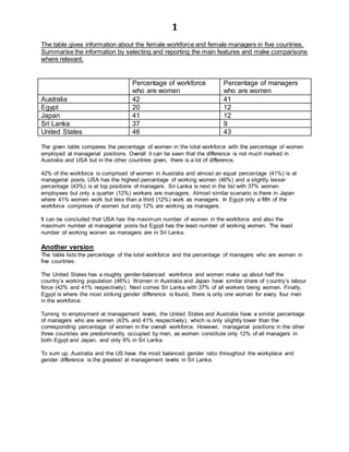
  • 1. 1 The table gives information about the female workforce and female managers in five countries. Summarise the information by selecting and reporting the main features and make comparisons where relevant. Percentage of workforce who are women Percentage of managers who are women Australia 42 41 Egypt 20 12 Japan 41 12 Sri Lanka 37 9 United States 46 43 The given table compares the percentage of women in the total workforce with the percentage of women employed at managerial positions. Overall it can be seen that the difference is not much marked in Australia and USA but in the other countries given, there is a lot of difference. 42% of the workforce is comprised of women in Australia and almost an equal percentage (41%) is at managerial posts. USA has the highest percentage of working women (46%) and a slightly lesser percentage (43%) is at top positions of managers. Sri Lanka is next in the list with 37% women employees but only a quarter (12%) workers are managers. Almost similar scenario is there in Japan where 41% women work but less than a third (12%) work as managers. In Egypt only a fifth of the workforce comprises of women but only 12% are working as managers. It can be concluded that USA has the maximum number of women in the workforce and also the maximum number at managerial posts but Egypt has the least number of working women. The least number of working women as managers are in Sri Lanka. Another version The table lists the percentage of the total workforce and the percentage of managers who are women in five countries. The United States has a roughly gender-balanced workforce and women make up about half the country’s working population (46%). Women in Australia and Japan have similar share of country’s labour force (42% and 41% respectively). Next comes Sri Lanka with 37% of all workers being women. Finally, Egypt is where the most striking gender difference is found, there is only one woman for every four men in the workforce. Turning to employment at management levels, the United States and Australia have a similar percentage of managers who are women (43% and 41% respectively), which is only slightly lower than the corresponding percentage of women in the overall workforce. However, managerial positions in the other three countries are predominantly occupied by men, as women constitute only 12% of all managers in both Egypt and Japan, and only 9% in Sri Lanka. To sum up, Australia and the US have the most balanced gender ratio throughout the workplace and gender difference is the greatest at management levels in Sri Lanka.
  • 2. 2 The table below shows some data regarding Australia’s nursing employment and total workforce in 1987 and 2001. Summarise the information by selecting and reporting the main features and make comparisons where relevant. Employmentnumber (1987) Employmentnumber (2001) Changes(%) Directorof nursing 4,000 5,200 30% Seniornurses 20,000 16,000 -20% Juniornurses 39,000 28,000 -28% Assistantnurses 117,000 112,000 -4% Total nurse employment 180,000 162,000 -10% Total workforce in Australia 2,728,000 3,378,000 24% The given table compares the number of nurses of various seniority levels and the total nurses employed with the total workforce in Australia in 1987 and 2001. It is clear from the graph that total workforce and the number of Directors of nursing increased over the period of 14 years but the employment decreased in all other categories of nursing. In 1987, 4000 Directors of nursing were there but this number increased to 5,200 which was a change of 30%. The number of senior nurses fell from 20,000 to 16,000 over the period. Junior nurses decreased from 39,000 to 28,000 which was the biggest negative change of 28%. The number of assistant nurses decreased marginally from 117,000 to 112,000 and the total nurse employment decreased from 180,000 to 162,000. The total workforce grew from 2,728,000 to 3,378,000, a change of 24%. Overall it can be seen that the total workforce increased despite the fact that people working in the nursing sector decreased. Another version The given table shows changes in Australia’s nursing employment between 1987 and 2001. The nursing workforce represented in this table consists of nurses working at four different levels. It is clear that the higher the level, the lower the number. During these 14 years, Australia’s entire labour force grew from 2,728,000 to 3,738,000, an increase of 37%. Despite the impressive growth in the total workforce, however, there was a 10% decrease from 180,000 to 161,000 in the number of employees in the nursing sector. The vast majority of nurses were working at the lowest level, 1.e. assistant nurses, whose number remained largely unchanged between 1987 and 2001 (117,000 and 112,000 respectively). However, the number of senior nurses and that of junior nurses decreased dramatically, the former by 20% from 20,000 to 16,000 and the latter by 28% from 39,000 to 28,000. The significant drop in employment numbers at lower levels were somewhat compensated by a 30% increase in the number working in the highest level (director of nursing) from 4.000 to 5,200. Overall, the table suggests that the development of the nursing employment in Australia was incompatible with the growth of its total workforce.
  • 3. 3 The table below shows the percentage of households with various electronic items in 1995 and 2002. Summarise the information by selecting and reporting the main features and make comparisons where relevant. Electronic goods in New Zealand households Percentage of households with 1995 2002 Washing machine 97 97 Colour TV 94 98 Computer 49 76 Cell phone 19 60 Video recorder 76 65 Dishwasher 45 54 Digital camera 2 39 The table demonstrates the changes in the ownership rates of selected consumer electronics in New Zealand households between 1995 and 2002. A comparison of the variation in ownership shows that the listed items fall into three categories. In the first category, significant improvements in the ownership of three items can be observed. Digital cameras were a relatively rare item in 1995, owned by only 2% of New Zealand families, put the percentage rocketed to 99% seven years later. Cell phones were also an increasingly common electronic item. There was an approximately three- fold rise in its ownership from 19% in 1995 to 69% in 2002. In addition, mere than a quarter of New Zealand families had a computer, up from about half in 1995. On the other hand, three items saw little change or no change. 54% of the households had a dishwasher in 2002, an increase of only 9%. Colour TV was only slightly more prevalent, up from 94% to 99%. Washing machine, however, had the same ownership rates of 97% in both years. In the third category comes video recorder, the only item that had its percentage dropped, from 76% to 65%. In conclusion, modern electronic items showed a more dramatic increase in ownership while traditional ones had the highest ownership rates.
  • 4. 4 The table below shows the percentage of men and women who travelled to work by different means of transport in Sydney in 2001. Summarise the information by selecting and reporting the main events and make comparisons where relevant. Percentage of people who chose different means of transport to travel to work Men Women BUS 32 38 CAR 28 27 MOTORBIKE 5 2 BICYCLE 18 16 ON FOOT 17 17 The table shows five different means of transportation taken to work by people living in Sydney in 2001. The five ways given are – bus, car, motorbike, bicycle and walking. As can be seen from the chart, buses were the most common way to travel to work by both genders in Sydney, although a slightly higher percentage of women than men chose this as their preferred form of transport (38% and 28% respectively). Cars were the second most popular, taken by almost an equal percentage of men and women (28% and 27%). Motorbike , on the other hand, was the least preferred means of transport for both genders. Only a small fraction of the population (5% for men and 2% for women) travelled to work on a motorcycle. Interestingly, about one third of citizens in Sydney got to their workplace without a motor vehicle. 18% of men and 16% of women rode a bicycle while 17% of both genders simply walked. Overall, citizens in Sydney made good use of alternative methods of transport for going to work but there was a heavy dependence on buses and cars.
  • 5. 5 The graph below shows the production level of three main types of fuels in the UK from 1981 to 2000. Summarise the information making comparisons where relevant. The given line graph shows the levels of three types of fuel produced in the UK from 1981 to 2000. It is clear from the graph that the production of oil and natural gas showed an upward trend but the production of coal showed a downward trend The first type, petroleum, was produced more than natural gas and coal throughout the entire given period. The production was approximately 90 million tons in 1981. It peaked at aver 100 million tons in 1984, but after that there was a gradual increase to reach an all time high of over 120 million tons in 2000. This steady increase can also be observed in the production level of natural gas. From 40 million tons in 1981, it climbed upwards continuously and reached at around 110 million tons in 2000. The trend in the production level of coal, however, is different from the trend of petroleum and natural gas. At the start of the period, 80 million tonnes of coal was being produced, but the level of production fluctuated throughout the period. It dropped dramatically to just 40 million tonnes in 1984, recovered slightly, to a little over 60 after 1985, and steadily decreased to hit an all time low of just over 20million tonnes in 2000. To conclude, the production levels of petroleum and natural gas increased during the period, while that of coal decreased.
  • 6. 6 The charts below show the energy consumption in UK and USA in 2005 and 2011. Summarise the information by selecting and reporting the main events and make comparisons where relevant. Energy Consumption2005 Energy Consumption2011 The given column graphs compares the energy consumption from different sources in the UK and the USA in 2005 and 2011. In both the given years non-renewable sources provided the vast majority of energy in both countries. In 2005, USA obtained more energy from oil and coal than the UK. It procured 37% and 35% energy from oil and coal respectively whereas UK obtained 30% energy from coal and 25% from oil. UK relied more than USA on gas, nuclear power and other renewable sources. In 2011, UK derived maximum energy from gas (36%) whereas the USA mainly used oil (40%). The oil consumption of both countries increased over the years with figures in the UK rising from 25% to 28% and in the USA from 37% to 40%. The consumption of coal in both countries decreased and that of natural gas increased over the years. The usage of nuclear power almost halved in UK in 2006 as compared to that of 2000. It came down from 15% to 8% in UK and from 8% to 6% in USA. The dependence on other renewable sources was the same in UK in 2011 as in 2005 but in USA the percentage fell slightly. 0 5 10 15 20 25 30 35 40 oil coal gas nuclear power other renewable sources % UK USA 0 5 10 15 20 25 30 35 40 oil coal gas nuclear power other renewable sources % UK USA
  • 7. 7 The chart below shows the percentage of the Internet users (males and females) in 2008. Summarise the information by selecting and reporting the main features and make comparison where relevant. The given column graph compares the percentage of male and female internet users in 2008. It is clear that males used the internet more for goods and services whereas females used it more for health information. 65% each of both sexes used the internet for banking and almost an equal percentage (70%) of both genders played games on the net. Using the net for sending and receiving e-mails was the most popular activity on the net with about 98-99% using the net for this purpose. 45% men used the net for health information. In contrast an almost double number (80%) of women used the net to get health information. Using the net for goods and services showed an opposing trend to using the net for health information with 35% women using the net for this purpose as opposed to 75% men. It can be concluded that using the net for gaming, banking and e-mailing was equally popular among both genders. The major discrepancy was in using the internet for health and for goods and services. 65 45 70 75 99 65 80 68 35 98 0 20 40 60 80 100 percentage Males Females
  • 8. 8 The charts below show the percentage of men and women in different weight groups in England between 1993 and 2002. Summarise the information by selecting and reporting the main features and make comparison where relevant. The two charts depict the proportion of males and females of England of four different weight categories over a nine year period starting 1993. The maximum percentage of both genders was overweight. In 1993, a little less than half the male population in England (47%) were within the healthy weight range, but the percentage dropped to 40% in 1998 and continued to decline slightly to about 38% in 2002. By comparison, the percentage of men who were overweight had an opposite trend, rising in two stages from 42% in 1993 to 45% in 1998 and finally 46% in 2002. During the same time, there was a modest increase in the obesity rate in the male population from 10% to 15% while the proportion of dangerously obese men remained low at about 2%. The second line graph shows that females had a quite similar trend as men over the same period. Women who had healthy weight and who were overweight constituted the vast majority of the female population, while the remaining 15-20% were considered obese or dangerously obese. Overall, it is clear that the whole population in England were becoming increasingly overweight and the obesity rate was constantly higher in the female population than in the male population. 0 10 20 30 40 50 1993 1998 2002 % Men healthy weight overweight obese dangerously obese 0 10 20 30 40 50 1993 1998 2002 % Women healthy weight overweight obese dangerously obese
  • 9. 9 The chart below shows the changes in car ownership in Great Britain between 1961 and 2001. Summarise the information by selecting and reporting the main events and make comparisons where relevant. The given line graph shows the variation in the percentage of households that owned no car, 1 car and 2 or more cars in Britain during a 40 year period from 1961 to 2001. The percentage of families with no cars showed a decreasing trend whereas families with one or two cars increased over the period of four decades. As can be seen from the chart, cars were a rare item in Britain in 1961, as nearly 65% of the households did not have a car. Half that percentage of families had 1 car and no families owned two or more cars. The next 20 years saw a significant increase in car ownership. In 1981, 15% of British families owned 2 or more cars while the percentage of families with 1 car reached a peak at 50%. During the same period, the percentage of households with no cars decreased sharply to approximately 35%. From 1981 to 2001, the percentage of households with one car decreased slightly to about 43%, while that with 2 or more cars kept increasing to about 30% in 2001, equaling the percentage of families with no cars. Overall, the proportion families without cars and with two cars showed opposing trends whereas the families with one car fluctuated over the period. 0 10 20 30 40 50 60 70 1961 1971 1981 1991 2001 Percentageofhouseholds Car ownership in Britain no car one car two or more cars
  • 10. 10 The graphs below are forecasts of carbon emissions and global temperature change from 2010 to 2100. Summarise the information by selecting and reporting the main features, and make comparisons where relevant. The given two line graphs predict the emissions of carbon in relation to the temperature changes that may occur by the end of the 21st century. Both graphs make different predictions about the future. The first graph predicts that both carbon emissions and global temperature will rise slowly till about 2060 and after that there is expected to be a sharp rise in both carbon emissions and global temperature. Both show similar trends throughout the period of ninety years. The global temperature is forecast to increase by 12.5°C by the year 2100. In the second graph it is predicted that the carbon emissions would show a sharp rise in the early part of the century and after that the carbon emissions are estimated to fall moderately and would be quite less than what they are at present. The global temperature is projected to increase by 7.5°C by 2100. This graph shows opposing trends. Despite the downward trend of carbon emissions the temperature rise would show an upward trend. However, the increase in temperature is predicted to be less severe. It is clear from the graphs that carbon emissions are directly related to the temperature changes and if carbon emissions are curbed then about 5° of temperature rise could be prevented.
  • 11. 11 The graphs below show the prison population in a European country between 1911 and 2001. Summarise the information by selecting and reporting the main features and make comparisons where relevant. The two line graphs show the male and female population from 1911 to 2001 of a prison in a European country. It is clearly seen that the female inmates were much lesser than the male inmates throughout the period of nine decades. As shown in the first line graph, there were 25,000 male prisoners in 1911. In 1921, the number dropped to approximately 20,000 and leveled out at that point until 1951, after which it rose gradually back to 25,000 by 1981. After that the number rose sharply before finally reaching an all time high of 35,000 in 2001. Turning to the second line graph, it is apparent that the population of female prisoners was significantly lower, with a highest point of 4500 prisoners at the beginning of the period. The number fell with fluctuations and reached the lowest point of less than 1500 prisoners in 2001. Overall, there were more male prisoners than female prisoners. Moreover, the number of male prisoners increased over the period while that of female prisoners decreased.
  • 12. 12 The graph below shows the percentage of secondary school leavers in Australia who were employed, unemployed or who pursued further education from 1980 to 2000. Summarise the information by selecting and reporting the main points and make comparisons where relevant. The Graph shows the percentage of secondary graduates who were employed, unemployed, and who pursued further education from 1980 to 2000. It is clear that the percentage of those employed and those who went for further education followed opposing trends whereas those who were unemployed followed a stable trend with minor fluctuations. As shown in the graph, the number of students who took up further studies increased significantly over the period. Their number peaked at around 60% in 1995 before decreasing to 50% in 2000. The number of students who got employed was around 50% in 1980. In this year the number of employed was higher than those who took up further education, but the trend reversed over the period and in 1995 it touched an all time low of 30% after which it recovered again and reached a little over 40% by 2000. As for the unemployed graduates, the number hovered constantly around 10% all throughout the period with minor ups and downs here and there. Based on the graph, it is clear that majority of secondary school graduates either got a job or took up higher studies, and only a small percentage ended up unemployed. 0 10 20 30 40 50 60 70 1980 1985 1990 1995 2000 % Australian Secondary School leavers Employed Further education Unemployed
  • 13. 13 The graph below shows the changes in the number of property crimes (e.g. theft) and violent crimes in the USA from 1982 – 2002. Summarise the information by selecting and reporting the main features and make comparisons where relevant. The graph shows the crime rate in the US in terms of property crimes and violent crimes over a period of two decades starting 1982. From the first glance it is clear that there are more property crimes than violent crimes in the US. According to the first line graph the number of property crimes in the US for the entire given period hovered around the 3000-4000 range. After remaining steady at around 4000 from 1982 to 1986, the number of property crimes dipped continuously for eight years straight and finally landed at a bit under 3000 in 1994. After that, however, the number rose to 4000 by I998, and fell slowly to exactly 3000 in 2002. The second line graph, on the other hand, tells us that the rate of violent crimes is lower than that of property crimes. The number of violent crimes was between 500 and 600 in the first decade after which there was a sharp dip in 1994 and the number of crimes halved and reached 300 per 100,000 population. The violent crimes grew again and reached around 550 crimes in 2002. The graphs show us that there was a similar trend of both, petty and violent crimes, and both were at their lowest levels in 1994. 0 1000 2000 3000 4000 5000 6000 1982 1984 1986 1988 1990 1992 1994 1996 1998 2000 2002 Property crimes per 100,000 population 0 200 400 600 800 1000 1982 1984 1986 1988 1990 1992 1994 1996 1998 2000 2002 Violent crimes per 100,000 population
  • 14. 14 The tables below show the average hours worked by full-time and part-time workers according to gender in three countries. Summarise the information by selecting and reporting the main features and make comparisons where relevant. Full-time work hours per week in Europe in 2002 Country Female Male Greece 33.5 39 Netherlands 38 38 UK 36.5 43 European Average 36 40 Part-time work hours per week in Europe in 2002 Country Female Male Greece 24.5 28.5 Netherlands 33 35 UK 30.5 32.5 European Average 29 32 The two given tables compare the number of hours worked by full-time and part-time male and female workers in three countries of Europe in 2002. It is clear from the graph that in both categories men worked more hours than women. If the European average is seen, full time male workers worked 40 hours a week and women worked 36 hours per week. Part-time work hours were 32 and 29 for men and women respectively. In UK, the full-time work hours spent by men were the highest (43 hours) where as women spent six and a half hours lesser at work. Among part time workers in UK the difference between the genders was not so marked. Men and women spent 32.5 and 30.5 hours respectively in part-time work. In the Netherlands, both men and women worked equal number of hours (38) in full time work. However there was a slight difference in part time work hours. The difference of the part-time and the full-time work hours was most marked in Greece. Men and women spent 39 and 33.5 hours in full time work but only 28.5 and 24.5 hours/week respectively in part-time work. Overall male employees and full timers worked more than their female and male counterparts. Further, the Greeks worked lesser than the European average, while the reverse is true for UK workers.
  • 15. 15 The graph below shows the actual and predicted population of Jakarta, Shanghai and Sao Paulo in 1990 and 2000. Summarise the information by selecting and reporting the main features and make comparisons where relevant The bar chart compares the population in Jakarta, Shanghai and Sao Paulo in the years 1990 and 2000, against the figures which were predicted for 2000 in 1990. Jakarta had the smallest population among the three cities. With 8 million in 1990, Jakarta's population was predicted to grow to 9 million 10 years later. But the actual figure for the year 2010 was approximately 11 million. Shanghai is the only city whoso population fell over the 10-year period. In 1990 over17 million people were living in Shanghai but this number dropped to 16.5 million in 2000. The predicted population was 16 million. Sao Paulo had the second largest population of 15 million in 1990, but 3 million people were added to its population which made it the largest city in 2000. This growth in population was much faster than previously predicted. Clearly, the populations of the three cities in 2000 were underestimated.
  • 16. 16 The table below shows energy used in 3 countries in 2000 and the rate of increase as compared to the year 1999. Summarise the information by selecting and reporting the main features, and make comparisons where relevant Energy consumption in millions of tonnes of oil equivalents and the rate of increase Countries / consumers Australia Japan USA Industry Increase since 1999 36 28% 159 39% 420 0.9% Transportation Increase since 1999 25 23% 96 52% 565 22% Others Increase since 1999 31 16% 148 46% 435 15% Total Increase since 1999 92 21.5% 403 42.5% 1420 13% The given table compares the energy consumed in industry, transportation and other sectors not mentioned in the graph, in three countries in 2000 along with the percentage increase since 1999. Overall, Australia consumed the minimum energy in all three sectors. Australia consumed 36 million tonnes of oil equivalent of energy in the industrial sector which was far lesser than that consumed in USA and Japan at 420 and 159 million tonnes respectively. It is interesting to note that even though USA consumed the maximum energy in this sector, the percentage change in USA was 0.9% since 1999 which implies that a year earlier, it consumed almost the same amount of energy. In contrast, Japan and Australia consumed lesser energy (159 and 36 million tons respectively) in this sector than the USA, but the percentage change was much higher at 39% and 28% respectively. In transportation sector, again the USA took the lead in consumption (565 million tonnes). Australia consumed 25 million tonnes whereas Japan used 96 million tonnes. The percentage change, however, was 23%, 52% and 22% for Australia, Japan and USA respectively. In all other areas USA took the lead in consumption of energy (435 million tonnes) and the percentage change since 1990 was 15%. Australia and Japan consumed 31 and 148 million tonnes energy respectively and the percentage change was 16% and 46% respectively. The total energy consumption followed a similar trend with USA taking the lead and Australia following at number 3. Overall the US consumed the maximum energy, but the percentage change was the highest in Japan.
  • 17. 17 The graph below shows the households in UK according to the number of family members between 1981 and 2001. Summarise the information by selecting and reporting the main features, and make comparisons where relevant. 1981 2001 8% 5% 19% 26% 12% 18% 9% 20% 4% 15% The given graph compares the household in United Kingdom according to the number of family members in each household. Overall it is clear from the graph that more than three persons per family households decreased in numbers over a period of two decades and one and two member holds increased considerably from 1981 to 2001. In 1981, a small minority (4%) households had only one person per family but this number grew to almost four fold and in 2001, 15% single member households were there. Two-member households also grew considerably from 9% in 1981 to 20% in 2001. Three persons per family households decreased from 18% to 12% over the period of two decades. Five-member households constituted the maximum number in 1981 at 26%. However, their number fell to 19% by 2001. More than 5 members per family households had a moderate fall from 8% to 5%. It is clear from the graph that 2 and 5 member households were almost equal in 2001 and the least number of households had more than 5 members per family. The More than 5 per family 5 Persons per family 3 Persons per family 2 Persons per family 1 Person per family
  • 18. 18 maximum number of households had 4 members in both the years but this is not directly given in the graph. It can be inferred by reading between the lines. The table below shows the number of men and women in a UK city who enrolled in adult educational courses between 1996 and 2002. Summarise the information by selecting and reporting the main features, and make comparisons where relevant. Adult education enrollment Daytime study Evening / distance courses Male Female Total enrollment 1996 580 677 310 930 1240 1998 565 615 290 890 1180 2000 540 564 270 834 1104 2002 560 544 285 819 1104 The table shows the number of males who enrolled in adult educational courses in the UK. The period covered is between 1996 and 2002. In 1996, there were 1240 students overall. Out of that number, 930 were female and only a third (310) were males. Two years later the total number decreased to 1180, but the distribution remained the same with three times more women. In 2000 and 2002, the total number decreased further to 1104, but the greater percentage still belonged to the female group. As for the enrollment in daytime study and evening/distance classes is concerned, the number of students throughout the period was distributed fairly evenly. Students in daytime courses ranged between 540 and 580, while those in evening/distance courses ranged from 540 to 680. However, the decreased noticeably as time went by. It is clear that there was a decreasing trend for both the number of men and women throughout the years, but there were more females than males throughout the period.
  • 19. 19 The table below shows the number of workers (actual and predicted figures between 1985 and 2015) with different types of qualifications. Summarise the information by reporting the main figures and make comparisons where relevant. Numberof workers (inmillion) withdifferentlevelsofqualifications Level of qualification 1985 1995 2005 2015 (predicted) No qualification 6 4.5 3 1.5 Low qualification 5 6.5 8 8.5 Intermediate qualification 4 5 5 7.5 Degree holdersor graduates 6 8.5 11.2 13.5 The given table depicts the actual and estimated figures of workers with different type of qualifications from 1985 to 2015. Overall it can be seen that the number of workers with no qualification decreased till 2005 and is predicted to decrease further till 2017 but the figures for all other categories increased and is expected to increase by 2015. It can be seen from the graph that 6 million workers had no qualification in 1985. This number decreased steadily over the period and halved to 3 million by 2005. The projected figures for this category for 2015 are 1.5 million. This trend is in sharp contrast to the degree holders or graduates. Their number was also 6 million in 1985 but this almost doubled and reached 11.2 million by 2005. This number is also predicted to rise and reach 13.5 million in 2015. The employees with low qualification stood at 5 million and grew rapidly to 8 million by 2005. This number is expected to show a slight increase by half a million by the year 2015. The people with intermediate qualification were 4 million in 1985 and their number is expected to almost double and become 7.5 million by 2015. Overall it is clear from the table that the importance of obtaining a degree is projected to increase among the workers.
  • 20. 20 The diagram below shows the development of the village of Kelsby between 1780 and 2000. Summarise the information by selecting and reporting the main features, and make comparisons where relevant. The given maps illustrate the development of Kelsby village from 1780 to 2000. It can be seen that radical changes took place in this village over a period of 240 years. In 1780, four farms can be seen in the centre of the layout. Towards the west of the farms a river running from the north to south can be seen. Towards the east of the farms there were woodlands and on the north east there were about a 100 homes. In 1860, a bridge was constructed over the river and the houses doubled in number. A road was made to connect the river to the residential area, The farming area halved and most of the trees from the woodland area were cut off. In 2000, many shops opened along the river and a wetland for birds developed towards the south west. Two schools and three sports fields were made. The farms were no longer there in 2000 and in their place another road was built to connect the houses with the schools. The number of homes grew to 500 in 2000.
  • 21. 21 It can be seen that by 2000, massive changes had taken place in the village of kelsby. The two maps below show an island before and after the construction of some tourist facilities. Summarize the information by selecting and reporting the main features, and make comparisons where relevant. The given two maps illustrate the changes that took place at an island prior to and after it was transformed into a tourist destination. It can be clearly seen that many changes took place at the island. The first map shows an island with a beach on the west. The total length of the island is approximately 200 metres. A few trees at odd places can be seen on the whole island. The second map shows a lot of buildings on the island. A pier can be seen on the southern side of the island for the tourists to get on and off the boats. The pier leads to a reception behind which a restaurant is there. On the eastern and western sides of the reception and restaurants there are huts for the accommodation of tourists. The huts are connected to each other by footpaths and the footpath also leads to the beach which the tourists use for swimming. There is also a vehicle track which leads from the pier to the reception and the restaurant.
  • 22. 22 Overall, there are a lot of changes on the island. It is clear that the once unused island has been transformed into a popular tourist destination. The three pie charts below show the changes in annual spending by a particular UK university in 1981, 1991 and 2001. Summarise the information by selecting and reporting the main features, and make comparisons where relevant. The three pie charts show a UK university’s expenditure by category in 1981, 1991 and 2001. It is clear from the chart that Spending on insurance increased and spending other staff’s salaries decreased, but the spending on but on all other things fluctuated over the given period of two decades. The most significant feature is that salary to teachers and other non teaching staff, was the major expenditure for this university throughout the 20 year period. The percentage of total spending on teacher’s salary was between 40% and 55% while that on other staff’s salary decreased steadily from a third to less than a fifth. teacher's salary, 40% other staff's salary, 33% resources (e.g. books), 10% insurance, 2% furniture and equipment, 15% 1981 teacher's salary, 55% other staff's salary, 23% resources (e.g. books), 12% insurance, 3% furniture and equipment, 7% 1991 teacher's salary, 45% other staff's salary, 18% resources (e.g. books), 5% insurance, 8% furniture and equipment, 24% 2001
  • 23. 23 The remaining expenditures were divided between smaller items such as furniture equipment, insurance and resources. Insurance spending continued to grow from 2% of the total spending in 1981 to 3% in 1991 and 8% in 2001. The percentage of total spending on resource such as books also increased slightly from 10% to 12% during the first 10 years, but it dropped sharply to 5% in 2001. Spending on furniture and equipment showed the most dramatic change. After being reduced by 8% in 1991, it more than tripled to make up about a quarter of the total amount a decade later. The graphs below show the percentage of household waste recycled in city between 1992 and 2002. Summarise the information by selecting and reporting the main features and make comparisons where relevant. The given bar graph illustrates the percentage of different household wastes recycled during the period from 1992 to 2002. It is clear that with the passage of time the recycling of all the given things grew except for the recycling of cans which was lesser in 1997 than in 1992. As can be observed from the chart, in 1992, the most recycled household waste are cans (17%), followed by paper (15%) and glass (15%), then by plastic (10%). In 1997, the trend reversed. The recycling rate for cans decreased by around 4%, whereas, the rate for glass, paper and plastic increased to 34%, 32% and 12% respectively. In 2002, the recycling for all things escalated and about 52% of glass was recycled that year. It was followed closely by paper at around 46%. 25% of the cans were recycled and only about 12% of plastic was recycled. Overall, plastic was recycled the least in all the given years. 0% 10% 20% 30% 40% 50% 60% Glass Paper Cans Plastic HouseholdWaste RecyclingRate 2002 1997 1992
  • 24. 24 The graphs below show the life expectancy of people in three countries in 1900, 1950 and 2000 and the proportion of population aged 15 or below. Summarise the information by selecting and reporting the main features and make comparisons where relevant. The given bar graphs depict the life expectancy and the percentage of people under age 15 during the years 1900, 1950 and 2000. It is interesting to note that the life expectancy increased in all three countries, whereas the proportion of youngsters below 15 years decreased over the given period of time. Looking at the first graph, we can see that life expectancy in 1900 was more or less equal in all the three countries (between 45 and 50 years). In 1950, life expectancy increased in all three countries, but in country A, it grew the most and in country B it escalated the least. In 2000 also the life expectancy rose further and became 82, 58 and 65 years for countries A, B and C respectively. Turning to the second graph, it is interesting to note that although country B had the lowest life expectancy, it had the highest percentage of people under 15 during 1900 and 1950 (50% and 40% respectively). Country C and country A had 48% and 35% in 0 20 40 60 80 100 Country C Country B Country A Years Life Expectancy 1900 1950 2000 0 20 40 60 Country C Country B Country A % Percentage of people aged 15 years old or younger 1900 1950 2000
  • 25. 25 1900, and 37% and 32% of people under the age of 15, in 1950. In 2000, all three countries suffered significant drops in the percentage of people aged 15 and below. In conclusion, there seems to be an inverse relation between life expectancy and percentage of young people in a country. The diagram and the line chart below show the growth of the city of Alexandria and its population from 1820 to 1940. Summarise the information by selecting and reporting the main features and make comparisons where relevant. The given diagram and line graph show the growth of Alexandria in terms of physical space and population during the period 1820 to 1940. The diagram describes how the city of Alexandria’s physical area grew from 1820 to 1940. In 1820, the beginning of the period, the size of Alexandria was 4 km2. The area then doubled in 1860 and again in 1900. Finally, in 1940, it expanded to 100 km2. Turning to the line graph, the population of the city remained steady under half a million from 1820 to 1870. By 1880, the number finally reached to 0.5 million mark. From that point on, the population climbed steeply to 2.5.million by 1920. By the end of the period, the city’s population reached to a peak of 2.8 million.
  • 26. 26 The sharp rise in population in 1900 can be attributed to the substantial expansion of the city’s geographical area during the same period. The pie chart below shows the main reasons why agricultural land becomes less productive. The table shows how these causes affected three regions of the world during the 1990s. Summarise the information by selecting and reporting the main features, and make comparisons where relevant. Causes of worldwide land degradation Causes of land degradation by region Region % land degraded by deforestation Over cultivation Over grazing Total land degraded North America 12 53 22 5% Europe 31 29 28 23% Oceania* 8 7 73 18% * A large group of islands in the South Pacificincluding Australia and New Zealand The pie chart and the table show the causes and the percentage of land degradation in three areas namely North America, Europe and Oceania. The pie chart shows that the causes of land degradation can be classified into three main causes, namely deforestation, over-cultivation, overgrazing and other factors. As can be seen from the chart that overgrazing is responsible for the biggest percentage (35%) of land degradation cases, closely followed by deforestation (30%) and over- cultivation (28%). The remaining 7% are caused by other factors. Turning to the table it is clear that Europe experienced the largest percentage of degradation (23%), and cases are almost equally caused by the top three factors. Oceania came in second with 18% of land degraded, with 73% due to overgrazing. 5%,
  • 27. 27 the lowest percentage of North American land has degraded and more than half this percentage is due to over-cultivation. Overall, it can be concluded that all three factors are almost equally responsible for land degradation in Europe, overgrazing is the top cause of land degradation in Oceania and over-cultivation is the major cause of land degradation in North America. The table below shows the use of three energy sources in the UK, their world reserve and how many years they are going to last. Summarise the information by selecting and reporting the main features and make comparisons where relevant. Percentage of total energy supply in the UK World Reserve (units) Expected to last (years) Coal 25% 13,530 300 Oil 45% 3,750 30 Uranium 3.5% 560 200 The given table illustrates the percentage of total energy supply in the UK from Oil, Coal and Uranium along with the world reserve of these in units and also gives the estimate of the years these sources are expected to last. 45% of the total energy supply in UK is from oil. This is the most used source out of the three given in the table. However, the world reserve of oil is 3,750 units and if it is used to this extent it is predicted to last only another 30 years. Coal is the second most commonly used source of energy with a quarter of the total energy coming from it. Fortunately the world reserves of coal are still the highest and these 13,530 units are expected to last another 300 years. Uranium is the least used energy source today (3.5%) and with 560 reserve units it is expected to last another 200 years. The table graph depicts that all these resources are not going to last much longer and alternative renewable sources have to be tapped on a war footing.
  • 28. 28 The graphs below show the percentage of time spent by workers in a typical office in US in 1980 and 2006. Summarise the information by selecting and reporting the main features and make comparisons where relevant. The given pie charts compare the time spent by employees in a typical US office in 1980 and 2006. The most striking feature of the pie charts is that no time was spent on e-mails in 1980 where as, in 2006 sending and receiving e-mails occupied 9% of the time. Time spent on telephone decreased from 12% in 1980 to 6% in 2006. Similarly time spent talking to colleagues halved from 22% in 1980 to 11% in 2006. Time spent on managing documents also decreased by 10% from 25% to 15% over the period of 26 years. Time spent on using computer increased threefold from 10% to 30%. Time spent on formal meetings stayed the same at 14%. However, time spent on other tasks not mentioned decreased slightly from 17% to 15% over the period. It can be concluded that office hours saw a considerable change in the way they were spent by employees mostly because of the revolution in communication technology. Using phone 12% Using computer 10% Documents 25% Talking to collegues 22% Formal meetings 14% Other tasks 17% Working time spent in 1980 Using phone 6% Using computer 30% Documents 15% Talking to collegues 11% Formal meetings 14% Other tasks 15% Emails 9% Working time spent in 2006
  • 29. 29 The diagrams below show the stages and equipment used in the cement-making process, and how cement is used to produce concrete for building purposes. Summarise the information by selecting and reporting the main features, and make comparisons where relevant. The diagram illustrates the various stages in the production of cement and concrete. From this diagram it can be seen that cement is a necessary ingredient of concrete, so concrete production follows cement production. The production of cement starts in a mixer, where limestone and clay are converted into a mixture, which is then fed into a crusher. Here the mixture is ground into cement powder, and then is passed through a rotating heater. After the heating is finished, the mixture is ground in a grinder after which the final step is to pack the cement into bags using special packing facilities. The production of concrete, by comparison, is a simple mix and mould process. The raw materials are mixed in measured proportions – approximately 15% cement, 10% water, 25% sand and 50% gravel. The blending takes place in a concrete mixture and the resulting mixture is poured into a mould where it sets into slabs of concrete. Overall, it is clear that cement and concrete production involve many steps.
  • 30. 30 The graphs below show the marriage and divorce numbers in the US and the marital status of its population in 1970 and 2000. Summarise the information by selecting and reporting the main features, and make comparisons where relevant. Two bar charts are given. The first bar chart demonstrates the number of marriages and divorces in the United States from 1970 to 2000, and the second compares the percentage of its population above the age of 15 in different marital status in 1970 and 2000. In 1970, there were around 2,200 thousand marriages in the US – the smallest number during the 30 years. The number of divorces was also very low (700 thousand). After that, although the number of marriages increased steadily, divorce rates showed a more significant growth and by 1985, 2400 thousand marriages were registered but almost half of them ended up in divorces. From then on, the number of marriages showed little variation, but the number of divorces declined to around 1000,000 in 2000. Turning to the US population over 15, 1970 and 2000 had the same percentage of married people (40%). Similarly the proportion of single people also remained the same at around 38%. Both together accounted for almost three quarters of the population above 15 years old. While the ratio of widowed citizens was slightly higher than that of divorced men in 1970, the reverse was true after three decades. Overall, divorce rate was the highest in the mid 1980s and a slightly higher percentage of the US population was divorced in 2000 than in 1970. 500 1000 1500 2000 2500 1970 1975 1980 1985 1990 1995 2000 inthousands Number ofmarriagesand divorcesin USA Number of marriages Number of divorces 0 10 20 30 40 50 1970 2000 % Population over theage of15 in different marital status. married divorced widowed single
  • 31. 31 The table below shows the monthly expenditure of an average Australian family in 1991 and 2001. Summarise the information by selecting and reporting the main features and make comparisons where relevant. 1991 2001 Australian dollar per month Food 155 160 Electricity and water 75 120 Clothing 30 20 Housing 95 100 Transport 70 45 Other goods and services 250 270 Total 675 715 Other goods and services – non essential goods and services The table shows the changes in the spending pattern of an average Australian household between 1991 and 2001. In general, the total Australian household spending was marginally higher in 2001 than in 1991. The amount of monthly spending on electricity and water saw a dramatic increase over the 10 year period from $ 75 to $ 120. The maximum spending in both years was on other goods and services but the rise in 2001 was very insignificant. In 1970 the Australians spent $250 on other non essential goods and services, but in 2001, this expenditure was $ 270. At the same time, money spent on food and housing rose very slightly from $155 to $160 and from $ 95 to $ 100 respectively. However, there was a decrease in expenditure on the other two items. Expenditure on clothing fell from $30 to $20, and that on transport fell from $70 to $ 45 over the period. Overall, Australians spent the maximum on food and other goods and services and spent the minimum on clothing.
  • 32. 32 The graphs below show information about the weekly work hours in Australia in 2001. Summarise the information by selecting and reporting the main features and make comparisons where relevant. The pie charts illustrate the working patterns of Australian employees and owners/managers by indicating the percentage of them who worked full time, part time or over time. Australia had 8.8 million total workforce in 2001, among which the vast majority were hired as employees (6.9 million) and the remaining 1.9 million either owners or managers. Only 29% of Australian employees had a full-time working week of 35-40 hours. 38% of them were working on a part-time basis for less than 35 hours per week, while a third had long working hours of 41 hours a week or more. When it comes to owners or managers, interestingly, two thirds of them had long hour weeks while only one fifth had a regular working day. Part-time working as can be expected, was relatively rare among owners/managers (only 14%) Full time 35-40hours per week 29% Part time: under 35 hoursper week 38% Long hours: over 41 hoursper week 33% Employees (6.9 million) Full time 35-40hours per week 19% Part time: under 35 hoursper week 14% Long hours: over 41 hoursper week 67% Owners/Managers (1.9 million) Full time 35-40hours per week 27% Part time: under 35 hoursper week 33% Long hours: over 41 hoursper week 40% Total Workforce(8.8 million)
  • 33. 33 Overall, two thirds of the total workforce work full time or long hours and the remaining one third work part-time. Working overtime was over two times more common among owners/managers than among employees The diagram shows the process of flooding in a UK town and two possible solutions. Summarise the information by selecting and reporting the main features, and make comparisons where relevant. The three diagrams highlight a flooding problem in UK town, and outline two possible suggestions to solve this problem. One solution is costlier but environmentally friendlier, while the other solution is less costly but affects the environment more. The flooding problem is shown in an area where the River A merges into River B and the areas affected residential area, Commercial buildings and an Industrial park. One solution to the area is to relocate the affected development to nearby areas which are slightly further away from the river. The downside of this is that it would be very costly, but the upside is that it would cause less environmental damage. The other solution is to dam the two rivers causing the flooding. This is a much cheaper option but would result in more area being taken up by the resulting reservoirs behind the dams thus leading to more environmental damage.
  • 34. 34 The graph below shows the land damaged in million hectares in four continents from tree cutting, overgrazing and crop farming. Summarise the information by selecting and reporting the main features and make comparisons where relevant. The given column graph depicts the amount of land damaged by tree cutting, over grazing and crop farming in Australia, Europe, Asia and Africa. It is clear from the graph that deforestation caused damage to 300 million hectares of land in Europe. Surprisingly, only about 40 million hectares of land is damaged from deforestation in Asia which is otherwise a much larger continent than Europe. Africa and Australia had 70-80 million hectares of land damage due to this reason. Over grazing is the major cause of land damage in Australia. 250 million hectares of land was damaged because of overgrazing. A little less than 150 million hectares of land in Europe, about 80 hectares in Asia and slightly less than 50 million hectares of land in Africa was damaged because of over grazing. Crop farming damaged 160, 120, 70 and 60 million hectares of land in Australia, Europe, Asia and Africa respectively. Overall, the maximum land damage from all these three causes occurred in Europe which was closely followed by Australia. Land damaged in Asia and Africa was almost similar. 0 50 100 150 200 250 300 350 Australia Europe Asia Africa Landdamaged(millionhectare) Tree cutting Over grazing Crop farming
  • 35. 35 The chart below shows the percentage of households with cars in one European country between 1971 and 2001. Summarise the information by selecting and reporting the main features and make comparisons where relevant. The given column graph shows the percentage of households with no car, one car and two or more cars between 1971 and 2001. It can be seen that with the passage of time, more and more households had one or two cars. It is very noticeable that in 1971 and in 1981, the numbers of households with no cars were very high, at around 55% and 45% respectively. The number of households with one car followed behind at about 35% which rose to about 40% in 1981. The trend reversed in 1991 and 2001, when the number of households with no cars dropped to 10% and 8% respevtively. In stark contrast, however, the number of households who had one car saw a dramatic increase to around 73% in both years. As for the households with two or more cars, the numbers saw a slight but continuously increasing trend, but stayed under 20% for the four years. Overall, it is clear that the number of car owners increased substantially over the period. 0 20 40 60 80 100 1971 1981 1991 2001 Percentageofhouseholds Car Ownership No car 1 car 2 or more cars
  • 36. 36 The bar chart below shows the passenger kilometres travelled by different means of transport in the UK in 1990 and 2000. Summarise the information by selecting and reporting the main features, and make comparisons where relevant. Passenger kilometres by different means of transport The given column graph compares five different means of passenger transport in the UK for the years 1990 and 2000 in terms of total passenger kilometres travelled. In 1990, a total of 100 billion passenger kilometres were travelled by UK residents using the surveyed transportation methods, which went up slightly by about 10 billion to reach 110 billion 10 years later. The rise in passenger kilometre number was recorded in air, bus and rail travelbut a slight decline was actually found in bicycle and motorbike travel. In this survey, buses and trains were the principal modes of public transport during the last decade in the UK, each with between 40 and 50 billion kilometres travelled. In contrast, the annual distance covered by bicycle, motorbyke and air travel only represented an insignificant share, with less than 8 billion passenger kilometres for each. Overall, there was a growth in ‘mass transit service’ in the UK such as air, bus and rail travel during the given decade. 0 20 40 60 80 100 120 bicycle motorbike air bus rail total passengerkilometres(billions) 1990 2000
  • 37. 37 The charts below show the number of students of a UK university who completed (on time or late), failed or rewrote their postgraduate dissertation in 1980, 1990 and 2000. Summarise the information by selecting and reporting the main features and make comparisons where relevant. The given column graph shows the number of students in a university who completed, failed, or had to rewrite their dissertation. The years covered are 1980, 1990 and 2000. In 1980, 150 students completed their dissertations on time, and around 140 completed theirs late. Only 40 students failed to complete their dissertation, while around 30 students had to rewrite. In 1990, the largest number of students accomplished their dissertations on time (210). This was followed closely by the number of those who submitted beyond the deadline ( a little over 150). The number of students who failed (30) is smaller compared to the previous year, while the number of students who had to rewrite their dissertations increased to 40. In 2000, the number of students increased substantially. Out of the total number of students, about 360 students completed their dissertations on time, and precisely half that number (180) completed theirs late. The numbers of students who failed to complete and who had to rewrite are both 20. Overall, in all three years, majority of students completed their dissertations on time. Also, only small numbers of students failed or had to rewrite theirs. 0 50 100 150 200 250 300 350 400 completed on time late failed to complete rewrote 1980 1990 2000
  • 38. 38 The charts below show the percentage of young people aged 15 to 24 employed in different sectors in New Zealand in 1990 and 2000. Summarise the information by selecting and reporting the main features and make comparisons where relevant. The chart shows the percentage of people from 15 no 24 who are already employed in different fields. The period covered is 1990 and 2000. In both 1990 and 2000, the largest number of the employed young people work in the commerce industry. The number also increased from nearly 30% in 1990 to almost 40% in 2000. On the other hand, the lowest number can be found in other services (13%) in 1990 and transport (7%) in 2000. In 1990, the number of young workers is almost equally distributed among the five sectors, except for commerce and other services, all with about 15% of workers. In contrast, the number of workers in 2000 is unequally distributed. The second largest number of workers (24%) is found in the hotel and restaurant field, followed by the agriculture industry (12%). The manufacturing sector and other services are tied in fourth, with 10% of workers each. Overall, the graph tells us that the number of young workers in the commercial field is consistently the highest in both years. Also, the workers are more evenly distributed in 1951 than in 2000. 0 5 10 15 20 25 30 35 40 % Percentage of young people in different employment sectors 1990 2000
  • 39. 39 The graphs below show the weekly spending of overseas students in four countries in four countries. Summarise the information by selecting and reporting the main features and make comparisons where relevant. Country Average weekly spending in US$ A 895 B 615 C 535 D 429 The table and graph show the weekly expenses of students in four countries, and the distribution of their overall expense. We can see from the table that students in Country A spend the most weekly at $895 a week and the amount leads by a large margin of about $200 to $400 a week from the other countries. The expenses of students in Country B, C, and D follow behind with $615, $535, and $429 respectively. The bar chart shows us how the expenses are distributed among three items, namely tuition, accommodation and living cost. According to the chart, County A spends the most on living costs, which account for more than half of their total weekly expense, than on tuition end accommodation, in that order. Among the four countries, Country B spends the most on tuition ($200), and Country C spends the largest amount on accommodation. Country D spends the least on tuition and living costs. It is also clear that in all the countries, tuition is more expensive than accommodation. But in countries A and B, living costs are higher than tuition. In summary, Country A spends the most in terms of overall expenses, but spends the least on accommodation and spends less on tuition compared to countries B and C. 0 100 200 300 400 Country A Country B Country C Country D Breakdown of student spending Tuition Accommodation Living cost
  • 40. 40 The graphs below show the annual expenditure of university students in three countries in 2003. Summarise the information by selecting and reporting the main features and make comparisons where relevant. The three pie charts show how university students in three countries spent their money in the year 2003. In general, students in country A spent slightly more than those in country B (US $5000 and US $4500 respectively. In comparison, student expenditure in country C was considerably lower at only US$1500 per year. Accommodation and food were the two biggest items of expenditure. Altogether they constituted around 60% of the total students’ expenditure in all the three countries. The difference is that in country A and B spending on accommodation exceeded the spending on food where as the reverse was true for country C. The rest of the students’ spending was divided among leisure, books and other items. Leisure expenditure constituted a larger percentage (around 20%) of student expenditure in both country A and country B, while in country C more money was spent on books (21%) than on leisure (12%). Leisure, 22% Books, 3% Food, 22% Accommodation, 45% Other, 8% Country A: Annual Expenditure per student US $ 5000 Leisure, 20% Books, 12% Food, 27% Accommodation, 36% Other, 5% Country B: Annual Expenditure per student US $ 4500 Leisure, 12% Books, 21% Food, 35% Accommodation, 31% Other, 1% Country C: Annual Expenditure per student US $ 1500
  • 41. 41 Overall, as wealth decreased, the percentage of students’ spending on non-essential items went down. The table below shows the size of a class in British primary schools from 1998 to 2002. Summarise the information by selecting and reporting the main features and make comparisons where relevant. 1998 1999 2000 2001 2002 Number of students in classes with 30 pupils or less 14500 14358 16224 18343 22193 Percentage of all students 72% 70% 78% 85% 99.3% Number of students in classes with 31 pupils or more 5840 6153 4576 3237 156 Percentage of all students 29% 30% 22% 15% 0.7% Average class size ( number of pupils) 25.9 26.1 25.3 24.8 24.5 The given table demonstrates how the average class size changed between 1998 and 2002 in British primary schools. It also shows the total number (as well as the percentage) of students who were studying in a small class (30 pupils or less) or a large class (31 pupils or more). In 1998 and 1999, an average class in Britain had about 26 students (25.9 and 26.1 respectively). Since then the number decreased at a slow but steady rate to 24.5 pupils in 2002. Throughout the 5 year period, the vast majority (more than 70%) of the primary school students in Britain were studying in a small class. The preference for a smaller class over a larger one, however, declined slightly from 72% in 1988 to 70% in 1999, but over the next 3 years it increased considerably, and until 2002, almost every student (99.3% or 22193) was studying in a small class. Overall, the numbers show a clear trend for British primary school classes to have fewer students, as an increasingly larger percentage of pupils chose to study in a smaller class.
  • 42. 42 The tables show the information about temperature and hours of daytime in two cities during a weekend in May 2003. Summarise the information by selecting and reporting the main features and make comparisons where relevant. Mumbai, India Friday Saturday Sunday Temperature Max: 33 Min: 28 Max: 33 Min: 29 Max: 34 Min: 28 Sunrise time 6.01 6.01 6.01 Sunset time 19.11 19.12 19.11 Moscow, Russia Friday Saturday Sunday Temperature Max: 8 Min: 5 Max: 12 Min: 9 Max: 17 Min: 10 Sunrise time 4.50 4.51 4.51 Sunset time 22.01 22.02 22.02 The two given tables show the highest and the lowest temperatures recorded on three consecutive days in May 2003 in Mumbai and Moscow. Listed in the tables are also the exact times for sunset and sunrise over the same days. The temperature in Mumbai ranged from 28°C to 34°C on Friday, Saturday and Sunday with only slight variations. While the sun rose at the same time (6.01) every morning, it set at 19.11. on Friday and Sunday, but one minute late on Saturday. The weather in Moscow was much colder, but there was an apparent increase in temperature from Friday to Sunday. On Friday, the highest and the lowest temperature in Moscow was recorded at 8 ° and 5 ° respectively, which rose considerably to 17 ° and 10 ° only two days later. Compared with Mumbai, sunrise time in Moscow was more than 1 hour earlier, while sunset time was about 2 hours and 50 minutes later. Overall, the spring season of May was much colder in Moscow than in Mumbai but people in Moscow enjoyed about 4 hours more daylight every day.
  • 43. 43 The graphs below show about citizenship to the UK and the origin of the immigrants to the UK. Summarise the information by selecting and reporting the main features and make comparisons where relevant. Origin of immigrants to the UK (number in thousands) The line graph shows the number of immigrants who obtained UK citizenship between 1996 and 2002, and the bar chart gives a breakdown of the number in 1996 and 2002 according to the continents they came from. In 1962, the number of people who became UK citizens stood at 20 thousand, which almost doubled to slightly less than 40 thousand in 1972. Although the next ten years saw a modest decline, the number increased again to 50,000 in 1992 and then shot up to just under the 120 thousand mark in 2002. Among the 72 thousand new citizens in the UK in 1996, the vast majority came from Asia (49 thousand). An equal number (9thousand) came from Europe and from Africa and the remaining came from other regions including Americas and Australasia. 6 years later, the number of citizens from Asia, Africa and Europe rose to 58, 25 and 27 thousand respectively, while immigrants from Americas, Australasia and from other regions showed a slight drop to 4 million. Overall, a surge in the immigration from Europe and Africa to the UK contributed to the rising number of UK citizens between 1996 and 2002. 0 20 40 60 80 100 120 1962 1972 1982 1992 2002 Inthousands Number of people who became UK citizens Asia, 49 Asia, 58 Africa, 9 Africa, 25 Europe, 9 Europe, 27 Americas, Australasiaand others, 5 Americas, Australasiaand others, 4 1996 2002
  • 44. 44 The table and the bar chart below show the result of a survey into how students in an Australian university used online facilities in 2001 and 2002. Summarise the information by selecting and reporting the main features and make comparisons where relevant. Total number of students in the university Students using online facilities Students submitting work online 2001 1600 1088 (68%) 320 (17%) 2002 1600 1536 (96%) 1568 (98%) The given table and bar chart show data regarding students’ use of computers and online facilities in 2001 and 2002. It can be seen from the table that there was an equal number of students in 2001 and 2002. Out of the 1600 students only 68% used online facilities in 2001. This percentage, however, increased dramatically to 96% in the following year. The increase in usage of online facilities also caused the number or students submitting work online leap from 17% to 98%. The bar chart, on the other hand, shows that there were 800 students using computers at home, 500 at the university, and 300 did not have access to computers in 2001. In 2002, only a little over 100 students did not have computers. The number of students using computers at home jumped to 1200, while those using computers at the school decreased to just 300. To conclude, the number of people using computers and online facilities increased sharply from 2001 to 2002. 0 200 400 600 800 1000 1200 1400 2001 2002 Locations of students using computers At home At University No computer
  • 45. 45 The table below shows the main reasons why people in the UK use the internet. Summarise the information by selecting and reporting the main features and make comparisons where relevant. Percentage of people who use the internet for 16-24 25-44 45-54 55 and over E-mail 38 36 39 40 Information on goods and services 12 20 20 22 Education 26 22 18 15 Banking 1 5 8 9 Chat-room 5 4 None None Other reasons 16 13 13 14 The table shows the percentage of people who used the internet for various reasons. It is clear that using the internet for banking and for chatting are the least popular reasons among all age groups. People of all ages use the internet the most for communication purposes, in the form of e-mails (36-40%). Almost equal percentage of people aged 25 and above (20%- 22%)use the internet for searching for information on products and services, while those aged 16-24 don’t do this as much (12%). Using the internet for education is the second most common reason among the youngest age group (26%), whereas only 15% of the oldest age group does so. Approximately 14%-16% of all ages use the internet for other purposes not mentioned in the table. Internet banking is used by 9% of the oldest age group which is in sharp contrast with 1% of the youngest age group. Chatting on the internet is not done by those over 45 years old but 4%-5% of the younger age groups use the internet for chatting. Based on the table we can see that different age groups use the internet for different reasons.
  • 46. 46 The chart below shows the number of total hours per year of different types of TV programmes shown on TV channel BBC1 in Britain. Summarise the information by selecting and reporting the main features and make comparisons where relevant. Hours of programming shown on BBC1 The given bar graph illustrates the number of hours various television shows were aired in the four given years. First, the number of hours that film and drama shows were shown increased consistently over the period. From just 500 hours in 1970, the number jumped to around 1750 hours in 2000. Turning to sports television shows, the number of hours fluctuated a bit. These shows were telecast for the lowest number of hours in 1970, at only approximately 200 hours, which jumped substantially to a little under 1000 hours in 2000. News and weather shows experienced a dramatic change over the period. These programmes started with only around 300 hours in 1970, but rose sharply to 1100 hours, then to 1600 hours before finally reaching at an all time high of 2700 hours in 2000. Overall, the number of hours that films and drama shows, and news and weather shows were telecast followed an upward trend, but sports shows showed inconsistent changes. 0 500 1000 1500 2000 2500 3000 News and weather Sports Filmsand drama 1970 1980 1990 2000
  • 47. 47 The bar chart below shows the percentage of students with part time jobs in Australia in 1983 and 2003 and the table shows the average hours of part time work and years to complete degree. Summarise the information by selecting and reporting the main features and make comparisons where relevant. Percentage of students with part-time jobs Average hours of part time work and years to complete degree 1983 2003 Average hours of work 5 hours 14.4 hours Average years to complete degree 4 years 5 years The bar chart demonstrates the percentage of Australian students with part time jobs during a given period, and the table shows the average number of hours they work and the average number of years they need to complete their degrees. According to the bar chart, the number of students who had part-time jobs in 2003 was generally higher than in 1983. In 1983, the highest number belonged to the 20-24 group at 55%, while the lowest number belonged to the 17-19 group at 35%. In 2003, the highest number can be traced to the 20-24 group with a little over 70%, but the lowest belongs to the 40+ group at around 54%. Turning to the table, it can be observed that the number of part time work hours per week almost trebled from 5 hours in 1983 to 14.4 hours in 2003. There was also an increase in years needed to complete the degree from 4 years in 1983, to 5 years in 2003. Overall, it is clear that when students did less part-time work, they completed their degree in lesser time. 0 20 40 60 80 17-19 20-24 25-29 30-39 40+ % Axis Title 1983 2003
  • 48. 48 Mock test 22/5/2017 The illustrations above show how chocolate is produced. Summarize the information by selecting and reporting the main features. Essay International travel makes people prejudiced rather than broad-minded. What are the causes and what solutions can be taken to solve the problem?
  • 49. 49 The diagram explains the process for the making of chocolate. There are a total of ten stages in the process, beginning with the growing of the pods on the cacao trees and culminating in the production of the chocolate. To begin, the cacao comes from the cacao tree, which is grown in the South American and African continents and the country of Indonesia. Once the pods are ripe and red, they are harvested and the white cacao beans are removed. Following a period of fermentation, they are then laid out on a large tray so they can dry under the sun. Next, they are placed into large sacks and delivered to the factory. They are then roasted at a temperature of 350 degrees, after which the beans are crushed and separated from their outer shell. In the final stage, this inner part that is left is pressed and the chocolate is produced. Overall, it can be seen that the process of making chocolate is a long process involving many steps. The graph shows some values and regions of import and export of food. Summarize the information by selecting and reporting the main features, and make comparisons where relevant. The given column graph illustrates the import and export of food from seven global regions. It is clear that North America, Oceania and Latin America are the major exporters, whereas Far East, Africa, Near East and Europe are the major importers. The total population of exporters is more than 600 million whereas the importers have a far more population of 5000+ million. North America exported $10,000 million worth of food and is thus the highest exporter. Oceania and Latin America export a little under $4000 million worth of food each. Europe is the biggest importer of food and shells out more than $5000 million worth for food items. Near East and Africa import food worth $4000 and $3000 million and Far East imports the least at $2000 million. -10,000 -8,000 -6,000 -4,000 -2,000 0 2,000 4,000 6,000 8,000 10,000 North America Oceania Latin America Far East Africa Near East Europe Value-$million Net importersand Exporters Importer Total population 5000+million Exporter Total population 600+million
  • 50. 50 Overall, it is understandable that the importers have to import as their population is far more than the population of countries that export food. The graph below gives information about a 2010 report about consumption of energy in the USA since 1980 with projections upto 2030. Summarise the information by selecting and reporting the main features and make comparisons where relevant The given line graph illustrates the energy consumption in the US from 1980 to 2012, and the projected consumption upto 2030. Petrol and oil are the dominant fuel sources during this period, with 35 quadrillion (35q) units used in 1980, rising to 42q in 2012. Despite small initial fluctuations, there was a steady increase after 1995. This rise is expected to continue and reach 47q by 2030.
  • 51. 51 Energy consumed from natural gas and coal is similar over the period. From 20q and 15q respectively in 1980, gas showed an initial fall and coal a gradual increase, with the two fuels equal between 1985 and 1990. Consumption has fluctuated since 1990 but both now provide 24q. Coal consumption is expected to grow steadily to 31q in 2030, whereas after 2014 it is predicted that usage of gas will remain stable at around 25q. In 1980, energy from nuclear, hydro and solar/wind power was equal at around 4q. Nuclear and solar/wind showed very insignificant increases and are expected to show the same trends, but hydro came back to its starting level after showing a slight increase in between. Overall, the US will continue to rely on the conventional fossil fuels with other alternative sources remaining relatively insignificant. The table below shows the changes of population in Australia and Malaysia from 1980 to 2002. Summarise the information by selecting and reporting the main features and make comparisons where relevant. Australia Malaysia 1980 2002 1980 2002 Total population 34.5 36.7 32.5 34.1 Rate of birth ( per hundred) 9.8 10.2 11.3 11.1 Male population (%) 27.8 27.8 24.8 25.9 Female population (%) 28.1 28.1 25.7 26.1
  • 52. 52 Population aged 65+ (%) 17.1 23.8 19.2 24.9 S. No. Graph Type 1. The table gives information about the female workforce and female managers in five countries. Table 2. The table below shows some data regarding Australia’s nursing employment and total workforce in 1987 and 2001. Table Past exam question 3. The table below shows the percentage of households with various electronic items in 1995 and 2002. Table Past exam question 4. The table below shows the percentage of men and women who travelled to work by different means of transport in Sydney in 2001. Table Past exam question
  • 53. 53 5. The graph below shows the production level of three main types of fuels in the UK from 1981 to 2000. Line Past exam question 6. The charts below show the energy consumption in UK and USA in 2005 and 2011. 2 column Past exam question 7. The chart below shows the percentage of the Internet users (males and females) in 2008. Column Past exam question 8. The charts below show the percentage of men and women in different weight groups in England between 1993 and 2002. Line Past exam question 9. The chart below shows the changes in car ownership in Great Britain between 1961 and 2001. Line Past exam question 10. The graphs below are forecasts of carbon emissions and global temperature change from 2010 to 2100. Line 11. The graphs below show the prison population in a European country between 1911 and 2001. Line 12. The graph below shows the percentage of secondary school leavers in Australia who were employed, unemployed or who pursued further education from 1980 to 2000. Line 13. The graph below shows the changes in the number of property crimes (e.g. theft) and violent crimes in the USA from 1982 – 2002. Line 14. The tables below show the average hours worked by full-time and part-time workers according to gender in three countries. 2 Tables Past exam question 15. The graph below shows the actual and predicted population of Jakarta, Shanghai and Sao Paulo in 1990 and 2000. Bar – prediction for the future in the past Past exam question 16. The table below shows energy used in 3 countries in 2000 and the rate of increase as compared to the year 1999. Table Past exam question 17. The diagram below describes the structure of a home smokery and how it works. Process Past exam question 18. The graph below shows the households in UK according to the number of family members between 1981 and 2001. Graph Past exam question 19. The table below shows the number of men and women in a UK city who enrolled in adult educational courses between 1996 and 2002. Table Past exam question 20. The table below shows the number of workers (actual and predicted figures between 1985 and 2015) with different types of qualifications. Table Past Exam question 21. The diagram below shows the development of the village of Kelsby between 1780 and 2000. Map Past exam question 22. The two maps below show an island before Map Past exam question
  • 54. 54 and after the construction of some tourist facilities. (Cambridge 9) 23. The three pie charts below show the changes in annual spending by a particular UK university in 1981, 1991 and 2001. 3 pie Past exam question Similar Cambridge 8 24. The graphs below show the percentage of household waste recycled in city between 1992 and 2002. Bar Past exam question 25. The graph below shows the life expectancy of people in three countries in 1900, 1950 and 2000 and the proportion of population aged 15 or below. Bar Past exam question 26. The diagram and the line chart below show the growth of the city of Alexandria and its population from 1820 to 1940. Map and line Past exam question 27. The pie chart below shows the main reasons why agricultural land becomes less productive. The table shows how these causes affected three regions of the world during the 1990s. Pie and table Past exam question Also in Cambridge 8 28. The table below shows the use of three energy sources in the UK, their world reserve and how many years they are going to last. Table - future Past exam question 29. The graphs below show the percentage of time spent by workers in a typical office in US in 1980 and 2006. 2 pie 30. The diagrams below show the stages and equipment used in the cement-making process, and how cement is used to produce concrete for building purposes. Process – cement and concrete Past exam question Also Cambridge 8 31. The graphs below show the marriage and divorce numbers in the US and the marital status of its population in 1970 and 2000. 2 Columns Past exam question 32. The table below shows the monthly expenditure of an average Australian family in 1991 and 2001. Table Past exam question 33. The graphs below show information about the weekly work hours in Australia in 2001. Pie Past exam question 34. The diagram shows the process of flooding in a UK town and two possible solutions. Map Past exam question 35. The graph below shows the land damaged in million hectares in four continents from tree cutting, overgrazing and crop farming. Column Past exam question 36. The chart below shows the percentage of households with cars in one European country between 1971 and 2001. Column Past exam question 37. The bar chart below shows the passenger kilometres travelled by different means of transport in the UK in 1990 and 2000. Column Past exam question 38. The charts below show the number of students of a UK university who completed (on time or late), failed or rewrote their postgraduate dissertation in 1980, 1990 and 2000. Column Past exam question
  • 55. 55 39. The charts below show the percentage of young people aged 15 to 24 employed in different sectors in New Zealand in 1990 and 2000. Column Past exam question 40. The graphs below show the weekly spending of overseas students in four countries in four countries. Column and table Past exam question 41. The graphs below show the annual expenditure of university students in three countries in 2003. 3 pie Past exam question 42. The table below shows the size of a class in British primary schools from 1998 to 2002. Table Past exam question 43. The tables show the information about temperature and hours of daytime in two cities during a weekend in May 2003. 2 tables Past exam question 44. The graphs below show about citizenship to the UK and the origin of the immigrants to the UK. Line and column (breakdown) Past exam question 45. The table and the bar chart below show the result of a survey into how students in an Australian university used online facilities in 2001 and 2002. Column and table Past exam question 46. The table below shows the main reasons why people in the UK use the internet. Table Past exam question 47. The chart below shows the number of total hours per year of different types of TV programmes shown on TV channel BBC1 in Britain. Bar Past exam question 48. The bar chart below shows the percentage of students with part time jobs in Australia in 1983 and 2003 and the table shows the average hours of part time work and years to complete degree. Column and table Past exam question 49. The illustrations above show how chocolate is produced. Process Past exam question 50. The graph shows some values and regions of import and export of food. Column 12/1/2012 Australia 51. The graph below gives information about a 2010 report about consumption of energy in the USA since 1980 with projections upto 2030. Line 19/5/2010 India Also in Cambridge 9 52. The tables below are the results of research, which examined the average percentage marks scored by boys and girls of different ages in several school subjects. Table Past exam question 53. The table below shows the changes of population in Australia and Malaysia from 1980 to 2002. Table 22/2/2014 Australia 54. The flow chart below shows the recycling procedure of glass bottles. Summarise the information by selecting and reporting the main features, and make comparisons where relevant Process 11/1/2014 Australia
  • 56. 56