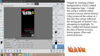
1. I began by creating a black
background to which I added
the magazine logo – I made
this using a website called
cooltext.com (as shown below)
I then removed the colour as I
feel like this colour reflected
the wrong part of horror I was
attempting to highlight. To
this, I added text based around
the idea of horror reviews,
horror games, films and
actors/actresses
2. Following this, I enhanced the size of the
masthead as I felt at its previous size it
was not eye catching enough however
with the addition of this, I then had to lay
the “GUTS,GORE,GHOULS AND
MORE” banner over the main masthead.
Continuing – I enhanced the size of the
text within the bottom banner as I felt that
it looked cluttered and wasn’t very clear
as well as changing the colour and size of
the plus sign.
3. I modified the main image using the paint tool to
create a more shadowed look to the jaw and eye
brow lines, moreover i refined the edges of the
image by adding a lighter shade of grey/brown and
then using the burn tool to blend it slightly.
4. Following this I enhanced the size of the text situated at the
footer of the page along with enhancing the size and colour
of the sub title: “DARK DESCENT EXCLUSIVE” as well
as changing the spelling mistake from decent to descent.
Continuing, I also maximised the size of the masthead to
make my magazine somewhat more noticeable to the
audience. As well as placing the image slightly over the
main masthead as a method of showing the importance of
the article.
5. I then proceeded to add the subtitles to
the left hand side of the page and
arranged it so each of the subtitles are
in line. I also changed the colour of
Katie's eye to make the image
somewhat more demonic and
intriguing.
6. Following this I enhanced the
size of the Main titles, sub
titles to create a more eye
catching image.
7. After this I changed and
added more to the subtitles
as well as moving the main
story titles again to create a
more eye catching title.