
Recommended
More Related Content
What's hot
What's hot (19)
Similar to screenshots for mag and poster
Similar to screenshots for mag and poster (20)
Recently uploaded
Recently uploaded (20)
screenshots for mag and poster
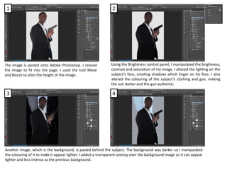
- 1. The image is pasted onto Adobe Photoshop. I resized the image to fit into the page. I used the tool Move and Resize to alter the height of the image. Using the Brightness control panel, I manipulated the brightness, contrast and saturation of my image. I altered the lighting on the subject’s face, creating shadows which linger on his face. I also altered the colouring of the subject’s clothing and gun, making the suit darker and the gun authentic. Another image, which is the background, is pasted behind the subject. The background was darker so I manipulated the colouring of it to make it appear lighter. I added a transparent overlay over the background image so it can appear lighter and less intense as the previous background. 1 2 3 4
- 2. I copied an image of police tapes and pasted it. I manipulated the colouring of this decorative piece to make it appear orange. I cropped the image, making the tape torn. I positioned the tape on either side of the subject. For text I added the credits, release date, actor’s names and the tagline. SF MOVIE POSTER is the credit’s font, whilst the release, tagline and actor’s name was BEBAS NEUE. I also copied logos from the production company, studio company, IMAX and REAL 3D and pasted it onto my poster. I had to find transparent images and if I could not find these images with transparency I had to make the image transparent. I used the Transparent tool to do so. The title’s font is GESSO which I placed directly on the subject and the police tape. 5 6 7 I used these tools.
- 3. I copied the image onto Adobe Photoshop and altered the brightness and contrast of the subject’s face and hands. I used the Brightness and Contrast panel. I added the white background onto my magazine front cover. I placed the title on top of my page yet I also made the subject in front of the text. I adjusted the layering of the two layers. The font used if BEBAS NEUE. 1 2 3
- 4. I used these tools. Afterwards I added my button and the plus symbol, using the Colour tool to make the symbols appear more authentic. I used the Move tool to resize the image. The tool Marquee was used to crop images whilst Lasso was to crop the smaller areas of the image, such as the watch and the gun. I allowed me to add detail as well. The Text tool was used to create the sell lines, headline and masthead. The Custom Shape tool was used to create the button and the plus symbol. I add more text and changed the colour of each, making them blue or red for bold and alertness. I used a variety of fonts such as BEBAS NEUE and ANDALE MONO. 4 5