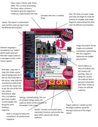
1. Connotes that this is a weekly
thing.
Font: The fonts are quite simple
and some are bright to show the
contrast of a bubbly and simple
magazine representing that they
cater for different personalities.
Image Placement: All the
images are scattered
everywhere representing
that this magazine
represents the bubbly
personalities.
Direct address as
they are looking into
the camera and
pointing, they are
doing this so that
the audience feels a
personal connection
with them almost as
if they are with the
audience.
Three colour scheme: pink, black,
white. This is a form of branding.
The three colour scheme is
included to give the magazine a
simple yet sophisticated neat look.
Layout: The layout is scattered yet
neat and this could yet again cater
for different personalities.
Informal language is
included for e.g. ‘hottest’
which could represent
that their target audience
is teenagers as this is their
chosen speech.
Shot type: Long shot. A
long shot shows a great
deal of background, be it
the set, the landscape or
the venue. Long shots are
essential to establish the
scene for the viewer and
to put the rest of the film
into context.
Settings: Isolated setting. The use
of isolated settings makes the
audience divert all the attention to
the people in the image. Target audience: I would say that
the target audience would be
teenagers because of the bright
colours.
Gender: Females as the pink colour
represents feminine and also the boy
band which attracts the female
audience.
Promotional offer:
This is included to
gain more readers
as most people like
discounts when
reading a
magazine.
Date is included to follow the
conventions of a professional
magazine.