SlideShare a Scribd company logo
1 of 4
Step Brother Radial Analysis Colour: They have used a blue 
background to show the 
brothers are nice to each other 
sometimes as blue is a calm 
happy colour, however the blue 
gets darker and this contrasts 
their relationship as at any 
moment they are ready for a 
fight or to explode; this makes 
us picture a sky waiting to rain. 
The title ‘step’ is in red this is 
because it shows a distance in 
their relationship and because it 
is in red shows connation's of 
danger and anger between the 
two. 
Layout: The step brothers are 
shown next to each other with 
one resting his hands on the 
other this shows us that they 
don’t hate each other and there 
is a connection between the two 
but because there is no eye 
contact this shows separation 
between them. The poster is 
clearly laid out as this is 
appealing to the target audience 
and will catch their attention 
immediately. 
Image: The image shows that the 
two are looking at something 
which we are unable to see and 
because there is no eye contact 
with us we straight away want to 
know what they are looking at 
which draws us in, which makes us 
want to watch the film to find out. 
The image is also a mid shot which 
is appealing for the target audience 
as they can see their faces and also 
a little bit of their body which gives 
us a clearer idea of the characters 
personality's , this is because their 
clothes and body language can give 
away clues. This is appealing for 
the target audience as they will feel 
like they know the characters well 
and they will understand what to 
expect in the film which will make 
them more likely to want to watch 
it. 
Font: They have used san serif 
fonts because it attracts a 
wider audience. This creates a 
brand image that they want to 
appeal to a wide target 
audience but mainly lower 
class/middle class. Also 
because the film is a comedy it 
fits in with this as it gives it a 
more quirky feeling for the 
audience and where it is bold it 
catches more peoples 
attention.
Colour: They have used a wide range 
of colours this creates an image that 
there is a lot of different things inside 
the magazine and it makes us think 
that there is going to be a lot going on 
inside. This is appealing as the target 
audience will want to find out as much 
gossip as possible. Also the colours 
red, yellow and pink are bright colours 
which creates a happy exciting feel 
which will make the audience want to 
read the magazine. The colours are 
always bright colours splashed across 
the page because this helps create 
consumer attention. 
Layout: The layout of the magazine 
is laid out in order of what the 
audience will want to see first. For 
example the title is at the top of the 
page because the audience will 
know whether they are going to 
want to read this certain magazine 
or not. Once they know the name 
of the magazine they are then going 
to scan the page, this is appealing 
because they will be prepared for 
what's inside the magazine and 
wont feel as if they are wasting 
time reading it. There's a lot of 
subheadings and gossip on the 
front page which will draw the 
audiences attention as this is the 
purpose of the magazine. 
Images: The images are of celebrity's, 
this is appealing for the target 
audience because if there is someone 
on there that they look up to or really 
like they are going to want to read it to 
find out the gossip with that person. 
They have used a image with the 
celebrity looking directly at you, this 
will make the audience feel welcomed 
into the magazine and they will feel as 
if they are telling them what's inside 
personally. They have used many 
images as the age group and class of 
this magazine are less likely to want to 
have loads of writing to read. 
Font: Bold fonts have been used this is 
because it creates excitement within 
the audience and that something bad 
has happened. Therefore they are 
going to want to read inside to find out 
what actually happened, this is good 
for the institution as they want people 
to read inside the magazine and enjoy 
it so they will buy the magazine again. 
They have used a mixture of different 
fonts to make the magazine look more 
exciting and adventurous. The 
masthead ‘heat’ is always the same 
this is so you can recognise it when the 
magazine is released and it also creates 
a brand image.
Image/shot type: the image is of the 
two main characters this is appealing 
to the target audience because they 
will be featuring the most in the film 
so the target audience can get to 
know them before the watch the film. 
If they know a bit about the characters 
before they watch the film they will 
have a better understanding whether 
they are going to like it and they will 
feel included. The image is also a mid 
shot, this is because we can still see 
the characters facial expressions but 
we also get to see what clothes their 
wearing and how they are standing. 
This tells us a bit about the 
personality's of the characters. The 
target audience will find this appealing 
because they will feel like they have a 
head start and a bit of a idea what the 
film is going to be like. 
Mise-en-scene: the background of this particular shot 
isn't very interesting however this is because they want 
the audience to focus clearly on the characters facial 
expressions. This is good that we sometimes draw 
attention to their facial expressions and not the 
background because it means the audience are clear 
with how they are feeling and getting a clear idea of how 
the characters are going to be acting in the film. However 
there are many shots showing the background as this 
makes the audience feel clear of the setting and the 
background will give of clues to the target audience of 
what the film is going to be like and tells them a bit more 
about the characters lifestyle 
Editing: The editing of the shots are 
a mixture. Some shots are fast , 
some are slow and some are of a 
medium past, this all depends on 
the part they are showing and how 
important the scene is. For example 
when the main parts are shown the 
pace of editing is slower because 
they want the audience to pay 
attention to these parts as they will 
draw them in and they want them 
to get a clear understanding of what 
the film is about. However when 
parts with tension appear the pace 
of the editing fastens this is 
because it builds enigma and gets 
the audience excited for what's 
going to happen. 
Theory: There are gratifications of entertainment in 
the trailers the genre is a comedy but they are 
trying to make people laugh and be entertained by 
the film, we can see this in the trailer through their 
facial expressions. In this shot they look upset and 
as if they are getting in trouble for doing 
something. This appeals to the target audience as 
they want to know more of why they are feeling 
this way and therefore they plan on buying the 
film, which is good for the institution.
Analysis of step brothers

More Related Content

What's hot

Film Poster Evaluation
Film Poster EvaluationFilm Poster Evaluation
Film Poster Evaluation12moorek
 
Photography choices and reasons
Photography choices and reasonsPhotography choices and reasons
Photography choices and reasons2033x
 
Mise en scene analysis 2
Mise en scene analysis 2Mise en scene analysis 2
Mise en scene analysis 2048454
 
Ass 9 part b
Ass 9 part bAss 9 part b
Ass 9 part bjudyibel
 
Magazine analysis and planning
Magazine analysis and planningMagazine analysis and planning
Magazine analysis and planningcallumsands
 
Magazine analysis
Magazine analysisMagazine analysis
Magazine analysisAyakhaireh
 
Evaluation 2 powerpoint
Evaluation 2 powerpointEvaluation 2 powerpoint
Evaluation 2 powerpointlillie94
 
Do all my images meet my intentions
Do all my images meet my intentionsDo all my images meet my intentions
Do all my images meet my intentionsjakestar09
 
Do all my images meet my intentions
Do all my images meet my intentionsDo all my images meet my intentions
Do all my images meet my intentionsjakestar09
 
Ollie long unit 14
Ollie long unit 14Ollie long unit 14
Ollie long unit 14olong17
 
Magazine Cover Analysis
Magazine Cover Analysis Magazine Cover Analysis
Magazine Cover Analysis Amy Orme
 
Poster analysis
Poster analysisPoster analysis
Poster analysisNT160371
 
little white lies analysis
little white lies analysis little white lies analysis
little white lies analysis Beckytristram
 

What's hot (20)

My Music Magazine
My Music MagazineMy Music Magazine
My Music Magazine
 
Photoshoot
PhotoshootPhotoshoot
Photoshoot
 
Film Poster Evaluation
Film Poster EvaluationFilm Poster Evaluation
Film Poster Evaluation
 
Question 1
Question 1 Question 1
Question 1
 
Photography choices and reasons
Photography choices and reasonsPhotography choices and reasons
Photography choices and reasons
 
media
mediamedia
media
 
Mise en scene analysis 2
Mise en scene analysis 2Mise en scene analysis 2
Mise en scene analysis 2
 
Ass 9 part b
Ass 9 part bAss 9 part b
Ass 9 part b
 
media
mediamedia
media
 
.
..
.
 
5 fave 3
5 fave 3 5 fave 3
5 fave 3
 
Magazine analysis and planning
Magazine analysis and planningMagazine analysis and planning
Magazine analysis and planning
 
Magazine analysis
Magazine analysisMagazine analysis
Magazine analysis
 
Evaluation 2 powerpoint
Evaluation 2 powerpointEvaluation 2 powerpoint
Evaluation 2 powerpoint
 
Do all my images meet my intentions
Do all my images meet my intentionsDo all my images meet my intentions
Do all my images meet my intentions
 
Do all my images meet my intentions
Do all my images meet my intentionsDo all my images meet my intentions
Do all my images meet my intentions
 
Ollie long unit 14
Ollie long unit 14Ollie long unit 14
Ollie long unit 14
 
Magazine Cover Analysis
Magazine Cover Analysis Magazine Cover Analysis
Magazine Cover Analysis
 
Poster analysis
Poster analysisPoster analysis
Poster analysis
 
little white lies analysis
little white lies analysis little white lies analysis
little white lies analysis
 

Similar to Analysis of step brothers

Analysis of step brothers
Analysis of step brothersAnalysis of step brothers
Analysis of step brothersdenirose17
 
Evaluation of my ancillary tasks 2
Evaluation of my ancillary tasks 2Evaluation of my ancillary tasks 2
Evaluation of my ancillary tasks 2hhsmediastudies
 
Magazine analysis totp 1
Magazine analysis   totp 1Magazine analysis   totp 1
Magazine analysis totp 1Deanna Harnden
 
Magazine analysis totp 1
Magazine analysis   totp 1Magazine analysis   totp 1
Magazine analysis totp 1deannaharnden
 
Magazine analysis totp 1
Magazine analysis   totp 1Magazine analysis   totp 1
Magazine analysis totp 1deannaharnden
 
Question 4 and 5
Question 4 and 5Question 4 and 5
Question 4 and 5Haisam10
 
Before i go to sleep poster film analysis
Before i go to sleep poster film analysisBefore i go to sleep poster film analysis
Before i go to sleep poster film analysisleahwatts
 
Poster analysis
Poster analysisPoster analysis
Poster analysisNT160371
 
Analysis of 6 film posters
Analysis of 6 film postersAnalysis of 6 film posters
Analysis of 6 film postersmattmosey1
 
Research on Romance Drama Film Posters
Research on Romance Drama Film PostersResearch on Romance Drama Film Posters
Research on Romance Drama Film Postershhsmediastudies
 
Conventions of a film poster and magazine
Conventions of a film poster and magazine Conventions of a film poster and magazine
Conventions of a film poster and magazine kayleedeath12345
 
Poster Analysis 3
Poster Analysis 3Poster Analysis 3
Poster Analysis 3Kalgani
 
Poster Analysis 3
Poster Analysis 3Poster Analysis 3
Poster Analysis 3Kalgani
 
Evaluation 2
Evaluation 2 Evaluation 2
Evaluation 2 hinnah1
 
Psychological Thriller Poster Analysis
Psychological Thriller Poster AnalysisPsychological Thriller Poster Analysis
Psychological Thriller Poster Analysisbexxlarr
 

Similar to Analysis of step brothers (20)

Analysis of step brothers
Analysis of step brothersAnalysis of step brothers
Analysis of step brothers
 
Evaluation of my ancillary tasks 2
Evaluation of my ancillary tasks 2Evaluation of my ancillary tasks 2
Evaluation of my ancillary tasks 2
 
Magazine analysis totp 1
Magazine analysis   totp 1Magazine analysis   totp 1
Magazine analysis totp 1
 
Magazine analysis totp 1
Magazine analysis   totp 1Magazine analysis   totp 1
Magazine analysis totp 1
 
Magazine analysis totp 1
Magazine analysis   totp 1Magazine analysis   totp 1
Magazine analysis totp 1
 
Question 4 and 5
Question 4 and 5Question 4 and 5
Question 4 and 5
 
Before i go to sleep poster film analysis
Before i go to sleep poster film analysisBefore i go to sleep poster film analysis
Before i go to sleep poster film analysis
 
magazine analysis
magazine analysismagazine analysis
magazine analysis
 
Poster analysis
Poster analysisPoster analysis
Poster analysis
 
Analysis of 6 film posters
Analysis of 6 film postersAnalysis of 6 film posters
Analysis of 6 film posters
 
Research on Romance Drama Film Posters
Research on Romance Drama Film PostersResearch on Romance Drama Film Posters
Research on Romance Drama Film Posters
 
Conventions of a film poster and magazine
Conventions of a film poster and magazine Conventions of a film poster and magazine
Conventions of a film poster and magazine
 
Unit 14 - LO1
Unit 14 - LO1Unit 14 - LO1
Unit 14 - LO1
 
Poster Analysis 3
Poster Analysis 3Poster Analysis 3
Poster Analysis 3
 
Daddys little girl.
Daddys little girl.Daddys little girl.
Daddys little girl.
 
Audience feedback
Audience feedbackAudience feedback
Audience feedback
 
Poster Analysis 3
Poster Analysis 3Poster Analysis 3
Poster Analysis 3
 
Evaluation 2
Evaluation 2 Evaluation 2
Evaluation 2
 
Psychological Thriller Poster Analysis
Psychological Thriller Poster AnalysisPsychological Thriller Poster Analysis
Psychological Thriller Poster Analysis
 
Ancillary Research
Ancillary Research Ancillary Research
Ancillary Research
 

Analysis of step brothers

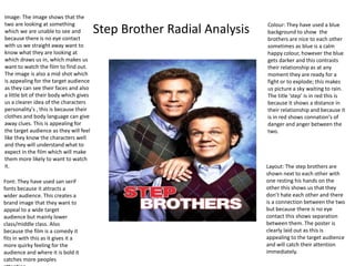
  • 1. Step Brother Radial Analysis Colour: They have used a blue background to show the brothers are nice to each other sometimes as blue is a calm happy colour, however the blue gets darker and this contrasts their relationship as at any moment they are ready for a fight or to explode; this makes us picture a sky waiting to rain. The title ‘step’ is in red this is because it shows a distance in their relationship and because it is in red shows connation's of danger and anger between the two. Layout: The step brothers are shown next to each other with one resting his hands on the other this shows us that they don’t hate each other and there is a connection between the two but because there is no eye contact this shows separation between them. The poster is clearly laid out as this is appealing to the target audience and will catch their attention immediately. Image: The image shows that the two are looking at something which we are unable to see and because there is no eye contact with us we straight away want to know what they are looking at which draws us in, which makes us want to watch the film to find out. The image is also a mid shot which is appealing for the target audience as they can see their faces and also a little bit of their body which gives us a clearer idea of the characters personality's , this is because their clothes and body language can give away clues. This is appealing for the target audience as they will feel like they know the characters well and they will understand what to expect in the film which will make them more likely to want to watch it. Font: They have used san serif fonts because it attracts a wider audience. This creates a brand image that they want to appeal to a wide target audience but mainly lower class/middle class. Also because the film is a comedy it fits in with this as it gives it a more quirky feeling for the audience and where it is bold it catches more peoples attention.
  • 2. Colour: They have used a wide range of colours this creates an image that there is a lot of different things inside the magazine and it makes us think that there is going to be a lot going on inside. This is appealing as the target audience will want to find out as much gossip as possible. Also the colours red, yellow and pink are bright colours which creates a happy exciting feel which will make the audience want to read the magazine. The colours are always bright colours splashed across the page because this helps create consumer attention. Layout: The layout of the magazine is laid out in order of what the audience will want to see first. For example the title is at the top of the page because the audience will know whether they are going to want to read this certain magazine or not. Once they know the name of the magazine they are then going to scan the page, this is appealing because they will be prepared for what's inside the magazine and wont feel as if they are wasting time reading it. There's a lot of subheadings and gossip on the front page which will draw the audiences attention as this is the purpose of the magazine. Images: The images are of celebrity's, this is appealing for the target audience because if there is someone on there that they look up to or really like they are going to want to read it to find out the gossip with that person. They have used a image with the celebrity looking directly at you, this will make the audience feel welcomed into the magazine and they will feel as if they are telling them what's inside personally. They have used many images as the age group and class of this magazine are less likely to want to have loads of writing to read. Font: Bold fonts have been used this is because it creates excitement within the audience and that something bad has happened. Therefore they are going to want to read inside to find out what actually happened, this is good for the institution as they want people to read inside the magazine and enjoy it so they will buy the magazine again. They have used a mixture of different fonts to make the magazine look more exciting and adventurous. The masthead ‘heat’ is always the same this is so you can recognise it when the magazine is released and it also creates a brand image.
  • 3. Image/shot type: the image is of the two main characters this is appealing to the target audience because they will be featuring the most in the film so the target audience can get to know them before the watch the film. If they know a bit about the characters before they watch the film they will have a better understanding whether they are going to like it and they will feel included. The image is also a mid shot, this is because we can still see the characters facial expressions but we also get to see what clothes their wearing and how they are standing. This tells us a bit about the personality's of the characters. The target audience will find this appealing because they will feel like they have a head start and a bit of a idea what the film is going to be like. Mise-en-scene: the background of this particular shot isn't very interesting however this is because they want the audience to focus clearly on the characters facial expressions. This is good that we sometimes draw attention to their facial expressions and not the background because it means the audience are clear with how they are feeling and getting a clear idea of how the characters are going to be acting in the film. However there are many shots showing the background as this makes the audience feel clear of the setting and the background will give of clues to the target audience of what the film is going to be like and tells them a bit more about the characters lifestyle Editing: The editing of the shots are a mixture. Some shots are fast , some are slow and some are of a medium past, this all depends on the part they are showing and how important the scene is. For example when the main parts are shown the pace of editing is slower because they want the audience to pay attention to these parts as they will draw them in and they want them to get a clear understanding of what the film is about. However when parts with tension appear the pace of the editing fastens this is because it builds enigma and gets the audience excited for what's going to happen. Theory: There are gratifications of entertainment in the trailers the genre is a comedy but they are trying to make people laugh and be entertained by the film, we can see this in the trailer through their facial expressions. In this shot they look upset and as if they are getting in trouble for doing something. This appeals to the target audience as they want to know more of why they are feeling this way and therefore they plan on buying the film, which is good for the institution.