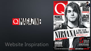
2. Homepage The same house style used in their magazine is also present here
on the Q website. A white background with black text with the red
Q logo at the top left corner. This layout of this website is similar
to many other websites for a magazine. This is apparent by the
large images placed all around the page and text over them. This
is so it’s clear what the text is linked to as with so many images
and different articles to click on the text would get lost if it wasn’t
so close to or actually on top of the image it may not be clear
what the image the text is with. I really like this layout however as
its very clear and the text isn’t so big that it overpowers the
images and vice versa. I also like the buttons at the buttons at the
top too and the way they are divided. There is a small diagonal
line to divide the text/buttons and I think that that is a lot better
than having nothing or even just vertical lines. I think that the
black bar at the top of the page isn’t a very good idea as although
it contrasts well with the white background, it’s still too small and
hard to notice so people may miss that part of the website. Overall
I think this is a very good and stylish website that works well with
the magazine as they have similar house styles and I also like the
layout of this website too.