1. Existing Research!
I have looked online at existing magazine covers from different colleges to see what
different features they contain and how the would appeal to students who attend that
college.
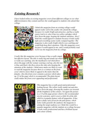
I think this magazine from an existing college would
appeal really well to the youths who attend the college,
because it is really bright and attractive, and has a really
snazzy look to it, also it has two yellow splodges which
flow down the page, keeping the students attention. Also I
think this would appeal to students because it looks really
tight and everything seems really cramped together. The
magazine is also really bright which is eye-catching and
would help keep there attention. I like this magazine cover
because it would appeal to me, and I would probably read
it if it was the magazine from my college.
I really like this magazine cover because it has a really simple
but effective layout. The title is really big and stands out which
is really eye-catching, also the masthead is red which flows
down the page with the woman wearing a red top, also the text
is blue and black, this flows down the sides also keeping the
attention of the students. I think more males are likely to want
to read the magazine because there is a woman on the front
cover which is more likely to appeal to the males than the
females. Also this front cover contains a picture which takes
up 1/3 of the page which is recommended. The plain layout
really makes the front cover appealing and professional.
This magazine has a really good and professional
looking layout. The yellow really stands out and also
flows down the page, drawing the readers eye towards
all the brightness of the colours. Yet again the picture
is a 1/3 of the page picture which is the recommended
size for a picture, and it covers a little bit of the title
which is a popular feature with all magazines. It has
quite a funky style of text for the pull quotes, which
looks really good for the audience the magazine is
aiming the target audience at, I think this would be a
popular magazine with the students at a college because
it looks really professional and has a brilliant layout
and colour scheme.