Media Representation of Women- Gender Studies.pptx
Magazine Adverts - Men & Women
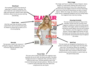
1. Masthead
The masthead is used in the interest of
capturing it’s audience’s attention. The
way it does this is by making the text very
large and, bold with a vibrant colour which
therefore, allows it to be very eye-catching
and alluring.
Main Image
The image used here is a photo of ‘Jessica Simpson. Jessica
Simpson is a well-known celebrity who will be sure to
capture the attention of many. She is wearing a very
attractive dress that slightly reveals her breasts illustrating
even more of the fact of how women are seen as ‘sexual
objects’. Within the image, the celebrity is addressing the
viewer which is displaying confidence and, her smiling makes
the magazine cover look very inviting.
Barcode
The barcode is used in the interest of
selling this magazine. Additionally, on top
of the bar code their website is also
displayed.
Arousing Curiosity
The text includes the words of ‘How to’ this
therefore, would raise the curiosity of the
magazine’s audience on what this article would
be about. Once again, women are being seen as
nothing but sexual objects that only live to please
men. However, since this magazine is aimed at
women, it would suggest that women are also
starting to see themselves that way also, as they
are constantly represented that way throughout
the media.
Bold Text
This text stands out alongside the Masthead as, it is
written in bold and a much larger fonts then the other
cover lines. The bold text allows the message to
capture the viewers attention straight away, which
would also then raise curiosity on what his article
would be about and, the statistics is used to back up
the points being made.House Style
The main colours being used within this magazine cover
would be the use of, pink, red, black and white. The white
background assists in making the titles and other colours
stand out even more. The pink would be used in the
interest of attracting its female audience. Whereas, the red
is used for most of the bold cover lines which also
compliments the use of pink.
Cover Lines
All of the cover lines are written in bold,
capital letters which would therefore give
its viewers no choice but to read it, as it is
very eye-gripping.
2. Masthead
The Masthead allows the viewers to
identify the audience for the magazine, in
this case it is men. For the Masthead it is
very bold, and large therefore, capturing
the attention of it’s audience. The title is
written in Sentence Case therefore,
allowing for the text above it to be
displayed, ‘Australian’.
Negative Space
The negative space is used in the
interest of making his fighting stance
and, muscles on his arm stand out
even more.
Main Image
The main image is Hugh Jackman, who is well-known for
his role as the Wolverine. He is doing a fighting stance,
which would then suggest dominance and power alongside
with determination. He is addressing the audience by
looking down at the camera, which would also suggest that
he is confident, and determined. Additionally, he looks like
he is ready to fight. The way that he is presented, is as his
role as the ‘Wolverine’, as this is what he is best known as.
The usage of him as the main image on the front cover of
this magazine would attract the male audience alongside
with fans of his work, etc.
Cover Lines
The bold text makes the text stand out
even more. The text is very simple with
only using the worlds of ‘Strong’ and,
‘Lean’. This would also go back to how
men are displayed within the media, they
are meant to be ‘strong’ and, ‘confident.
The usage of the exclamation mark makes
the text stand out with it being in capital
letters also, this makes it come out as very
aggressive.
Plug/Anchor
This text tells the audience about “Power
secrets from the World’s Top Gym”, the
usage of the words ‘Power’ and, ‘Top Gym’
raises engrossment within the audience as,
it makes them feel as if they are going to
learn something ‘amazing’ and significant
if they read that article. Furthermore, the
text also features the page number on
where the article is held which would
therefore, suggest that this is one of their
‘good’ articles which are guaranteed to get
their audience interested in buying the
magazine.
Genre
The magazine uses the movie reference to,
‘Wolverine’, as it makes sense with the actor who
plays Wolverine being their main image. Wolverine
is portrayed as a strong and, confident character
with a lot of muscles. Therefore, by referencing to
him would make the audience think that if they do
this workout, they could look and, feel like
wolverine and be as strong as he is, when
portrayed in the movie.
Arousing Curiosity
This text is specifically highlighted in red which makes
this stand out a lot more from the other cover lines.
Additionally, this raises the curiosity of the magazine’s
target audience as every one is interested in money.
Also, instead of saying ‘Money tricks guys know’, it
uses the word ‘Rich’ in front of ‘guys’, this would
therefore make the audience more engrossed in this
article, as rich guys are known to already have money
therefore, meaning that they feel as if these ‘tricks’ will
work.