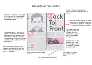
1. Little White Lies Page Furniture
Header - Placed on the right hand
side, Pun play on word from “Back to
Front”
Strap/Sub Header - Shouts out to the
reader, Idea of mystery and Meaning
and luring the reader in. The by line
is the person who wrote the article.
Illustration is like zerox - Could apply
to the character as it was originally
a comic book. Also image could
represent it is dated
Two page structure - section in the
middle is the “Gutter” First letter is
called a “drop cap” as it starts with a
capital letter and drops a few lines,
This stands out with its size and color
and also tells the audience where to
start reading,
Sub dividers split up the passages
makes it more user friendly and also
creates a play on words say ing “is it
a bird ? is it a plane?...”
Folio - Page number and issue
number
Slug Goes in the bottom
right hand side of the
page.
The full stop is the little
white lies logo, this is
for branding and to let
the audience know they
are reading LWL.
This image is also pink
to go with the theme of
the page, LWL use
design of the magazine
over the film they are
talking about.
Info - Gives details on basic info.