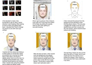
1. I first decided to make a few
thumbnails to get an idea in which
direction I was heading. After looking
at most of them and getting feed
back. I decided that I had to change
my picture to one with more eye
contact.
I started with the colours by finding a
a close match to normal skin colour
as possible then covering his whole
face in that colour, and found a
slightly darker tone to do the next, for
a slightly darker/shaded area. I then
coloured facial features and clothes.
Then I moved onto using the gradient
tool to shade and lighten areas.
Once I got my picture I then chose to
jump right into it and trace the outline
of his head, by putting the opacity
down by 50% then getting an
accurate drawing.
After the face as done, I then moved
onto the background and played
around a bit, then thought a fitting
colour would be orange which is the
prime colour of the film the hunger
games. I found that a creamy grey
colour went well alone side it.
I then removed the picture from the
background and decided to start
thinking about colours. The one area
I stuggle with mostly is the hair. So I
started there and then moved onto
the next section, which would be face
colours and shading.
The last thing I had to do was put the
title of the film on. Firstly I put on premade text from the internet, but it
looked too cheesy, I then chose to
find some text then trace underneath
it by hand.